Archer (typeface)
Archer is a slab serif typeface designed in 2001 by Tobias Frere-Jones and Jonathan Hoefler for use in Martha Stewart Living magazine.[1] It was later released by Hoefler & Frere-Jones for commercial licensing.
 | |
| Category | Serif |
|---|---|
| Classification | Humanist slab serif |
| Designer(s) | Tobias Frere-Jones Jonathan Hoefler |
| Foundry | Hoefler & Co. |
Structure
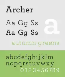
The typeface is a geometric slab serif, which takes inspiration from mid-twentieth century designs such as Courier and Landi.[2] Ball terminals were added to the upper terminals on letters such as C and G to increase its charm.[3][2] Italics are true italic designs, with flourishes influenced by calligraphy, an unusual feature for geometric slab serif designs.[2][4]
Uses
The typeface has been used for, among other things, branding for Wells Fargo and is a main font for the San Francisco Chronicle and Wes Anderson's film The Grand Budapest Hotel.[5]
References
- de Wilde, Barbara. "Martha Stewart Living". Barbara de Wilde. Retrieved 4 July 2023.
- Wilson, Doug. "Designing Archer". Frere-Jones Type. Retrieved 4 July 2023.
- Devroye, Luc. "Jonathan Hoefler". McGill University. Retrieved 29 September 2014.
- Earls, David John. "Archer". Typographica. Retrieved 11 July 2015.
- Adams, Lauren. "Is Archer's Use on Target?". AIGA. Archived from the original on 26 October 2019.
External links
- Archer (H&FJ website)