Architecture of the night
Architecture of the night or nocturnal architecture, also referred to as illuminated architecture and, particularly in German, light architecture, is architecture designed to maximize the effect of night lighting, which may include lights from within the building, lights on the facade or outlining elements of it, illuminated advertising, and floodlighting.
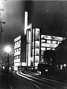
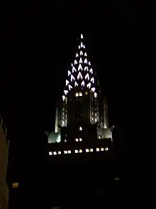
With the rise of artificial lighting in the 19th and 20th centuries, architects were increasingly aware of it as an element to be integrated into design; deliberate use of it has been popular at various times, including the design of skyscrapers and other commercial buildings in the 1920s and 1930s, in the 1950s and 1960s, and in modern festive city architecture.
History
The term is attributed to Raymond Hood, writing in a special issue of the Bulletin of the General Electric Company, also titled "Architecture of the Night," in February 1930.[1] He wrote:
[T]he possibilities of night illumination have barely been touched. . . . Eventually, the night lighting of buildings is going to be studied exactly as Gordon Craig and Norman Bel Geddes have studied stage lighting. Every possible means to obtain an effect will be tried—color, varying sources and direction of light, pattern and movement. . . . [T]he illumination of today is only the start of an art that may develop as our modern music developed from the simple beating of a tom-tom.[2][3][4]
However, architects and designers had been preoccupied with the concept for some time. The German term Lichtarchitektur (light architecture) first appears in print in a 1927 essay by Joachim Teichmüller in Licht und Lampe, another technical electrical publication, but he had used it as a wall label at an exhibition five months before,[5] and there was a lengthy preceding history of more or less metaphysical discussion in Germany of "crystalline" architecture, the "dissolution" of cities, and the concept of the Stadtkrone (city crown), particularly among the members of the Gläserne Kette (Glass Chain).[6] (Louis I. Kahn held a similarly metaphysical view, saying in 1973 in his lecture at Pratt Institute that "light is really the source of all being".[7]) In his essay, Teichmüller distinguishes between lighting design and light architecture, which will only come about through integration of the lighting engineer's concerns with those of the architect so that the "space-shaping power of light" itself is realized: "[T]his architectural light can lead to light architecture if with it, and only with it, specific architectural effects are produced, which appear and disappear simultaneously with the light."[8] Also in 1927, Max Landsberg wrote that commercial centers now presented such different aspects by day and night that architecture of the day and of the night should be distinguished. He argued for "not only regulations, but planning and competitions" to facilitate the development of the latter and bring order to the current chaos of advertising.[9] That same year, Hugo Häring foresaw the "nocturnal face" of architecture soon eclipsing the "diurnal face."[10] And also that same year, Walter Behrendt devoted a section in his book Sieg des neuen Baustils (translated edition: The Victory of the New Building Style) to "artificial illumination as a problem of form" and defined one of the tasks of new building as being:
not only to use these new possibilities [of electric lighting] but also to design them, [whereupon] illumination is exploited in a functional sense, that is, it becomes an effective tool for designing the space, explaining the spatial function and movement, and accentuating and strengthening the spatial relations and tensions.[11]
Behrendt's examples include one interior: the lighting of a staircase in Otto Bartning's Red Cross Building in Berlin by means of tubular light fixtures placed under the corners of the flights of stairs, "underscor[ing] . . the stairs' tendency toward movement."[12] A British endorsement of the same concept, P. Morton Shand's Modern Theatres and Cinemas (1930), confines itself to external lighting but embraces advertising, which was to remain a point of contention:
[N]ight architecture is something more than a transient phase or a mere stunt. It is a definite type of modern design with immense possibilities for beautifying our cities, which is opening up entirely new and untrammelled perspectives of architectural composition. Publicity lighting is becoming to architecture what captions and lay-outs are to journalism—a new and integral part of its technique, which can no longer be ignored or derided with superior academic 'art for art's sake' smiles.[13]
From the beginning to World War II
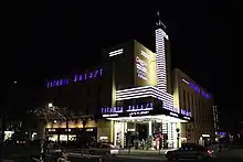
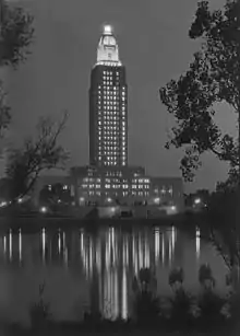

Electrical companies promoted the integration of lighting design into architecture, beginning with the World's Fairs of the late 19th century.[15] In the late 1920s, General Electric was exhibiting model buildings at its Nela Park research facility in Cleveland to illustrate modern electrical advertising and building illumination as well as street lighting, and General Electric and Westinghouse both built theaters in which to display streetscapes under differing lighting conditions.[16] Floodlighting of buildings and monuments, developed and refined by lighting engineers like Luther Stieringer and Walter D'Arcy Ryan at successive fairs, was encouraged as a way to showcase a city's most prominent buildings, particularly skyscrapers: the first attempt at floodlighting the Statue of Liberty took place in 1886, the top of the Singer Building was floodlighted in 1908, the Capitol dome in Washington, D.C. during World War I.[17] It was soon discovered that the angle and nature of the lights distorted architectural features; in the same promotional publication as Hood's essay, Harvey Wiley Corbett argued for the form of the building to take floodlighting into account from the beginning, in a continuation of changes that had already taken place, such as the elimination of the cornice. "The form of the illuminated portion should be so tied in with the rest of the building that it should appear as a jewel in a setting, forming a coherent part of the entire structure." The setback skyscraper shape was best from this point of view, and Hood argued that classical architecture should simply not be floodlighted.[18] Floodlighting also influenced the materials of many buildings: at the 1915 Panama–Pacific International Exposition in San Francisco, a rough finish was used on Ryan's advice to diffuse the light and avoid glare,[19] and conversely the 1921 Wrigley Building in Chicago was built with a pale terra cotta facade that becomes whiter and more reflective with increasing height, to maximize the effect of floodlighting.[20][21][22] Lighting was an important part of the competition between skyscrapers.[23]
Hood and André Fouilhoux's 1924 black American Radiator Building in New York was used for experimentation with illumination. Hood wrote in 1930:
We tried multi-colored revolving lights and produced at one time the effect of the building's being on fire. We threw spots of light on jets of steam rising out of the smokestack. Then again, with moving lights, we had the whole top of the building waving like a tree in a strong wind. With cross-lighting . . . the most unusual cubistic patterns were developed.[24]
The lighting designer, Bassett Jones, argued for a lighting scheme using rose, scarlet, and amber color screens:
My mental picture of this building at night would result from pouring over the structure a vast barrel of spectral hued incandescent material that streams down the perpendicular surfaces, cooling as it falls, and, like glowing molten lava, collects in every recess and behind every parapet.[24]
The building was eventually illuminated in amber. Even a critic who found the building "theatrical to a degree that opens it to a charge of vulgarity" said that "at night, when . . . the gilded upper portion seems miraculously suspended one and two hundred feet in the air, the design has a dreamlike beauty."[25] Georgia O'Keeffe made a famous painting of it, American Radiator—Night (1927) in which she simplified the architecture and made the lighting white,[26] and The American Architect called the illumination "one of the sights of the city. . . . The vast throngs that crowd this district at night are blocking traffic".[24]
Floodlighting was popular in American cities in the 1920s and 1930s, all the more so as electricity prices dropped by more than half.[19] It made cities look like a "fairyland" or a "dream city";[19] and it edited out ugliness, such as the power station at Niagara Falls[27] or "poor or unsightly sections" which at night became "now unimportant blanks" in a "purified world of light".[28] In addition to the World's Fairs, light festivals were popular in Europe beginning in the second half of the 1920s, the most important being Berlin im Licht in October 1928.[29][30]
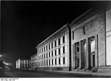
Authorities on both sides of the Atlantic had argued against the curtailment of floodlighting and lighted advertising signs during World War I despite the need to save fuel,[31] and upon seizing power the Nazis immediately applied floodlighting as part of their program of public buildings that culminated in Albert Speer's New Reich Chancellery of 1939, in addition to the Cathedral of light effect wherein floodlights were used to define space themselves at the Nuremberg rallies.[32][33]
In Europe, lighting of public squares in major cities was more important than in America, primarily because American cities had fewer squares. Paris, in particular, reinforced its reputation as the City of Lights by illuminating the Place de l'Opéra and the Avenue de l'Opéra as early as 1878,[34] and in 1912 Edith Wharton wrote home in distress that the city landmarks were lighted at night, "torn from their mystery by the vulgar intrusion of floodlighting."[35] Conversely, since European cities had hardly any skyscrapers, lighting from within the building or on its facade dominated the use of light in modern architecture to an extent that it did not in America. Some buildings used glass illuminated from within; for example Franz Jourdain's 1907 extension to the Samaritaine department store in Paris, with glass domes,[36] and Erich Mendelsohn's 1928 Petersdorff Department Store in Breslau, with ribbon windows illuminated by over-mounted neon lighting reflected out into the street by white curtains.[37] The emphasis on bright, flat surfaces to simplify illumination helped to spread the architectural vocabulary of modernism.[38] Architects themselves drew attention to and embraced the greater importance of lighted advertising, rather than the American approach of floodlighting a skyscraper like "a gleaming holy grail" or "the dream castle of Valhalla" and ignoring the possibilities for lettering of the "gigantic, widely visible wall areas".[39] Häring went so far as to welcome "the destruction of architecture" by advertising:
It is a fact that commercial buildings don't have an architectural facade anymore, their skin is merely the scaffolding for advertising signs, and lettering and luminous panels. The rest are windows.[10][40]
His article, like other publications of the period, contrasts day and night views of sample buildings. One of his examples was Arthur Korn's remodeled facade of the "Wachthof." A larger later example is Jan Buijs' De Volharding Building in The Hague, where the elevator shaft and stair tower are glass bricks, lighted at night, and the illuminated sign on the roof is surmounted by a lighted shaft, but in addition the spandrels between the plate glass windows are opal glass, behind which lettering advertising the advantages of the insurance cooperative was mounted to be backlighted at night.[41] In 1932 Mildred Adams, writing in The New York Times magazine, described Berlin, which had yet to build a single skyscraper, as "the best-lighted city in Europe" because of its "display lighting [using] glass brick and opal glass".[42] Another difference in the application of architecture of the night in Europe resulting from the lack of skyscrapers was that movie theaters, such as Rudolf Fränkel's Lichtburg and Ernst Schöffler, Carlo Schloenbach, and Carl Jacobi's Titania Palast in Berlin, were particularly striking examples of architecture of the night, often "the most striking [nocturnal] sights" in cities.[43][44][45][46][47] In the case of UfA, this extended to spectacular transformations of theater facades to advertise particular movies.[48]
A late example of European architecture of the night is Simpson's Department Store in London, co-designed by László Moholy-Nagy, who also pioneered kinetic light art; he had recently published an essay on "Light Architecture."[49]
The first age of experimentation with architecture of the night was brought to a close by the Depression and World War II blackouts.[1][20][50] Not until 1956 was Walter Köhler's book on the concept, Lichtarchitektur, published, edited by Wassili Luckhardt.[51]
Postwar
There was renewed exploration of exterior lighting in architecture in the 1950s and 1960s, this time brought to a close by the Energy Crisis of the 1970s.[1][52]
Immediately after the end of the war, lighting spectaculars were used to celebrate victory; for example in Los Angeles on October 27, 1945, a hundred searchlights each with a 16-foot color wheel attached created a "crown of light" above Memorial Coliseum, and the following summer, the "Victory Lighting" festival turned London into a "fairyland" with floodlighted buildings, illuminated fountains, fireworks, and colored searchlight displays over the Thames.[53] Sound and light shows began at Chambord in May 1952, invented by Paul-Robert Houdin, who had apparently been inspired by the pre-war use of floodlighting at the 1937 Paris World's Fair and on Paris monuments.[54] Le Corbusier and Yannis Xenakis adapted the idea at Expo '58 in Brussels.[55] The use of nighttime lighting in German cities such as Frankfurt immediately after the war was a different kind of architectural application, indicating the intended form of as yet unreconstructed buildings, squares, and streets "in a town that, in daytime, still looks more like a shanty town or a huge bomb site", as Gerhard Rosenberg observed in 1953.[55]
Lighting of new buildings was less of an architectural preoccupation at first than it had been before the war, since the uninterrupted facades of the International Style did not have setbacks to facilitate floodlighting. New approaches were required; buildings including Skidmore, Owings and Merrill's Manufacturers Trust bank branch building on Fifth Avenue in Manhattan, completed in 1954, and Ludwig Mies van der Rohe, Philip Johnson, and Ely Jacques Kahn's Seagram Building, completed in 1958, used glass walls and luminous ceilings to create a "tower of light," an updating of the technique of trans-illumination, that is, illuminating the building from within, that had been developed in Europe in the 1920s.[22][55][56][57] Ada Louise Huxtable wrote of the Manufacturers Hanover Building: "The whole, viewed from the outside, is no longer architectural in the traditional sense: it is a design, not of substance, but of color, light and motion."[58] The same year, the Tishman Building by Carson & Lundin created a "tower of light" in quite a different way, updating the American tradition of exterior floodlighting: Abe Feder's lighting design used mercury vapor lamps to evenly illuminate the aluminum facade so as to recreate the building's daytime appearance, with the accent feature of the address, "666," picked out in red neon at the top.[59] Architects and critics rediscovered the possibilities of light, apparently unaware of the pre-war discussions. For example, also in 1958 a New York Times writer declared "lighting [as] an art that combines function and decoration" to be "one of the big advances in recent years in architecture".[60] Gio Ponti condemned floodlighting as "primitive and barbaric" and predicted "a new nocturnal city":
Lighting will become an essential element of spatial architecture. . . . By a predesigned self-illumination this architecture will present formal night effects never yet imagined—illusions of spaces, of voids, of alternations of volumes, weights, and surfaces. . . . We artists will create luminously corporal entities of form.[61]
His 1960 Pirelli Tower in Milan was a prominent example of postwar European night architecture, using ceiling fluorescent lights in the three vertical sections into which the building is divided, and rooftop floodlights reflecting off the bottom of a cantilevered roof;[62] Walter Gropius and Pietro Belluschi's Pan Am Building was influenced by its form but used floodlighting at night.[55]
The development of sign "spectaculars" in Las Vegas also began after World War II, going beyond those in New York's Times Square (which in any case were becoming more floodlight-dependent and less able to compete with increasing neon and backlighted signage at street level[63]) into three-dimensionality so that the architecture on the Strip "[became] symbol in space, rather than form in space".[64] By 1964, Tom Wolfe pointed out that "signs have become the architecture of Las Vegas"; he later dubbed them "electrographic architecture."[65][66] Also in 1964, lighting designer Derek Phillips criticized such nighttime architecture of signage as deceptive:
There are few disappointments as real as entering some towns after dark and experiencing the sense of scale and vitality given by the facades of neon signs, only to find the following morning one has been in a shanty town of huts at low level, above which large sign frameworks have been erected. The nighttime appearance need not be the same, but it should bear sufficient correlation with the day appearance to be appreciated as the same building.[67]
There were some experiments with colored floodlighting in the 1960s, such as the 15-minute sequences of changing colors on the Theme Building at Los Angeles International Airport, which replaced initial static illumination with amber light.[68]
Recent night architecture

The latest revival of interest began in 1977, with a revival of floodlighting.[1][69] Color has been a major preoccupation, with computerized sequences used and, increasingly, large LED screens.[70][71] The upper stories of the Empire State Building were floodlighted from 1964 to 1973; on October 12, 1977, using a new lighting installation by Douglas Leigh, they were lighted in blue and white to celebrate the Yankees' World Series win, and since then the building has been lighted in different colors to celebrate a variety of holidays and other special occasions,[69][72] despite the objections of Paul Goldberger that the colors "turn [it] into a toy".[73] I. M. Pei and Harold Fredenburgh's Bank of America Tower in Miami, completed in 1987, also changes colors on holidays.[74] Modern computerized lighting can respond to external conditions, as in Toyo Ito's 1986 Tower of Winds in Yokohama,[75] or execute other complex tasks, as in the installation on the facade of the Forty-Second Street Studios in New York, where the color cycling speeds up throughout the week from slow changes on Mondays to changes every few seconds on weekend nights.[76]
Many modern instances of architecture of the night are associated with festival architecture, both in permanent environments such as Universal City Walk in Orlando, Florida, by John Johnston (1999), or in temporary installations, for example art works by John David Mooney such as Light Space Chicago 1977, involving searchlights on the Chicago lakefront, and Lightscape '89, involving lights and colored screens in the windows of the IBM Building in Chicago (on the occasion of the company's 75th birthday).[77] Light festivals are once more popular, and in the 1980s and 1990s, such temporary illumination was popular worldwide, sometimes in combination with music performances, as with works by Jean Michel Jarre in Houston in 1986 and in the La Défense district of Paris in 1990.[70] Yann Kersalé has produced both temporary installations (for example at the Grand Palais in Paris in 1987, using rhythmically waxing and waning blue fluorescents under the glass dome to suggest a beating heart) and permanent works collaborating with architects including Jean Nouvel and Helmut Jahn, for example the Sony Center in Potsdamer Platz in Berlin (2000), where the office tower is spotlighted and the fiberglass membranes tented above the atrium are lighted in an "extension of daylight" every evening and then in a succession of sequences emulating sunset until midnight, when the lighting becomes dark blue until shortly before sunrise, when it becomes white until full daylight.[70][78][79] There were many searchlight displays in association with the end of 1999 and the beginning of 2000, and the Tribute in Light in which the twin towers of the World Trade Center are memorialized in twin shafts of white light is a comparable application.[80]
Notable examples
Prewar
United States
- Singer Building, New York (1908): roof outlined with lights, tower floodlighted from base. Building design: Ernest Flagg. Lighting design Walter D'Arcy Ryan and Charles G. Armstrong.[81]
- Gas & Electric Building, Denver, Colorado (1910): building facades covered with 13,000 incandescent bulbs, called "The Best Lighted Building in the World." Building design: Frank E. Edbrooke.[82] Lighting design Cyrus Oehlmann.[83]
- General Electric Company Building, Buffalo, New York (1912; new lighting scheme 1927): multi-level floodlights, purple lights on tower, revolving searchlights. One of the first color lighting schemes, and one of the first to use large lamps instead of outlining with many small ones. Often lit in particular colors for seasonal and other special displays. Building design: Esenwein & Johnson. Lighting design Walter D'Arcy Ryan.[84]
- Woolworth Building, New York (1914): multi-level floodlighting, lighting in lantern on automatic increase and dim cycle. Building design: Cass Gilbert. Lighting design H. Herbert Magdsick, reworked with similar appearance by Douglas Leigh.[85]
- Wrigley Building, Chicago (1921): floodlighting with revolving beacon, building clad in grey and cream terra cotta of increasingly pale shade with rising height; Chicago's first major floodlighted building and at the time the world's most completely illuminated structure. Illumination increased in 1933 because of advertising effectiveness; more powerful lights installed in the 1980s. Building design: Graham, Anderson, Probst and White. Lighting design: James B. Darlington.[22][86]
- McJunkin Building, Chicago (1924): first building to be permanently illuminated in color, design modified to facilitate lighting. Building design: Marshall & Fox, Arthur U. Gerber. Lighting design: Edwin D. Tillson.[87]
- San Joaquin Light and Power Corporation Building, Fresno, California (1924): multi-colored floodlighting defining different building levels, roof corner lights, lighted rooftop sign, steam jets. Lighting design: H.H. Courtright, Walter D'Arcy Ryan, and Carl F. Wolff.[88]
- American Radiator Building, New York (1924): amber floodlighting, following a series of experiments. Building design: Raymond Hood and André Fouilhoux. Lighting design: Bassett Jones.[89]
- Pacific Gas and Electric Company Building, Market Street, San Francisco (1925): floodlighting from adjacent buildings and on setbacks as part of a lighting festival commemorating the 75th anniversary of California statehood. Lighting design: C. Felix Butte, Hunter and Hudson.[90]
- Pacific Telephone and Telegraph Company Building, San Francisco (1925): floodlighting of top segments and lower corner setbacks; terra cotta selected to facilitate lighting and building much publicized as an example. Lighting design: Simonson and St. John, Arthur Fryklund, C. Felix Butte.[91]
- Paramount Building, New York (1926): designed as a "ziggurat" with many setbacks to conceal floodlights; clockfaces with illuminated hands and minute points near the top; glass ball flashed white to indicate the hour, red on the quarter hour, and could be seen from New Jersey and Long Island; described by The New Yorker as "an incinerator for the ashes of departed movies." Setback floodlighting and ball illumination resumed in 1998. Building and lighting design: Rapp and Rapp.[92]
- Philadelphia Electric Company Edison Building, Philadelphia (1927): an early use of mobile washes of color, with floodlights fitted with special caps and lenses and separate reactors for each setback to facilitate color changes, and variable dimmer cycles so that colors grew more intense and then faded; initial activation by Thomas Edison by telegraph relay from his home. Building design: John T. Windrim. Lighting design: Arthur A. Brainerd.[93]
- First Methodist Episcopal Church of Chicago, Chicago (1927): "revenue church" with church on ground floor of skyscraper surmounted by Gothic steeple floodlighted behind the buttresses and pinnacles, and bright floodlighting on top of steeple and cross, visible up to 12 miles away. Building design: Holabird & Roche. Lighting design: W. A. Beile and Co.[94]
- Palmolive Building, Chicago (1929): Chicago's first illuminated setback skyscraper, in Indiana limestone and entirely illuminated as a "monument to cleanliness," with three vertically lighted indented sections in the center of the facade creating a pattern of light and dark stripes; the white lighting gave the building the nickname "La Tour d'Argent." Revolving light on mast at top was a navigation beacon, originally named for Charles Lindbergh. Building design: Holabird & Root. Lighting design: unknown.[95]
- Chicago Tribune Tower, Chicago (1929): the winning design in the 1922 international competition noted that the upper part was designed with a view to lighting; Bassett Jones envisaged a complex scheme of rose-colored light and silhouetting, giving the "effect [of] Walhalla burning in the skies," but the building was only lit in 1929, five years after completion, and only with gold floodlighting on the crown. Building design: Raymond Hood and John Mead Howells. Lighting design: Bassett Jones.[96]
- Union Trust Building, Detroit (1929): nicknamed the "Cathedral of Finance," a multi-colored skyscraper with a golden crown, from which a motorized "scintillator" (developed for World's Fairs) of eight moving searchlight beams in magenta, green, orange, and yellow formed patterns in the sky. Building design: Wirt Rowland. Lighting design: William D'Arcy Ryan.[97]
- Chanin Building, New York (1929): a prominent skyscraper planned with illumination in mind, the crown formed of buttresses over a promenade was illuminated from behind, in white light on yellow terracotta, to produce a golden glow that reversed the daytime aspect of the building. Building design: Sloan & Robertson. Lighting design: Westinghouse and Edwards Electrical Construction.[98]
- Merchandise Mart, Chicago (1930): bright illumination of upper stories, varied intensity on lower stories over an unilluminated base, producing a notable example of steady illumination in an era of experimentation with moving colored displays. Building design: Graham, Anderson, Probst and White. Lighting design: unknown.[99]
- Terminal Tower, Cleveland, Ohio (1930): upper half of tower illuminated in white light of varying intensity to show details. Reilluminated in 1979 with a "timid" scheme, replaced in 1981 with golden-white illumination of entire building, at the time the tallest building in the US illuminated from bottom to top. Lights converted to high-pressure sodium in the 1990s, enabling both truer colors and color changes. Building design: Graham, Anderson, Probst and White. Lighting design: unknown. 1981 lighting design General Electric, John J. Kennedy.[100]
- A. E. Staley Manufacturing Company Administration Building, Decatur, Illinois (1930): mobile color floodlighting, first use of General Electric's Thyratron tube dimmer, plus revolving beacon on dome. Color display recreated in 1989 with a computer. Building design: Aschauer & Waggoner. Lighting design: F. D. Crowther, General Electric (1930); Lutron Co., Bodine Electric, and Staley Co. (1989).[101]
- Richfield Building, Los Angeles (1930): elaborate floodlighting to emphasize shiny black and gold, including spotlights on corner angels; openwork metal tower resembling an oil derrick was an aircraft beacon and neon sign and was echoed by towers on company gas stations. Floodlighting continued while company in bankruptcy during the Depression. Building design: Morgan, Walls & Clements. Lighting design: Ralph Phillips.[102]
- Kansas City Power & Light Company Building, Kansas City, Missouri (1931): color floodlighting with Thyratron control, luminous panels, red neon outlining in lantern. Building design: Hoit, Price & Barnes. Lighting design: General Electric.[103]
- Empire State Building, New York (1931): Initially lighted only at the top, with lights inside the mooring mast, bands of light at the 86th-floor observation deck and above, and 8 searchlights from the tip of the mast, which, however, could not be seen because of lack of material in the air at that height. Stronger single searchlight added in 1932. Four revolving "Freedom Lights" added at 90th floor in 1956, one pointing skyward at all times. In 1964, the entire top floodlit with a black band below, with the effect of a "chandelier suspended from the sky." Colored lighting from 1976, later updated; building is lit in a wide range of colors to mark holidays and other special occasions. Building design: Shreve, Lamb & Harmon. Lighting design: Meyer, Strong & Jones (1931), Raymond Loewy (1956), Douglas Leigh (1976).[104]
- Cities Service Building, New York (1932): increasing lighting on the upper stories, beginning at the corners, surmounted by a 20-foot glass lantern, a rare feature in America, and neon beacons at base and top of flagpole. Building design: Clinton & Russell. Lighting design: Alfred Paulus, Westinghouse Lamp Co.; Horton Lees Lighting (update).[105]
- Niagara-Hudson-Syracuse Lighting Company Building, Syracuse, New York (1932): Tower with illuminated glass corner panels, luminous glass pillars on ground floor, all lighted in multiple changing colors; floodlighted stainless steel and glass Spirit of Light atop tower. 1999 scheme, inaugurated at Light up Syracuse, uses fluorescent and neon on computerized timer to produce similar effects. Building design: Melvin L. King, Bley and Lyman. Lighting design: unknown. Howard Brandston and Kevin Simonson, Brandston Partnership (1999).[106]
- RCA Building, Rockefeller Center, New York (1933): One of the first buildings of the new building complex, and immediately floodlighted, but only on the east side; Lewis Mumford wrote that that was the best time to see the center: "Under artificial lighting, in a slight haze, the group of buildings that now make up the Center looks like one of Hugh Ferriss' visions of the City of the Future." Relighted in 1960 and 1984, now the only Manhattan skyscraper lighted for its entire height. Building design: L. Andrew Reinhard, Harry Hofmeister, Raymond Hood, Wallace Harrison, Harvey Wiley Corbett. Lighting design: Abe Feder (1984).[107]
- General Electric Building, New York (1940): 1931 building with Gothic crown creating a night-time effect of lack of solidity, relighted in 1940 to showcase fluorescent lighting, with red lights inside and blue outside the crown and a dimmer on a timer added for the existing white lights to produce color changes; spotlighting of architectural details; blue fluorescents beneath windows, lighting only the glass. New lighting scheme in 1965: entire building floodlighted, east and west facades more brightly than north and south, gold lights in crown with randomly sparkling blue-white, yellow, and pink "jewels." Building design: Cross & Cross. Lighting design: A. F. Dickerson, General Electric (1940), Robert E. Faucett, General Electric (1965).[23][108]
Germany
- 'Der Wachthof' (headquarters of Berliner Wach- und Schließgesellschaft, Berlin Association of Watchmen and Locksmiths), Berlin (1926): facade renovation of contiguous commercial premises, unified by illuminated strips outlining the square facade, a large painted horizontal sign across the top, and a protruding vertical sign / illuminated strip. Building and lighting design: Arthur Korn.[109]
- Tauentzienstraße 3, Berlin (1927): renovation and floor addition to a 19th-century commercial building with illuminated light-colored strips with brass lettering installed above each floor, much cited as an example of modernization and purification from ornament. Renovation and lighting design: Luckhardt Brothers and Anker (Wassili Luckhardt, Hans Luckhardt, and Alfons Anker).[110][111]
- Lichthaus Luz, Stuttgart (1927): multistory downtown store with projecting square bay window, with illuminated horizontal bands of white glass, rooftop rotating star outlined in two-color neon, another star projecting from the 2nd floor, and first floor all-glass full-width bay window illuminated, with white glass bands top and bottom (demolished). Building and lighting design: Richard Döcker.[112][113][114]
- C. A. Herpich Sons, Furriers, Berlin (1928, destroyed WW2): New facade and two set-back upper storeys on three older buildings, with ribbon windows alternating with travertine bands illuminated from above by lights behind opal glass. Replaced with blue neon in 1930. Building and lighting design: Erich Mendelsohn.[115][116]
- Titania Palast, Berlin (1928): movie theater with the highest degree of night lighting in Berlin, designed with lighting in mind. Concealed colored floodlights, backlighted translucent glass bands ran up the front edge of the 100-foot tower, across the top, and around the signboard area at its base, the roof edge had outline lighting, and the name of the theatre was spelled out in blue neon on red background along both facades. Building design: Ernst Schöffler, Carlo Schloenbach, and Carl Jacobi. Lighting design: Ernst Hölscher.[117][118]
- Rudolf Petersdorff Department Store, Breslau (1928): on one facade of the corner building, terminating in a cantilevered semicircular corner section, ribbon windows illuminated by neon behind the transoms, reflected outwards by white curtains. Building and lighting design: Erich Mendelsohn.[37]
- Lichtburg, Berlin (1929; demolished 1970): movie theater as centerpiece of commercial center for new housing development, with half cylinder atrium building pierced by 15 lighted columnar windows contrasting with horizontal strip windows on adjacent building; 4-foot red neon sign and 3 rotating searchlights on roof; lobby had glowing pilasters. Building and lighting design: Rudolf Fränkel.[43][45][118]
- Karstadt Department Store, Hermannplatz, Berlin (1929, largely destroyed WW2): at the time the largest department store in Europe, with the many bays of the facade outlined in vertical strips, with glowing opal glass panels marking the cornice, and the setbacks of the two towers illuminated by floodlighting, topped by tall towers made entirely of opalescent glass. Building design: Philip Schaefer. Lighting design: unknown.[119]
- Linenhaus FV Grünfeld, Kurfürstendamm 227, corner of Joachimsthaler Straße (largely destroyed WW2); in c1925 this older corner building was transformed with the ground, first and 2nd floors rebuilt as all glass horizontal windows, accented by lighting the underside of a projecting 2nd floor strip, with neon signs spruiking homewares in strips across the upper facade; in c1929 the upper signs were removed in favour of an attached structure across the top floors, which at night became a series of vertical strips resting an illuminated horizontal strip, topped by a tall sign spelling FVGRUNFELD.[120] Designer unknown.
- Euopahaus, Stresemannstraße, Berlin (1928-32): an entertainment and office complex, built with strip lighting around the eaves of the top level of the 10 storey block, with a thin blade structure that projects out from the building, runs up its full height, and continues up across the top of the roof. The blade hosts vertical neon strips, and vertical and horizontal signboards, spelling Allianz and versicherung (insurance). The roof later also hosted a very tall box structure with vertical strips, advertising ODOL (mouthwash). At the base of the sign, a set of thick L shaped opalescent beams marked the entry, and the windows of the long first floor were outlined in neon; the names of the various occupants such were spelled out in neon along this face, as well as the top of the building. A coloured postcard shows the use of red, blue, white and yellow neon. Archtiect : Richard Bielenberg and Josef Moser (damaged in WW2 the sign elements were not reinstated)
- New Reich Chancellery, Berlin (1939, largely destroyed WW2): Floodlighting from nearby buildings and from trenches in courtyards and main entrance to make the building appear similar by day and night and make streetlighting unnecessary, and concealed between double glazing in windows of the Marble Gallery to mimic incoming daylight. Building design: Albert Speer. Lighting design: Albert Speer and Eberhard von der Trappen.[121]
Elsewhere in Europe
- De Volharding Building, The Hague (1928): insurance cooperative headquarters clad entirely in glass, with glass-brick elevator stairway towers; light tower above illuminated rooftop sign; strips of plate-glass windows alternating with opal glass strips behind which lettering was mounted to form night-time advertising. "[T]he most famous of all luminous buildings." Building design: Jan Buijs and Joan B. Lürsen. Lighting design: Jan Buijs with Osram Lichthaus.[122]
- Bata Store, Wenceslas Square, Prague (1929): shoe store using illuminated opal glass bands carrying advertising, inspiring illumination on other central Prague buildings and causing bands of opal glass to become a trademark of other Bata stores. Building design: Ludvik Kysela, František L Gahura, and Josef Gočar. Lighting design: Ludvik Kysela.[123]
- Gaumont-Palace cinema, Paris (1932): bright floodlighting reflected on the sidewalk, plus light cascade on new tower added in building renovation and expansion; blue and green neon, 10-foot red neon letters. Renovation design: Henri Belloc. Lighting design: Les Établissements Paz e Silva.[124]
- Simpson's Department Store, London (1936): Blue, red, and green neon tubes on dimmers above ribbon windows, to produce either colored or (by combining all three) white light; surfaces inclined to ensure even lighting, vertical light trough framing facade. Neon-lighted store name added later. Building design: Joseph Emberton with László Moholy-Nagy and Felix Samuely. Lighting design: Joseph Emberton.[49][125]
Postwar
United States
- Blau Gold Haus, Cologne (1952): Modernist building with integral lighting design using neon under the cornice and hidden incandescent lights in piers between windows to reflect off the turquoise and gold facade (the colors of 4711 eau-de-cologne). Building and lighting design: Wilhelm Koep.[126]
- Manufacturers Trust bank branch, New York (1954): a pioneer of glass-walled bank architecture, replacing the security of solid walls with that of visibility from the street; banking hall set back from the outside wall and it and outer edges of upper floors illuminated by a luminous ceiling. Building design: Skidmore, Owings and Merrill. Lighting design: Gordon Bunshaft Syska & Hennessy, Fischbach & Moore.[22][127]
- Indianapolis Power & Light Company, Electric Building, Indianapolis (1956, 1968): 1924 office building floodlit with color available, in 1968 redesigned with stone cladding and halogen lamps (now replaced with quartz) with colored filters illuminating only the window recesses. Dimmer controls and programmed effects including symbols for holidays and a moving band of darkness created by shutting off lights on one floor at a time. Building design: Unknown (1924), Lennox, Matthews, Simmons & Ford (1968). Lighting design: George E. Ransford, IPL (1956), Norman F. Schnitker, IPL (1968)[128]
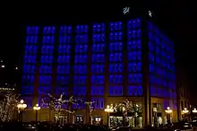
- Seagram Building, New York (1958): Tinted-windowed modernist skyscraper designed with a strip of luminous ceiling on outsides of all floors to counter sky glare during the day and provide a night-time "tower of light" appearance in contrast to daytime appearance; ground floor made four times brighter than upper floors by white marble illuminated from concealed lighting slots. Night illumination system not used since 1973. Building design: Ludwig Mies van der Rohe, Philip Johnson, Ely Jacques Kahn. Lighting design: Richard Kelly.[22][129][130]
- Tishman Building, New York (1958): Slim office tower with setbacks, clad in folded aluminum, evenly illuminated by mercury vapor lamps to create "tower of light," a similar appearance to daytime but with the "666" of the address in red neon near the top. Building design: Carson, Lundin & Shaw. Lighting design: Abe Feder.[59]
- Michigan Consolidated Gas Company Building, Detroit (1961): Skyscraper adjacent to Union Trust building, built by the same company to take over its night-time advertising presence: white quartz facing sparkled during the day, lobby ceiling lighting represented blue gas flames, office floors had perimeter fluorescent lighting, top two floors set back behind a masonry screen which was silhouetted by floodlighting, with openwork tower on top; colors varied for holidays but building became known for the standard scheme of deep blue lighting on the roof tower above white lights, emulating a gas pilot light. Building design: Minoru Yamasaki. Lighting design: John J. Andrews and James McDonald.[131]
- Embarcadero Center, San Francisco (1971-1973): The buildings are lit up every year in green and red during the Christmas/Hanukkah holidays, between the day after Thanksgiving and Epiphany.
- Chrysler Building, New York (1981): 1930 building was originally intended to have a lighted glass dome; triangular windows in the metallic spire were equipped with lights, but not lighted until after the Depression and then only for holidays. New owner in 1979 had these updated to fluorescents and floodlighting added on spire and tower shaft. Building design: William Van Alen. Lighting design: William Di Giacomo and Steve Negrin, William Di Giacomo Associates, based on William Van Alen designs.[132]
- Bank of America Tower, Miami (1987): Main facade given setbacks to house floodlights; evenly lighted aluminum strips create a "luminous beacon"; usually white, but colored lenses placed by hand for special occasions. A city-wide illumination plan resulted from the building. Building design: I. M. Pei and Harold Fredenburgh, Pei Cobb Reed & Partners. Lighting design: Douglas Leigh.[133]
Europe
- Thyssenhaus, Düsseldorf (1960): Skyscraper consisting of three slender slabs, two smaller ones sandwiching a larger, designed for two distinct night-time appearances: fluorescent ceiling lights near building edges to illuminate entire building from within as a stack of ribbon windows, or alternatively display of the company signet by illuminating only blue fluorescents placed on both sides of selected windows on each side of the building. This terminated when the company merged with Thyssen in 1966. Building design: Helmut Hentrich and Hubert Petschnigg. Lighting design: Unknown.[134]
- Pirelli Tower, Milan (1960): Skyscraper with central section flanked by two tapering thinner sections, designed as "self-lighting architecture", with cantilevered roof illuminated from beneath. Building design: Gio Ponti with Antonio Fornaroli and Alberto Rosselli, and engineers Pier Luigi Nervi and Arturo Danusso. Lighting design: Gio Ponti, Antonio Fornaroli, and Alberto Rosselli.[135]
Since the 1980s
- Tower of Winds, Yokohama (1986): Renovated ventilation and water tower covered in mirrors, encircled by 12 neon bands, enclosed in a steel framework with floodlights and 1,200 bulbs, covered in perforated steel sheeting to look solid in daylight; all lighting computer-controlled to reflect wind direction and speed and street noise in "environmental music" or an "audio-visual seismograph". Building and lighting design: Toyo Ito, lighting design with Kaoro Mende, TL Yamigawa Labs, and Masami Usuki.[136][137]
- Kirin Plaza, Osaka (1988; demolished 2008[138]): Almost windowless black granite building with metal elements, with four light towers, described by critics as combining "Zen and kitsch" and contrasting with advertising-filled facades of nearby buildings. Initial lighting scheme involved computerized colored lights appearing three times a night. Building and lighting design: Shin Takamatsu.[139]
- NEC Supertower, Tokyo (1990): Upper stories of tower floodlighted on the narrow sides with lights concealed in plaza vegetation; tinted blue in spring and summer, coral in fall and winter, and turning off in rising stages every hour between 7:00 and midnight, leading to the nickname "watchtower." Perimeter ceiling lighting on ribbon windows on broad sides. Lighting scheme won an international award. Building design: Nikken Sekkei. Lighting design: Motoko Ishii.[140]
- Petronas Towers, Kuala Lumpur (1996): Floodlighting almost entirely on inner faces of twin towers, emphasizing the space between; upper floors encircled with light from setbacks; the two pinnacles topped by internally illuminated spheres at the base and smaller floodlighted spheres at tops of finials. Uplighting extends above towers and is reflected in clouds. Scheme won an Illuminating Engineering Society merit award. Building design: Cesar Pelli and Fred Clarke, Cesar Pelli and Associates. Lighting design: Howard Brandston, Scott Matthews, Chou Lien, Jung Soo Kim, H. M. Brandston and Partners.[141]
- Tower of Time, Manchester (1996): Technical equipment tower for Bridgewater Hall converted into "a huge, abstract clock": lights inside glass facade change color to indicate Zodiac sign, those outside to indicate season; lines of tubing on each of the five floors lit incrementally to indicate Monday through Friday; rapid sequence of color changes "chimes" the quarter hours. Building design: Renton Howard Wood Levin. Lighting design: Jonathan Speirs, Jonathan Speirs & Associates.[142]
- Kunsthaus Bregenz, Bregenz (1996). Art museum in the form of a cube with facade of frosted glass shingles three feet outside building walls; daylight penetrates through these and translucent ceiling, at night floodlighted from inside the glass skin (the space also housing technical equipment). Building design: Peter Zumthor. Lighting design: Peter Zumthor and James Turrell (1997), Keith Sonner (199), Tony Oursler (2001).[143][144]
- Verbundnetz AG, Administration Building, Leipzig (1997). A modern example of a power company building using lighting to advertise electricity: light from red, yellow, and blue neon tubes between the two layers of glass forming the facade of the northeast tower is reflected outward by the ceiling and metal louvers and is computer-controlled to reflect the temperature changes to which the building systems are responding. Building design: Becker, Gewers, Kühn & Kühn. Lighting design: James Turrell.[145]
- Victorian Arts Centre, Melbourne (1997 renovation). Replacement spire on 1973–84 building replaces floodlighting with eight lighting systems, thousands of lights including incandescents, halogen, neon, strobes, color-changing floodlights at base, and fiber-optic cable. Building design: Roy Grounds (1973); Peter McIntyre and Bob Sturrock (new spire, 1997). Lighting design: Barry Webb with Stephen Found, Bytecraft Australia.[146]
- Theme Building and light columns, Los Angeles International Airport (1997). Building in futuristic style originally lit with amber floodlights to symbolize optimism in the jet age. 1997 lighting redesign floodlights building from below to avoid blinding patrons in restaurant, plus observation deck lights to light the arches that cross above it. Dichroic color changers programmed to change gradually over several minutes, producing many intermediate color effects, with a brief sequence of rapid changes on the quarter hour. In 2000, addition of 15 110-foot glass pylons in a circle at airport entrance, plus 11 along Century Boulevard, of increasing height to evoke the flight path of an aircraft after takeoff. Pylons lit from within in changing colors, nicknamed the "Psychedelic Stonehenge," won Lighting Dimensions International's Lighting Designer of the Year award for Dawn Hollingsworth. Building design: James Langenheim, Charles Luckman, William Pereira, Welton Becket, Paul Williams; light columns: Nadel architects. Lighting design: Michael Valentino, Walt Disney Imagineering; light columns: Dawn Hollingsworth, Jeremy Windle, Erin Powell, Moody Ravitz Hollingsworth Lighting Design, Inc.[147][148]
- Burj al Arab hotel, Dubai (1999). Metal exoskeleton lighted in white from base; crown of building and fiberglass facade of atrium lighted by luminaires at various levels and on bridge to island that change colors every half hour, plus colored strobes, searchlights, and projection of images on special occasions. Lighting design won a 2000 International Illumination Design Award. Building design: W. A. Atkins & Partners, Tom Wright design director. Lighting design: Jonathan Speirs, Gavin Fraser, Malcolm Innes, Alan Mitchell, James Mason and Iain Ruxton, Jonathan Speirs & Associates.[149]
- Forty-Second Street Studios, New York (2000). Rehearsal space building meets city requirement for Times Square buildings to provide lighted signs with a screen of steel blades on which more than 500 colored abstract patterns are projected, changing slowly on Monday night and more rapidly as the week progresses, every few seconds on weekends. Translucent shades behind the frame lit by fluorescents to create a background; 175-foot acrylic spire at one side of building also changes color; 30-foot glass square with dichroic fins on lower floors recalls theatre facade previously on site and refracts daytime light. Building design: Platt Byard Dovell. Lighting design: Anne Militello, Vortex Lighting, and James Carpenter.[150][151]
- Goodman Theatre Center, Chicago (2001). Computer-controlled LED display on 96-panel facade, capable of 16.7 million colors and numerous effects, plus crown of LEDs over entrance rotunda changing colors in harmony. Integration of music to produce a giant color organ planned. Building design: Kuwabara Payne McKenna Blumberg Architects and Decker Legge Kemp Architecture. Lighting design: Rich Locklin, Lightswitch, and Color Kinetics.[152]
- Sony Center, Potsdamer Platz, Berlin (2001). Perimeter fluorescent lighting in office tower and adjacent buildings; ten-story atrium of entertainment center roofed by folded fiberglass on which bright white light is projected beginning before sunset to extend daylight, followed by a series of 21-second artificial sunsets from sunset to midnight, dark blue until early morning, and bright white once more until daylight. Building design: Helmut Jahn. Lighting design: Yann Kersalé and L'Observatoire International.[79][153]
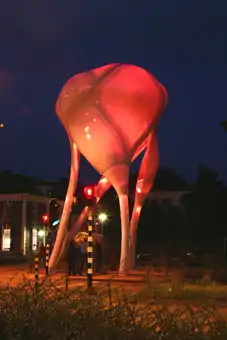
- D-Tower, Doetinchem, Netherlands (2004): 12-meter tower of translucent epoxy resin, reminiscent of a nerve cell in form, displaying computer-generated colors representing citizens' dominant mood as ascertained from a daily questionnaire. Design: Lars Spuybroek, NOX.[154]
- Torre Agbar, Barcelona (2005). Office tower "glow[ing] at night as a colorful monolith." Building design: Jean Nouvel. Lighting design: Yann Kersalé.[155]
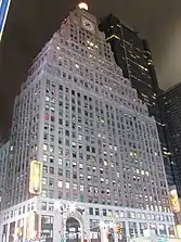 Paramount Building in Times Square, 1926 by Rapp and Rapp, with glass ball reilluminated in 1998; setback floodlighting also reactivated at that time
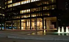 Glass walls and illuminated ceilings in the Seagram Building in New York, 1958 by Ludwig Mies van der Rohe, Philip Johnson, and Ely Jacques Kahn; lighting design Richard Kelly
 Theme Building at Los Angeles International Airport, 1961 by James Langenheim, Pereira-Luckman, et al.; lighting design Michael Valentino, Walt Disney Imagineering; photographed in 2007
 Empire State Building lighted in blue and white at sunset on 19 November 2009; lighting design Douglas Leigh
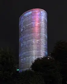 Tower of Winds, Yokohama, 1986 by Toyo Ito; lighting design Toyo Ito, TL Yamigawa Labs, Masami Usuki
 Miami Tower lighted pink for Valentine's Day in 2007, 1987 by I. M. Pei and Harold Fredenburgh, Pei Cobb Reed & Partners; lighting design Douglas Leigh
.jpg.webp) Petronas Towers, Kuala Lumpur, 1996 by Cesar Pelli and Fred Clarke, Cesar Pelli and Associates; lighting design Howard Brandston, Scott Matthews, Chou Lien, Jung Soo Kim
Petronas Towers, Kuala Lumpur, 1996 by Cesar Pelli and Fred Clarke, Cesar Pelli and Associates; lighting design Howard Brandston, Scott Matthews, Chou Lien, Jung Soo Kim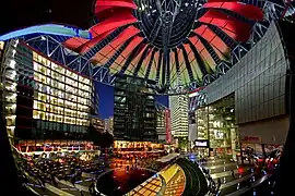 Interior view of Sony Center atrium, Berlin, 2000 by Helmut Jahn, during artificial sunset sequence; lighting design Yann Kersalé
 Torre Agbar, Barcelona, 2005 by Jean Nouvel; lighting design Yann Kersalé; photographed in 2011
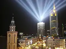 Lighting in central Frankfurt during Light+building tradeshow and Luminale lighting festival, April 2008
 Frankfurt Stock Exchange illuminated for Luminale 2008
References
- Dietrich Neumann, "Introduction," in Architecture of the Night: The Illuminated Building, ed. Dietrich Neumann, Munich/New York: Prestel, 2002, ISBN 978-3-7913-2587-3, pp. 6–7, p. 6: "When the American architect Raymond Hood coined the term 'Architecture of the Night' in 1930, the concept behind it had been enthusiastically debated for a number of years by lighting designers, critics and architects. They all were convinced that the nocturnal appearance of architecture had to be a carefully planned, important part of its design concept."
- Dietrich Neumann, "'Architecture of the Night' in the U.S.A.," in Architecture of the Night pp. 54–67, p. 59. The cover of the General Electric publication is reproduced there as fig. 12 and is also the front cover of the book.
- The Western Architect 39.7, July 1930, p. 103.
- Casabella 63 (1999) p. 168.
- Werner Oechslin, "Lichtarchitektur," in Moderne Architektur in Deutschland 1900 bis 1950: Expressionismus und neue Sachlichkeit, ed. Vittorio Magnago Lampugnani and Romana Schneider, Stuttgart: Hatje, 1994, ISBN 978-3-7757-0452-6 (in German), pp. 117–31, p. 117, where the German is cited.
- Simone Schimpf, "Die Wunder der Nacht—Die Rezeption der Lichtarchitektur in Malerei und Fotografie" / "The Wonders of the Night—'Light Architecture' in Painting and Photography," in Leuchtende Bauten: Architektur der Nacht / Luminous Buildings: Architecture of the Night, eds. Marion Ackermann and Dietrich Neumann, Kunstmuseum Stuttgart, Ostfildern: Hatje Cantz / Maidstone: Amalgamated Book Services, 2006, ISBN 978-3-7757-1757-1, pp. 30–37, 40–45, pp. 31–32, 41.
- Oechslin, "Lichtarchitektur," p. 131, note 38, referring to Louis I. Kahn with John Lobell, Between Silence and Light: Spirit in the Architecture of Louis I. Kahn, Boulder, Colorado: Shambhala / New York: Random House, 1979, ISBN 978-0-394-50625-8, p. 22.
- Werner Oechslin, "Light Architecture: A New Term's Genesis," in Architecture of the Night pp. 28–35, p. 28 (cited in translation).
- Oechslin, "Lichtarchitektur," p. 126, citing Max Landsberg, "Lichtreklame im Stadtbild," Der Städtebau 22.3 (1927), p. 35: "Die Geschäftsstadt hat schon heute bei Tag und bei Nacht ein so verschiedenes Aussehen, daß man von einer Stadtbaukunst für den Tag sprechen kann, und eine solche für die Nacht fordern muß."
- Hugo Häring, "Lichtreklame und Architektur," Architektur und Schaufenster 24.8 (1927), quoted in translation in Neumann, "Lichtarchitektur and the Avant-Garde," in Architecture of the Night, pp. 36–53, p. 38.
- Walter Curt Behrendt, Der Sieg des neuen Baustils, Stuttgart: Wedekind, 1927, pp. 47–48; tr. Harry Francis Mallgrave with introduction by Detlef Mertins, The Victory of the New Building Style, Texts & Documents, Los Angeles: Getty Research Institute, 2000, ISBN 978-0-89236-563-0, p. 133; referenced in Oechslin, "Light Architecture," pp. 31–32, with a differing translation.
- Behrend, The Victory of the New Building Style p. 133, figs. 66, 67.
- P. Morton Shand, Modern Theatres and Cinemas, London: Batsford, 1930, p. 28.
- "Louisiana to Open New Capitol Tomorrow". The New York Times. May 15, 1932. p. E6.
- John A. Jakle, City Lights: Illuminating the American Night, Landscapes of the Night, Baltimore/London: Johns Hopkins University, 2001, ISBN 978-0-8018-6593-0: for example the heavy investment by General Electric in the Southern Exposition at Louisville in 1883, the last to use gas light and the first to make heavy use of electric lighting, pp. 147–48.
- Neumann, "'Architecture of the Night' in the U.S.A.," p. 58.
- Jakle, pp. 180–85.
- Neumann, "'Architecture of the Night' in the U.S.A.," pp. 58–59.
- Neumann, "'Architecture of the Night' in the U.S.A.," p. 55.
- Jakle, p. 185.
- "Selected Projects" in Architecture of the Night, pp. 88–227, p. 108.
- Margaret Maile Petty, "Spiegelungen" / "Reflections," in Leuchtende Bauten: Architektur der Nacht / Luminous Buildings: Architecture of the Night, pp. 76–77, p. 76.
- Rosemarie Haag Bletter, "Art Deco Skyscrapers: Towers of Modern Babel," in Berlin/New York: Like and Unlike: Essays on Architecture and Art from 1870 to the Present, ed. Josef Paul Kleihues and Christina Rathgeber, New York: Rizzoli, 1993, ISBN 0-8478-1657-5, pp. 330–39, p. 335.
- "Selected Projects," Architecture of the Night, p. 114.
- G. H. Edgell, The American Architecture of Today, New York: Scribner, 1928, cited in Robert A. M. Stern with Thomas P. Catalano, Raymond Hood, Institute for Architecture and Urban Studies Catalogue 15, New York: Rizzoli, 1982, ISBN 978-0-8478-0410-8, p. 10.
- Mary Woods, "Photography of the Night: Skyscraper Nocturne and Skyscraper Noir in New York," in Architecture of the Night, pp. 68–77, p. 74.
- Jakle, p. 184.
- David E. Nye, Electrifying America: Social Meanings of a New Technology, 1880–1940, Cambridge, Massachusetts: MIT, 1990, ISBN 978-0-262-14048-5, p. 60, quoted in Neumann, "'Architecture of the Night' in the U.S.A.," p. 62.
- Neumann, "Lichtarchitektur and the Avant-Garde," pp. 40–42.
- Dietrich Neumann, "Leuchtende Bauten—Architekturen der Nacht" / "Luminous Buildings—Architectures of the Night," in Leuchtende Bauten: Architektur der Nacht / Luminous Buildings: Architecture of the Night, pp. 16–21, 24–29, pp. 17, 25.
- Neumann, "'Architecture of the Night' in the U.S.A.," p. 62.
- "Selected Projects," Architecture of the Night, p. 174.
- Dietrich Neumann, "Lichtarchitektur and the Avant-Garde," pp. 46–47.
- Jakle, pp. 37, 40.
- Quoted in Jakle, p. 182.
- Neumann, "Lichtarchitektur and the Avant-Garde," p. 36, fig. 5, p. 37.
- "Selected Projects," Architecture of the Night, p. 134.
- Dietrich Neumann, "Lichtreklame" / "Luminous Advertising," in Leuchtende Bauten: Architektur der Nacht / Luminous Buildings: Architecture of the Night, pp. 80–81.
- Translated quotations from Wassili Luckhardt, "Stand der modernen Baugesinnung in Amerika," Bauwelt 20.46 (1929), in Neumann, "Lichtarchitektur and the Avant-Garde," p. 43.
- Quoted in German and with a different translation in Dietrich Neumann, "Leuchtkörper" / "Luminous Bodies," in Leuchtende Bauten: Architektur der Nacht / Luminous Buildings: Architecture of the Night, pp. 82–83, p. 82.
- "Selected Projects," Architecture of the Night, pp. 132–33.
- "In their Lights the Cities are revealed," The New York Times December 11, 1932, SM 12, 15, quoted in Neumann, "Lichtarchitektur and the Avant-Garde," p. 39.
- "Selected Projects," Architecture of the Night, p. 135.
- Wolf Tegethoff, "Lichtspielhäuser" / "Picture Palaces," in Leuchtende Bauten: Architektur der Nacht / Luminous Buildings: Architecture of the Night, pp. 116–17.
- Franziska Nentwig (ed.), Berlin im Licht, exhibition catalogue, Stiftung Stadtmuseum Berlin, Berlin: G & H, 2008, ISBN 978-3-940939-06-7, p. 6 (pdf) (in German)
- Richard Gray, Cinemas in Britain: One Hundred Years of Cinema Architecture, Cinema Theatre Association, London: Lund Humphries, 1996, ISBN 978-0-85331-685-5, pp. 60, 96, mentions the "night architecture" of German movie theatres as a major influence on Odeon architecture, particularly at Woolwich.
- Shand, p. 27: "'Night architecture' has been very considerably developed in Germany for big shops, restaurants, cafés and, above all, cinemas."
- Klaus Kreimeier, trans. Robert and Rita Kimber, The Ufa Story: A History of Germany's Greatest Film Company, 1918-1945, 1996, repr. Berkeley: University of California, 1999, ISBN 978-0-520-22069-0, p. 117.
- Schimpf, pp. 32, 42.
- Neumann, "'Architecture of the Night' in the U.S.A.," p. 63.
- Oechslin, "Lichtarchitektur," pp. 118, 124; "Light Architecture," p. 29.
- Neumann, "Architectural Illumination since World War II," Architecture of the Night, pp. 78–86, p. 81.
- Dietrich Neumann, "Architectural Illumination since World War II," pp. 78–79.
- Neumann, "Architectural Illumination since World War II," pp. 79–80.
- Neumann, "Architectural Illumination since World War II," p. 80.
- "Selected Projects," Architecture of the Night, p. 184.
- "Selected Projects," Architecture of the Night, pp. 188–91.
- Ada Louise Huxtable, "Banker's Showcase," Arts Digest 29, December 1, 1954, quoted in Neumann, "Architectural Illumination since World War II," p. 79 and in "Selected Projects," Architecture of the Night, p. 184.
- "Selected Projects," Architecture of the Night, p. 191.
- Thomas W. Ennis, "Lighting, Once Mere Utility, Has Become an Important Element of Design," The New York Times October 26, 1958, RE 1, 8, quoted in Neumann, "Architectural Illumination since World War II," p. 80; reproduced in Margaret Maile Petty, Lighting is Architecture: Architectural Lighting Design and the Imaging of Corporate America, Yale School of Architecture, October 1, 2010
- Gio Ponti, In Praise of Architecture, New York: Dodge, 1960; trans. by Guiseppina and Mario Salvadori of Amate l'Architettura: l'Architettura è un Cristallo, Genoa: Vitali e Ghianda, 1957; quoted in Neumann, "Architectural Illumination since World War II," pp. 80–81.
- "Selected Projects," Architecture of the Night, pp. 196–97.
- Jakle, pp. 206–07.
- Jakle, pp. 249, 251, quoting Robert Venturi, Denise Scott Brown, and Steven Izenour, Learning from Las Vegas, Cambridge, Massachusetts: MIT, 1972, ISBN 978-0-262-22015-6.
- Thomas K. Wolfe, "Las Vegas (What?), Las Vegas (Can't hear you! Too noisy), Las Vegas!!!," Esquire 61.2 (February 1964), quoted in Neumann, "Architectural Illumination since World War II," p. 81.
- John A. Walker, "Electrographic Architecture" in Glossary of Art, Architecture and Design since 1945, 3rd. ed. Boston: Hall, 1992, ISBN 978-0-8161-0556-4, online at Café Library Archived 2016-03-03 at the Wayback Machine, Art Design Café, April 8, 2011.
- Derek Phillips, Lighting in Architectural Design, New York: McGraw Hill, 1964, p. 210, quoted in Neumann, "Architectural Illumination since World War II," p. 81.
- "Selected Projects," Architecture of the Night, pp. 218–19.
- Neumann, "Architectural Illumination since World War II," p. 81.
- Neumann, "Architectural Illumination since World War II," p. 82.
- Neumann, "Leuchtende Bauten—Architekturen der Nacht" / "Luminous Buildings—Architectures of the Night," pp. 20, 27–28.
- Richard Grigonis, The Empire State Building's 80th Anniversary, Interesting America.com
- Paul Goldberger, "Design Notebook: Colored lights turn the Empire State Building into a toy," The New York Times December 8, 1977.
- "Selected Projects," Architecture of the Night, pp. 206–07.
- Neumann, "Architectural Illumination since World War II," p. 82; "Selected Projects," Architecture of the Night, pp. 204–05.
- "Selected Projects," Architecture of the Night, pp. 222–23.
- Neumann, "Architectural Illumination since World War II," pp. 81–82.
- "Selected Projects," Architecture of the Night, pp. 226–27.
- Neumann, "Leuchtende Bauten—Architekturen der Nacht" / "Luminous Buildings—Architectures of the Night," pp. 18–19, 26.
- Neumann, "Architectural Illumination since World War II," p. 83.
- "Selected Projects," Architecture of the Night, pp. 96–97.
- Francis J. Pierson and Dennis Joseph Gallagher, Getting to Know Denver: Five Fabulous Walking Tours, Denver, Colorado: Charlotte Square, 2006, ISBN 978-0-914449-20-1, pp. 102–03.
- "Selected Projects," Architecture of the Night, pp. 98–99.
- "Selected Projects," Architecture of the Night, pp. 100–101.
- "Selected Projects," Architecture of the Night, pp. 102–03.
- "Selected Projects," Architecture of the Night, pp. 108–09.
- "Selected Projects," Architecture of the Night, p. 112.
- "Selected Projects," Architecture of the Night, p. 113.
- "Selected Projects," Architecture of the Night, pp. 114–15.
- "Selected Projects," Architecture of the Night, p. 118.
- "Selected Projects," Architecture of the Night, p. 119.
- "Selected Projects," Architecture of the Night, pp. 120–21.
- "Selected Projects," Architecture of the Night, p. 128.
- "Selected Projects," Architecture of the Night, p. 129.
- "Selected Projects," Architecture of the Night, pp. 140–41.
- "Selected Projects," Architecture of the Night, pp. 142–43.
- "Selected Projects," Architecture of the Night, pp. 144–45.
- "Selected Projects," Architecture of the Night, p. 146.
- "Selected Projects," Architecture of the Night, pp. 148–49.
- "Selected Projects," Architecture of the Night, pp. 150–51.
- "Selected Projects," Architecture of the Night, p. 152.
- "Selected Projects," Architecture of the Night, p. 153.
- "Selected Projects," Architecture of the Night, pp. 154–55.
- "Selected Projects," Architecture of the Night, pp. 156–57.
- "Selected Projects," Architecture of the Night, p. 158.
- "Selected Projects," Architecture of the Night, pp. 160–61.
- "Selected Projects," Architecture of the Night, pp. 162–63.
- "Selected Projects," Architecture of the Night, p. 182.
- Behrendt, The Victory of the New Building Style, figs. 62, 63, p. 131.
- "Selected Projects," Architecture of the Night, p. 126.
- Behrendt, The Victory of the New Building Style figs. 64, 65, p. 132.
- "Selected Projects," Architecture of the Night, p. 127.
- Neumann, "Leuchtkörper" / "Luminous Bodies," p. 82.
- Section and elevations at Oechslin, "Lichtarchitektur," p. 123.
- "Selected Projects," Architecture of the Night, p. 130.
- Daytime view in Dietrich Neumann, "The Unbuilt City of Modernity," in City of Architecture of the City: Berlin 1900–2000, exhibition catalogue, Neues Museum, Berlin, 23 June–3 September 2000, ed. Thorsten Scheer, Josef Paul Kleihues and Paul Kahlfeldt, tr. Julia Bernard, Berlin: Nicolai, 2000, ISBN 978-3-87584-018-6, pp. 160–73, p. 162, fig. 194.
- "Selected Projects," Architecture of the Night, p. 131.
- Tegethoff, p. 116.
- "Selected Projects," Architecture of the Night, pp. 136–37.
- "Posts by Spreetunnel - Page 83". Architekturforum Architectura Pro Homine. Retrieved 2020-05-25.
- "Selected Projects," Architecture of the Night, pp. 174–75.
- "Selected Projects," Architecture of the Night, pp. 132–33, quoting Tyler Stewart and Alvin L. Powell, "Exterior Illumination of Buildings", American Architect Reference Data 18 (1935) 1–360, p. 69.
- "Selected Projects," Architecture of the Night, p. 147.
- "Selected Projects," Architecture of the Night, p. 159.
- "Selected Projects," Architecture of the Night, pp. 168–69.
- "Selected Projects," Architecture of the Night, p. 183.
- "Selected Projects," Architecture of the Night, p. 184.
- "Selected Projects," Architecture of the Night, p. 185.
- "Selected Projects," Architecture of the Night, pp. 188–90.
- See also Maile Petty, "Lighting is Architecture."
- "Selected Projects," Architecture of the Night, p. 198.
- "Selected Projects," Architecture of the Night, pp. 202–03.
- "Selected Projects," Architecture of the Night, pp. 206–07.
- "Selected Projects," Architecture of the Night, p. 192.
- "Selected Projects," Architecture of the Night, pp. 196–97.
- "Selected Projects," Architecture of the Night, pp. 204–05.
- Neumann, "Leuchtende Bauten—Architekturen der Nacht" / "Luminous Buildings—Architectures of the Night," pp. 19, 26–27.
- "Japanese architectural trends reflect unique realities, scholar says", University of Illinois at Urbana-Champaign, at PHYSorg.com, March 9, 2009 (pdf) p. 2.
- "Selected Projects," Architecture of the Night, pp. 208–09.
- "Selected Projects," Architecture of the Night, pp. 210–11.
- "Selected Projects," Architecture of the Night, pp. 212–13.
- "Selected Projects," Architecture of the Night, p. 214.
- "Selected Projects," Architecture of the Night, p. 215.
- Neumann, "Leuchtkörper" / "Luminous Bodies," p. 83.
- "Selected Projects," Architecture of the Night, p. 216.
- "Selected Projects," Architecture of the Night, p. 217.
- "Selected Projects," Architecture of the Night, pp. 218–19.
- Gateway to the Sky, Landscape Online, 2010.
- "Selected Projects," Architecture of the Night, pp. 220–21.
- "Selected Projects," Architecture of the Night, pp. 222–23.
- Paul Goldberger, "Busy Buildings," The New Yorker September 4, 2000, repr. in Building up and Tearing down: Reflections on the Age of Architecture, New York: Monacelli, 2009, ISBN 978-1-58093-264-6, p. 118.
- "Selected Projects," Architecture of the Night, pp. 224–25.
- "Selected Projects," Architecture of the Night, pp. 226–27.
- Neumann, "Leuchtende Bauten—Architekturen der Nacht" / "Luminous Buildings—Architectures of the Night," pp. 19, 27.
- Neumann, "Leuchtende Bauten—Architekturen der Nacht" / "Luminous Buildings—Architectures of the Night," pp. 19, 26.
Further reading
- László Moholy-Nagy. "Light Architecture." Industrial Arts 1 (1936)
- Walter Köhler. Lichtarchitektur: Licht und Farbe als raumgestaltende Elemente. Idee und Gestaltung der Bildfolge von Wassili Luckhardt. Berlin: Bauwelt, 1956 (in German)
- Walter Köhler and Wassili Luckhardt. Lighting in Architecture: Light and Color as Stereoplastic Elements. New York: Reinhold, 1959. (Translation)