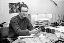
Bram de Does
Bram de Does (19 July 1934 – 28 December 2015) was a graphic and type designer.[1] Born in Amsterdam, De Does studied at the Amsterdamse Grafische School in the 1950s. De Does came into contact with the printing trade at an early age, as his father had a printing office in the east of Amsterdam. From 1958 to 1988 he worked, with several intervals, at Joh. Enschedé, a printing office in Haarlem. He worked there primarily as a book designer. De Does was asked by his employer to design a typeface, which was to become Trinité.

Book design at Enschedé
After Jan van Krimpen died − De Does' predecessor at Enschedé − the production of quality books stopped being a top priority at Enschedé, and De Does decided to leave, to work for the Querido publishing house. He was asked to come back to Enschedé a year later, which he did. He designed annual reports, commemorative volumes and type specimens. He also designed and printed his own books at his private press, Spectatorpers. Around 1970, Enschedé developed a renewed interest in publishing, and Bram de Does could design several beautiful books. One of the most perfected is the book Typefoundries in the Netherlands. It was published in 1978, and is a prime example of fine Dutch printing and publishing. Incidentally, it was also the last book Enschedé published that was printed entirely by letterpress. De Does is known for his attention for detail and perfectionism; for the Typefoundries in the Netherlands, he personally supervised the production of the paper (produced with his own recipe) and he insisted that the book should be printed by one person in a specially equipped room.
Typefaces
Lexicon
Bram de Does' first typeface was the serif typeface Trinité, released in 1982. In 1978 Enschedé replaced their phototypesetting machines, for which they wanted to adapt Jan van Krimpen's typeface Romanée. The company consulted with De Does, who was against it, fearing the typeface would lose its character in the translation from metal movable type to phototype. He considered commissioning a new typeface, specifically designed for the new technology, a much better idea. Although it was not his intention, Enschedé invited him to design this new typeface. Trinité was developed from 1979 to 1982. It is currently available as a PostScript Type 1 font from The Enschedé Font Foundry (TEFF). In 1991 De Does won the H.N. Werkmanprize for the design.
Ten years after Trinité, De Does designed his second serif typeface, Lexicon, for the Van Dale dictionary. This typeface was specifically designed for use at small pointsizes.
Publications
- Bram de Does, Kaba-structuren, Uitgeverij de Buitenkant, Spectatorpers (2011) ISBN 978-94-90913-15-1
- Bram de Does, Kaba-ornament, Uitgeverij de Buitenkant (2006) ISBN 978-907642595-5
- Bram de Does, Kaba Ornament, Deel I, Vorm, Spectatorpers (2002)
- Bram de Does, Romanée en Trinité: historisch origineel en systematisch slordig, Uitgeverij de Buitenkant, Spectatorpers (1991) ISBN 90-70386-43-7
Literature
- Sebastian Carter, 'The Spectatorpers – The press of Bram de Does', in Parenthesis; 14 (2008 February), p. 10–18
- Mathieu Lommen & J. A. Lane, Bram de Does: letterontwerper & typograaf = typographer & type designer (2003. Uitgeverij de Buitenkant) ISBN 978-90-7645-291-3
Documentary
- In 2003 a documentary about Bram de Does, called Systematisch slordig[2] (roughly translates to systematically sloppy) was released. It is available on vimeo.com (see external links).
Awards
References
- Carter, Sebastian (2008). "The Spectatorpers – The press of Bram de Does". Parenthesis. 14.
- "Kijkwijzer classification of Systematisch Slordig: Bram de Does - kijkwijzer.nl". www.kijkwijzer.nl (in Dutch).
- Jan Middendorp, Dutch Type, 010 Publishers, Rotterdam (2004)
External links
 Media related to Bram de Does at Wikimedia Commons
- Trinité on the TEFF website
- Lexicon on the TEFF website
- (in Dutch) Collection Bram de Does on the website of the University of Amsterdam (with original drawings)
- Documentary "Systematisch slordig" on vimeo.com