Burndown chart
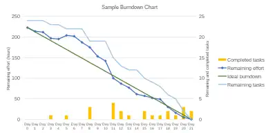
A burndown chart or burn down chart is a graphical representation of work left to do versus time.[1] The outstanding work (or backlog) is often on the vertical axis, with time along the horizontal. A burn down chart is a run chart of remaining work. It is useful for predicting when all of the work will be completed. It is often used in agile software development methodologies such as Scrum. However, burn down charts can be applied to any project containing measurable progress over time.

Remaining work can be represented in terms of either time or story points (a sort of arbitrary unit).[2]
Burn charts can be used to present the project's team velocity.[3] Velocity is a measure that represents the productivity rate, within a predefined interval, for which deliverables are created, validated and approved.[3]
Reading burn down charts

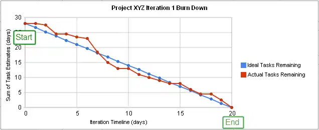
A burn down chart for a completed iteration is shown above and can be read by knowing the following:[4]
| X-Axis | The project/iteration timeline |
| Y-Axis | The work that needs to be completed for the project. The time or story point estimates for the work remaining will be represented by this axis.[3] |
| Project Start Point | This is the farthest point to the left of the chart and occurs at day 0 of the project/iteration. |
| Project End Point | This is the point that is farthest to the right of the chart and occurs on the predicted last day of the project/iteration |
| Number of Workers and Efficiency Factor | In the above example, there are an estimated 28 days of work to be done, and there are two developers working on the project, who work at an efficiency of 70%. Therefore, the work should be completed in (28 ÷ 2) ÷ 0.7 = 20 days. |
| Ideal Work Remaining Line | This is a straight line that connects the start point to the end point. At the start point, the ideal line shows the sum of the estimates for all the tasks (work) that needs to be completed. At the end point, the ideal line intercepts the x-axis showing that there is no work left to be completed. Some people take issue with calling this an "ideal" line, as it's not generally true that the goal is to follow this line. This line is a mathematical calculation based on estimates, and the estimates are more likely to be in error than the work. The goal of a burn down chart is to display the progress toward completion and give an estimate on the likelihood of timely completion. |
| Actual Work Remaining Line | This shows the actual work remaining. At the start point, the actual work remaining is the same as the ideal work remaining but as time progresses, the actual work line fluctuates above and below the ideal line depending on this disparity between estimates and how effective the team is. In general, a new point is added to this line each period (for example in Scrum each day for a sprint backlog or each sprint for a release backlog). Its y-value is the sum of effort of remaining work after the past period. (This is in general not equal to subtracting recently completed amount of work from the last point, but only if the total work remained constant.) |
Measuring performance
| Actual Work Line is above the Ideal Work Line | If the actual work line is above the ideal work line, it means that there is more work left than originally predicted and the project is behind schedule. |
| Actual Work Line is below the Ideal Work Line | If the actual work line is below the ideal work line, it means that there is less work left than originally predicted and the project is ahead of schedule. |
The above table is only one way of interpreting the shape of the burn down chart. There are others.[2]
Removing variability in time estimates
One issue that may be noticed in burn down charts is that whether or not the Actual Work line is above or below the Ideal Work line depends on how accurate the original time estimates are. This means that if a team constantly overestimates time requirements, the progress will always appear ahead of schedule. If they constantly underestimate time requirements, they will always appear behind schedule. This issue is corrected by incorporating an efficiency factor into the burn down chart. After the first iteration of a project, the efficiency factor can be recalculated to allow for more accurate estimates during the next iteration. Some templates automatically calculate the efficiency as a project progresses. This can be used to identify areas/phases where inaccurate estimates consistently occur.[4]
Burnup chart
A burnup chart or burn-up chart is a diagram of complete work, and is sometimes used as an alternative to the burndown chart. Similar to the burndown chart, the burnup chart shows time on the horizontal axis and work completed on the vertical axis. The difference is that the burnup chart starts on the bottom and rises as tasks are completed (opposite to the burndown chart). Similarly to burndown charts, the work can be measured in several ways, like for instance using time or story points. Burnup charts are less common compared to burndown charts.
See also
Citations
- Project Management Institute 2021, §4.6.6 Visual Data and Information.
- "Feel The Burn, Getting the Most out of Burn Charts - Better Software, Volume 11, Issue 5, pp. 26-31" (PDF). July–August 2009.
- Project Management Institute 2021, §2.7.3.3 Visual Controls.
- Wenzel, Joel (December 2012). "Burn Down Chart Tutorial: Simple Agile Project Tracking". Archived from the original on 2013-07-07. Retrieved 2011-06-14.
References
- Project Management Institute (2021). A guide to the project management body of knowledge (PMBOK guide) (7th ed.). Newtown Square, PA: Project Management Institute. ISBN 978-1-62825-664-2.