Franzisca Baruch
Franzisca Baruch[lower-alpha 1] (Hebrew: פרנציסקה ברוך; 21 November 1901 – 3 September 1989) was a German–Israeli graphic designer. She is known for designing Hebrew fonts, the cover of the first Israeli passport, the emblem of Jerusalem, and the logo of the Ha'aretz newspaper.
Franzisca Baruch | |
|---|---|
 Franzisca Baruch in 1935 | |
| Born | 21 November 1901 |
| Died | 3 September 1989 (aged 87) |
| Occupation | Graphic designer |
| Known for | Design of Hebrew fonts, first Israeli passport, and the logo of Ha'aretz |
Biography
Early life and career in Germany
_from_Passover_Haggadah_(8606526066).jpg.webp)
Franzisca Baruch was born in Hamburg, Germany in 1901. Her father died when she was four; she and her sister Anna then lived with their grandmother; their mother studied in the State Academy of Music in Berlin at that time.[1] At the age of 17 she was admitted to the Staatliche Kunstgewerbeschule Berlin (State School of Arts and Crafts). Baruch studied decoration, illustration, graphics, and lettering.[1] She attended the graphic and book art class led by Ernst Böhm;[2] she also took private courses in handwriting with Else Marcks-Penzig. In 1920 she won the first prize for designing Christmas plates for the porcelain manufacturer of the Prussian Royal house.[1] A year later, in 1921, she drew the letters for the Passover Haggadah, which was decorated with woodcuts by Jacob Steinhardt.[3][4] To prepare for that work she studied the medieval Jewish manuscripts and the Prague Haggadah in the library of the Jewish community in Berlin.[5] The Book of Jonah was published in 1953, and the Book of Ruth in 1957, both with lettering done by Baruch and illustrated by Steinhardt.[5]
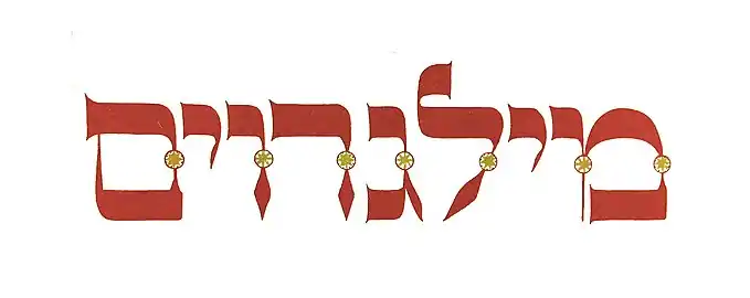
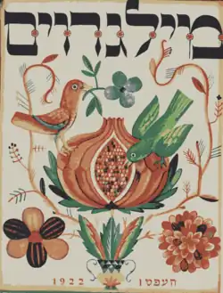
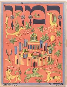
Together with her teacher Ernst Böhm, Baruch worked for the Berlin publishing house "Rimon", established by Rachel and Mark Wischnitzer, which published a magazine on Jewish art, Rimon–Milgroim. Ishai Mishory of the Columbia University writes that Rachel Wischnitzer saw the magazine as a "recombination of historical and modern material", and ordered Baruch to design the logo as a mix between "modern and medieval in one visual element". Baruch designed the logo in style of the Prague Hagaddah from 1523; "She has retained the text’s most historically prominent feature [...] namely the decorative circular shapes adorning each letter's stalk and the letters' particular "rhythm", as embodied in the relation between the horizontal and vertical strokes but also in the unique way space between letters is rendered [...]. The letters of the masthead are rounder than the letters in the Prague Haggadah source, and the circular decorative adornment of their stalks even more flowery, however her rendering makes the medieval source immediately recognizable." Baruch chose the letters from the medieval manuscripts not because of their liturgical importance, but only because of the visual elements.[6] Baruch also created covers for books by famous Jewish writers and artists, including Hayim Nahman Bialik, Shmuel Yosef Agnon, and Shaul Tchernichovsky. One of the notable works was the design of the cover and letters of Bialik's book from 1923, Ketina Kol-Bo,[7] inspired by a manuscript of the Bible copied in Spain in the 15th century by Moshe Ibn Zabara and the Yosef Ibn Chaim.[4]
- Logo and covers of Rimon and Milgroim, designed by Franzisca Baruch and Ernst Böhm
 Logo
Logo Milgroim #1
 Rimon #2
In 1926, she began working for the Weimar Republic's Reichskunstwart (Imperial Art Monitor) Edwin Redslob, who was responsible for the state graphic works: designing the symbols and images of the Republic, including stamps, coins, banknotes, certificates, flags, memorial sites, exhibitions and national holidays. One of Baruch's jobs for the government was the graphic and design preparations that accompanied King Amanullah of Afghanistan's visit to Berlin in 1928, the first royal visit to the Republic after the Kaiser. She designed the king's emblem on the festive decor that greeted him and was printed on the porcelain boxes given to him as a gift. She also made a special design of the eagle, the emblem of the Weimar Republic, which corresponded with the emblem of the Afghani king. Woodcuts of the Afghan emblem and the German eagle were found in her estate in Israel.[5][4]
Baruch was also involved in the preparation of exhibitions in which the government participated. One of them, an international print exhibition called Pressa, was held in Cologne in 1925. Baruch prepared the letters of the German pavilion; before the exhibition was opened the supervisor of the exhibition fell ill, and Franzisca was asked to substitute him.[5] Designers Henri Friedlaender and Gideon Stern, who took an interview with Baruch in 1984, described this episode:
Although she had no experience of this kind of work, she jumped into the breach [...] and found herself in charge of a gang of rowdy workmen. These carpenters, electricians and other workers moved as slowly as possible during the day in order to get overtime pay for evening and night work. But the young girl student managed somehow to win their trust, and when they put down tools after midnight, regaled them with beer and sausages until they were ready to carry on. The pavillion was ready in time for the opening, and Franzisca returned to Berlin. A few days later she was called to the Director-General of the Ministry, who had her expense sheet in front of him; he asked her how she had managed to consume in less than a fortnight 287 bottles of beer and 522 pairs of sausages. Her expense sheet was approved after she had told her story.[5]
In 1932, on the centenary of Goethe's death, Baruch designed characters and titles for the animated film Goethe is Alive![2] The critics praised her work, but the name of the Jewish artist was absent from the list of credits.[4]

Baruch created a Hebrew font based on the Gershom ben Solomon Kohen's 1526 Haggadah, printed with wooden type by the Gersonides family in Prague; it was published in 1928 by the type foundry H. Berthold AG under the name "Stam", a Hebrew acronym of Sefarim, Tefillin, Mezuzot, traditional activities of a Jewish scribe.[8] She also created a thinner version of this script for the orientalist Leo A. Mayer, who taught at the Hebrew University of Jerusalem. A new cut of this typeface was later offered as "Mayer-Baruch" by Moshe Spitzer's Jerusalem Type Foundry.[8]
Immigration and career in Israel
Baruch left Germany in 1933, and immigrated to Mandatory Palestine alone. She arrived in Tel Aviv "almost penniless", as she recounted, and her few belongings and tools, except for a small suitcase, were retained in Jaffa harbour due to the Arab strike in 1933 against the Jewish aliyah (immigration from the diaspora).[4][5] She passed a crash course in window decorating in order to obtain an "artisan's certificate", as her occupation, graphic design, was not recognized by British authorities.[5]
She settled in Tel Aviv after the aliyah. Her first work was an exhibition in honor of Bialik's birthday. The architect of this exhibition, Arie Elhanani, heard about her from a mutual friend – the architect Heinz Rau. When she moved to Jerusalem, Rau helped her to become acquainted with other architects. In 1934 she designed the sign for Hadassah Medical Center at Mount Scopus.[5] In 1936 the influential Schocken family hired Baruch to re-design the Ha'aretz newspaper, that they bought from a businessman David Cohen in 1935. Baruch shortened the leg of the letter "tzadik" in the logo, brought letters together, and rounded their sides; her design was in use until 1990 when it was slightly changed by Eran Volkowski. Gershom Schocken, who received the newspaper as a gift from his father Zalman, also hired Baruch; in 1940 he asked her to create a new Hebrew font for him. Work on it was done during World War II, and nine years later the letter "Schocken-Baruch" (or just "Schocken") was published. This font was used for the autobiography of the first president of Israel, Haim Weizmann, which was published in 1949. The book has an inscription: "This book was printed in a new letter, which was installed according to Hebrew letters from the beginning of the printing period in Italy by Francesca Baruch". Nevertheless, commercially the font was unsuccessful.[4]
In the 1940s Baruch got a number of works done: she drew geographic maps for the Palestine Post (now called The Jerusalem Post), baked marzipan biscuits, as she knew them from her childhood in Germany (she called them: "Tufinei Baruch"), and packed them in well-designed cardboard boxes. She designed the packaging with motifs of Hanukkah, Christmas or Adam and Eve.[4]
In 1948 Baruch co-designed some of the official insignia of the new State of Israel: the cover of the Israeli passport, the emblem of the city of Jerusalem, and the emblems of several institutions.[9][4][10] She also participated in the design of first Israeli banknotes, probably under the supervision of Otte Wallish, but was not credited. Several sketches were found in her archive after her death.[9]
As Ha'aretz put it:
Francesca Baruch barely knew Hebrew but designed the first Israeli passport and the font in which Israel's official paperwork was printed, the emblem of Jerusalem, and also the logo of the Ha'aretz newspaper.[4]
Her acquaintance told Ha'aretz, that Baruch "belonged to a group of artists who would meet on Fridays at Cafe Tamon in front of the old Knesset. They all spoke German. She herself did not know a word of Hebrew. The letters she designed were graphic forms with no program meaning".[4]
Baruch recalled the story of the design of the Israeli passport in an interview in 1984:[9][5]
One dark evening in 1948 a small man with a black mustache knocked on her door, and without introducing himself showed her the cover of the new Israeli passport. He said: "I have to go abroad tomorrow, and I am not going with a passport so badly designed. Please re-write the four lines to be gold-stamped – the Israeli coat-of-arms is already blind-stamped and the lettering has to fit the available space." Franzisca protested that even a small job takes time and experiments, but in the end, moved by the stranger's sensitivity to graphic design, she sat down and accomplished the lettering. She wondered how this could be translated into gilt lettering by the next day, but the stranger assured her that he would take care of it. In the end he signed an invoice so she would be paid. She later deciphered his signature as "Moshe Shertok" – the first foreign minister of the new state.[lower-alpha 2]
Passports with Baruch's design were used until 1980.
Family and personal life
Baruch's father died when she was a child. Her mother, Augusta, and her sister, Anna, were murdered in Theresienstadt concentration camp in 1943; Baruch only found out about this nine years later through the Red Cross.[4]
An acquaintance of Baruch, who stayed anonymous, described her to Ha'aretz as "a childless woman, dressed in masculine clothes, tall, walking like a camel. The walls of her small apartment were white and bare, empty of any decoration. With such a view she did not need decorations, she would say, and indeed her balcony overlooked the Old City".[4]
She lived alone in Jerusalem, on Shmuel Hanagid street.[1] Baruch died in Jerusalem in 1989. She never married and had no children. After her death, her will was taken care of by her close friend and her investment advisor, Ilsa Rosenthal, who donated her archive to the Israel Museum.[4]
Recognition

Designers Henri Friedlaender and Gideon Stern wrote about Baruch's design that it
combines natural, unsophisticated pureness of form with an instinctive feeling for the reach and limits of graphic possibilities. The completed design looks as if it could not be different, inspired by a sober yet imaginative sense for the right form. Her own personality is hidden behind her absolute dedication to the task before her, the job always came first. She barely made a living from her work, yet she contributed unmeasurably to the renaissance of the modern Hebrew letter and graphic design in Israel.[5]
Oded Ezer, a Bezalel Academy graduate who teaches in the Department of Visual Communication at the Institute of Technology said of Baruch:
I always call her 'the first lady of Hebrew typography' for historical reasons. She was the first woman and she remains the most significant woman in this field. There is no typographer, font designer or graphic designer who studied at one of the institutions in the country who does not know her name.[4]
Gil Weissblai, an archivist at the National Library of Israel and researcher of the history of the Hebrew book, said that "Francesca Baruch was ... unique as an artist, one of the greatest and most talented graphic artists who worked in Israel. She belongs to a different generation, of artists who had not signed their works and had not received credit for them."[4]
Exhibitions
- 2015/2016: New Types. Three Pioneers of Hebrew Graphic Design. Palevsky Design Pavilion, Israel Museum in Jerusalem
- 2017: New Types, Museum für Druckkunst in Leipzig
Notes
- Also spelled Franziska or Francesca
- Shertok was the first foreign minister (1948–1956), and the second prime minister (1954–1956) of Israel
References
- Wardi, Ada, ed. (2016). New Types. Three Pioneers of Hebrew Graphic Design (First ed.). Jerusalem: Israel Museum. pp. 173–184. ISBN 978-965-278-457-5.
- "Franzisca Baruch (1901–1989)" (in German). Goethe Institute. Archived from the original on 2 October 2017.
- "Passover Haggadah". Center for Jewish History. Retrieved 13 November 2021.
- Aderet, Ofer. "סיפורה של פרנציסקה ברוך, המעצבת הנשכחת שעיצבה את הסמלים הבולטים של מדינת ישראל [The story of Francisca Baruch, the forgotten designer who designed the prominent symbols of the State of Israel]". הארץ (in Hebrew). Ha'aretz. Archived from the original on 24 June 2019. Retrieved 11 November 2021.
- Stern, Gideon; Friedlaender, Henri (1984). "People of the Book – Franzisca Baruch". Israel Bibliophiles Newsletter (4): 1–4.
- "Molded Inexorably by the Times: Rachel Wischnitzer's and Franzisca Baruch's Collaboration on the Headlines of Rimon/Milgroym". In geveb. Retrieved 13 November 2021.
- "Ketina Kol-Bo". Center for Jewish History. Retrieved 13 November 2021.
- "Stam in use". Fonts in Use. Retrieved 11 November 2021.
- Wardi, Ada, ed. (2016). New Types. Three Pioneers of Hebrew Graphic Design (First ed.). Jerusalem: Israel Museum. pp. 232–245. ISBN 978-965-278-457-5.
- "חלוצים ופורצי דרך, בלי לייבש ביצות: 3 הטיפוגרפים של העברית המתחדשת [The 3 typographers of the regenerating Hebrew]". xnet.ynet.co.il (in Hebrew). Retrieved 11 November 2021.
_DAILY_OF_THE_EARLY_20S.jpg.webp)


