Grecs du roi
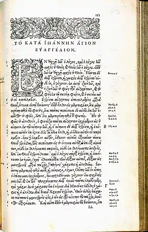
Les grecs du roi (lit. "the king's greeks") are a celebrated and influential Greek alphabet typeface in the Greek minuscule style which was cut by the French punchcutter Claude Garamond between 1541 and 1550. Arthur Tilley calls the books printed from them "among the most finished specimens of typography that exist".[2]


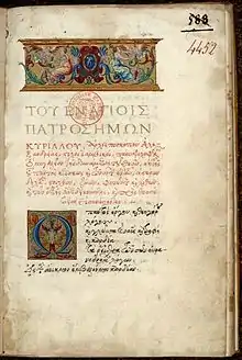
The grecs du roi punches were ordered by Pierre du Chastel on behalf of King Francis I of France from Robert Estienne in a contract dated 2 November 1540 and remain the property of the French government.[3] The design was based on the handwriting of the Cretan copyist Angelo Vergecio, and includes many alternate letters and ligatures. The grecs du roi were influenced by types cut by Francesco Griffo and used by printer Aldus Manutius in Venice. The types formed the basic model for Greek typefaces for the next two centuries.[4]
History
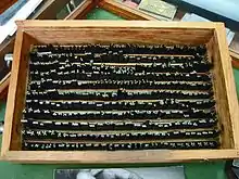
Garamond contracted to cut the Grecs du roi types on 2 November 1540.[5][6] They are cut in the sizes Manutius used, but are more complex. It took Garamond nearly 10 years to complete all the sizes. In 1543, he completed the medium sized 16pt character set, which he named "gros romaine". Three years later, in 1546, he completed the small sized 9pt character set which he named "Cicéro". Finally, in 1550, he completed the large sized 20pt character set, which he named "gros parangon".[7][8][9][10]

The grecs du roi were extremely influential and became a model other printers and publishers quickly sought to emulate, with versions by other French punchcutters even before Garamond had finished the last size.[11] According to John A. Lane, the most popular imitations were those made by Pierre Haultin and Robert Granjon, which were also widely used abroad.[12][13] More obscure versions in France were made by du Villiers, Jean Arnoul le Jeune dit Picard and possibly Michel Du Boys, and abroad one known in Hamburg from 1587, and in the sixteenth century several by Jean Jannon and one made in London by Arthur Nicholls.[14][15]
The grecs du roi style, although extremely influential, places significant demands on printers, since it requires a choice among many possible sorts that could be used in every word, in contrast to Latin-alphabet general-purpose typefaces which do not attempt to simulate handwriting as closely. Typefaces designed for Greek since that time have generally been much simpler, with a decline in number of ligatures. Gerry Leonidas, a leading expert on Greek typesetting, felt that Vergecio's handwriting "has all the marks of a script that is unsuitable for conversion to [printing]."[16]
In 1946, the original punches were classified as historical monuments.[17]
Digitizations

A digital revival of the grecs du roi was created by Anagrafi Fonts in 2009, being renamed to KS-GrequeX in the process. It includes 2 weights and over 1100 glyphs and ligatures, more than Garamond had cut.[18]
A digital revival of the grecs du roi was created by Franck Jalleau of the Imprimerie Nationale and used for a publication of Pindar's Olympic Odes on the occasion of the 2004 Summer Olympics in Athens.[19][20]
Mindaugas Strockis created a free digital font named Grecs du roi WG, but it lacks ligatures.[21]
See also
- Garamond
- Greek minuscule - includes information on ligatures
References
- Valerie R. Hotchkiss, Charles C. Ryrie (1998). "Formatting the Word of God: An Exhibition at Bridwell Library". Archived from the original on 2009-07-27. Retrieved 2010-10-13.
- Tilley, Arthur (1900). "Humanism under Francis I". The English Historical Review. 15 (59): 456–478. doi:10.1093/ehr/xv.lix.456.
- Parent, Annie; Veyrin-Forrer, Jeanne (1974). "Claude Garamont: New Documents". The Library. s5-XXIX (1): 80–92. doi:10.1093/library/s5-XXIX.1.80.
- Lane 1996.
- Vervliet 2008, p. 383.
- Parent, Annie; Veyrin-Forrer, Jeanne (1974). "Claude Garamont: New Documents". The Library. Series 5. XXIX (1): 80–92. doi:10.1093/library/s5-XXIX.1.80.
- "Garamont's early career: the grecs du roi". French Ministry of Culture. Retrieved 3 December 2015.
- "The Greek Typefaces". French Ministry of Culture. Retrieved 3 December 2015.
- Mosley, James. "Porson's Greek type design". Type Foundry. Retrieved 30 January 2016.
- Elizabeth Armstrong (28 April 2011). Robert Estienne, Royal Printer: An Historical Study of the Elder Stephanus. Cambridge University Press. p. 52. ISBN 978-0-521-17066-6.
- Lane 1996, p. 110.
- Lane 1996, p. 111.
- Vervliet 2008, pp. 365–382.
- Lane, John A. (1991). "Arthur Nicholls and his Greek Type for the King's Printing House". The Library. s6-13 (4): 297–322. doi:10.1093/library/s6-13.4.297.
- Vervliet 2008, p. 270.
- Berry, John D., ed. (2002). Language Culture Type: International Type Design in the Age of Unicode. ATypI. pp. 80–3. ISBN 978-1-932026-01-6.
- "Claude Garamont, graveur typographe réformé". Musée protestant. Retrieved 4 January 2023.
- "Anagrafi Fonts: Γραμματοσειρές - KS GrequeX".
- de Chazournes, Éric (26 August 2004). "Projet de sauvegarde du patrimoine de l'Imprimerie nationale". www.garamonpatrimoine.org. L'atelier du livre d'art et de l'estampe, Patrimoine de l'Imprimerie Nationale. Retrieved 2022-05-29.
- Franck Jalleau, "La recréation numérique des Grecs du Roi", Claude Garamont: créateur typographique, conference in Amiens, France, 29 September 2011
- "Archived copy". www.flf.vu.lt:80. Archived from the original on 17 October 2005. Retrieved 20 July 2022.
{{cite web}}: CS1 maint: archived copy as title (link)
Cited literature
- Carter, Harry (2002). Mosley, James (ed.). A View of Early Typography Up to About 1600 (Reprinted ed.). London: Hyphen. ISBN 978-0-907259-21-3.
- Carter, Harry, ed. (1969). The type specimen of Delacolonge. Les caractères et les vignettes de la fonderie du sieur Delacolonge, Lyons, 1773. Introduction and notes by Harry Carter. (Facsimile ... made from a copy belonging to the publishers.).
- Dreyfus, John, ed. (1963). Type Specimen Facsimiles. London: Bowes & Bowes, Putnam.
- Lane, John A. (1996). "From the Grecs du Roi to the Homer Greek: Two Centuries of Greek Printing Types in the Wake of Garamond". In Macrakis, Michael S. (ed.). Greek Letters: From Tablets to Pixels. Oak Knoll Press. ISBN 9781884718274.
- Lane, John A. (2004). Early Type Specimens in the Plantin-Moretus Museum: annotated descriptions of the specimens to ca. 1850 (mostly from the Low Countries and France) with preliminary notes on the typefoundries and printing offices (1. ed.). New Castle, Del.: Oak Knoll Press. ISBN 9781584561392.
- Slimbach, Robert (2005). "The Making of Garamond Premier". Garamond Premier Pro: a contemporary adaptation; modelled on the roman types of Claude Garamond and the italic types of Robert Granjon. San Jose: Adobe Systems. pp. 15–21.
- Vervliet, Hendrik D. L. (2008). The Palaeotypography of the French Renaissance: Selected Papers on Sixteenth-century Typefaces. BRILL. ISBN 978-90-04-16982-1.
- Vervliet, Hendrik D. L. (2010). French Renaissance Printing Types: a Conspectus. New Castle, Del.: Oak Knoll Press. ISBN 978-1-58456-271-9.
External links
- —Konstantinos Siskakis's digitization
- Graphê, association pour la promotion de l'art typographique—includes a photo of the punches for les Grecs du roi, Vergecio's manuscript, and the first book printed with the Grecs du roi.