Janson
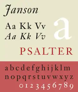
Janson is the name given to a set of old-style serif typefaces from the Dutch Baroque period, and modern revivals from the twentieth century.[1][2][3] Janson is a crisp, relatively high-contrast serif design, most popular for body text.
 | |
| Category | Serif |
|---|---|
| Classification | Old-style |
| Designer(s) | Miklós Tótfalusi Kis Chauncey H. Griffith |
| Foundry | Linotype |
| Design based on | Nicholas Kis' Roman of 1685 |
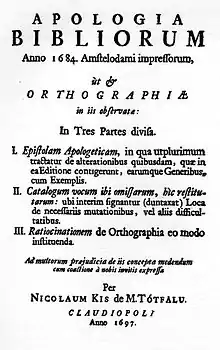
Janson is based on surviving matrices from Leipzig that were named for Anton Janson (1620–1687), a Leipzig-based printer and punch-cutter from the Netherlands who was believed to have created them. In 1954 Harry Carter and George Buday published an essay asserting that the designer of the Janson typeface was in fact a Hungarian-Transylvanian schoolmaster and punchcutter, Miklós (Nicholas) Tótfalusi Kis (1650–1702).[4][5]
Historical background


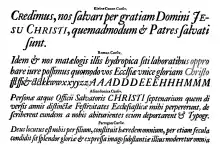
Miklós Kis, a Transylvanian Protestant pastor and schoolmaster, became deeply interested in printing after being sent to Amsterdam to help print a Hungarian Protestant translation of the Bible.[6][7] This was a period of considerable prosperity for the Netherlands and a time when its styles of printing were very influential across Europe, making it a centre for the creation of new typefaces.[5][8][9] He developed a second career as a punchcutter, an engraver of the punches used as a master for stamping matrices for casting metal type, selling his work to printers in the Netherlands and abroad. The style he worked in was based on French serif typefaces of the previous century, but with boosted x-height and higher stroke contrast, creating a higher-contrast, sharper effect.[10] It was later called the "Dutch taste" (goût hollandois), a term originating from the writings of Pierre Simon Fournier in the next century.[11] Kis is considered to have been one of the most talented engravers active during this period, and perhaps uniquely wrote about his work in later life, allowing greater insight into his work than other earlier engravers.[5] Kis also cut typefaces for other languages including Greek and Hebrew typefaces.
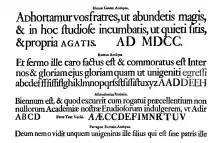
Kis returned to Transylvania around 1689 and may have left matrices (the moulds used to cast type) in Leipzig on his way home.[12][5][lower-alpha 1] The Ehrhardt type foundry of Leipzig released a surviving specimen sheet of them around 1720, leading to the attribution to Janson.[13][14]
Kis's surviving matrices were first acquired by Stempel, and are now held in the collection of the Druckmuseum (Museum of Printing), Darmstadt.[15][16][17] Kis's identity as the maker of the typefaces was rediscovered in the 1950s by comparison with type from Hungarian archive sources (including his autobiography) on which his name was identified.[18][19][20] Due to their survival, the Janson typefaces became popular with fine printers of the late Arts and Crafts period such as Updike, who could print books from them using hand-set type cast from surviving original matrices. In his book Printing Types: Their History, Forms and Uses, Updike commented that "although heavy, they retain considerable vivacity of line and have great capabilities when used with taste."[14]
Despite its 17th-century origins, Janson is used in a wide variety of modern-day text applications. As of the magazine's 2011 redesign, Architectural Digest uses Janson for body text in all of its articles; so does Philosophy Now. It has also been used for the Journal of the British Printing Historical Society.[21]
Revivals

The Janson type was popular with twentieth-century typographers including Updike and Stanley Morison, who admired its design as something different to the Didone and neo-medieval types dominant in the nineteenth century, and several revivals were made in the twentieth century for the hot metal typesetting systems of the period.[22][2]
A revival of the face was designed in 1937 by Chauncey H. Griffith of the Mergenthaler Linotype foundry. The revival was taken from the original matrices, held since 1919 by the Stempel Type Foundry, which were Mergenthaler's exclusive agent in Europe. Griffith was a great admirer of the Janson designs, writing to Carl Rollins of Yale University Press that "I am so anxious to have the Linotype face worthy of its name. If I cannot succeed in satisfying myself that our interpretation of Janson will be worthy of the honored name it bears, we shall not hesitate a moment to scrap the whole work and forget it."[23]
The most common digital version, Janson Text, comes from a metal version produced by Hermann Zapf in the 1950s at Stempel. This was based on Kis' original matrices.[24] Digitisations are available from Linotype, Adobe, Bitstream (adding Cyrillic glyphs), URW++ (adding an additional light and black weights) and others. A separate digital version is Elsner+Flake's Kis Antiqua Now. Described by Paul Shaw as the best digital version, it was designed by Hildegard Korger and Erhard Kaiser and originates from Korger's revival for the East German foundry VEB Typoart.[25][1][26]
A separate common revival of the Janson types is Ehrhardt, created by Monotype in the 1930s.[27] Somewhat more condensed than most Janson revivals, giving it a crisp, vertical appearance, it is a popular book typeface, particularly often used in the UK.[28] Besides a number of revivals specifically of Ehrhardt (described in that article), two more by Linotype and Berthold have been sold under the name of Kis.[29][30]
Random House's Modern Library Classics collection has some of its books printed in a digitized version of Janson typeface.
References
- Paul Shaw (April 2017). Revival Type: Digital Typefaces Inspired by the Past. Yale University Press. pp. 78–9. ISBN 978-0-300-21929-6.
- Alexander S. Lawson (1990). Anatomy of a Typeface. David R. Godine Publisher. pp. 158–68. ISBN 978-0-87923-333-4.
- Stauffacher, Jack (1985). "The Transylvanian Phoenix: the Kis-Janson Types in the Digital Era". Visible Language. 19 (1): 61–76. Archived from the original on 30 December 2017. Retrieved 19 May 2017.
- Middendorp, Jan (2004). Dutch type. Rotterdam: 010 Publishers. p. 25. ISBN 978-90-6450-460-0. Retrieved 27 July 2015.
- Lane, John (1983). "The Types of Nicholas Kis". Journal of the Printing Historical Society: 47–75.
- Lawson, Alexander (1990). Anatomy of a Typeface (1st ed.). Boston: Godine. pp. 158–168. ISBN 978-0-87923-333-4.
- Rozsondai, Marianne (2004). "The bindings of books printed by Miklos Misztotfalusi Kis". E codicibus impressisque : opstellen over het boek in de Lage landen voor Elly Cockx-Indestege. Leuven: Peeters. pp. 149–170. ISBN 978-90-429-1423-0.
- "Miklós Kis" (PDF). Klingspor Museum. Retrieved 6 November 2015.
- "Quarto". Hoefler & Frere-Jones. Retrieved 9 December 2015.
- Johnson, A. F. (1939). "The 'Goût Hollandois'". The Library. s4-XX (2): 180–196. doi:10.1093/library/s4-XX.2.180.
- Mosley, James. "Type and its Uses, 1455-1830" (PDF). Institute of English Studies. Archived from the original (PDF) on 9 October 2016. Retrieved 7 October 2016.
- Morison, Stanley; Carter, Harry (1973). "Chapter 8: Ehrhardt". A Tally of Types. Cambridge: Cambridge University Press. pp. 117–122. ISBN 978-0-521-09786-4. Retrieved 11 September 2015.
- "Ehrhardt Specimen Book image". Rietveld Academie. Archived from the original on 10 December 2015. Retrieved 6 November 2015.
- Updike, Daniel Berkeley (1922). "Chapter 15: Types of the Netherlands, 1500-1800". Printing Types: Their History, Forms and Uses: Volume 2. Harvard University Press. p. 44. Retrieved 18 December 2015.
A headline...reads "Real Dutch Types"
- Mosley, James. "The materials of typefounding". Type Foundry. Retrieved 14 August 2015.
- "Janson Text". MyFonts. Adobe/Linotype. Retrieved 5 November 2015.
- Heiderhoff, Horst (1984). "The Rediscovery of a Type Designer: Miklos Kis". Fine Print: 25–30.
- Heiderhoff, Horst (1988). "The Rediscovery of a Type Designer: Miklos Kis". In Bigelow, Charles (ed.). Fine Print on Type: the best of Fine Print magazine on type and typography. San Francisco: Fine Print. pp. 74–80. ISBN 978-0-9607290-2-9.
- Morison, Stanley (2009). "Chapter 8: Leipzig as a Centre of Type-Founding". In McKitterick, David (ed.). Selected essays on the history of letterforms in manuscript and print (Paperback reissue, digitally printed version ed.). Cambridge: Cambridge University Press. pp. 149–170. ISBN 978-0-521-18316-1.
- Buday, George (1974). "Some More Notes on Nicholas Kis of the 'Janson' Types". Library. s5-XXIX: 21–35. doi:10.1093/library/s5-XXIX.1.21.
- Boag, Andrew (2000). "Monotype and Phototypesetting" (PDF). Journal of the Printing History Society: 57–77. Archived from the original (PDF) on 28 March 2016. Retrieved 22 July 2016.
- McKitterick, David, ed. (1979). Stanley Morison & D.B. Updike: Selected Correspondence. Scolar Press. pp. 24–5, etc.
- Tracy, Walter. Letters of Credit. pp. 38–9.
- Jaspert, Pincus, Berry, and Johnson, p. 122.
- Korger, Hildegard; Kaiser, Ehrhard. "Kis Antiqua: Portrait of a Typeface". Fonts4Ever. Retrieved 20 September 2017.
- Karner, Michael. "Ein Schriftporträt der Typoart Kis Now" (PDF). Design Typografie. Retrieved 20 September 2017.
- "Ehrhardt". MyFonts. Monotype. Retrieved 14 June 2015.
- Butterick, Matthew. "Equity specimen" (PDF). Practical Typography. Retrieved 13 July 2015.
- Luin, Franko. "Kis Classico LT". Linotype. Retrieved 11 September 2015.
- "Berthold Kis". MyFonts. Berthold. Retrieved 11 September 2015.
- This is a slight simplification: technically the mould is clamped around the matrix, however the matrix is the mould for the variable part of a sort.
- Carter, Rob, Day, Ben, Meggs,Philip. Typographic Design: Form and Communication, Second Edition. Van Nostrand Reinhold, Inc: 1993 ISBN 0-442-00759-0.
- Molnár, József. Misztótfalusi Kis Miklós. Európai Protestáns Szabadegyetem: 2000. ISBN 963-506-329-6.
External links
On other Kis/Janson revivals: On Ehrhardt:
Ehrhardt digitisations: