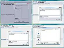
Look and feel
In software design, the look and feel of a graphical user interface comprises aspects of its design, including elements such as colors, shapes, layout, and typefaces (the "look"), as well as the behavior of dynamic elements such as buttons, boxes, and menus (the "feel"). The term can also refer to aspects of a non-graphical user interface (such as a command-line interface), as well as to aspects of an API – mostly to parts of an API that are not related to its functional properties. The term is used in reference to both software and websites.[1][2]

Look and feel applies to other products. In documentation, for example, it refers to the graphical layout (document size, color, font, etc.) and the writing style. In the context of equipment, it refers to consistency in controls and displays across a product line.
Look and feel in operating system user interfaces serves two general purposes. First, it provides branding, helping to identify a set of products from one company. Second, it increases ease of use, since users will become familiar with how one product functions (looks, reads, etc.) and can translate their experience to other products with the same look and feel.
In widget toolkits
Contrary to operating system user interfaces, for which look and feel is a part of the product identification, widget toolkits often allow users to specialize their application look and feel, by deriving the default look and feel of the toolkit, or by completely defining their own. This specialization can go from skinning (that only deals with the look, or visual appearance of the graphical control elements) to completely specializing the way the user interacts with the software (that is, the feel).
The definition of the look and feel to associate with the application is often done at initialization, but some Widget toolkits, such as the Swing widget toolkit that is part of the Java API, allow users to change the look and feel at runtime (see Pluggable look and feel).
Some examples of Widget toolkits that support setting a specialized look and feel are:
- XUL (XML User Interface Language): The look and feel of the user interface can be specialized in a CSS file associated with the XUL definition files. Properties that can be specialized from the default are, for example, background or foreground colors of widgets, fonts, size of widgets, and so on.
- Swing supports specializing the look and feel of widgets by deriving from the default, another existing one, creating one from scratch, or, beginning with J2SE 5.0, in an XML property file called synth (skinnable look and feel).
Lawsuits
Some companies try to assert copyright of trade dress over their look and feel.
The Broderbund v. Unison (1986) case was an early software copyright case that attempted to apply U.S. copyright law to the look and feel presented by a software product.
In 1987 Lotus sued Paperback Software and Mosaic for copyright infringement, false and misleading advertising, and unfair competition over their low-cost clones of 1-2-3, VP Planner and Twin, and sued Borland over its Quattro spreadsheet.[3]
In December 1989,[4] Xerox sued Apple over the Macintosh copyright.
Apple Computer was notable for its use of the term look and feel in reference to their Mac OS operating system. The firm tried, with some success, to block other software developers from creating software that had a similar look and feel. Apple argued that they had a copyright claim on the look and feel of their software, and even went so far as to sue Microsoft, alleging that the Windows operating system was illegally copying their look and feel.[5]
Although provoking a vehement reaction from some in the software community,[6] and causing Richard Stallman to form the League for Programming Freedom,[7] the expected landmark ruling never happened, as most of the issues were resolved based on a license that Apple had granted Microsoft for Windows 1.0. See: Apple v. Microsoft. The First Circuit Court of Appeals rejected a copyright claim on the feel of a user interface in Lotus v. Borland.
More recent reactions
In 2012 and 2014, Apple Inc. has filed lawsuits against competing manufacturers of smartphones and tablet computers, claiming that those manufacturers copied the look and feel of Apple's popular iPhone and iPad products.[5][8][9]
In APIs
An API, which is an interface to software which provides some sort of functionality, can also have a certain look and feel. Different parts of an API (e.g. different classes or packages) are often linked by common syntactic and semantic conventions (e.g. by the same asynchronous execution model, or by the same way object attributes are accessed). These elements are rendered either explicitly (i.e. are part of the syntax of the API), or implicitly (i.e. are part of the semantics of the API).
See also
References
- "What is the "Look and Feel" of a Website?". November 21, 2013.
- "Look and Feel in Computer Software". ComputerLaw.com.
- John Scwartz; Debra Rosenberg (August 27, 1990). "Computing the Cost of Copyright: Programmers fight "Look and Feel" lawsuits". Newsweek.
- Lawrence Fisher (December 15, 1989). "Xerox Sues Apple Computer Over Macintosh Copyright". The New York Times.
- Timothy B. Lee (2011-10-25). "Yes, Google "Stole" From Apple, And That's A Good Thing". Forbes. Retrieved 2015-08-13.
- "Special Report: Apple's New Look and Feel".
- Richard Stallman. "Is Digital Inclusion a Good Thing? How Can We Make Sure It Is?". gnu.org. Retrieved 2015-08-13.
- Derek Broes (2011-09-24). "Samsung vs. Apple: And The Winner Is..." Forbes. Retrieved 2015-08-13.
- Josh Lowensohn (March 31, 2014). "Round two: Apple and Samsung suit up for another billion dollar patent war". The Verge. Retrieved 2015-08-13.