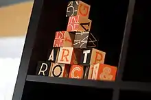
Neutraface
Neutraface is a geometric sans-serif typeface designed by Christian Schwartz for House Industries, an American digital type foundry.[1][2] It was influenced by the work of architect Richard Neutra and was developed with the assistance of Neutra's son and former partner, Dion Neutra.
| Category | Sans-serif |
|---|---|
| Classification | Geometric sans-serif |
| Designer(s) | Christian Schwartz |
| Foundry | House Industries |
| Date released | 2002 |
Design
Neutraface was designed by Christian Schwartz over the period of a year with assistance in art direction from Ken Barber and Andy Cruz.[3][4] It was the result of a project started by Schwartz to design "the most typographically complete geometric sans serif family ever",[3] based on Richard Neutra's principles of architecture and design.[5] The Neutraface alphabet was developed through consultation with Neutra's son and former partner, Dion Neutra, and with reference to the signs on the buildings designed by Neutra.[5] Since there were limited samples of Neutra's signage and no lowercase, much of the design was Schwartz's invention. The lowercase was influenced by Avenir, Futura, Nobel and Tempo.[3][1]
Although Neutraface was conceived as a display and headline typeface, Neutraface Text was created to complement Neutraface Display. Neutraface Text has a larger x-height than its display counterpart and increased stroke contrast.[5]
Styles

Neutraface was originally released with Display and Text styles. Additional weights have been released.
- Neutraface Condensed is an adaptation of Neutraface with a condensed width that Schwartz began to develop as soon as he and his colleagues realized how popular the original series was. It was released by House Industries in 2004.[7]
- Neutraface No. 2 is a revision of Neutraface made by Schwartz in response to what he perceived to be a demand for a "more 'normal' Neutraface". It is described by Schwartz as a "director's cut" of the original typeface, with the main change being its raised crossbars, reducing the eccentricity of the design and increasing its suitability for body text. Neutraface No. 2 was released by House Industries in 2007.[8] The family also included an inline face.[9]
- Neutraface Slab is a derivative of Neutraface in a slab serif style, following the style of geometric slab-serif popular in the interwar period. The concept originated as a joke but when Schwartz proposed the idea to House Industries, they convinced him to follow through with the concept. The development of Neutraface Slab by Schwartz, Kai Bernau and Susana Carvalho began in 2005 and it was released by House Industries in 2009 in both text and display weights.[10][11]
Usage
.jpg.webp)
Neutraface is very widely used, and Schwartz has commented, "I can't leave my apartment without running into an ad for a new condo development using it, or a restaurant, or a new cookbook."[8][12] Some examples of the usage of Neutraface are in the signage for the New York City Shake Shack chain,[13] book covers for Taschen's Movie Icons series,[14] advertising material for Wendy's fast food restaurants, and posters for movies. For example, It was used for the title of the 2005 remake of House of Wax,[15] and 2008 film Quantum of Solace.[16] Neutraface was also used in both the intro and outro of the 2005 film Robots. Rite Aid's new logo since 2020 uses Neutraface. Neutraface is the official font of the University of Minnesota.[17] The font has been called the "gentrification font" for its use in house numbers on new midcenturyesque housing developments.[18]
Neutraface was also the subject of a parody video of Lady Gaga's song "Poker Face" on YouTube, titled "Neutra Face: An Ode On A Typeface".[19]
Asked why Neutraface became popular, Schwartz commented "I guess it was just normal enough and just different enough...a House font that you could buy and your boss would let you use. There’s only so much you could do with the Rat Fink fonts."[20]
References
- Coles, Stephen. "Neutraface: Functional Novelty". Typographica (archived). Archived from the original on October 14, 2007. Retrieved December 8, 2017.
{{cite web}}: CS1 maint: bot: original URL status unknown (link) - Klara, Robert. "House Industries' Fonts Have Added Style, Swagger and Strangeness to What We Buy for 2 Decades". Adweek. Retrieved December 8, 2017.
- Schwartz, Christian. "Neutraface". www.christianschwartz.com. Retrieved October 2, 2011.
- Berry, John D. (2006). Dot-font: Talking About Fonts (1st ed.). New York: Mark Batty Publisher. pp. 117–121. ISBN 0-9772827-0-8.
- "The Neutra Legacy". House Industries. Retrieved October 2, 2011.
- "Neutraface Slab Blocks". House Industries. Retrieved September 8, 2020.
- Schwartz, Christian. "Neutraface Condensed". www.christianschwartz.com. Retrieved October 2, 2011.
- Schwartz, Christian. "Neutraface No. 2". www.christianschwartz.com. Retrieved October 2, 2011.
- Coles, Stephen. "Farewell Futura, Hello Neutraface No. 2". Typographica. Retrieved November 17, 2017.
- Schwartz, Christian. "Neutraface Slab". www.christianschwartz.com. Retrieved October 2, 2011.
- "Neutraface Slab". House Industries. Retrieved October 2, 2011.
- Makalintal, Bettina. "A Deep Dive Into the 'Gentrification Font'". Vice. Retrieved September 13, 2020.
- "Sightings: Shake Shack". House Industries. Retrieved October 2, 2011.
- "Sightings: McQueen". House Industries. Retrieved October 2, 2011.
- "House of Wax(2005)". May 6, 2005. Retrieved April 2, 2020.
- Korwin, Josh (March 25, 2009). "Neutraface is the new Helvetica". threestepsahead.com. Retrieved October 2, 2011.
- "Colors and Type". University Relations. Retrieved May 30, 2023.
- Richard Neutra’s Architectural Vanishing Act by Alex Ross, The New Yorker. September 20, 2021. Accessed January 12, 2021. "Those with more limited resources can settle for house numbers executed in Neutraface, a sans-serif font based on the architect’s favored lettering. Sometimes called the “gentrification font,” it adorns countless neo-mid-century developments."
- Abramson, Dan (December 9, 2009). "Neutra Face: Font Fanatics Do "Poker Face"". The Huffington Post. Retrieved October 2, 2011.
- Palmieri, Chris. "Christian Schwartz on Type Design". Tokyo Art Beat. Retrieved September 8, 2020.
Further reading
- Garza, Frida (May 16, 2023). "The gentrification font: how a sleek typeface became a neighborhood omen". The Guardian. Retrieved April 14, 2023.