Norman Wilson (graphic designer)
Norman Wilson (1931-1991) was a notable English commercial graphic designer, working in Manchester between 1960 and 1985.[1]
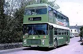
Wilson's approach to design was inspired by the International style of typography and graphic design, of which he was a leading proponent in northern England. He is known for his innovative combination of striking imagery with the manipulation of letterforms, and was described by designer and entrepreneur Edward Pond as 'a typographer in the true sense of the word".[2] His best-known work was a corporate identity for the National Bus Company (NBC), applied to coaches and buses throughout England and Wales; and corporate design and branding for chemicals companies including Croda International and Geigy, and restaurant chain UCP.[3]

After training at Manchester School of Art, National Service and an early career as an in-house designer at Manchester advertising agency Cross-Courtney, Wilson set up his own practice in Manchester in 1960, one of a very few such agencies outside London at the time.[2][4] Wilson worked for a range of mainly industrial clients. In 1971 he designed an arrow symbol for the National Bus Company and National Express, formed in red and blue by the letter 'N' and its shadow. The arrow symbol became ubiquitous as part of Wilson's modernist corporate identity for NBC, implemented throughout England and Wales from 1972,[5] the symbol coming to perform the same role for bus transport that Gerry Barney's 'double arrow' symbol did for British Rail. Wilson described his approach to design in a series of articles for NBC staff, arguing that "design, unlike art, is not a means of self expression, but an attempt to solve a pre-determined problem in visual terms”.[6]
Wilson was an early advocate for positive business benefits of design excellence, and for the development of graphic design as a discipline as well as a commercial profession.[7] He was a visiting lecturer at the Manchester and Bolton Schools of Arts, teaching a combination of design and commercial processes.[4]
Wilson's graphic work for Croda was selected for inclusion in the Typomundus 20 exhibition in 1966,[8] and the Brno International Biennial of Graphic Design in 1978.[9] He was the subject of several touring retrospective exhibitions organised by the Design Council.[10]
References
- Obituary: Mr N Wilson, Whaley Bridge: Buxton Advertiser, 29 May 1991
- Edward Pond (1991): Norman Wilson, true typographer; Design Week, July 1991.
- Tony Bisley: Designed to last, Graphics World, January 1983
- Richard Price (2022): Norman Wilson: a Manchester modernist; the Modernist, edition 44, September 2022.
- NBC Corporate Identity Project (2022): "Identity shock! Wood and Wilson show their hand"
- Norman Wilson (1973): "Building an image"; Bus News, National Bus Company
- Tony Bisley: Designed to last, Graphics World, January 1983, p.58.
- Typomundus 20 Committee (1966): Typomundus 20: A project of the International Centre for the Typographic Arts; Reinhold Publishing Corporation, New York.
- Bienále užité grafiky, Brno/Brno International Biennial of Graphic Design: 'Bienále '78: Mezinárodní výstava propagační grafiky/International biennial of graphic design' catalogue, Moravian Gallery, Brno, Czechoslovakia, pages 196 and 383.
- Norman Wilson archive, Special Collections, Manchester Metropolitan University