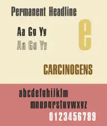
Permanent Headline
Permanent Headline is a bold, highly compressed sans-serif typeface in the neo-grotesque style. It was designed by Karlgeorg Hoefer for the type foundry Ludwig & Mayer in Frankfurt am Main.[1] It was released from 1964 and later issued by a range of companies in phototypesetting and digital versions.[2][3]
 | |
| Category | Sans-serif |
|---|---|
| Designer(s) | Karlgeorg Hoefer |
| Foundry | Ludwig & Mayer |
| Date created | 1964 |
Similar to other common newspaper typefaces intended to be compact, such as Times New Roman, the design has deliberately minimised descenders to save space. This distortion reaches an extreme level in Permanent Headline, with the descenders eliminated and tails such as the curve of the 'y' kept above the baseline. The x-height (height of lower-case letters) is very high. The design is highly folded-up and condensed with narrow apertures, making the design harder to read at distance. Permanent Headline was also released in an "outlined" style and in versions with regular descenders.[4] It was part of a larger “Permanent” sans-serif family without these attributes, which did not achieve such lasting popularity and has mostly not been digitised.[5] In the United States it was initially released by Amsterdam Continental.
Permanent Headline's highly compact, tightly spaced and industrial design is a prominent example of the aggressive, menacing style of graphic design that despite its poor legibility was popular in the 1960s and 70s, and was often used for purposes besides newspapers, such as book covers.[6] It resembles other condensed designs (both typefaces and custom lettering) of the period, such as Schmalfette Grotesk (and its successor Haettenschweiler), Linotype's Helvetica Inserat and other German designs.[7][8] Similar British designs from the period include Letraset’s Compacta, Stephenson Blake’s Impact and Matthew Carter’s masthead for Private Eye.[9][10]
References
- Devroye, Luc. "Karlgeorg Hoefer". Type Design Information. Retrieved 17 June 2016.
- "Karlgeorg Hoefer" (PDF). Klingspor Museum. Retrieved 17 June 2016.
- "Permanent Headline". MyFonts. URW++. Retrieved 17 June 2016.
- Advertising Techniques, Volume 8. ADA Publishing Co. 1972. p. 39.
- Coles, Stephen. "Ludwig & Mayer Brochure". Fonts in Use. Retrieved 17 June 2016.
- "Permanent Headline - Fonts in Use". Fonts in Use. Retrieved 17 June 2016.
- Dempsey, Mike. "Schmalfette: Tall, dark and handsome". Graphic Journey. Retrieved 22 August 2015.
- Dempsey, Mike. "Frederick Lambert: Graphic Design Britain". Design Journey. Retrieved 22 August 2015.
- Carter, Matthew. "Carter's Battered Stat". Eye. Retrieved 5 February 2016.
- Walters, John. "Matthew Carter's timeless typographic masthead for Private Eye magazine". Eye. Retrieved 24 August 2015.
External links
- Karlgeorg Hoefer (memorial site, listing typefaces)
- Fonts in Use - Permanent Headline