No symbol
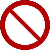
The general prohibition sign,[1] also known informally as the no symbol, 'do not' sign, circle-backslash symbol, nay, interdictory circle, prohibited symbol, don't do it symbol, or universal no, is a red circle with a 45-degree diagonal line inside the circle from upper-left to lower-right. It is overlaid on a pictogram to warn that an activity is not permitted, or has accompanying text to describe what is prohibited.
Appearance
According to the ISO standard (and also under a UK Statutory Instrument), the red area must take up at least 35 percent of the total area of the sign within the outer circumference of the "prohibition sign". Under the UK rules the width of a "no symbol" is 80 percent the height of the printed area.
For computer display and printing, the symbol is supported in Unicode by combining elements rather than with individual code points (see below).
Uses
Motor vehicle traffic signage
The "prohibition" symbol is used on traffic signs, so that drivers can interpret traffic laws quickly while driving. For example:
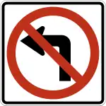 No left turn or
  No right turn
 No U-turn
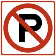 No parking (English) or
 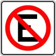 No estacionarse (Spanish)
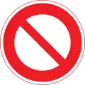 Road closed to vehicles (Japan),
  Road closed to vehicles (Germany, but typical in Europe)
Non-motor traffic
The symbol's use is not limited to informing drivers of motorized vehicles, and is commonly used for other forms of traffic:
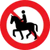 ,
, 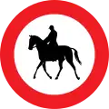 , No horse-riding
 ,
, 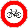 , No bicycles
 ,
, 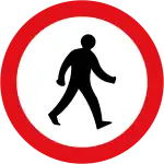 , No pedestrians
General prohibitions and warnings
The symbol is used for non-traffic purposes to warn or prohibit certain activities:
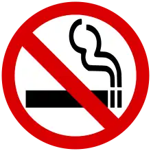 No smoking (with symbol of a lit cigarette).
 or
or 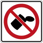 No littering (with symbol of person littering or of litter)
 No swimming (with symbol of swimmer in water underneath)
Packaging and products
It is also used on packages sent through the mail and sealed boxes of merchandise that are sold in stores. Using a graphical symbol is useful to convey important warnings regardless of language. For example:
- Breakable; do not drop
- Keep away from magnetic fields
In product documentation, the symbol may be accompanied by drawings of the product being threatened by the prohibited items: for instance, a cartoon of a floppy disk being menaced by horseshoe magnets.
It is also used on clothing, linens, and other household products to indicate the care, treatment or cleaning of the item. For example:
- Do not iron
Promotional and advertising
Some companies use the "prohibition sign" when describing the services they offer, e.g. an insect deterrent spray brand symbol showing the "prohibition sign" over a mosquito. The Ghostbusters logo is a fictional example of this, although it uses a mirror image of the symbol with the slash going from upper right down to lower left.
International standards
The official prohibition sign design characteristics are governed by regional and international standards. The symbol's canonical definition comes from the International Organization for Standardization which published ISO 3864-1 in 2002, a revision of a standard first published in 1984. The current version was published in 2011.[2]
ISO 3864-1 sets the rules for the color, shape, and dimensions of safety signage. The regulations include the incorporation of text and pictograms, with reference to materials used, sign size, and viewing conditions. The introduction includes language on the need for using as few words as possible to convey information.
Design specifics
The 3864 standard defines the color and design for the prohibition symbol. The verbal definition reads "circle with diagonal bar" with a red safety color, a white contrast color, and black for the graphical symbol[3] (i.e. the pictogram).
Dimensions per 3864-1
The symbol is defined as a circle, with the circular band having a thickness of 10% of the outer diameter of the circle. The inner diagonal line has a thickness of 8% of the outer diameter of the circle (i.e. 80% of the circle's line width). The diagonal is centered in the circle and at a 45 degree angle going from upper left to lower right. It is recommended to have a white outside border that is 2.5% to 5% of the outer diameter of the circle.
The circle and line are red, the background is white, and the pictogram or descriptive text is black.
Color red per 3864-1
The standard defines the range of CIE x,y chromacity coordinates for the color red to be used, relative to the CIE 1931 2° standard observer. They also list equivalent colors for various common color systems such as Munsell, defining red as Munsell 7,5R 4/14.
Relative to CSS colors for the web and sRGB, and assuming a white background of #fff, the red color should be no lighter than #f80000, and no darker than #a00000, with #b00 being a useful choice in terms of good contrast and color.
Variations
Non-conforming designs
Despite the fact that the ISO standard is freely available,[4] it is not uncommon for graphic artists to improvise on the particular color and dimensions. As a result, there is a wide variation of the symbol in common use, for instance using a lower contrast red than specified in the standard or using the same width for the diagonal line as the circle (the standard specifies the diagonal width is 80% as wide as the circle).
For example, compare  (a non-conforming example) with
  (drawn using the ISO standard).
Alternate or regional design differences

Circles with red borders and no slanted or diagonal line are used under the Vienna Convention on Road Signs and Signals to indicate "No entry to vehicles with the following characteristics" (often defined on a plate beneath) such as height, width, mass, or speed. The European Vienna Convention prohibits a diagonal line in the symbol for any sign other than no turning signs. An alternative use for red bordered circles is as a Mandatory Action Symbol type B.[5]
In many jurisdictions, (such as Germany) 'no entry' is indicated by a solid red disc with white horizontal bar. See the general article on Prohibitory traffic signs.
A blue filled circle with an illustration or legend means that a lane is restricted to a particular class of users (such as buses, cyclists, pedestrians) as shown, and no other traffic may use it. In contrast, a blue filled circle without a diagonal line through it is used as a Mandatory Action Symbol, indicating that the activity represented inside the circle is mandatory and must be executed.[6]
Unicode and fonts
Unicode combining character
The Unicode code point for the prohibition sign is U+20E0 ⃠ COMBINING ENCLOSING CIRCLE BACKSLASH. It is a combining character, which means that it appears on top of the character immediately before it.
Example: Putting W⃠ will display the letter W inside the prohibition sign: W⃠ (if the user's system handles it correctly, which is not always the case).
Emoji and other unicode versions
There are also several prohibition sign emojis and related unicode characters:[7][8]
- U+20E0 ⃠ COMBINING ENCLOSING CIRCLE BACKSLASH
- U+26D4 ⛔ NO ENTRY
- U+2B55 ⭕ HEAVY LARGE CIRCLE
- U+1F232 🈲 (Japanese sign meaning "prohibited")
- U+1F4F5 📵 NO MOBILE PHONES
- U+1F51E 🔞 NO ONE UNDER EIGHTEEN SYMBOL
- U+1F6AB 🚫 NO ENTRY SIGN
- U+1F6AD 🚭 NO SMOKING SYMBOL
- U+1F6AF 🚯 DO NOT LITTER SYMBOL
- U+1F6B1 🚱 NON-POTABLE WATER SYMBOL
- U+1F6B3 🚳 NO BICYCLES
- U+1F6B7 🚷 NO PEDESTRIANS
- U+1F6C7 🛇 PROHIBITED SIGN
In fonts
The symbol appears in a number of different fonts, such as Arial Unicode MS, and in dingbat fonts such Webdings and Wingdings 2. These are not necessarily "combining characters." In the case of Webdings and Wingdings 2, the character encoding does not match the Unicode standard, so if these fonts are not present on the user's system, the symbol may not render correctly.[9] This is particularly an issue in webpages. If the page designer wishes to use Webdings for instance, it is important to provide the font resource via the CSS @import font-face command.
Similar-appearing symbols
There are Unicode code points for other glyphs that look very similar to the 'prohibited' symbol, but which may be available in more font repertoires:
- U+29B8 ⦸ CIRCLED REVERSE SOLIDUS, which is difficult to distinguish from the 'prohibited' symbol.
- U+29B0 ⦰ REVERSED EMPTY SET
Other glyphs exist but are incorrectly oriented, for example
- U+2298 ⊘ CIRCLED DIVISION SLASH
- U+2205 ∅ EMPTY SET
- U+03F4 ϴ GREEK CAPITAL THETA SYMBOL
- U+04E8 Ө CYRILLIC CAPITAL LETTER BARRED O
All of these are spacing characters, which means that they cannot readily be used in combination with a symbol for the action to be prohibited.
References
- "ISO Symbol P001: General prohibition sign". www.iso.org. Retrieved 2019-03-17.
- "Graphical symbols — Safety colours and safety signs — Part 1: Design principles for safety signs in workplaces and public areas". www.iso.org. Retrieved 2020-12-28.
- ISO 3864-1 Graphical symbols — Safety colours and safety signs (2nd ed.). ISO. 2002. p. 4.
- "Official ISO template for prohibition sign". ISO. Retrieved 28 December 2020.
- "Vienna Convention on Road Signs and Signals" (PDF). United Nations Economic Commission for Europe. UNECE. Retrieved 2016-08-19.
- "ISO Online Browsing platform". ISO. Retrieved 2014-07-30.
- https://www.unicode.org/charts/PDF/U1F680.pdf
- https://www.unicode.org/charts/PDF/U1F300.pdf
- Wood, Alan. "Character sets: Webdings character set and equivalent Unicode characters". alanwood.net.