Ridgeline plot
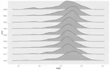
A ridgeline plot (also known as a joyplot) is a series of line plots of distributions that are combined by vertical stacking to allow the easy visualization of changes in distributions over space or time. The plots are often overlapped slightly to allow the changes to be more clearly contrasted. [1][2][3][4][note 1]

An example of a ridgeline plot showing the distributions of wages for a sample of firms over a series of years from a panel data set
Notes
- The name Joyplot is derived from the use of a Ridgeline plot of a pulsar on the front of Joy Division's album Unknown Pleasures.
References
- Wilke, C. O.(2019). Fundamentals of data visualization: a primer on making informative and compelling figures. O'Reilly Media.(See pages, 39, 43 88-91, 196)
- https://cran.r-project.org/web/packages/ggridges/vignettes/introduction.html#:~:text=Ridgeline%20plots%20are%20partially%20overlapping,distributions%20over%20time%20or%20space.
- Naqvi, S.A.A., 2022. JOYPLOT: Stata module to produce joyplots or ridgeline plots.
- https://r-graph-gallery.com/294-basic-ridgeline-plot.html
This article is issued from Wikipedia. The text is licensed under Creative Commons - Attribution - Sharealike. Additional terms may apply for the media files.