Architecture of the Paris Métro
From the original plain white tilework and Art Nouveau entrances, the architecture of Paris Métro stations has evolved with successive waves of building and renovation.
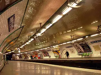
After experiments with diverse colour schemes, furniture and lighting, since 1999 there has been a reversion to the original design principles of the network. In parallel, the line 14 has provided an entirely new template for the stations of the 21st century.
Entrances
As with all subway systems, Métro entrances are designed firstly to be visible and recognisable. They feature at least a column and a network map. Decorative styles have changed over the years.
Concept
_Porte_Dauphine_Paris_16e_002.jpg.webp)
In 1899, the Compagnie du chemin de fer métropolitain de Paris (the Paris Metropolitan Railway Company, CMP) launched a competition for the street architecture of the soon-to-be-opened Métro. The CMP was concerned to avoid criticism in the context of a backlash against the industrial-style architecture epitomized by the recently built Eiffel Tower. In 1886 Charles Garnier, architect of the Opera, had declared in a letter to the minister of public works that:
The metropolitan railroad, in the eyes of most Parisians, will only be excused if it rejects absolutely all industrial character so as to be completely a work of art. Paris must not be made into a factory, it must stay a museum.[1]: 39
— Charles Garnier
The winner of the competition was Henri Duray.[2]: 186 The CMP's president, Adrien Bénard, nonetheless favored the municipality architect Jean-Camille Formigé. Later he proposed the art nouveau architect Hector Guimard, which was agreed to by the municipality.[3]: 73,76
Original Guimard style
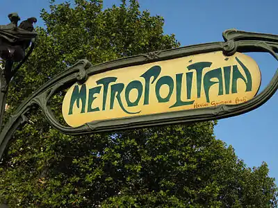
Guimard designed two types of entrances to metro stations, with and without glass roofs. Built in cast iron, they make heavy reference to the symbolism of plants and are now considered classic examples of French art nouveau architecture. 141 entrances were constructed between 1900 and 1912, of which 86 still exist.
| External video | |
|---|---|
 | |
The roofed variety, known as an édicule (kiosk), features a fan-shaped glass awning. Many examples also featured an enclosure of opaque panelling decorated in floral motifs (those at Gare de Lyon, now destroyed, and at Hôtel de Ville, now located at Abbesses, did not have panelling). The most imposing of these were built at Étoile and Bastille, on opposite sections of the inaugural line 1. Both of these were torn down in the 1960s. Today only two édicules survive, at Porte Dauphine and Abbesses (the latter having been moved from Hôtel de Ville in 1974). A third, replica édicule was erected at Châtelet in 2000.
The simpler open type of entrance, known as an entourage (enclosure), is framed by a "Métropolitain" sign held between two ornate, sinuously curved lampposts. These are designed strikingly in the form of plant stems, in which the orange lamp is enclosed by a leaf (resembling a brin de muguet, or sprig of lily of the valley).[4]: 73
Later styles
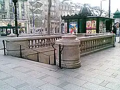
From 1904, the CMP employed the architect Joseph Cassien-Bernard to design a number of new station entrances in austere neo-classical stonework.[4]: 73 These can be found near certain important monuments, including the Opéra, the Madeleine and on the Champs-Elysées.
After the end of the Belle Époque, new entrances were entrusted to various architects. These typically feature cast-iron balustrades in an elegant but sober style. Many of the entrances that were built by the Nord-Sud company on the present-day lines 12 and 13 retain elegant art nouveau style motifs on the tiling surrounding the walls of the stairwell.
Special cases
A few entrances, for example at Pelleport and Volontaires, are housed in independent buildings. These are generally concrete constructions, and recall the architectural styles of the 1920s and 1930s. Conversely, a number of entrances (Riquet, Pernety) are built into the ground floor of existing buildings.
Signposts
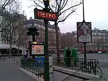
Also known as masts or totems, distinctive Métro signposts were a 1920s innovation of the Nord-Sud company.
In the early years, two styles arrived in succession. The Val d'Osne variant (named after an iron foundry, and visible at Saint Paul) consists of a globe-shaped lamp atop a "MÉTRO" sign surrounded by an ornate cast-iron frieze. The simpler Dervaux lampposts (named after their architect) became common in the 1930s, following the contemporary trend away from decorative embellishment.
After World War II, new Métro totems lost their lamps and became progressively more simple. The 1950s style features the familiar "MÉTRO" against a blue ring and a large red "M". In the 1960s, the blue ring was replaced by two stainless steel rings. Subsequent masts have kept these rings, now framing a simple interior-lit yellow "M".
Masts built since 1998 on line 14 are almost entirely novel, featuring a minimalist two-dimensional design but containing a hint of the original Guimard style in their plant-like verticals.
Ticket halls and corridors
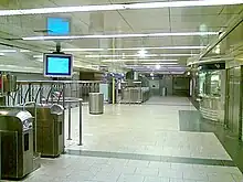
Ticket halls are typically found directly beneath the street. In the early years they contained little more than a kiosk for buying tickets, amid spartan decoration. From the 1930s, network maps appeared, including the popular plan indicateur lumineux d'itinéraires, a version with lights to indicate the fastest route to a given destination. From 1946 local street plans were installed, and later food dispensers and telephones. In the 1970s, shops appeared in certain stations where space permitted (for instance, Franklin D. Roosevelt).[4]: 78
Corridors which connect platforms of different lines can be long: near-surface construction means tracks and corridors must follow the streets above, and connecting lines are often situated under perpendicular streets. Only a few stations (for example, Jussieu) feature the cross-platform interchange common in deep underground networks.
Stairways are built to a rigorous standard (steps 30 cm or 11.8 in deep and 16 cm or 6.3 in high) in order to avoid irregularity, often the cause of accidents.
Escalators made their appearance at Père-Lachaise in 1909, and numbered around 15 by 1930.[4]: 77 Today over 200 stations are equipped with escalators. In general they only ascend – to the ticket hall, to the street or both in busy stations. Moving walkways similar to those in airports have been installed in the two largest transfer stations where some transfers require walking a considerable distance, Châtelet and Montparnasse – Bienvenüe. At the latter station, a high-speed walkway was in brief operation but has since reverted to normal speed.
Elevators were first installed at République in 1910, following a convention by which the CMP agreed to build them where platforms were situated deeper than 12 m below street level. They are in constant use only at a handful of deep stations, notably Abbesses (36 m or 118 ft below street level) and Buttes-Chaumont (28.7 m or 94 ft).
Automatic crowd-control gates known as portillons automatiques were once present in the majority of stations at the end of the corridors leading to the platforms. Introduced from the 1920s to regulate passenger access to crowded platforms, their usefulness was never properly demonstrated and from the 1960s they were withdrawn from service. Most have been dismantled, but non-functioning examples can still be found at Charles de Gaulle – Étoile and Gare d'Austerlitz.
Train halls
Most Paris Métro stations are vaulted. Certain stations were built by the cut-and-cover method, with flat roofs of iron or concrete. Finally, a number of stations are situated above ground on viaducts. The original train hall length was 75 m (246 ft), though this has been extended to 90 m (300 ft) on busy lines (1, 3, 7, 8, 9) to allow for 6-car trains. Certain stations were further extended to 105 m (344 ft), the difference as yet being unused.
Types
Vaulted train halls generally comprise two platforms surrounding two central tracks. Exceptions include:
- Stations on one-way, "looped" stretches of track, with a single track and platform (example: Église d'Auteuil)
- Stations that have two platforms, one for each direction, but whose platforms are housed in separate vaults that are not directly opposite each other, typically because the station is situated under narrow streets (example: Liège)
- Terminus (or former terminus) stations with 3 or 4 tracks and platforms (example: Porte de la Chapelle)
- Stations where two lines share a single platform (example: La Motte-Picquet – Grenelle)
The classic station vault is 14.1 m (46 ft) wide and 5.9 m (19 ft) high, including a 0.7 m (2.3 ft)-thick sill on which the rails are laid. Platforms are 4 m (13 ft) wide and separated by a 5.3 m (17 ft) gap. The walls of the stations are slightly curved and their overall shape is elliptical.
Stations on today's line 12, and some of the northern stations on line 13 (Saint-Lazare to Porte de Clichy and Porte de Saint-Ouen) were built by a competing company, the Companie du Nord-Sud. They are larger, allowing for straight walls up to the point where the curvature of the vault begins, and have higher ceilings to provide room for overhead catenaries that have since been removed.
Flat-roofed train halls are of two common types. Early stations built by cut-and-cover (due to tracks being less than 7 m (23 ft) below the surface) typically feature roofs of metal beams, which in turn support miniature brickwork vaulting (as at Champs-Élysées – Clemenceau on line 1). The standard hall width is 13.5 m (44 ft). A second type of cut-and-cover train hall is found in suburban stations built after the Second World War, and has a pure rectangular cross-section and reinforced concrete construction (Malakoff – Plateau de Vanves).
Elevated stations are the signature feature of lines 2 and 6. They are supported by iron columns, of which the exterior masonry features decorative motifs – of the Paris municipality and various wreaths and cornucopia. Stations on line 2 are covered by platform awnings, while those on line 6 have full glass roofs and opaque brick walls decorated on the outside with geometric motifs.
Decoration



_par_Cramos.JPG.webp)

Original CMP style (1900–1914)
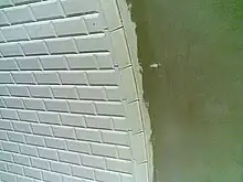
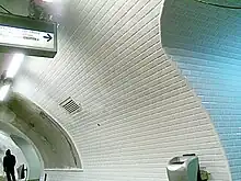
The original decoration of the Métro's underground train halls was austere. Stations featured plain white tiles, enamel plaques for the station name, a few wooden benches and the station manager's kiosk in the middle of the platform. Within a few years advertising billboards and confectionery machines appeared. The now-famous beveled white tiles (of Gien earthenware) were chosen for their effective reflection of ambient light. Early-20th-century electric lighting had a strength of only 5 lux, making it impossible to read a book. Today's fluorescent lighting can reach 200 lux.[1]: 33
Nord-Sud style (1910–1930)
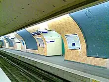
To attract travelers, the Nord-Sud Company, which built what is now line 12 (line A, Porte de Versailles to Porte de la Chapelle) and part of the northern section of what is now line 13 (line B, Saint-Lazare to Porte de Clichy and Porte de Saint-Ouen) chose a more elaborate decorative scheme for the interior of its stations than that of the CMP. Most of the tile was the familiar white beveled type, but the white tile was complemented by arches of colored tile over the vault and garland-like swags on the walls. This complementary tiling was color-coordinated: brown for normal stations, green for terminal and transfer stations, and pale blue for the station Madeleine (the reason for this station's particular color scheme has never been fully explained).[5]: 113 These colors matched the colors of the tile borders on the station's poster frames, nameplates and corridors. The most impressive feature of the Nord-Sud stations were the station names themselves, executed in large tile mosaics with white letters on a blue background. Blue and white tiling above the two tunnel entrances also indicated the destination of the trains (for example, "Dir. Montparnasse / Dir. Montmartre" on line 12).
Today, only a few stations – Solférino, Liège, Porte de Versailles, Porte de la Chapelle, Porte de Clichy, and Pasteur – retain much of their original Nord-Sud tiling, with Solférino the most intact example. There are a number of stations on line 12, including Falguière, Marx Dormoy, and Convention, whose Nord-Sud tiling is intact but has been covered over and hidden from view since renovation in carrossage style in the 1960s (see below). As the RATP renovates these stations, it has generally removed the original tilework and installed replicas. Many stations, including Sèvres-Babylone, Notre-Dame-des-Champs, and Lamarck – Caulaincourt have undergone renovations to restore the Nord-Sud decoration damaged or destroyed in earlier renovations.
CMP interwar style (1920s–1950s)
Between the 1920s and early 1950s, the CMP responded to the aesthetic challenge of the Nord-Sud stations by introducing a more elegant décor in newly constructed stations. Experiments were made with both tiled and enameled nameplates on line 8 stations between Porte d'Auteuil and Opéra, and in the newly constructed (in 1916) line 7 stations Pyramides and Palais-Royal. The CMP rolled out its final chosen design in 1921 in three newly built line 3 (now 3bis) stations from Gambetta to Porte des Lilas. Primarily, the CMP borrowed the Nord-Sud's idea of station names executed in blue and white earthenware tiles. The CMP also tiled its poster frames with more elaborately decorated borders of honey or ochre-colored faience, featuring floral and organic motifs. Art-deco-inspired geometric variants of this tiling were introduced later, including at Charenton – Écoles (opened 1942).[1]: 97
Carrossage (metal paneling) (1952–1968)
On 21 March 1948, when the RATP in charge of transportation within Paris was created, the modernization of the network had become a necessity.[6]: 84 In the straitened post-war economic circumstances, the company first enhanced the lighting of stations through fluorescent tubes introduced in the 1950s.[7]: 39 Starting in 1952, a series of pilot renovations were carried out. These consisted of renovating stations by applying sheaths of metal paneling (known as carrossage) along the sides of the stations, hiding the aging tilework. This proved to be cheaper than refurbishing the tile and increased the amount of space available for advertising posters whose revenues contributed to financing the renovation.
Franklin D Roosevelt on line 9 received the first paneling makeover in 1952, to be followed by five other stations between 1954 and 1958, each featuring slightly different prototypes: Saint-Paul and Franklin D. Roosevelt on line 1, Opéra and République on line 3, and Chaussée d'Antin on line 9.[6]: 85-86 Experiments were also conducted on the closed Arsenal station, which had been shuttered with about a dozen other stations at the onset of the Second World War. Public reception was favourable, and so the programme was extended to many other stations, with the prototype at République becoming the standard after some further slight modifications. The standard style eventually adopted throughout the network featured light yellow paneling with forest green accents, complemented by brown and yellow enamel station nameplates. Between 1960 and 1968 approximately 70 stations were paneled in this style.[6]: 87 [4]: 82 Because the Nord-Sud had used different sized advertising-poster frames than the CMP in constructing its stations, carrossage also presented an opportunity to harmonize the poster frames on lines 12 and 13 with the rest of the network (and indeed, with the rest of the country: the CMP poster frame size had become a national standard). All but seven stations on lines 12 and 13 received the carrossage makeovers, with line 12 the most extensively remodeled line on the network.[6]: 87–88
But paneling had serious drawbacks that quickly became apparent. It used space on the platforms, making stations feel more cramped, and it rendered maintenance of the underlying tilework difficult.[6]: 88 In the 1980s and 1990s, the RATP refreshed the carrossages by painting them white with trim in an array of bright colors (red, yellow, yellow ochre, green, and blue), in an effort to relieve the monotony of so many identical stations. The paneling is currently being removed as part of the Renouveau du Métro programme. As of October 2022, six carrossage stations remain: Sentier and Parmentier (where the carrossage is part of the cultural scheme) on line 3; Franklin D. Roosevelt on line 9; and Falguière, Vaugirard, and Convention on line 12.
Mouton-Duvernet style (1968–1973)
Tiling made its return in the late 1960s, with the renovation style known as Mouton-Duvernet (this station on line 4 being the first concerned).
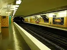
The style's signature was the warm and dynamic colour orange, in variegated shades. Flat (non-bevelled) orange tiles covered the station walls but not the roof, which was simply painted in a neutral (and often dark) tone. The fluorescent-light housing, placed over the train tracks, was rectilinear and coloured in matching orange.
Around 20 stations were renovated in this way between 1968 and 1973, including Étoile, Oberkampf, Raspail and Commerce.
The Mouton-Duvernet aesthetic was intended to lend warmth and colour to hitherto plain station interiors. It was also self-consciously modern, a product of its iconoclastic era. However, the orange tones were quickly perceived as garish and aggressive, and the overall aesthetic as rather gloomy because the vault remained in shadow and the orange tiles did not reflect light as well as the white. The style is being withdrawn in the context of the Renouveau du Métro programme.
Andreu-Motte style (1974–1986)
The Andreu-Motte style, named after designers Joseph-André Motte and Paul Andreu, prevailed in station renovations between 1974 and 1984 and affected around 100 stations. It represented a compromise between colourful innovation and the classic white aesthetic of the Métro.
Where the existing beveled tile was in good repair, the Andreu-Motte style was applied over the original tile, but in stations where more extensive tile replacement was called for, the beveled tiling was replaced by flat white rectangular tiles. To introduce color into the stations, a coordinated colour scheme was added to elements of the train hall – the seating, light housings, and walls of connecting corridors. Five main colour schemes were used: yellow, red, green, blue and orange. An aim was to facilitate subliminal recognition of stations by passengers, since particular stations took on colour identities – for example, Ledru-Rollin is blue and Voltaire yellow.
The other innovation was a tiled ledge along the base of the station wall, in the station's signature colour. On this were placed individual seats in a sculpted single-piece style which has since become closely associated with the Métro. These seats, also called Motte seats, were ultimately introduced throughout the métro network, even in stations not renovated in the Motte style.
Ouï-dire style (1986–1988)
The most recent genuinely original style used in renovations of early Métro stations is known as Ouï-dire ("Hearsay"), after the design firm responsible for the design. Beginning with Stalingrad (line 7) in 1988, around 30 stations were decorated in this style.[4]: 83 Ouï-dire's main component was a new light housing, cradled by distinctive scythe-shaped supports. Its hidden upper side projected light through colored filters directly onto the ceiling of the vault, illuminating it in a rainbow of multiple colors. The style initially featured distinctive seating complemented by high, "sit-lean" benches, but these fixtures proved difficult and costly to maintain and in many cases were replaced by standard Motte-style seating in the 1990s. The tiling in almost all of the Ouï-dire stations was replaced by the flat white Motte rectangular tiles. As with the Motte renovations, four distinct color schemes (red, yellow, green and blue) were put into place, with each station's chairs, light fixtures, and poster frames built in matching colors, but the effect was more subtle than the use of color in the Motte stations.
In the 1990s, over years of exposure to the ultraviolet fluorescent light, the colored refractory panels progressively lost their color, and the RATP judged it too expensive to regularly replace the panels to maintain the colored light directed onto the vaults. With the RATP's commitment in the 2010s to progressively install energy-saving light-emitting diodes LEDs throughout the metro network, it has now become possible to restore color to the 27 Ouï-dire stations. Colored LEDs imitating the original design began to be installed in Ouï-dire stations in 2014.
Météor style (1998–present)
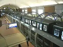
A case apart, the new line 14 (originally known as Météor, or Métro Est-Ouest Rapide) represented a blank slate for station decoration. Following the logic of the stations' capacious volumes, the RATP opted for minimalism, with an emphasis on space, light and modernity. Specifically, the stations should represent "a noble public space, monumental in spirit, urbane in its choice of shapes and materials."[4]: 47
In practical terms, this meant a diversity of materials. Walls are panelled in steel, stone and frosted glass, while platform floors are marbelled. Elsewhere, the dominant surface is polished bare concrete.
The first seven stations of the line were designed by Jean-Pierre Vaysse, Bernard Kohn, Antoine Grumbach and Pierre Schall.
The decoration of Mairie de Montrouge station, opened in 2013 on line 4, includes elements of the Météor style alongside entirely new features such as corrugated metal panelling.
Bruno-Gaudin style (1996–present)
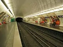
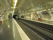
In 1996 Saint-Augustin on line 9 was chosen as the trial station for a new renovation style. Its original feature is a new light housing (known as the Bruno-Gaudin light fixture) with a wide wave-shaped reflecting surface which is attached to and follows the curve of the vault, hides the bare fluorescent bulbs seen throughout the metro after World War II, and also hides cables efficiently. The style, which focuses on maximizing the amount of light in the stations and hiding unsightly fixtures, also returns to the classic beveled white tile, which reflects light better than all other types that have been used on the system. For this reason, Bruno-Gaudin can be seen to represent a return to the design charter of the original Métro of 1900, and represents a kind of "neo-CMP" aesthetic. The style has also seen the introduction of a new type of seating: a curved, rounded, individual seat called the coque, or shell model, after its distinctive shape.
This extremely successful style has been used by the RATP in all of the major station renovations undertaken since 1999 as part of the Renouveau du Métro program. The style also lends itself to both minor and major renovation schemes. In stations that have the beveled tile already, renovation in Bruno-Gaudin style is fairly straightforward; other stations have been entirely retiled in the classic white tile to bring them into conformity with this style.
In some stations, the Bruno-Gaudin wave light fixture cannot be used due to the particularities of the vault or, in the case of stations with Nord-Sud decor, because it would obscure particular decorative features. For these cases, the RATP has developed a secondary type of lighting fixture consisting of a long, compact tube of extremely luminescent fluorescent light that is suspended from the ceiling of the vault, over the train tracks, rather than being attached to the walls of the vault itself. This light fixture has the benefit of being equally bright as the Gaudin model, but is very discreet, and allows the RATP to work around the particularities of many stations.
Station renovation programme (Renouveau du Métro)

Starting in 1999, and in conjunction with the Bruno-Gaudin architectural charter developed in the late 1990s, the RATP has been conducting a major programme of station renovation, known as Le Renouveau du Métro. Its aims are clarté (brightness, clarity) and cleanliness. This charter supersedes many previous renovation styles, notably the carrossage and Mouton-Duvernet renovations, but does retain Motte and Oui-dire stations in good repair. All other stations renovated under the Renouveau du Métro program receive the Bruno-Gaudin decoration style.
The program involves:
- Replacing and standardising the tiling of stations across the network. Beveled tile and flat Motte tile in good condition is retained and/or cleaned and repaired. Tile in poor condition, the remaining carrossages, and the orange tile of the Mouton stations, is replaced with fresh beveled white tile. In many stations, retiling has been followed by the installation of sub-surface drains to control future water infiltrations, the source of unsightly hard-water stains on the ceiling and sides of the vaults and in corridor areas.
- Replacing lighting, mainly with the Bruno-Gaudin "wave" model or the suspended tube model.
- Removing or hiding exposed pipes and electrical cables, notably with the Bruno-Gaudin light fixture and storage lockers at various intervals along the platform.
- Replacing the remaining Alphabet Métro signage with Parisine signage and updating direction indicators, in tandem with the electronic train arrival boards known as the SIEL system (le Service d'Information d'attente en Ligne, or Line Waiting Information Service).
Signage and typography


When the first sections of the metro opened in the early 20th century, most station names in CMP stations were indicated by enameled signs hung from the ceiling and later mounted on the walls. The signs featured white, narrow, sans-serif uppercase letters set against a dark blue background. Despite the CMP's later decision to equip future stations with tiled nameplates, the enamel plaques in place survived well into the postwar period, with the last example, at La Motte-Picquet – Grenelle on line 6, only retired in 2006.
Stations that were modernized in the carossage style of the 1950s and 1960s received new station signage. Breaking with the blue-and-white used for both tile and enamel nameplates until that time, the nameplates installed in carossage stations featured bright yellow, uppercase, sans-serif letters on a dark brown background, which proved to be more difficult to read from inside the trains.
In the early 1970s, spurred on by the development of the RER system and by the opening of several new extensions to the network, the RATP undertook a program to harmonize the metro's corporate identity by replacing the many different fonts then in use with a unified, standard typeface. The font eventually chosen, "Métro Alphabet," was developed by the Swiss typeface designer Adrian Frutiger as a special, modified version of his Univers typeface. Installed throughout the network between 1973 and 1994, Métro Alphabet became the most widespread font used on the system and still remains in dozens of stations.
By the early 1990s, the RATP had decided to update its signage, and selected a variant of the widespread Helvetica typeface, Neue Helvetica, for use in stations and on maps. The first métro typeface to employ upper and lower case letters, it was only used in a handful of stations, notably Place d'Italie on line 6, before the RATP changed course and commissioned French typeface designer Jean-François Porchez to create an exclusive font for the system. Porchez's font, called Parisine because it was initially used for the station signs, was first introduced in 1997. Since then, it has been adopted throughout the system and has increasingly replaced the remaining Frutiger signage.[6]: 167–172
Cultural stations
Around 30 stations are decorated in entirely original ways, to celebrate particular themes.
Louvre station (known since 1989 as Louvre – Rivoli) was the first station to receive such a makeover, on the initiative of culture minister André Malraux in 1968. Other stations were subsequently redecorated on the theme of the landmark situated above them or to reflect the cultural significance of the name of the station. A handful were redecorated according to more general themes as part of the celebrations of the Métro's centenary in the year 2000. Cultural stations range from the extremely complex that encompass the entire station (i.e., Louvre-Rivoli, Arts et Métiers) to simpler plaques, exhibits or displays on station platforms.
| Station | Line | Description |
|---|---|---|
| Abbesses | 12 | The walls of the two curving staircases to the platform at the very deep Abbesses station are covered with murals featuring different views of the Butte Montmartre. On the ascending staircase, there are pictures of nature and life in Montmartre. The descending staircase features images of the Moulin Rouge, the Place des Abbsesses, the rue Lepic, Sacré Cœur, and the grapevines of Montmartre. These decorations from 2007 replaced an earlier fresco that was vandalized by graffiti. |
| Argentine | 1 | This station, formerly called Obligado, was renamed Argentine in 1948 when the Rue d'Obligado above was changed to the Rue d'Argentine following a 1947 visit by Eva Perón. The change was made in recognition of Argentina's assistance in providing France with food imports, including famed Argentine beef, after the Second World War. Photos displayed on the Vincennes-bound platform depict General José de San Martin (born in Argentina in 1778, died in France in 1850), who played an important role in fighting for Argentine independence. The Vincennes platform also features several panels indicating cultural life in Argentina. Finally, four panels on each platform provide information on important national parks and historical sites. |
| Arts et Métiers | 11 | The station derives its name from the nearby Conservatoire national des arts et métiers, and is clad strikingly in copper to evoke the Jules Verne-like interior of a submarine, a design by comic-book author François Schuiten. The renovation was completed in 1994. |
| Assemblée Nationale | 12 | The station has no advertising on the station walls, which are reserved for 90-meter long colorful murals, featuring silhouettes of deputies. Developed by Jean-Charles Blais, this decoration is changed with each renewal of the legislature. |
| Bastille | 1 | In 1989 tiled scenes from the French Revolution were installed on the open-air platforms on line 1. |
| Bastille | 5 | Archeological remains and an information panel about the Bastille, the notorious former prison whose storming on July 14, 1789 was the most famous episode of the French Revolution, can be seen on the platform of line 5. |
| Cadet | 7 | Cadet is entirely tiled in the red, white and blue stars and stripes of the American flag, complemented by red, white and blue Andreu-Motte seats. |
| Cluny—La Sorbonne | 10 | The station, decorated when it reopened after 50 years of closure in 1988, celebrates the writers of the Latin Quarter. The ceiling of the station is covered in mosaics representing the signatures of poets, philosophers, historians, artists, scientists, statesmen and others from the Latin Quarter, including Balzac, Racine, Hugo, Rimbaud and Marie Curie. They are accomanied by a mosaic entitled "Wings and Flames," by Jean Bazaine, composed of over 60,000 hand-cut tesserae made out of enamelled lava from Volvi in the Puy-de-Dôme department. Bazaine's work was overseen by Gino Silvestri da Bellun, assisted by 10 other mosaic artists. |
| Concorde | 12 | This station is completely tiled in the text of the August 1789 Declaration of the Rights of Man and of the Citizen. The scheme was designed by Françoise Schein and executed in 1991. |
| Europe | 3 | The station marks European integration and cooperation. |
| Liège | 13 | In 1982 the station was renovated with artwork offered by France’s northern European neighbor, Belgium. The design, by Marie Claire Van Vuchelen and Daniel Hicter, incorporates mosaic tiles featuring images of various locations in the Belgian province of Liège into the original Nord-Sud design. The mosaics are placed into the original, non-standard-sized advertising frames on the walls of each half-station opposite the platform, with each half-station featuring 9 different tableaux. In the northbound direction (toward Asnières–Genevilliers and Saint-Denis), the mosaics are executed in shades of blue and white. Those in the southbound direction (toward Saint-Lazare) are in multiple colors. |
| Louvre-Rivoli | 1 | The subtly lit platforms feature stonework, statues and other replica museum pieces from the holdings of the Musée du Louvre, transforming the station into an antechamber of the museum. Until the reconstruction of the Louvre in the late 1980s, this station was the closest to the museum's entrance. When I. M. Pei's pyramid was added to the Louvre and made the central entrance at the end of the 1980s, the neighboring metro station Palais-Royal became the closest to the museum entrance (so close, in fact, that a subterranean corridor was constructed leading directly from the museum to the Palais-Royal station, which was renamed Palais-Royal – Musée du Louvre. As part of the change, Louvre station took on the name Louvre – Rivoli. The resulting configuration—with the specially decorated Louvre station at a further distance from the museum—is confusing. |
| Parmentier | 3 | Parmentier is a celebration of the potato. The station, named after the 18th-century French scientist Antoine-Augustin Parmentier, who promoted the use of potato as a food source, is a specially modified version of the carrossage stations. It features green trellises instead of metal sheaths along the walls, which resemble a classic bag of potatoes; tractor seats for benches; and exhibits about the potato. |
| Pont Neuf | 7 | Located near the Mint, the station features enormous 3-D sculptures of oversized coins along the ceiling and walls. The installation includes an old monetary pendulum as well as two displaycases displaying different coins. The installation was designed by the architectural firm of Bruno Donzet. |
| Porte des Lilas | 11 | The Porte des Lilas station pays tribute to the singer Georges Brassens and his famous song "Les Lilas" ("Lilacs"), which mentions the Porte des Lilas neighborhood of Paris. On the Châtelet-bound platform of line 11, there are three tile mosaics inserted into the former advertising frames. Two of these represent lilac flowers, and the last shows Georges Brassens smoking his pipe. |
| St-Germain-des-Prés | 4 | The station presents projections of the musings of the neighbourhood's postwar philosophers. |
| Tuileries | 1 | Tuileries was redecorated in 2000 for the 100th anniversary of the Paris metro using the theme "heritage" or "patrimony." The walls have no advertising and feature a fresco of images both about modern history and the history of Parisian transportation. Among the images are a Sprague-Thomson metro car, a Z Railcar, Charlie Chaplin, the liberation of Paris, the Place de la Concorde, a Game Boy, Carl Lewis, Nelson Mandela, Darth Vader, and the Airbus A380. |
| Villejuif – Léo Lagrange | 7 | The station, named after the Popular Front's minister for sports and leisure, celebrates sports. |
References
- Canac, Sybil (2014). Paris Métro: Histoire et design. Éditions Massin.
- Clausen, Meredith L.; Jourdain, Frantz (1987). Frantz Jourdain and the Samaritaine: art nouveau theory and criticism. Brill Archive. ISBN 978-90-04-07879-6.
- Berton, Claude; Ossadzow, Alexandre; Filloles, Christiane (2006). Fulgence Bienvenüe et la construction du métropolitain de Paris (in French) (2 ed.). Presses des Ponts. ISBN 978-2-85978-422-5.
- Tricoire, Jean (1999a). Un siècle de métro en 14 lignes. De Bienvenüe à Météor [A century of the Metro in 14 lines. From Bienvenüe to Météor] (in French). Paris: Éditions La Vie du Rail. ISBN 2-915034-32-X.
- Lamming, Clive (2001). Métro Insolite (2011 ed.).
- Ovenden, Mark (2008). Pepinster, Julian; Lloyd, Peter B. (eds.). Paris Métro Style in map and station design. Capital Transport Publishing. ISBN 978-1-85414-322-8.
- Hardy, Brian (1999). Paris Metro Handbook (3 ed.). Capital Transport Publishing. ISBN 1-85414-212-7.