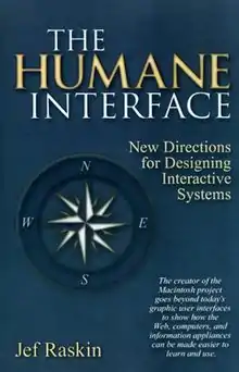
The Humane Interface
The Humane Interface: New Directions for Designing Interactive Systems (ISBN 0-201-37937-6) is a book about user interface design written by Jef Raskin and published in 2000. It covers ergonomics, quantification, evaluation, and navigation.[1][2][3]
 | |
| Author | Jef Raskin |
|---|---|
| Country | United States |
| Language | English |
| Genre | Computer Science |
| Publisher | Addison Wesley |
Publication date | 2000 |
| Pages | 233 |
| ISBN | 0-201-37937-6 |
| OCLC | 43286483 |
| 004/.01/9 21 | |
| LC Class | QA76.9.H85 R37 2000 |
Contents
The book puts forward a large number of interface design suggestions, from fairly trivial ones to radical ones. The overriding theme is that current computer interfaces are often poor and set up users to fail, as a result of poor planning (or lack of planning) by programmers and a lack of understanding of how people actually use software.
Raskin often refers to the computer he designed, the Canon Cat, as an example of a system that implemented the various measures he advocates.[4] The Canon Cat is often considered the first information appliance. Many of the ideas presented in the Canon Cat and The Humane Interface were later adopted by Raskin in his Archy project, and later by his son Aza.
Raskin includes a chapter demonstrating four models of quantifying the efficiency of a software interface: the GOMS keystroke model, Raskin's own efficiency measure, Fitts' law and Hick's law. All are intended to minimize the amount of time required for the user to perform any specific task.[5]
Design rules
Raskin also advocates a number of changes to conventional interface design.[6] Among them:
- Modelessness – a mode is a state in which the computer produces a different output for the same input than it would have if it were another state; the classic example is the keyboard's "caps lock" key. Raskin advocates either getting rid of them entirely or using "quasimodes" (a term he invented in the book); a quasimode is a state in which the user must make some constant physical action in order to keep the computer in that state, so that they cannot forget that they are in that mode; an example is the keyboard's shift key.[7]
- Monotony of design – there should be only one way to accomplish a certain atomic task in an application (in many modern applications, there are at least three - one through a button on the screen, one through a menu dropdown, and one through a keyboard shortcut – and often more).[8]
- Universal undo/redo – every action should be undoable and redoable, even after a document or application has been closed and reopened.[9]
- Elimination of warning screens – modern software applications often ask the user "are you sure?" before some potentially harmful action; Raskin argues they are unhelpful because users tend to ignore them out of habit, and that having a universal undo eliminates the need for them.[10]
- Universal use of text – Raskin argues that graphic icons in software without any accompanying text are often cryptic to users.[11]
Habituation is an important concept driving Raskin's guidelines, intended to free the user's mind from attention to low-level interaction details.[12] A modeless interface, monotony of design and elimination of blocking warnings are all intended to favor habit-forming reactions to interface handling.
Non-standard interaction architecture
Raskin also advocates a document-centered approach to computer interfaces that entails several radical changes to the current nature of operating systems and software:
- An end to stand-alone applications – every software package should be structured as a set of tools available to users on any document. For example, in the middle of writing a text document, a user should be able to do a mathematical computation by writing out the computation in the document, then hitting some "calculate" function.[13]
- An end to directories and file names – "the content of a text file is its own best name." Every document should be identifiable by its contents, so there should not be need for directories or names for user-generated documents; Raskin argues that these names tend to be cryptic and make files difficult to find afterwards.[14]
- Zooming user interface – Raskin advocates an interface he calls ZoomWorld, in which the user navigates around a two-dimensional plane containing a graphical representation of every document on the computer. The user can zoom out to see all the documents, or zoom in on any specific document in order to read and edit it.[15]
Raskin further asserts that interface design should be subject to regulation, analogous to building codes. This could be done by establishing legal safeguards to protect consumers from harm, and establishing professional guidelines and standards to evaluate good practice and interface quality.[16]
Notes
- Trinder 2002.
- Brown 2002.
- DeLoach 2002.
- Raskin 2000, pp. 29–31, 50, 56–57, 100, 121, 127, 129, 136, 138, 142, 174, 180, 182.
- Raskin 2000, chpt. 4.
- Raskin 2000, pp. 212–213.
- Raskin 2000, sec. 3-2.
- Raskin 2000, sec. 3-5.
- Raskin 2000, pp. 100, 107–109.
- Raskin 2000, pp. 25–27.
- Raskin 2000, pp. 168–174, sec. 6-3.
- Raskin 2000, pp. 18–20, sec. 2-3-1.
- Raskin 2000, pp. 140–142.
- Raskin 2000, pp. 117–123, sec. 5-3.
- Raskin 2000, sec. 6-2.
- Raskin 2000, pp. 200–202.
Sources
- Raskin, Jef (2000). The humane interface : new directions for designing interactive systems. Reading, Mass.: Addison-Wesley. ISBN 0-201-37937-6.
- Trinder, Jon (October 2002). "The Humane Interface: New Directions for Designing Interactive Systems (Book review)". Interactive Learning Environments. 10 (3): 299–302. doi:10.1076/ilee.10.3.299.8765. S2CID 34725955.
- Brown, Dan (January 2002). "Review of The humane interface: new directions for designing interactive systems by Jef Raskin. Addison-Wesley". ACM SIGCHI Bulletin - A Supplement to Interactions. 2002 (January–February): 12. doi:10.1145/967135.967153. S2CID 194943.
- DeLoach, Scott (1 August 2002). "The Humane Interface: New Directions for Designing Interactive Systems. (Book Reviews)". Technical Communication. 49 (3): 367–369.