Villa Mairea
Villa Mairea is a villa, guest-house, and rural retreat designed and built by the Finnish modernist architect Alvar Aalto for Harry and Maire Gullichsen in Noormarkku, Finland. The building was constructed in 1938–1939.
.jpg.webp)
The Gullichsens were a wealthy couple and members of the Ahlström family. They told Aalto that he should regard it as 'an experimental house'. Aalto seems to have treated the house as an opportunity to bring together all the themes that had been preoccupying him in his work to that point but had not been able to include them in actual buildings.
Today, Villa Mairea is considered one of the most important buildings Aalto designed in his career.[1]
Introduction
The plan of the Villa Mairea is a modified L-shape of the kind Aalto had used before. It is a layout which automatically created a semi-private enclosure to one side, and a more exclusive, formal edge to confront the public world on the other. The lawn and the swimming pool are situated in the angle of the L, with a variety of rooms overlooking them. Horizontals and overhangs in the main composition echo the ground plane, and the curved pool weds the nearby forest topography. In contrast to these softening devices, the main facade has a more rigid, formal mood, and even possesses a canopy restated in a garden pergola vocabulary of bindings, poles and slats. The interiors of the Villa Mairea are richly articulated in wood, stone and brick. The spaces vary in size from the grand to the cabin-like.
Clients
The Villa Mairea was designed for Harry and Maire Gullichsen, to whom Aalto was introduced in 1935, by Nils-Gustav Hahl. Hahl was keen to promote his bentwood furniture designs. Maire, after whom the house was named, was the daughter of Walter Ahlström, of the Timber and Paper Company. She studied painting in Paris during the early 1920s, and in 1928, married the businessman Harry Gullichsen, who four years later became managing director of the A. Ahlström Company. Maire and Hahl had the idea of founding an avant-garde art gallery in Helsinki to act as a focus of progressive culture, and in due course this became ‘ARTEK’, now world-famous as manufacturers and distributors of Aalto's furniture and glassware.
The Gullichsens believed in the possibility of a social utopia based on technological progress, and found in Alvar Aalto a designer who shared their ideals and could give them convincing architectural expression. Aalto and his first wife Aino had undertaken various projects for the Ahlström Company, including workers' housing, social facilities, and the celebrated Sunila Plant, completed in 1939, but it was in the Villa Mairea itself that the character of their utopian vision was demonstrated most fully.
Family projects
The villa was the third major house built with Ahlström money. In 1877 the founder of the company, Maire's grandfather Antti Ahlström, had built an imposing wooden house as a family residence in Noormarkku, a village a few miles inland from the town of Pori on Finland's west coast; at the turn of the century her father, Walter, commissioned an art nouveau house on a nearby site. As Aalto's biographer Göran Schildt has pointed out, each was representative of the values of their time: the first an expression of semi-feudal authority organized around a highly formalized style of living, the latter underlining ‘the domestic happiness afforded by solid riches, with comfortable rooms, cosy furniture and luxurious, well-tended garden grounds’. The new villa – to be used as a summer house, a form of retreat to nature traditional in Finland – was intended to express the aspirations of the new generation and of the Gullichsens’ vision of ‘the good life’ which they believed industrialization would eventually make available to the majority in the newly independent state.
Initial concepts
Aalto began work on the Villa towards the end of 1937, and was given an almost free hand by his clients.[2] His first proposal was a rustic hut modelled on vernacular farmhouses. Early in 1938, however, inspiration came from a radically different source, the residence named ‘Fallingwater’ designed by Frank Lloyd Wright, which had just received international acclaim thanks to an exhibition at the Museum of Modern Art in New York and publication in Life and Time magazines, as well as in architectural journals. Such was Aalto's enthusiasm for the design, Schildt tells us, that he tried to persuade the Gullichsens to build their home over a stream on Ahlström land a few miles out of Noormarkku.
Serpentine
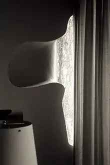
The influence of Fallingwater is evident in several sheets of studies, which show boldly cantilevered balconies and an undulating basement story intended as a substitution for the natural forms of the stream and rocks. In later sketches, the free-form basement appears as an upper-floor studio with a serpentine wall sunk into a one-and-half storey entrance hall, forming a drop-ceiling around the fireplace. The undulating, wave-like form was already established as a leitmotiv of Aalto's work: it was familiar from the vases designed for the 'Savoy Restaurant' in Helsinki. It also featured prominently in the second-prize-winning entry for the Finnish Pavilion at the Exposition Internationale des Arts et Techniques dans la Vie Moderne (Paris World Fair of 1937), named ‘Tsit Tsit Pum’. Aalto won the first prize with a different design and, never one to waste a good idea, used vast sinuous partitions as the primary spatial device of his masterly design for the New York Fair of 1939.
The free forms of nature were seen as symbols of human freedom, and as early as 1926 Aalto remarked that the ‘curving, living, unpredictable line which runs in dimensions unknown to mathematics, is for me the incarnation of everything that forms a contrast in the modern world between brutal mechanicalness and religious beauty in life. The fact that the Finnish word aalto means ‘wave’ doubtless added a certain piquancy to his attraction to the motif.

L-shape
Throughout his early studies for the Villa, Aalto envisaged an L-shaped plan similar to that of his own house in Munkkiniemi (1934–36). There, the ‘L’ shape distinguishes between the house proper and the integral studio; at Villa Mairea, it separates the family accommodation from that of a courtyard - garden variously enclosed by combinations of walls, fences, trellises and the wooden sauna. Demetri Porphyrios has pointed out that this plan form is common amongst Scandinavian aristocratic residences; it was also used, for example, by Gunnar Asplund in his celebrated Snellman House of 1919. Although Aalto's clients had asked for an ‘experimental’ house, it is significant that he first envisaged it as a reversion to a vernacular form, and then as a variant on a familiar plan type; in embodying a vision of the future, Aalto is at pains to endow the dwelling with strong memories of the past.
'Proto-Mairea'
In the early spring of 1938 the Gullichsens approved a design which Schildt has called the Proto-Mairea, on the basis of which construction began in the summer. The plan established the basic disposition of accommodation found in the finished house, with the dining situated in the corner between the family rooms and the servants' wing, and the bedrooms and Maire's studio upstairs, the latter originally expressed as a free-form curve in elevation, rather than plan.
Aalto's analysis of the activities to be accommodated produced a schedule of reception rooms which included an entrance hall with an open fireplace, a living room, a gentlemen's room, a ladies’ room, a library, a music room, a winter garden, a table tennis room and an art gallery. It read more like the programme for a Victorian country house than a demonstration of the social-democratic dwelling of the future, and Aalto was far from satisfied with the design. A young Swiss student working in his office at the time recalls that he used to scold the model like a naughty dog, explaining to her that 'those people don't need so many rooms'.
Redesign
After the foundations had been excavated Aalto had a new idea and was able to persuade his clients to accept a radical redesign in which only the plan footprint and servant wing remained more or less intact. The basement was greatly reduced in area, and the main entrance moved from its curious position at the side and rear to a much more obvious location in front of the dining room. Marie's studio was re-positioned to occupy the place above the former entrance canopy, whose shape it echoes, and the various reception rooms were accommodated in a large 14 metre-square space. The separate art gallery was removed and its place taken by the sauna, which nestles against a low L-shaped stone wall, the remainder of the original wall and trellis being replaced by a short fence and earth mound.
Harry Gullichsen's only objection to the revised design was the lack of a separate library where he could hold confidential business meetings, for which Aalto proposed a small room screened by movable shelving units which did not reach the ceiling. Aalto suggested that these units could also be used for storing Maire's art collection – an idea which, he pointed out, should be 'socially supportable as it could be realized in a small, even single room, dwelling' where the inhabitant has ‘a personal relationship to the phenomena of art'. Not surprisingly, this arrangement did not offer the necessary acoustic privacy and the shelving units were permanently sited (although not actually fixed), with one angled to suggest frozen movement; the gap under the ceiling was filled with an undulating glazed screen. ii
Final design
Although the revised plan followed the existing foundations, the transformation achieved a compression and coherence in the spatial organization which had been almost entirely lacking in the ‘Proto-Mairea’. The entrance opens into a small top-lobby, from which another door straight ahead leads into an open hall positioned four steps below the main level. One enters on axis with the dining table beyond, but the axiality is undermined by asymmetry of a screen of wooden poles and a free-standing, angled wall which together define an informal ante-room between the living room and dining room. The angle of the low wall is set from the corner of the white-plastered fireplace diagonally opposite, which becomes the natural centre of attention as one ascends the step into the living room. Similar diagonal relationships are established between Harry Gullichsen's private library/study and the ‘winter garden’ (which Maire used for flower arranging and from which a stair leads directly up to her studio), and between the main staircase and open sun-lit part of the living room into which eyes are drawn as you emerge from behind the vertical poles which screen the stairs.
 Detail at main entrance
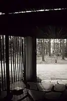 View from main entrance
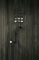 Front door, detail
Living room
The open living room is planned around a rectilinear structural grid whose dimensions are adjusted to suit the disposition of rooms above. This is in contrast to the conventional Modernist practice exemplified by the work of Le Corbusier by comparison with the sophisticated spatial composition of the ground floor. Aalto varies the dimensions of the structural grid in both directions, and the circular steel columns are randomly placed; in one case, they are tripped clad with wooden strips or bound with rattan, and in the library, one of the three columns in arbitrarily changed to concrete (early sketches also show it as free-form in plan). Aalto is at such pains to subvert any clear geometric reading of the structural and spatial organization that it comes as something of a discovery that the whole plan is in fact regulated by a series of squares. This is in contrast to Mies van der Rohe, by whom the structural grid was conceived as a regular counterpoint to the independent spatial disposition of the ‘free plan’. Although this geometry contributes to the formal discipline which underpins the episodic spatial composition, and is emblematic of an ‘ideal’ house, it is only in the dining room that one can directly sense the underlying order.
Dining room
The dining room itself is a double-square in plan, and the triple-square of the service block is centred on it; the formality is entirely appropriate to the activity of dining and entertaining and can be interpreted, as Klaus Herdeg, an architect and author, has argued, as an architectural embodiment of the social traditions of the bourgeois family. Harry Gullichsen, as head of the household, occupied the head of the table facing towards the entrance. From there he could see along the axis to the entrance and beyond into the pine forest through the clerestory windows above the vestibule, and also diagonally through the entire living room. Mrs. Gullichsen would occupy the seat at the opposite end of the table, conveniently close to the servery and kitchen, from where, as Herdeg writes, she ‘can contemplate her husband silhouetted against the dining room’s asymmetrical fireplace, while through the window she can see the sauna, the pool, the garden court, and the pine forest - things natural or traditional. Most of these views the father would only see reflected in an artifice, the living room windows.
Terrace
The flat roof of the dining room is extended to form a covered terrace, which connects with the irregular roof of the small timber sauna. The terrace is served by a fire which backs up against the fireplace in the dining room, and over which a rustic stone staircase rises to the wooden deck on the roof. The angle of the stairs determines the line of the plaster which rises diagonally across the fire to level out over the door. The same angle is continued outside in the flue which connects at the first-floor level into the service wing – a typical example of a rigorous formal integration which underlies Aalto’s at times seemingly willful manipulation of form. The rectangular pier at the end of the terrace affords another example. Viewed in isolation this seems to be simply another instance of Aalto’s desire to break the ‘artificial rhythms’ established by a regular grid, akin to the doubling and tripling of columns in the living room, but it is also an act as a visual and formal termination to the implied band of secondary circulation which runs through the door between dining room and terrace, past the servery wall which defines the entrance hall.
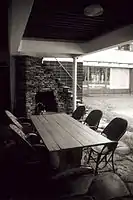 Garden kitchen
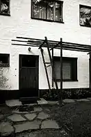 Side entrance
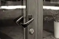 Terrace door, detail
Upper floor

By comparison with the sophisticated spatial composition of the ground floor, the upper or first (second-U.S) floor is a relatively straightforward assemblage of private rooms. The main stair arrives in an intimate upper hall, with its own fireplace placed directly above the one below. Mr. and Mrs. Gullichsen's bedrooms are paired on either side of an en suite bathroom, which are entered under a slightly dropped ceiling, with vents for air conditioning. The upper hall terminates in the familiar serpentine line.
The three children's bedrooms open onto a large circulation/play space, fitted with wall bars for exercise. Their windows are obliquely projecting bays, which read almost as objects on the façade, rather than openings in it, and are angled to address the line of approach to the main door. The guest bedrooms are disposed along a single-banked corridor and look out full-height windows and present a blank wall to the family's private garden.
See also
References
- "Elevating the Everyday" (PDF). The Social Insurance Institution of Finland. 2007. p. 41. ISBN 978-951-669-756-0. Retrieved 19 November 2014.
- Aalto, Alvar. "Villa Mairea 1938-39". Retrieved October 28, 2014.
We told him that he should regard it as an experimental house; if it didn't work out we wouldn't blame him.
External links
- Official website
- AD Classics: Villa Mairea by Alvar Aalto at ArchDaily
- Villa Mairea - Alvar Aalto - Great Buildings Architecture (Architecture Week)