Aqua (user interface)
Aqua is the graphical user interface, design language and visual theme of Apple's macOS operating system. It was originally based on the theme of water, with droplet-like components and a liberal use of reflection effects and translucency. Its goal is to "incorporate color, depth, translucence, and complex textures into a visually appealing interface" in macOS applications.[2] At its introduction, Steve Jobs noted that "... it's liquid, one of the design goals was when you saw it you wanted to lick it".[3]
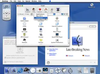 The first version of the Aqua interface, from Mac OS X Public Beta (Kodiak) | |
| Developer(s) | Apple Inc. |
|---|---|
| Initial release | January 6, 2000 |
| Written in | C++[1] |
| Operating system | macOS |
| Type | Desktop environment |
| License | Proprietary EULA |
| Website | developer |
Aqua was first introduced at the 2000 Macworld Conference & Expo in San Francisco. Its first appearance in a commercial product was in the July 2000 release of iMovie 2, followed by Mac OS X 10.0 the following year.[4] Aqua is the successor to Platinum, which was used in Mac OS 8, Mac OS 9 and Mac OS X Server 1.2. The appearance of Aqua has changed frequently over the years, most recently and drastically with the release of macOS Big Sur in 2020 which Apple calls the "biggest design upgrade since the introduction of Mac OS X."[5]
History

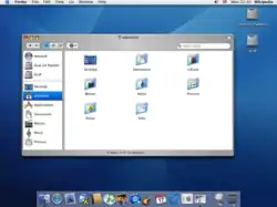
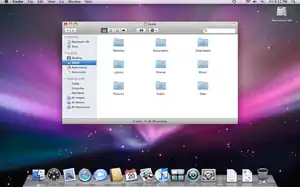
Mac OS X 10.2, Panther and Tiger
Mac OS X 10.2 "Jaguar" brought flatter interface elements, such as new buttons and drop-down menus, and reduced the transparency to tone down the pinstripes in windows and menus. These trends continued in subsequent Mac OS X releases.
In Mac OS X Panther, brushed metal was brought to the Finder. New buttons were made to appear sunken into their surroundings, following a general trend of more flattened interface elements in the operating system. The traditional pinstripes were replaced with a much subtler theme, most notably in the menu bar, and the use of transparency was again reduced (for example in the title bars of inactive windows). Tabs also changed; they were made flatter and the whole tab area was sunken rather than raised. Tab buttons were centered on the top border of the tab area. New icons appeared across the system, including a new flatter, glossier Finder icon and a new System Preferences icon.[6]
Mac OS X Tiger brought more subtle changes, including the unified titlebar scheme.[7] Pinstripes were removed from the menu bar entirely and replaced with a glossy, white look. Tabs were altered to appear as normal segmented buttons. The Apple menu icon was toned down to a more matte appearance and the new Spotlight search utility was permanently bound to the very right of the menu bar in the same color and gradient of the Apple menu.[8]
Mac OS X Leopard and Snow Leopard
Mac OS X Leopard brought wide-ranging changes to Aqua. Aqua windows and "brushed metal" windows obtained the same metal-like, gray look, pin-striped backgrounds were removed entirely, toolbars and titlebars were fused into a whole, differences between active and inactive windows became more distinct through thicker drop shadows and a monochrome appearance of inactive windows, the color of the menubar was changed into gray with an optional semi-transparency look on capable Macs and the Dock obtained a 3D look with a reflective glass-like 'floor'. The Dock's design, when placed on the left or right side, changed to a black translucent background with a white border and rounded corners. Context menus had slightly-rounded corners and numerous icons were redesigned, including folder icons and System Preferences icons.[9]
Mac OS X Snow Leopard made almost no changes to Aqua. Most notably, the context menu of Dock items changed from a solid white to a translucent black.[10]
Mac OS X Lion, OS X Mountain Lion and Mavericks
Mac OS X Lion introduced many changes inspired by iOS that persisted in OS X Mavericks as well as OS X Yosemite, although the latter changed the overall aesthetic. Scrollbars were removed and scrollbar handles turned into thin, semi-transparent bars that disappear when not used. The corner radii of push buttons were reduced, giving an appearance similar to Mac OS 8 and 9. The gel-like appearance of most components was replaced with a slightly glossy and flatter look. Window backgrounds became slightly brighter and window corners were rounded. Lion also added more animations.[11]
OS X Mountain Lion brought only minor changes and changed the Dock's appearance into a frosted-glass style, with rounded corners, rectangular indicator lights, a new diagonal separator and a new Trash icon.[12]
OS X Mavericks dispensed with several rich and ornamental designs, reflecting the design overhaul in iOS 7. The applications Calendar, Contacts and Notes respectively lost their leather, book and notepad appearance (all introduced in Lion). Linen textures in Notification Center and Launchpad were removed as well and replaced with simple gray backgrounds.[13]
OS X Yosemite, El Capitan, macOS Sierra, High Sierra, Mojave, and Catalina
In OS X Yosemite, many of the Aqua elements and icons were simplified and flattened, following a similar design change in iOS 7. Apple incorporated the same saturated frosted-glass effect, called "Vibrancy", across the system. Examples include the Dock, the menubar, sidebars, Notification Center and Mission Control. A similar effect was applied to toolbars, but they maintained their gray appearance. Toolbar buttons became white and Apple introduced a more compact type of toolbar that removed the window title, but retained the toolbar buttons (for example, in Safari). Certain controls, such as checkboxes and radio buttons, gained animations, whereas animations in other places were removed, such as the "poof" animation when removing an icon from the Dock and the "cube" animation when fast-switching to another user account. Apple changed the system typeface to Helvetica Neue. Yosemite also added a 'dark theme' you can turn on in the settings which makes the dock and menu bar black. [14]
OS X El Capitan made only minor changes to Aqua. The white toolbar buttons regained a slightly glossy look, the spinning pinwheel was redesigned and the Vibrancy effect was reduced in certain areas, such as Mission Control. The system typeface was changed once more, to Apple's own San Francisco typeface, concurrent with iOS 9 and following the typeface's release in watchOS in April 2015.[15] These changes continued throughout macOS Sierra, High Sierra, Mojave, and Catalina.
macOS Big Sur, Monterey, and Ventura
macOS Big Sur brought major changes to Aqua design that brings it in line with other Apple platforms such as iOS and iPadOS. The Dock is now detached from the screen edge and more rounded on all corners. The icons are now all squircle-shaped and take on more noticeable depth in general. Titlebars lose their gradient chrome, opting for a flat white look, and the titlebar text is now bold, and inline with toolbar items, which are no longer contained within a distinct background. Modal dialogs have changed significantly, only being as large as the content inside; laid out with a large icon at the top, text in the center, and buttons at the bottom. Sheets no longer slide out like paper from under the titlebar, instead more simply fading in from the center of the window. Unified sidebars have become more commonplace and are the default for all applications. Windows now have more rounded corners take on a tint from the user's wallpaper, akin to Windows 11's Mica effect. The menubar is now completely transparent, using a strong blur to differentiate from the background. This revision of Aqua continued to be used in macOS Monterey and Ventura.
Microsoft Windows applications
Aqua has also been embedded in Apple's applications for Microsoft Windows, such as iTunes, QuickTime and Safari (although not in Safari 4). iTunes for Windows has generally adopted the same developments as the concurrent macOS version, with the exception of the use of native Windows user interface controls and Windows-style title bar buttons at the upper right of the player window. The Windows version of Safari, in version 3, included a functional Aqua look and feel that was very similar to macOS. As of version 4, a more Windows-like theme was employed using the standard Windows user interface controls and window border. QuickTime for Windows uses the same theme as seen in older versions of QuickTime for macOS, with brushed-metal windows and Aqua buttons on top.
Design elements
Gray, white and blue are the three principal colors which define the Aqua style. Window toolbars, window backgrounds, buttons, menus and other interface elements are all found in either of these colors. For instance, toolbars and sidebars are often grey or metal-colored, window backgrounds and popup menus are white and buttons (in older systems also scrollbar handles) are accented with a bright blue. In versions of OS X prior to OS X Yosemite, most controls have a "glass" or "gel" effect applied to them. David Pogue described this effect as "lickable globs of Crest Berrylicious Toothpaste Gel".[16]
macOS has few native customization options to change the overall look of the system. Users can choose a graphite appearance instead of the default blue one. When using the graphite appearance, controls have a slate-like, grey-blue or grey color, including the primary window controls which are red, yellow and green with the default appearance. The appearance option was added at the behest of developers and users who found the blue appearance garish or unprofessional. OS X Yosemite added a dark mode that darkens the predominantly white menubar and Dock. Users can also freely choose a highlight color for text and file selection.
Windows
Historically, Aqua had two window designs: the default Aqua windows and "brushed metal" windows. Aqua windows typically have a metal-like or gray titlebar with three buttons on the left side (for closing, minimizing and zooming or entering fullscreen mode). Visually, these buttons used to be placed on top, but later appeared 'sunken' into the window. Aqua windows have almost no frame or outside border, instead drop shadows are used to separate and distinguish active from inactive windows. The aesthetic of the window backgrounds changed from pin-striped to white backgrounds. Brushed-metal windows had a thick frame with a metallic texture or dark-gray background and sunken buttons and inner frames. They had the additional property of being draggable at every point of the frame instead of just the titlebar and toolbar. Apple recommended brushed-metal windows for applications that mimic real-world devices (such as iTunes) or are used to interface with such devices (such as iSync),[17] but was criticised by designers for not following its own guidelines or applying it inconsistently (it was also used in Safari or Finder).[18] Brushed-metal windows have been largely phased out since Leopard and become visually indistinctive from Aqua windows.[9]
In addition to titlebars, windows can also have toolbars with separate buttons. Up to Leopard, toolbars were visually separated from the titlebar and had the same background as the window frame or were pin-striped.[8] Leopard introduced a unified style that extended the metal-like background of the titlebar to the toolbar, making it appear as one whole.[9] Optionally, a separator could be placed between the titlebar and the toolbar to mimic the previous style. OS X Yosemite brought a compacter version of the toolbar that fused the titlebar and toolbar together, made it shorter and removed the window title (for example, in Safari 8 and later).[14]
Drawers are accessory sidebar views that can slide out from any edge of a window except the top edge. They can be resized perpendicular to their window edge but follow the window's size in the other direction. Drawers were once frequently used to display controls and information that did not need to be always visible, but Apple now recommends against their use.[19]
Sheets are dialog boxes that are modal to a specific window. When opened, they are thrust towards the user like a sheet of paper, hence the name. They are partially transparent and focus attention on the content of the sheet. The parent window's controls are disabled until the sheet is dismissed, but the user is able to continue work in other windows (including those in the same application) while the sheet is open.
Menus
Menus are backed with a slightly translucent solid gray, and when menu items are highlighted they appear blue. In application menus, which run in a single bar across the top of the screen, keyboard shortcuts appear to the right-hand side of the menu whilst the actual menu item is on the left. In Yosemite, the menus are much more translucent and have a blur effect.
Drop down menus for use in windows themselves are also available in several varieties. The standard "pop up" menu is white with a blue end cap with opposing arrows, whilst 'pull down' menus only have one downward facing arrow in the end cap. 'Pull down' menus are available in four different Aqua varieties, most of which have fallen into disuse in later macOS releases.
Text boxes and fields
Text boxes are black on white text with a sunken effect border. In addition to regular square text boxes, rounded search text boxes are available . For more extensive text requirements, there is also a multi-line text field. A combined text box and pull down menu is available, which allows the user to type in a value in addition to choosing from a menu. There is also a combination textbox and picker control, which allows the user to type in a date and time or edit it with directional buttons. Mac OS X 10.4 introduced a new interface element that allows the user to drag non-editable 'tokens' to a text box, between which text can be typed. Whitespace before and after the tokens is trimmed.
Push buttons
Standard push buttons with rounded corners are available in two varieties: white and blue. A blue button is the default action, and in OS releases prior to Yosemite, would appear to pulse to prompt the user to carry out that action. The action of a blue button can usually also be invoked with the return key. White buttons are usually associated with all other actions.
Also available are rounded bevel buttons, designed to hold an icon; standard square buttons; glass square buttons and round buttons. In addition, circular, purple online help buttons are available which display help relative to the current task when clicked. Disclosure triangles, although technically buttons, allow views of controls to be shown and hidden to preserve space.
Checkboxes and radio buttons
In macOS, empty check boxes are small, white rounded rectangles. When they are checked, they turn blue and a checkmark is present. They are essentially buttons which can be toggled on or off. Radio buttons are similar in appearance and behaviour except that they are circular and contain a dot instead of a check. Radio buttons are classed into groups of which only one can be activated at a time.
In Yosemite, a short animation was added to show the checkbox or radio button filling in.
Tables and lists
Tables and lists can be broadly categorised in three ways: A standard multi-columnar table with space to enter values or place other interface elements such as buttons; An outline view that can contain disclosure triangles to show and hide sets of data; and a Miller columns view akin to the column view in the Finder. All table views can use alternating blue and white row backgrounds.
Progress indicators
Two main types of loading/saving progress indicator are available: a progress bar or a monochromatic spinning wheel (not the spinning pinwheel). The progress bar itself is available in two varieties: indeterminate, which simply shows diagonal blue and white stripes in animation with no measure of progress; or determinate, which shows a blue pulsing bar against a white background proportional to the percentage of a task completed. The spinning wheel indicator, also found in the Mac OS X startup screen since version 10.2, is simply a series of 12 increasingly darker grey lines arranged circularly, like the side view of a spoked wheel rotating clockwise. Many other interfaces have adopted this device, including the Firefox and Camino web browsers and many Web 2.0-influenced web sites.
In Yosemite, the progress bar was changed to a thin, light gray. The "indeterminate" variation kept the pulses, but slower and spaced out. A progress indicator now appears during boot, replacing the spinning wheel indicator found in earlier versions.
Miscellaneous
Sliders are available in three types: one with tick marks and a triangular scrubber, one with a round scrubber and no tick marks and a circular slider which can be rotated. All are available horizontally or vertically. The circular slider is simply a gray dot on a white circle which can be rotated to set values.
macOS has a standard control for picking colors which appears as a regular square button with a color sample in the middle. When clicked, it shows the standard macOS color palette.
Tabs in macOS are nearly identical to push buttons, with the unselected tab(s) being white and the selected tab being blue. Image "wells" are also available: a small, sunken container into which image files can be dropped. When the well contains an image, it can display a thumbnail representation of the file's contents.
Typefaces
Apple used Lucida Grande as the system typeface from the first release Cheetah to Mavericks. Occasionally, Apple also used Helvetica and Helvetica Neue, such as in applications like Mail and iPhoto. The system typeface was changed to Helvetica Neue in Yosemite and changed again in El Capitan into Apple's own San Francisco typeface. macOS makes use of system-wide typeface anti-aliasing to make edges appear smoother and preserve the distinct shapes of typefaces, sometimes at the cost of sharpness and clarity.
Animations

Aqua makes heavy use of animation. Examples include:
- Dock icons bounce up and down as their corresponding applications are launched.
- Dock icons also bounce up and down, in a different rhythm, when a background application requires the user's attention.
- Dock icons can increase in size when approached by the cursor. This feature (called "magnification") is optional.
- When minimized, windows are "sucked" into the Dock using the "Genie effect" or "Scale effect." Both of the effects are customizable by the user. The former makes a window turn into a curvy shape so it looks like reverse animation of a genie exiting a lamp, and the latter scales down the window until it is small enough to be in the Dock. By pressing the shift key, both effects can be seen in slow motion. These keystrokes can also be applied to other Aqua effects such as Dashboard, Mission Control and Front Row. Holding Control as well as Shift makes the minimize effect take twice as long as just holding Shift. Holding just Control also slows down the animation slightly. There is another undocumented dock effect called "Suck" which can be enabled by hand editing a configuration file or using a Terminal command;[20] this appears to be the same effect that accompanies the removal of widgets from the Dashboard.
- When a folder on the desktop is opened or closed, the corresponding Finder window appears to come from, or disappear into, the folder icon rather than just appearing from nowhere. This effect was present in the Classic Mac OS Finder as ZoomRects, but had disappeared from early Mac OS X developer releases.
- Sheets are "posted" out of window title bars. Sheets appear to be pieces of paper being thrust toward the user, or slide out like paper from a tray.
- Dashboard widgets appear to fly onto the screen. Dashboard widgets appear with a "ripple" effect, as if being dropped onto the surface of a pond. When removed, widgets are sucked into the close button as if being drawn into a vacuum. This effect can be applied on windows being minimized to the Dock.[20] Starting from Mac OS X 10.7 Lion, the default Dashboard configuration differs from that of previous versions (it takes its own space in Mission Control), causing the rippling effect to be removed. However, the user can re-invoke the original Dashboard (along with the ripple effect) in System Preferences.
- The contents of a stack will appear to spring out from behind the icon when clicked.
- In the Mac OS X Public Beta, docked items dragged onto the desktop simply disappeared, apparently 'dropping' onto the desktop. This behaviour was changed with Mac OS X 10.0; from this release onward, items dragged off the dock would 'disappear' in a cartoon-like puff of smoke, an effect which Apple later used in various places, such as Safari's Bookmarks Bar and iPhoto's tag removal). A similar effect was used in Apple's Newton OS. In OS X 10.10 Yosemite, this effect is no longer present; the item simply disappears, however can still be seen on the boot picker of Intel-based Mac computers when a boot device (such as a external hard-drive) is disconnected from the computer.
- Starting from Mac OS X 10.7 Lion, windows which contain a document or website open with an animation similar to Windows Aero. A similar zoom effect can be seen when opening files from the desktop, or within a Finder window. This also applies to the entire desktop when a user logs in.
- When fast user switching is used, Apple's "Cube" effect is used to transfer between desktops and/or the login window.
Many of these effects can be turned off by the user or are only available on supported hardware.
Underlying technology
Aqua is powered by the display server Quartz Compositor.
Criticism
Much of Aqua's original design resembled the translucent two-tone look of Apple's contemporary hardware.[21] In 2003 and 2004, Apple moved to the use of brushed aluminium in their industrial design (such as with the aluminium Apple Cinema Displays). The design of Aqua changed accordingly. This somewhat inconsistent mix of interface styles has been controversial among the Mac community.[22][23][24][25][26][27][28]
Litigation
In the past, Apple has threatened legal action against those who make themes similar to their look and feel.[29] The Mac skinning community took exception to Apple's heavy-handed actions against all Aqua lookalikes. Stardock's Brad Wardell contrasted the company's litigious approach with Microsoft's approach to incorporating third-party skins into Windows XP.[30]
See also
- Compiz
- KWin
- Metro (design language)
- Windows Aero
- GNOME
References
- Lextrait, Vincent (January 2010). "The Programming Languages Beacon, v10.0". Archived from the original on May 30, 2012. Retrieved March 14, 2010.
- "Developer documentation on Aqua".
- "Macworld San Francisco 2000". 6 min 45 sec. Archived from the original on December 12, 2021. Retrieved January 6, 2009 – via YouTube.
- Apple PR (July 19, 2000). "Apple Introduces iMovie 2". Apple.com. Archived from the original on January 17, 2008. Retrieved January 5, 2008.
- "Apple introduces macOS Big Sur with a beautiful new design". Apple Newsroom. Retrieved August 19, 2021.
- Siracusa, John (November 9, 2003). "Mac OS X 10.3 Panther". Ars Technica. Retrieved December 7, 2015.
- "Technical Q&A's". developer.apple.com.
- Siracusa, John (April 28, 2005). "Mac OS X 10.4 Tiger". Ars Technica. Retrieved December 7, 2015.
- Siracusa, John (October 29, 2007). "Mac OS X 10.5 Leopard: the Ars Technica review". Ars Technica. Retrieved December 7, 2015.
- Siracusa, John (September 1, 2009). "Mac OS X 10.6 Snow Leopard: the Ars Technica review". Ars Technica. Retrieved December 7, 2015.
- Siracusa, John (July 20, 2011). "Mac OS X 10.7 Lion: the Ars Technica review". Ars Technica. Retrieved December 7, 2015.
- Siracusa, John (July 25, 2012). "OS X 10.8 Mountain Lion: the Ars Technica review". Ars Technica. Retrieved December 7, 2015.
- Siracusa, John (October 22, 2013). "OS X 10.9 Mavericks: The Ars Technica Review". Ars Technica. Retrieved December 7, 2015.
- Siracusa, John (October 16, 2014). "OS X 10.10 Yosemite: The Ars Technica Review". Ars Technica. Retrieved December 7, 2015.
- Cunningham, Andrew; Hutchinson, Lee (September 29, 2015). "OS X 10.11 El Capitan: The Ars Technica Review". Ars Technica. Retrieved December 7, 2015.
- Pogue, David (2000). Macs for Dummies (7th ed.). Hungry Minds. p. 340. ISBN 0-7645-0703-6.
- "Apple Human Interface Guidelines" (PDF). December 6, 2005. Retrieved December 7, 2015.
- Gruber, John (October 16, 2004). "Brushed Metal and the HIG". Daring Fireball. Retrieved December 7, 2015.
- "OS X Human Interface Guidelines".
Drawers are rarely used in modern Mac apps. As much as possible, redesign your UI to avoid using drawers; if you're creating a new app, avoid adding a drawer to the design.
- "Change the Minimize Effect in Mac OS X via Defaults Command". April 12, 2007.
- "Macworld Expo 2007 Predictions".
The red/yellow/green/blue candy-colored transparent elements of Aqua resemble the hardware from the old G3 iMacs and Power Macs.
- "Aqua Interface to be updated?".
- "An Anthropomorphized Brushed Metal Interface Theme Shows Up for the WWDC Preview Build of Mac OS X Leopard".
- "First Look: Leopard preview: Desktop and Finder changes".
- "Brushed Metal and the HIG".
- "Tiger's first tweaks".
- "CUSTOMIZING THE MAC OS X USER INTERFACE".
One of the big gripes regarding the user interface in Mac OS X is that with each OS release, Aqua has become inconsistent and too varied in its appearance.
- "Apple Mac OS X 10.3 Panther review". Archived from the original on May 3, 2012. Retrieved September 27, 2012.
The interface is also busier and less consistent than Jaguar's.
- Lettice, John (February 2, 2001). "Apple rattles lawyers at DesktopX over Aqua". The Register. Retrieved December 7, 2015.
- Orlowski, Andrew (September 20, 2001). "Microsoft blesses XP skins". The Register. Retrieved December 7, 2015.
External links
- Apple Human Interface Guidelines
- Hackett, Stephen (April 24, 2014). "On the Past, Present and Future of Apple's Aqua User Interface". 512 Pixel.