Visual aids can be effective at enhancing your presentation and helping the audience better understand the key points of your presentation. However, if visual aids do not help your message or are too confusing, they may actually detract from the presentation and hinder understanding. Some key "don'ts" of using visual aids include:
- Inconsistency in color scheme or theme
- Small or complicated font or overwhelming text or graphics
- Too much information or too many slides
- Distracting animation or noises
Inconsistency in Color Scheme or Theme
If your visual aid has inconsistencies in color scheme or theme, the audience may become confused since color change may indicate a change in topic . Consistency in theme and color will help coordinate all of the information in your presentation and will help the audience understand the topics in relation to one another. There are a number of default themes that Microsoft PowerPoint offers that can help unify your color scheme and theme.Small or Complicated Font or Overwhelming Text and GraphicsAvoiding small font is essential to making sure that the audience can read your visual aids. A general standard is to make sure that all PowerPoint slides are at least 18-point font to ensure that audience members in the back row will be able to read your presentation. Additionally, you should avoid overwhelming text and graphics as they will distract from the main topics and points of your presentation.

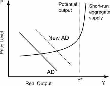
AS + AD graph
The "aggregate supply" and "aggregate demand" curves for the AS-AD model.
Too Much Information or Too Many Slides
Try to keep the amount of information on each slide to a minimum and use only what is necessary to convey the key point of the visual aid or slide. Additionally, try to keep the number of slides or visual aids in your presentation to a minimum. A rule of thumb is to use each slide in a PowerPoint for 30 seconds to a minute of your presentation. Remember that the majority of your presentation should come across in what you are speaking about rather than through the text on your visual aids. Distracting Animation or NoisesAvoid distracting animation and noises. These will take the focus of the audience away from your presentation and shift it toward the noise or animation instead.