Color is a fundamental artistic element which refers to the use of hue in art and design. It is the most complex of the elements because of the wide array of combinations inherent to it. Color theory first appeared in the 17th century when Isaac Newton discovered that white light could be passed through a prism and divided into the full spectrum of colors. The spectrum of colors contained in white light are, in order: red, orange, yellow, green, blue, indigo and violet.
Color theory subdivides color into the "primary colors" of red, yellow, and blue, which cannot be mixed from other pigments; and the "secondary colors" of green, orange and violet, which result from different combinations of the primary colors. Primary and secondary colors are combined in various mixtures to create "tertiary colors." Color theory is centered around the color wheel, a diagram that shows the relationship of the various colors to each other .
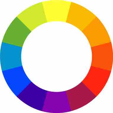
Color wheel
The color wheel is a diagram that shows the relationship of the various colors to each other.
Color "value" refers to the relative lightness or darkness of a color. In addition, "tint" and "shade" are important aspects of color theory and result from lighter and darker variations in value, respectively. "Tone" refers to the gradation or subtle changes of a color on a lighter or darker scale. "Saturation" refers to the intensity of a color.
Additive and Subtractive Color
Additive color is color created by mixing red, green, and blue lights. Television screens, for example, use additive color as they are made up of the primary colors of red, blue and green (RGB). Subtractive color, or "process color," works as the reverse of additive color and the primary colors become cyan, magenta, yellow, and black (CMYK). Common applications of subtractive color can be found in printing and photography.
Complementary Color
Complementary colors can be found directly opposite each other on the color wheel (purple and yellow, green and red, orange and blue). When placed next to each other, these pairs create the strongest contrast for those particular two colors.
Warm and Cool Color
The distinction between warm and cool colors has been important since at least the late 18th century. The contrast, as traced by etymologies in the Oxford English Dictionary, seems related to the observed contrast in landscape light, between the "warm" colors associated with daylight or sunset and the "cool" colors associated with a gray or overcast day. Warm colors are the hues from red through yellow, browns and tans included. Cool colors, on the other hand, are the hues from blue green through blue violet, with most grays included. Color theory has described perceptual and psychological effects to this contrast. Warm colors are said to advance or appear more active in a painting, while cool colors tend to recede. Used in interior design or fashion, warm colors are said to arouse or stimulate the viewer, while cool colors calm and relax.