Lesson 28: Doing More with PivotTables
/en/excel/intro-to-pivottables/content/
Introduction
As you learned in our previous lesson, PivotTables can be used to summarize and analyze almost any type of data. To manipulate your PivotTable—and gain even more insight into your data—Excel offers three additional tools: filters, slicers, and PivotCharts.
Watch the video below to learn more about enhancing PivotTables.
Filters
Sometimes you may want focus on a certain section of your data. Filters can be used to narrow down the data in your PivotTable so you can view only the information you need.
To add a filter:
In the example below, we'll filter out certain salespeople to determine how their individual sales are impacting each region.
- Drag a field from the Field List to the Filters area. In this example, we'll use the Salesperson field.
- The filter will appear above the PivotTable. Click the drop-down arrow, then check the box next to Select Multiple Items.
- Uncheck the box next to any item you don't want to include in the PivotTable. In our example, we'll uncheck the boxes for a few salespeople, then click OK.
- The PivotTable will adjust to reflect the changes.
Slicers
Slicers make filtering data in PivotTables even easier. Slicers are basically just filters but are easier and faster to use, allowing you to instantly pivot your data. If you frequently filter your PivotTables, you may want to consider using slicers instead of filters.
To add a slicer:
- Select any cell in the PivotTable.
- From the Analyze tab, click the Insert Slicer command.
- A dialog box will appear. Check the box next to the desired field. In our example, we'll select Salesperson, then click OK.
- The slicer will appear next to the PivotTable. Each selected item will be highlighted in blue. In the example below, the slicer contains all eight salespeople, but only five of them are currently selected.
- Just like filters, only selected items are used in the PivotTable. When you select or deselect an item, the PivotTable will instantly reflect the change. Try selecting different items to see how they affect the PivotTable. Press and hold the Ctrl key on your keyboard to select multiple items at once.
You can also click the Filter icon in the top-right corner of the slicer to select all items at once.
PivotCharts
PivotCharts are like regular charts, except they display data from a PivotTable. Just like regular charts, you'll be able to select a chart type, layout, and style that will best represent the data.
To create a PivotChart:
In the example below, our PivotTable is showing a portion of each region's sales figures. We'll use a PivotChart so we can see the information more clearly.
- Select any cell in your PivotTable.
- From the Insert tab, click the PivotChart command.
- The Insert Chart dialog box will appear. Select the desired chart type and layout, then click OK.
- The PivotChart will appear.
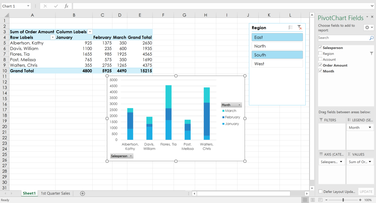
Try using filters or slicers to narrow down the data in your PivotChart. To view different subsets of information, change the columns or rows in your PivotTable. In the example below, we've changed the PivotTable to view the monthly sales for each salesperson.
Challenge!
- Open our practice workbook.
- In the Rows area, remove Region and replace it with Salesperson.
- Insert a PivotChart and choose the type Line with Markers.
- Insert a slicer for Regions.
- Use the slicer to only show the South and East regions.
- Change the PivotChart type to Stacked Column.
- In the PivotChart Fields pane to the right, add Month to the Legend (Series) area. Note: You can also click the PivotTable and add Month to the Columns area for the same results.
- When you're finished, your workbook should look something like this:

/en/excel/whatif-analysis/content/


