Bookman (typeface)
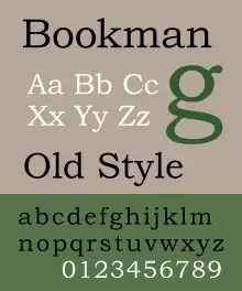
Bookman, or Bookman Old Style, is a serif typeface. A wide, legible design that is slightly bolder than most body text faces, Bookman has been used for both display typography, for trade printing such as advertising, and less commonly for body text. In advertising use it is particularly associated with the graphic design of the 1960s and 1970s, when revivals of it were very popular.[1] It is also used as the official font of Indonesian laws since 2011.
 | |
| Category | Serif |
|---|---|
| Classification | Transitional |
| Designer(s) | Unknown Influenced by: Alexander Phemister Revivals: Chauncey H. Griffith Ed Benguiat |
| Foundry | Miller & Richard Bruce Type Foundry American Type Founders Lanston Monotype |
| Date created | c. 1869 |
| Design based on | Old Style Antique |
| Variations | Antique Old Style No. 7 Old Style Antique #310 New Bookman Meola Bookman ITC Bookman Bookman Oldstyle MT Bookman JF Bookmania |
| Also known as | Bartlett Oldstyle Revival 711 |
| Shown here | Bookman Oldstyle by Monotype Imaging |
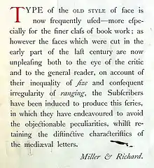
Bookman evolved from fonts known as Old Style Antique, released around 1869. These were created as a bold version of the "Old Style" typeface, which had been cut by Alexander Phemister around the 1850s for the Miller & Richard foundry and become a standard, popular book typeface.[2][3][4] Old Style Antique has letterforms similar to those of the eighteenth-century typeface Caslon, with a more even and regular structure, a wide and tall lower-case, and little contrast in line width.
Bookman is much bolder than the original Old Style, to which it was intended to be a bold complement, almost to the point of being a slab serif, and evolved its own identity, with American Type Founders giving it its own name and a distinctive set of swash characters, with which it is often associated.[5][6][lower-alpha 1] The 1924 textbook Introduction to Advertising described Bookman as having "the impression of reliability without heaviness".[7][8][9]
History

.jpg.webp)
The ancestor of Bookman Old Style is Miller & Richard's "Old Style", cut by Alexander Phemister. Often described as "modernised old style", it is a redesign of "true old-style" serif faces from the eighteenth century such as Caslon. Like them, it has sloping top serifs and an avoidance of abrupt contrasts in stroke widths. The lower-case letters are quite wide and the x-height (height of lower-case letters) is quite large.[13][14][15][16][lower-alpha 4] Widely resold and pirated, it became a standard typeface and helped to create a genre of a wide range of loose revivals and adaptations of the Caslon design, visible in the wide-spreading arms of the T and the sharp half-arrow serifs on many letters. (Ronaldson Old Style by Alexander Kay (1884) was another, as was Phemister's own later Franklin, created after he had emigrated.[19][20])
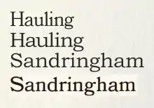
The direct ancestor of Bookmans were several fonts from around 1869 named "Old Style Antique" intended as a bold complement to the original Old Style face. "Antique" was a common name given to bolder typefaces of the time, now often called slab serifs, and identifies the aim of creating a complementary bolder design on the oldstyle model for uses such as emphasis and headings. However, the old style antique fonts also became used for extended body text use.[21][lower-alpha 5] Although Old Style Antique faces were bolder than Old Style, the difference was not great enough that they could not be used for body text.[5]
G. Willem Ovink, a historian of type, writes in his history of the style in 1971 that:[24][lower-alpha 6]
A bold Old Style was needed. This was indeed produced, almost simultaneously in Philadelphia and in Edinburgh [around 1869] in two distinct designs, both under the name of Old Style Antique. The term 'Antique' probably refers less to historical forms than to the boldness and the stubby serifs of the Egyptians [slab serifs], which were also called antiques. In the 1890s, when such faces as Caslon and Jenson had introduced the notion that all historic romans were bold, their colour and old-style basic forms made the old-style Antiques in the words of De Vinne...'now often used as fair substitutes for older styles of text types,' regardless of their unhistoric origin.[21] The course of development is difficult to trace.

These designs, for MacKellar, Smiths, & Jordan Co. in Philadelphia and Miller & Richard in Edinburgh were then copied and extended by a series of American type foundries, according to Ovink in a mixture of sizes based on the two foundries' designs. (During the period many fonts once created were copied by other foundries, in some cases probably illegally by electrotyping, making the evolution of styles complicated to track.) Ovink describes the MacKellar, Smiths, & Jordan Oldstyle Antique as being different for being slightly less bold and having an 'a' with a rounded top and a 'T' with slight curves on top.[24] Theodore De Vinne wrote of the style in 1902 that it was "in marked favour as a text letter for books intended to have more of legibility."[28] As Ovink notes, Old Style Antique was used by historically minded printers to emulate the solid style of fifteenth-century typefaces, and in particular to emulate the custom Golden Type used by William Morris at his Kelmscott Press.[26][3] Printers of the period noted the confusion of the apparently tautologous name,[5] one saying that it reminded him of a joke about a man who ordered café au lait with milk.[26]
By 1903 Old Style Antique was sold by American Type Founders under the new name of Bookman Old Style, with an added 'italic'. ATF did not offer a normal italic, instead featuring an oblique, or "sloped roman", in which the letters are simply slanted. Serif typefaces which use an oblique are now quite rare, but the style was relatively common for display typefaces in the nineteenth and early twentieth centuries. It was sold with some swash capitals and other letters. Although one critic described its swash letters in 1913 as "ridiculous", they would become a popular feature of revivals and derivatives.[5]
.jpg.webp)
Bookman was popular in twentieth-century American printing for its solid colour, wide characters and legibility: one 1946 review commented that it "can stand a lot of mauling".[29] Fine printers and those more interested in the pre-nineteenth century typefaces from which it descended, however, were less impressed by it, finding it dull for its wide, large lower-case and lack of elegance.[30][3] It was most popular in the USA: by the mid-twentieth century, all the Modernised Old Styles had become almost totally eclipsed in British printing except as a backup choice, partly as a result of the dominance of the British Monotype Corporation's extremely successful and well-promoted series of book faces and Linotype's similar series.[31] While John Betjeman liked the design for its association with hymn-books, and used it in several of his books to evoke this atmosphere, the slightly younger Philip Larkin described its use in a review of Betjeman's autobiography Summoned By Bells in terms suggesting that he found its use archaic and somewhat ridiculous.[32][33] In 1950 Monotype's marketing manager Beatrice Warde told an audience of Canadian printers that Bookman had not "been used in England in 20 years."[34] One 1959 British study of typefaces – albeit one connected to Monotype and carried out by the controversial Cyril Burt, later accused of fabricating research – described Monotype's Oldstyle Antique as "seldom used for ordinary book work" and treated it as a design most appropriate for books for children under 12.[35]
Chauncey H. Griffith of the Mergenthaler Linotype Company developed a revival for Linotype's hot metal typesetting system (which was named "Bookman"), and Monotype also offered one.[36][37][lower-alpha 7] (Linotype's has been digitised by Bitstream based on its design from this period form, making it one of the few digital versions not based on post-war versions.[39][40]) Other Old Style Antique releases were common in American printing during the nineteenth and twentieth centuries.

Phototypesetting period
.jpg.webp)
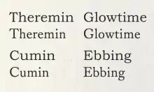
Many Bookman revivals appeared for phototypesetting systems in the 1960s and 1970s, often including an extensive repertoire of swash characters, meaning that the design is commonly associated with the graphic design of the period.[1] These large character repertoires took advantage of the new phototypesetting technology, which allowed characters to be stored on film or glass phototype master disks and printed at any desired size, rather than bulky metal type.[41] Letraset created one revival during this period.[42] The separation of type designs from the complex manufacturing process of metal type also allowed for easier cloning of typefaces, meaning that many fonts sold during the period were unauthorised copies or modifications of other companies' designs.
Mark Simonson, who has designed a revival of the Bookmans of this period, has commented on the most common version used in the 1960s:[43]
I have so far been unable to find out who designed and produced it. I think of it as the "Sixties Bookman." ... It’s closest to the larger sizes of ATF Bookman Oldstyle, but significantly bolder, with more contrast between the thicks and thins than other Bookmans and with smaller serifs...I’ve yet to see a credit for the designer or maker of this version. The best theory I have is that it was a custom font created for an ad campaign in the mid-sixties. Someone who had access to it made copies. And before long, every typesetting shop had it. Whatever the story is, this version of Bookman was everywhere. I had Sixties Bookman on rub-down type sheets when I was in high school in the early Seventies discovering type.
One of the most famous results of this period is the 1975 ITC's revival from which many modern versions are descended.
Type designer and lawyer Matthew Butterick has written that as a result of its use in this period Bookman "evokes the Ford administration. If fonts were clothing, this would be the corduroy suit."[1]
ITC Bookman
ITC Bookman is a revival designed by Ed Benguiat in 1975, for the International Typeface Corporation. Benguiat developed a full family of four weights plus complementary cursive designs: unlike previous Bookman versions, these are true italics in which the letters take on handwriting forms. Benguiat also drew a suite of swash and alternate characters for each of the members of the family. While Bookman's x-height was quite high already, this enlarges the lower-case even more, in the fashion of the period. Fonts for swash and alternate characters were eventually released in OpenType versions of the fonts,[44] or separately as ITC Bookman Swash.
ITC licensed the design to Adobe and Apple, guaranteeing its importance in digital printing by making it one of the core fonts of the PostScript page description language as part of the Adobe PostScript 3 Font Set.[43] (The weights licensed were Light, Light Italic, Demi, Demi Italic.)
Digitisations
Most digitisations of Bookman are based on the Bookman revivals of the 1960s and 1970s. An exception is Bitstream's digitisation of the Linotype Bookman of the 1930s.[39]
Because of ITC Bookman's status as a basic part of the Postscript standard, many modern Bookman revivals and variants were created as a "metrically identical" alternative, or copy it due to its popularity. These include 'Revival 711' by Bitstream, and 'BM' by Itek.
Monotype version

The current Monotype version of Bookman is called Monotype Bookman Old Style or marketed as Bookman Old Style. It was designed by Ong Chong Wah. It is based on earlier Lanston Monotype and ATF models, but again was redesigned to match the ITC version. It is bundled with many Microsoft products, making it one of the most commonly used versions of Bookman.[45]
In Monotype Bookman the italic was redrawn to be a true italic similar to ITC Bookman. Though the face's name includes the phrase 'Old Style', the near-vertical stress of the face places it more in the transitional classification. This version include support of Cyrillic, Greek, and extended Latin characters.
It was bundled with Microsoft Office products since version 4.3, except in Windows 7 Starter, and in TrueType Font Pack. A retail version of the font is also sold.[46]

Other Postscript clones
Other companies developed similar knockoff fonts matching ITC Bookman's metrics for PostScript compatibility.
URW++ donated their PostScript alternative, known as URW Bookman L, to the Ghostscript project as a free software replacement for the ITC version. It was further enhanced by the Polish GUST foundry as part of their TeX Gyre project and named Bonum.[47][48]
Jukebox Bookman
Jukebox Bookman is a revival of the original Bookman family, designed by Jason Walcott and originally published by Veer. Veer(Corbis) closed permanently in early 2016 but the Jukebox Bookman fonts continue to be offered online through other digital type vendors. [49]
This family includes two OpenType fonts, both Roman and Italic with all accompanying swash characters and alternates.
Bookmania (2011)
Bookmania is a revival of Bookman Oldstyle and the Bookmans of the 1960s, designed by Mark Simonson. The design was started from a custom font designed by Mark Simonson back in 2006, which was based on Bookman Bold Italic with Swash, and a Bookman Bold with Swash font designed by Miller & Richard (as credited by Letraset). The italic fonts were redesigned to include optical correction. Unlike the ITC and Monotype revivals, Simonson chose to use the obliques preferred by ATF, offering true italic characters as an alternate.
The family contains a large number of alternate characters, such as swashes and unicase characters.
Notes
- In Germany, Old Style Antique was called "Medieval-Egyptienne" - Medieval meaning antiqua type and Egyptienne meaning a bold serif font.
- As with Bookman itself, historically minded designers came to find this recut Old Style dull, following a practice of reverence for eighteenth-century art over that of the nineteenth. Stanley Morison commented "What in Caslon did not conform to Victorian ideas of typographical rectitude had been cast out. Even swash letters were not included. Eyes used to sharpness of cut and regularity of letter-width found both in Old Style."[10][11]
- Some sources credit the design of Oldstyle Antique to Phemister, but William E. Loy (who knew him) does not credit it to him in his obituary for Phemister and nor does Macmillan credit it directly to him.[12]
- Some confusion has occurred over this naming, with some using "old-style" to mean typefaces in the eighteenth-century and before, and others, including Miller and Richard, using it to mean revivals in the same style. This article follows Walter Tracy and others in using the term "modernised old style" to avoid confusion, although this phrase was not normal generally in the nineteenth century.[17][18]
- The mid-nineteenth century was a period in which the idea that a normal body text font should be sold with its own related bold had not fully evolved: it was common for printers to use an unrelated bolder serif font, then called "Clarendon" or "Antique" types, but now often called "slab serifs", to match their body text face.[22][23] So "Oldstyle Antique" signified a bold type with the letterforms of oldstyle typefaces.
- Note, however, that an unsigned article in "The Printing Art" of 1904 offered a quite different account saying that they were cut first in the 1850s by Phemister himself.[25] This description does not mention the original Old Style type at all, and so may be confused. In the absence of evidence for this account Ovink's conclusions are used in this article.
- Linotype had an "Old Style Antique" version with oblique before 1911.[38]
References
- Butterick, Matthew. "Bad Fonts". Practical Typography. Retrieved 29 October 2015.
- Neil Macmillan (2006). An A-Z of type designers. Yale University Press. p. 146. ISBN 0-300-11151-7. Retrieved 2009-08-21.
- Alexander S. Lawson (January 1990). Anatomy of a Typeface. David R. Godine Publisher. pp. 262–280. ISBN 978-0-87923-333-4.
- Bennett, Paul A. (1935). "On Recognising the Type-Faces". The Dolphin.
- Currier, E.R. (1913). "Intensive Typography". The Printing Art. 22 (3): 181–8. Retrieved 3 May 2017.
- Meggs, Philip B.; Carter, Rob (15 December 1993). Typographic Specimens: The Great Typefaces. John Wiley & Sons. p. 60. ISBN 978-0-471-28429-1.
- Arthur Judson Brewster; Herbert Hall Palmer (September 2001). Introduction to Advertising. The Minerva Group, Inc. p. 179. ISBN 978-0-89875-506-0.
- Quadrat (1907). "Discursions of a Retired Printer, No. 11". The Inland Printer. Retrieved 11 August 2017.
- Geist, Ellsworth (1920). "The Human Attributes of Type". Printers' Ink Monthly. Retrieved 11 August 2017.
- Stanley Morison (7 June 1973). A Tally of Types. CUP Archive. pp. 16–18. ISBN 978-0-521-09786-4.
- William S. Peterson (1991). The Kelmscott Press: A History of William Morris's Typographical Adventure. University of California Press. pp. 25-6, 89, 106. ISBN 978-0-520-06138-5.
- Loy, William (28 January 2011). "An excerpt from Nineteenth-Century American Designers & Engravers of Type". Oak Knoll. Retrieved 3 February 2017.
- Alastair Campbell; Alistair Dabbs (10 February 2014). Typography Pocket Essentials: The History and Principles of the Art. Octopus. pp. 113–8. ISBN 978-1-78157-155-2.
- Mosley, James. "Recasting Caslon Old Face". Type Foundry. Retrieved 1 August 2015.
- Johnson, Alfred F. (1931). "Old-Face Types in the Victorian Age" (PDF). Monotype Recorder. 30 (242): 5–14. Retrieved 3 February 2017.
- Hlasta, Stanley (1950). Printing Types and How to Use Them. pp. 55–6.
- Bill Bell (23 November 2007). Edinburgh History of the Book in Scotland, Volume 3: Ambition and Industry 1800-1880. Edinburgh University Press. pp. 27–30. ISBN 978-0-7486-2881-0.
- Alexander Nesbitt (1998). The History and Technique of Lettering. Courier Corporation. pp. 163–4. ISBN 978-0-486-40281-9.
- "Ronaldson Old Style". MyFonts. Canada Type. Archived from the original on 21 November 2015. Retrieved 27 November 2015.
- Quadrat (1906). "Discursions of a Retired Printer, No. 3". The Inland Printer. pp. 817–822. Retrieved 10 August 2017.
- Theodore Low De Vinne (1910). The practice of typography: a treatise on the processes of type-making, the point system, the names, sizes, styles and prices of plain printing types. Century Co. pp. 323–335.
- Tracy, Walter. Letters of Credit. pp. 65–6.
The other kind of secondary type, the related bold face, is a twentieth-century creation. Although the use of bold type for emphasis in text began when display advertising became a feature of the family magazines of the mid-nineteenth century, the bold types themselves were Clarendons, Ionics and Antiques quite unrelated to the old styles and moderns used for the text. As late as 1938 the Monotype Recorder, a distinguished British journal of typography, could say, "The 'related bold' is a comparatively new phenomenon in the history of type cutting."
- Mosley, James. "Comments on Typophile thread "Where do bold typefaces come from?"". Typophile. Archived from the original on 20 December 2016. Retrieved 16 December 2016.
For the record, the Clarendon type of the Besley foundry is indeed the first type actually designed as a 'related bold' – that is, made to harmonize in design and align with the roman types it was set with. It was registered in Britain in 1845.
- Ovink, G.W. (1971). "Nineteenth-century reactions against the didone type model - I". Quaerendo. 1 (2): 18–31. doi:10.1163/157006971x00301. Retrieved 20 February 2016.
- "Old Style Antique Type". The Printing Art. 3 (6): 181–. 1904. Retrieved 3 May 2017.
- William R. Johnston (22 September 1999). William and Henry Walters, the Reticent Collectors. JHU Press. pp. 105–7. ISBN 978-0-8018-6040-9.
- Gerald W. R. Ward (1987). The American Illustrated Book in the Nineteenth Century. Winterthur Museum. p. 182. ISBN 978-0-912724-17-1.
- Theodore Low De Vinne (1902). The Practice of Typography: A Treatise on Title-pages, with Numerousillustrations in Facsimile and Some Observations on the Early and Recent Printing of Books. Century Company. pp. 233–241. ISBN 9780838309353.
- Bookbinding & Book Production, Volumes 44-45. 1946. p. 80.
- The Inland Printer, Volume 73. 1924. p. 74.
The "higher critics" of typedom do not recognise the Bookman type face, but the practical fellows who keep the printing business alive - we refer particularly to the advertisers and their agents - think a lot of it.
- David Finkelstein (23 November 2007). Edinburgh History of the Book in Scotland, Volume 4: Professionalism and Diversity 1880-2000. Edinburgh University Press. pp. 122–149. ISBN 978-0-7486-2884-1.
- Peterson, William S. (2006). John Betjeman: A Bibliography. Clarendon Press. pp. 24–6. ISBN 978-0-19-818403-4.
- Philip Larkin (20 December 2012). Required Writing: Miscellaneous Pieces 1955-1982. Faber & Faber. pp. 120–2. ISBN 978-0-571-29497-8.
- @typographica (21 April 2020). ""Mrs. Warde voiced another critical observation of Canadian Printing. 'You people still consider Bookman & Century Schoolbook too seriously. They haven't been used in England for 20 years. We treat our readers as respected individuals!'" B: always selling" (Tweet) – via Twitter.
- A Psychological Study of Typography. CUP Archive. 1959. pp. 11, 30. GGKEY:L0XRUJA9NW4.
- "Lanston Monotype Bookman specimen" (PDF). Retrieved 27 November 2015.
- "Lanston Monotype Bookman specimen b" (PDF). Retrieved 27 November 2015.
- "This Month's Linotype Faces - Old Style Antique". Linotype Bulletin. 1911. Retrieved 11 August 2017.
- "Bookman Linotype/Bitstream". MyFonts. Bitstream. Retrieved 27 November 2015.
- Hardwig, Florian (11 November 2013). "The Instructor Primary Science Concept Charts". Fonts in Use. Retrieved 4 February 2017.
- Lurie-Terrell, Joshua (8 January 2015). "Famous Manwich Recipes 1971". Fonts In Use. Retrieved 27 November 2015.
- Priddey, Neil (22 March 2015). "An Old Raincoat Won't Ever Let You Down by Rod Stewart". Fonts In Use. Retrieved 27 November 2015.
- Simonson, Mark. "Bookmania specimen pdf". Mark Simonson Studio. Retrieved 27 November 2015.
- What's Hot From ITC: January 2006
- Simonson, Mark. "Monotype's Other Arials". marksimonson.com. Retrieved 21 August 2014.
- "Bookman Old Style". MyFonts. Monotype. Retrieved 3 February 2017.
- "URW font ttf conversions". Ghostscript. Archived from the original on 2015-09-19. Retrieved 22 September 2015.
- "The TeX Gyre (TG) Collection of Fonts — GUST Web Presence". Archived from the original on 2023-02-02. Retrieved 2008-10-01.
- "Jukebox Bookman". MyFonts. Retrieved 27 November 2015.
External links
- ATF's 1912 specimen book. Many sample settings including ads and newspaper designs.
- ATF's 1923 specimen book, their legendary last major specimen before the Depression.
- Bookman JF
- ITC Bookman by Adobe Font Family - by Edward Benguiat
- ITC Bookman/ITC Tabula
- Microsoft Typography page
- TeX Gyre Bonum, variant based on URW bookman L
- Early Monotype Bookman metal type specimen - completely unlike modern Monotype Bookman which copies aspects of the ITC Bookman design.
