Didone (typography)
Didone (/diˈdoʊni/) is a genre of serif typeface that emerged in the late 18th century and was the standard style of general-purpose printing during the 19th century. It is characterized by:
- Narrow and unbracketed (hairline) serifs. (The serifs have a nearly constant width along their length.)
- Vertical orientation of weight axes. (The vertical strokes of letters are thick.)
- Strong contrast between thick and thin lines. (Horizontal parts of letters are thin in comparison to the vertical parts.)
- Some stroke endings show ball terminals. (Many lines end in a teardrop or circle shape, rather than a plain wedge-shaped serif.)
- An unornamented, "modern" appearance.
.jpg.webp)
The term "Didone" is a 1954 coinage, part of the Vox-ATypI classification system. It amalgamates the surnames of the famous typefounders Firmin Didot and Giambattista Bodoni, whose efforts defined the style around the beginning of the nineteenth century.[1] The category was known in the period of its greatest popularity as modern or modern face, in contrast to "old-style" or "old-face" designs, which date to the Renaissance period.
History

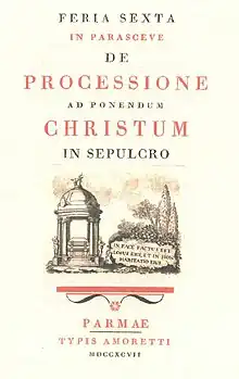
Didone types were developed by printers including Firmin Didot, Giambattista Bodoni and Justus Erich Walbaum, whose eponymous typefaces, Bodoni, Didot, and Walbaum, remain in use today.[2][3] Their goals were to create more elegant designs of printed text, developing the work of John Baskerville in Birmingham and Fournier in France towards a more extreme, precise design with intense precision and contrast, that could show off the increasingly refined printing and paper-making technologies of the period.[4][5] (Lettering along these lines was already popular with calligraphers and copperplate engravers, but much printing in western Europe up to the end of the eighteenth century used typefaces designed in the sixteenth century or relatively similar, conservative designs.[6]) These trends were also accompanied by changes to page layout conventions and the abolition of the long s.[7][8][9][10][11][12] Typefounder Talbot Baines Reed, speaking in 1890 called the new style of the early nineteenth century "trim, sleek, gentlemanly, somewhat dazzling".[13] Their designs were popular, aided by the striking quality of Bodoni's printing, and were widely imitated.
In Britain and America, the lasting influence of Baskerville led to the creation of types such as the Bell, Bulmer and Scotch Roman designs, in the same spirit as Didone fonts from the continent but less geometric; these like Baskerville's type are often called transitional serif designs.[14][lower-alpha 1] Later developments of the latter class have been called Scotch Modern and show increasing Didone influence.[16]
Didone typefaces came to dominate printing by the middle of the nineteenth century, although some "old style" faces continued to be sold and new ones developed by typefounders.[17] From around the 1840s onwards, interest began to develop among artisanal printers in the typefaces of the past.[18][19][20][21]
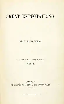
Many historians of printing have been critical of the later Didone faces popular in general-purpose printing of the nineteenth century, especially following the reaction of the twentieth century against Victorian styles of art and design. Nicolete Gray has described later Didone typefaces as depressing and unpleasant to read: "the first modern faces designed around 1800 and 1810 are charming; neat, rational and witty. But from that time onwards nineteenth-century book types grow more and more depressing; the serifs grow longer, the ascenders and descenders grow longer, the letters crowd together; the normal mid nineteenth-century book is typographically dreary. The Victorians lost the idea of good type to read."[22] Historian G. Willem Ovink has described late nineteenth-century Didone types as "the most lifeless, regular types ever seen".[23] Stanley Morison of the printing equipment company Monotype, a leading supporter of the revival of "old-style" and transitional typefaces, wrote in 1937 of the eighteen-fifties being a time of "batteries of bold, bad faces" and said that "the types cut between 1810 and 1850 represent the worst that have ever been."[24][25]
Display derivatives


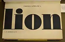
Driven by the increasing popularity of advertising, whether printed or custom lettering, the beginning of the nineteenth century saw the development of bold lettering and the arrival of types of letterform that were not simply larger versions of body text faces.[22][28][29][30][31][32][33] These included the sans-serif, slab-serif and new styles of bold blackletter, but also Didone-style letters that emboldened or decorated the roman type form.[34][35] Known as 'fat faces', these showed magnified contrast, keeping the thin parts of the letter slender while magnifying the vertical strokes massively.[36][37][38][39][40] Other "effect" typefaces were sold such as patterned letterforms which added a pattern to the bold parts of the fat face letter, and the pre-existing inline types with a line inside the type.[41][22]
Displacement
Didone fonts began to decline in popularity for general use, especially in the English-speaking world, around the end of the nineteenth century. The rise of the slab serif and sans-serif genres displaced fat faces from much display use, while the revival of interest in "old-style" designs reduced its use in body text. This trend, influenced by the Arts and Crafts movement and antiquarian-minded printers such as William Morris, rejected austere, classical designs of type, ultimately in favour of gentler designs.[21][17] Some of these were revivals of typefaces from between the Renaissance and the late eighteenth century such as revivals (with varying levels of faithfulness to the originals) of the work of Nicolas Jenson, William Caslon's "Caslon" typefaces and others such as Bembo and Garamond. Others such as "Old Styles" from Miller and Richard, Goudy Old Style and Imprint were new designs on the same pattern.[42]
An early example of the distaste some printers had for the modern type style was French printer Louis Perrin, who would eventually commission some new typeface designs on a traditional model.[43][44] He wrote in 1855 (tr. James Mosley):
You ask me what kind of whim leads me to revive types of the sixteen century today.... I often have to reprint old poetry [from the sixteenth century] and this task invariably makes me oddly uneasy. I cannot recognise in my proofs the verses … our present day punches, which are so precise, so correct, so regularly aligned, so mathematically symmetrical ... no doubt have their merits, but I should prefer to see them kept for printing reports on the railway.[39]
A revival of interest in the old styles of letter in Britain around 1870 was, however, criticised by master signpainter James Callingham in his contemporary textbook on the art:
It is ... marvellous to think that, after the much desiderated correction [to letters] had been applied, an attempt should recently have been made to introduce these old irregular letters again to the public notice, for the vagaries of fashion have of late brought into use in the printing trade several kinds of old-faced types ... and the infection has in some degree been caught by the sign-writer ... we have thus, on the one hand, a hard, an irregular and unfinished letter; and on the other, a graceful, symmetrical and highly finished letter ... there is some indication that this absurdity, like all fashions that have their birth in bad taste, is happily passing away, and the modern letter is again asserting its superiority. It has always been the case in the arts that, after periods of extravaganza and bizzarerie, there has been a recurrence to sound taste. Positive retrogession is against nature and any tendency in this direction will most assuredly correct itself. The adherents of the old irregular alphabets, which were made so because scarcely anyone was capable of making them better, might just as reasonably advocate a return to the rough and unplaned machinery of the first locomotive steam engines, taking as their model the old "Puffing Billy", now so carefully preserved in the Patent Museum at South Kensington.[45]
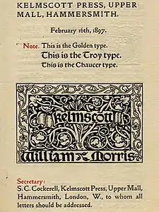
One influential example in the late nineteenth century was William Morris's Kelmscott Press, which commissioned new custom fonts such as his Golden Type on medieval and early Renaissance models. Many fine press printers imitated his model, and while some printers such as Stanley Morison in the twentieth century found his work excessive, it was heavily imitated. Talbot Baines Reed in 1890, shortly before his company cast type for Morris, commented on a desire among typefounders to move back to earlier models: "types appeared leaning this way and that, flowery and stringy, skeleton and fat, round and square ... until it became almost a merit that the original shape was barely recognisable. I am not describing a thing of the past. Herod is out-heroded every week in some new fancy which calls itself a letter ... I do not deny that may of our modern fancy letters are graceful ... nor am I bold enough to suggest that at this time of day they can be dispensed with. But I admit to some misgivings at the lengths to which the craze is carrying us, and the almost total abandonment of traditional models which it involves."[13]
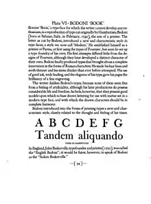
Frederic Goudy, an Arts and Crafts movement-inspired printer turned type designer, had similar reservations about the lettering style. While he mentioned Bodoni in his book Elements of Lettering, he wrote that it was a style "for which the writer cannot develop any enthusiasm", adding: "his pages [had] the brilliance of a fine engraving. The writer dislikes Bodoni's types, because none of them seem free from a feeling of artificiality"[46] As an experiment in this period, Goudy attempted to 'redeem' Didone capitals for titling purposes by leaving a white line in the centre of the thick strokes. He hoped this design, Goudy Open, would leave a lighter colour (density of ink) on the paper.[46][47]
Nonetheless, Didone designs have remained in use, and the genre is recognised on the VOX-ATypI classification system of typefaces and by the Association Typographique Internationale (AtypI).[48] The genre remains particularly popular for general-purpose use in the printing of Greek (the Didot family were among the first to set up a printing press in the newly independent country).[49] It also is often seen in mathematics, as the open-source standard mathematical typesetting programmes TeX and LaTeX use the Computer Modern family as default. The system's creator, Donald Knuth, deliberately created the system with the intention of producing an effect inspired by the "classic style" of nineteenth-century scientific printing with a family based on an American Monotype Company Modern face.[50][51][52][53]
Many newspapers were founded in the nineteenth century, and many newspaper typefaces have remained rooted in nineteenth-century models of type. Linotype's popular Legibility Group of the 1930s, for many years the model for most newspaper printing worldwide, remained based on this model but toughened-up to increase clarity.[54][55] American Type Founders' Bodoni typeface, introduced around 1907-1911, became hugely popular for news headlines.[56][57] Writing in 2017, digital font designer Tobias Frere-Jones wrote that he had kept his font design for The Wall Street Journal based on the nineteenth-century model because it "had to feel like the news."[58]
Among popular faces in modern use, the typeface family Century is inspired by later American Didone designs, although compared to many in the Didone genre it has quite a low level of stroke contrast, suitably for its purpose of high legibility in body text. Typefaces of the period have often been revived since for cold type and digital composition, while modern typefaces along the same lines include Filosofia and the open-source Computer Modern. Some later Didone families have focused on subgenres of the period, such as Surveyor, inspired by labels on maps. Fat face typefaces remained popular for display use in the mid-twentieth century with new designs such as Monotype's Falstaff and Morris Fuller Benton's Ultra Bodoni; Matthew Carter's Elephant is a more recent version.[37][59][40]
Usage

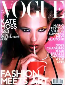
In print, Didone fonts are often used on high-gloss magazine paper for magazines such as Harper's Bazaar, on which the paper retains the detail of their high contrast well, and for whose image a crisp, 'European' design of type may be considered appropriate.[60] They are used more often for general-purpose body text, such as book printing, in Europe.
The effective use of digital Didone typefaces poses unique challenges. While they can look very elegant due to their regular, rational design and fine strokes, a known effect on readers is 'dazzle', where the thick verticals draw the reader's attention and cause them to struggle to concentrate on the other, much thinner strokes that define which letter is which.[11][61][62] For this reason, using the right optical size of digital font has been described as particularly essential with Didone designs.[63] Fonts to be used at text sizes will be sturdier designs with thicker 'thin' strokes and serifs (less stroke contrast) and more space between letters than on display designs, to increase legibility.[64][65] Optical sizes were a natural requirement of printing technology at the time of Didone typefaces' first creation in metal type, since each size of metal type would be custom-cut, but declined as the pantograph, phototypesetting and digital fonts made printing the same font at any size simpler; a revival has taken place in recent years.[66][67] French designer Loïc Sander has suggested that the dazzle effect may be particularly common in designs produced in countries where designers are unfamiliar with how to use them effectively and may choose Didone fonts designed for headings.[68] Many modern Didone digital revivals intended for professional printing, such as Parmagiano, ITC Bodoni and Hoefler & Frere-Jones' Didot and Surveyor, have a range of optical sizes, but this is less common on default computer fonts.[68][69][70][71] Among default Didone fonts on computer systems, Century Schoolbook on Windows is oriented towards body text use, while the Didot revival on OS X was specifically intended for display use and not for body text.
Derivatives

The shape of nineteenth-century Didone designs, with their narrow apertures, has been suggested as a major influence on many early sans-serif fonts such as Akzidenz-Grotesk and its derivatives such as Helvetica, developed in Europe some years after their introduction.[72] An example of this influence is the narrow apertures of these designs, in which strokes on letters such as a and c fold up to become vertical, similar to what is seen on Didone serif fonts.[73]
Matthew Carter's Scotch Roman-inspired computer font Georgia is notable as an extremely distant descendant of Didone typefaces. In Georgia, the stroke contrast is greatly reduced and the bold made much bolder than normal in order for the design to render well on a low-resolution computer monitor, but the general letter shape and ball terminals of Scotch Roman designs are preserved. He also developed the Scotch Roman revival Miller for print use.[74] Given these unusual design decisions, Matthew Butterick, an expert on document design, recommended that organizations using Georgia for onscreen display license Miller to achieve a complementary, more balanced reading experience on paper.[75][76]
Reverse-contrast styles
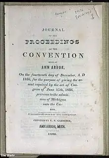
An eccentric method of reworking and parodying Didone typefaces has long been to invert the contrast, making the thin strokes thick and the thick strokes thin.[77][78] First seen around 1821 in Britain and occasionally revived since, these are often called reverse-contrast fonts. They effectively become slab serif designs because of the serifs becoming thick. In the 19th century, these designs were called Italian because of their exotic appearance, but this name is problematic since the designs have no clear connection with Italy; they do slightly resemble capitalis rustica Roman writing, although this may be a coincidence. They were also called Egyptian, an equally inauthentic term applied to slab serifs of the period.[79][80]
Intended as attention-grabbing novelty display designs more than as serious choices for body text, within four years of their introduction the printer Thomas Curson Hansard had described them as 'typographic monstrosities'.[81] Nonetheless, somewhat toned-down derivatives of this style persisted in popular use throughout the nineteenth century, and are commonly associated with 'wild west' printing on posters.[82][83] They ultimately became part of the Clarendon genre of slab-serif typefaces, and these later designs are often called French Clarendon designs.[84]
Notes
- Note that the classification of typefaces as "transitional" is somewhat nebulous. Eliason (2015) provides a modern assessment of the limitations of this classification.[15]
- The specific Clarendon face shown is actually the Haas Clarendon of the 1950s, but it is not too dissimilar to ones of the nineteenth century.
References
- Phil Baines; Andrew Haslam (2005). Type & Typography. Laurence King Publishing. pp. 50–5. ISBN 978-1-85669-437-7.
- Tracy, Walter (1985). "Didot: an honoured name in French typography". Bulletin of the Printing Historical Society (14): 160–166.
- Coles, Stephen. "The Didot You Didn't Know". Typographica. Retrieved 29 October 2017.
- Chisholm, Hugh, ed. (1911). . Encyclopædia Britannica. Vol. 4 (11th ed.). Cambridge University Press. pp. 111–112.
- Rines, George Edwin, ed. (1920). . Encyclopedia Americana.
- Johnson, A. F. (1930). "The Evolution of the Modern-Face Roman". The Library. s4-XI (3): 353–377. doi:10.1093/library/s4-XI.3.353.
- Mosley, James. "Long s". Type Foundry. Retrieved 11 August 2015.
- Wigglesworth, Bradford, Lieber (1830). Encyclopædia Americana - Didot. Carey, Lea & Carey.
{{cite book}}: CS1 maint: multiple names: authors list (link) - Bodoni, Giambattista. Columbia Electronic Encyclopedia, 6th Edition [serial online]. January 2009:1-1. Available from: Academic Search Premier, Ipswich, MA. Accessed August 7, 2009.
- Shaw, Paul (10 February 2011). "Overlooked Typefaces". Print magazine. Retrieved 2 July 2015.
- Cees W. De Jong, Alston W. Purvis, and Friedrich Friedl. 2005. Creative Type: A Sourcebook of Classical and Contemporary Letterforms. Thames & Hudson. (223)
- Osterer, Heidrun; Stamm, Philipp (8 May 2014). Adrian Frutiger – Typefaces: The Complete Works. p. 362. ISBN 978-3038212607.
- Reed, Talbot Baines (1890). "Old and New Fashions in Typography". Journal of the Society of Arts. 38: 527–538. Retrieved 17 September 2016.
- Phinney, Thomas. "Transitional & Modern Type Families". Graphic Design and Publishing Centre. Archived from the original on 19 October 2015. Retrieved 10 August 2015.
- Eliason, Craig (October 2015). ""Transitional" Typefaces: The History of a Typefounding Classification". Design Issues. 31 (4): 30–43. doi:10.1162/DESI_a_00349. S2CID 57569313.
- Shinn, Nick. "Modern Suite" (PDF). Shinntype. Archived from the original (PDF) on 25 February 2021. Retrieved 11 August 2015.
- Mosley, James. "Recasting Caslon Old Face". Type Foundry. Retrieved 1 August 2015.
- Ovink, G.W. (1971). "Nineteenth-century reactions against the didone type model - I". Quaerendo. 1 (2): 18–31. doi:10.1163/157006971x00301. Retrieved 20 February 2016.
- Ovink, G.W. (1971). "Nineteenth-century reactions against the didone type model - II". Quaerendo. 1 (4): 282–301. doi:10.1163/157006971x00239. Retrieved 20 February 2016.
- Ovink, G.W. (1 January 1972). "Nineteenth-century reactions against the didone type model-III". Quaerendo. 2 (2): 122–128. doi:10.1163/157006972X00229.
- Johnson, A.F. (1931). "Old-Face Types in the Victorian Age" (PDF). Monotype Recorder. 30 (242): 5–15. Retrieved 14 October 2016.
- Gray, Nicolete (1976). Nineteenth-century Ornamented Typefaces.
- Ovink, G. Willem (1973). "Review: Jan van Krimpen, A Letter to Philip Hofer". Quaerendo: 239–242. doi:10.1163/157006973X00237.
- Morison, Stanley (1937). "Type Designs of the Past and Present, Part 4". PM: 61–81. Archived from the original on 2021-07-24. Retrieved 4 June 2017.
- Morison, Stanley (1937). "Type Designs of the Past and Present, Part 3". PM: 17–81. Archived from the original on 2017-09-04. Retrieved 4 June 2017.
- Shaw, Paul. "By the Numbers no. 2—Fat Faces in New England Cemeteries". Paul Shaw Letter Design. Retrieved 13 May 2020.
- Untitled specimen issued by William Caslon IV. London. c. 1814. Retrieved 5 March 2019.
- Frere-Jones, Tobias. "Scrambled Eggs & Serifs". Frere-Jones Type. Retrieved 23 October 2015.
- Twyman, Michael. "The Bold Idea: The Use of Bold-looking Types in the Nineteenth Century". Journal of the Printing Historical Society. 22 (107–143).
- Mosley, James (1999). The Nymph and the Grot: the Revival of the Sanserif Letter. London: Friends of the St Bride Printing Library. pp. 1–19. ISBN 9780953520107.
- Mosley, James. "The Nymph and the Grot: an Update". Typefoundry blog. Retrieved 12 December 2015.
- Mosley, James (1963). "English Vernacular". Motif. 11: 3–56.
- Mosley, James. "English vernacular (2006)". Type Foundry (blog). Retrieved 21 October 2017.
- Eskilson, Stephen J. (2007). Graphic design : a new history. New Haven: Yale University Press. p. 25. ISBN 9780300120110.
- Hoefler, Jonathan. "Didot history". Hoefler & Frere-Jones. Retrieved 11 August 2015.
- Phinney, Thomas. "Fat faces". Graphic Design and Publishing Centre. Archived from the original on 9 October 2015. Retrieved 10 August 2015.
- Kennard, Jennifer (6 February 2014). "The Story of Our Friend, the Fat Face". Fonts in Use. Retrieved 11 August 2015.
- Paul Shaw (April 2017). Revival Type: Digital Typefaces Inspired by the Past. Yale University Press. pp. 121–2. ISBN 978-0-300-21929-6.
- Mosley, James (2003). "Reviving the Classics: Matthew Carter and the Interpretation of Historical Models". In Mosley, James; Re, Margaret; Drucker, Johanna; Carter, Matthew (eds.). Typographically Speaking: The Art of Matthew Carter. Princeton Architectural Press. pp. 35–6, 61, 84, 90. ISBN 9781568984278. Retrieved 30 January 2016.
- Johnson, Alfred F. (1970). "Fat Faces: Their History, Forms and Use". Selected Essays on Books and Printing. pp. 409–415.
- Mosley, James. "The Typefoundry of Vincent Figgins, 1792-1836". Motif (1): 29–36.
- Lawson, A. (1990). Anatomy of a typeface. Boston: Godine, p.200.
- Devroye, Luc. "Louis Perrin". Type Design Information. Retrieved 20 February 2016.
- Savoie, Alice. "Louize - typeface review". Typographica. Retrieved 20 February 2016.
- Callingham, James (1871). Sign Writing and Glass Embossing.
- Goudy, Frederic (1922). Elements of Lettering. New York: Mitchell Kennerley. pp. 34–5 & 40. Retrieved 3 September 2015.
- "LTC Goudy Open". LTC. Myfonts. Retrieved 26 August 2015.
- Campbell 2000, p. 173
- Leonidas, Gerry. "A primer on Greek type design". Gerry Leonidas/University of Reading. Archived from the original on 4 January 2017. Retrieved 14 May 2017.
- John D. Berry, ed. (2002). Language Culture Type: International Type Design in the Age of Unicode. ATypI. pp. 82–4. ISBN 978-1-932026-01-6.
- "GFS Didot". Greek Font Society. Archived from the original on 2 March 2016. Retrieved 10 August 2015.
- Knuth, Donald (1986). "Remarks to Celebrate the Publication of Computers & Typesetting" (PDF). TUGboat. 7 (2): 95–8. Retrieved 24 September 2015.
- Knuth, Donald. "Commemorative lecture of the Kyoto Prize, 1996" (PDF). Kyoto Prize. Archived from the original (PDF) on 27 January 2018. Retrieved 18 August 2018.
- Hutt, Allen (1973). The Changing Newspaper: typographic trends in Britain and America 1622-1972 (1. publ. ed.). London: Fraser. pp. 100–2 etc. ISBN 9780900406225.
- Tracy, Walter. Letters of Credit. pp. 82, 194–195.
- "ATF Bodoni". Museo Bodoniano.
- Hutt, Allen. Newspaper Design. pp. 109–115.
- Frere-Jones, Tobias. "Decompiled and Remixed History". Frere-Jones Type. Retrieved 13 October 2017.
- Horn, Frederick A (1936). "Type Tactics No. 4: Heavy Roman Types". Commercial Art & Industry: 242–245. Retrieved 5 September 2018.
- "HFJ Didot introduction". Hoefler & Frere-Jones. Retrieved 10 August 2015.
- Berkson, William. "Reviving Caslon, Part 2". I Love Typography. Retrieved 21 September 2014.
- Katz, Joel (2012). Designing information : human factors and common sense in information design. Hoboken, NJ: Wiley. p. 140. ISBN 9781118420096.
- Coles, Stephen. "Trianon review". Identifont. Retrieved 10 August 2015.
- "HFJ Didot". Hoefler & Frere-Jones. Retrieved 10 August 2015.
- Sowersby, Kris. "Why Bembo Sucks". Retrieved 30 June 2015.
- Ahrens and Mugikura. "Size-specific Adjustments to Type Designs". Just Another Foundry. Retrieved 21 November 2014.
- Coles, Stephen. "Book Review: Size-specific Adjustments to Type Designs". Typographica. Retrieved 21 November 2014.
- Sander, Loïc. "Parmigiano review". Typographica. Retrieved 10 August 2015.
- Twemlow, Alice. "Forensic Types". Eye Magazine. Retrieved 6 October 2014.
- "Surveyor overview". Hoefler & Frere-Jones. Retrieved 11 August 2015.
- McNaughton, Melanie (December 2010). "Martha Stewart's Graphic Design for Living". Bridgewater Review. Retrieved 7 October 2014.
- My Type Design Philosophy by Martin Majoor
- Spiekermann, Erik. "Helvetica Sucks". Spiekermann blog. Retrieved 15 July 2015.
- Middendorp, Jan. "Matthew Carter interview". MyFonts. Monotype. Retrieved 11 July 2015.
- Butterick, Matthew. "Miller". Archived from the original on 2015-06-23.
- "Miller". Font Bureau. Retrieved 11 July 2015.
- Barnes & Schwarz. "Type Tuesday". Eye. Retrieved 10 August 2015.
- Devroye, Luc. "Henry Caslon". Retrieved 10 August 2015.
- Bilak, Peter. "Beauty and Ugliness in Type design". I love typography. Retrieved 10 August 2015.
- De Vinne, Theodore Low, The Practice of Typography, Plain Printing Types, The Century Co., N.Y.C., 1902, p. 333.
- Hansard, Thomas Carson (2003). Typographia : an historical sketch of the origin and progress of the art of printing. Bristol: Thoemmes. ISBN 1843713659.
- Provan, Archie, and Alexander S. Lawson, 100 Type Histories (volume 1), National Composition Association, Arlington, Virginia, 1983, pp. 20-21.
- "P.T. Barnum". MyFonts.
- Challand, Skylar. "Know your type: Clarendon". IDSGN. Retrieved 13 August 2015.
Further reading
- Valerie Lester, Giambattista Bodoni: His Life and His World (2015)
- Sébastien Morlighem, The 'modern face' in France and Great Britain, 1781-1825: typography as an ideal of progress (thesis, University of Reading, 2014), download link
- T. M. Cleland, "Giambattista Bodoni of Parma". Boston, Society of Printers. 1916. (1916)
External links
Period specimen books:
- Manuale Tipografico of Bodoni's types (1818, published posthumously by his wife), at Rare Book Room
- Specimen of Printing Types by Vincent Figgins, Letter Founder - the specimen book of London typefounder Vincent Figgins, 1834


