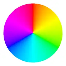
Color wheel
A Colour wheel or color circle[1] is an abstract illustrative organization of color hues around a circle, which shows the relationships between primary colors, secondary colors, tertiary colors etc.

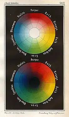
Some sources use the terms color wheel and color circle interchangeably;[2][3] however, one term or the other may be more prevalent in certain fields or certain versions as mentioned above. For instance, some reserve the term color wheel for mechanical rotating devices, such as color tops, filter wheels or the Newton disc. Others classify various color wheels as color disc, color chart, and color scale varieties.[4]
History
In his book Opticks, Isaac Newton presented a color circle to illustrate the relations between these colors.[5] The original color circle of Isaac Newton showed only the spectral hues and was provided to illustrate a rule for the color of mixtures of lights, that these could be approximately predicted from the center of gravity of the numbers of "rays" of each spectral color present (represented in his diagram by small circles).[6] The divisions of Newton's circle are of unequal size, being based on the intervals of a Dorian musical scale.[7] Most later color circles include the purples, however, between red and violet, and have equal-sized hue divisions.[8] Color scientists and psychologists often use the additive primaries, red, green, and blue; and often refer to their arrangement around a circle as a color circle as opposed to a color wheel.[9]
Thomas Young postulated that the eye contains receptors that respond to three different primary sensations, or spectra of light. James Clerk Maxwell showed that all hues, and almost all colors, can be created from three primary colors such as red, green, and blue, if they are mixed in the right proportions. Goethe's Theory of Colours provided the first systematic study of the physiological effects of color (1810). His observations on the effect of opposed colors led him to a symmetric arrangement of his color wheel anticipating Ewald Hering's opponent color theory (1872).
... for the colours diametrically opposed to each other ... are those that reciprocally evoke each other in the eye.
— Goethe, Theory of Colours
Colors of the color wheel
Trichromatic model
Most color wheels are based on three primary colors, three secondary colors, and the six intermediates formed by mixing a primary with a secondary, known as tertiary colors, for a total of 12 main divisions; some add more intermediates, for 24 named colors. They make use of the trichromatic model of color.
Subtractive
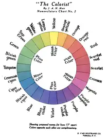
The typical artists' paint or pigment color wheel includes the blue, red, and yellow primary colors. The corresponding secondary colors are green, orange, and violet or purple. The tertiary colors are green-yellow, yellow-orange, orange-red, red-violet/purple, purple/violet-blue and blue-green.
Non-digital visual artists typically use red, yellow, and blue primaries (RYB color model) arranged at three equally spaced points around their color wheel.[10] Printers and others who use modern subtractive color methods and terminology use magenta, yellow, and cyan as subtractive primaries. Intermediate and interior points of color wheels and circles represent color mixtures. In a paint or subtractive color wheel, the "center of gravity" is usually (but not always[11]) black, representing all colors of light being absorbed.
Additive
A color wheel based on RGB (red, green, blue) additive primaries has cyan, magenta, and yellow secondaries. Alternatively, the same arrangement of colors around a circle can be described as based on cyan, magenta, and yellow subtractive primaries, with red, green, and blue being secondaries. Sometimes a RGV (red, green, violet) triad is used instead. In an additive color circle, the center is white or gray, indicating a mixture of different wavelengths of light (all wavelengths, or two complementary colors, for example).
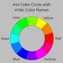
The HSL and HSV color spaces are simple geometric transformations of the RGB cube into cylindrical form. The outer top circle of the HSV cylinder – or the outer middle circle of the HSL cylinder – can be thought of as a color wheel. There is no authoritative way of labelling the colors in such a color wheel, but the six colors which fall at the corners of the RGB cube are given names in the X11 color list, and are named keywords in HTML.[12]
Opponent process model
Some color wheels are based on the four opponent process colors - red, yellow, blue and green. This includes those of the Natural Color System.
The color circle and color vision
 sRGB rendering of the spectrum of visible light | |||
|---|---|---|---|
| Color | Wavelength (nm) |
Frequency (THz) |
Photon energy (eV) |
| 380–450 | 670–790 | 2.75–3.26 | |
| 450–485 | 620–670 | 2.56–2.75 | |
| 485–500 | 600–620 | 2.48–2.56 | |
| 500–565 | 530–600 | 2.19–2.48 | |
| 565–590 | 510–530 | 2.10–2.19 | |
| 590–625 | 480–510 | 1.98–2.10 | |
| 625–750 | 400–480 | 1.65–1.98 | |
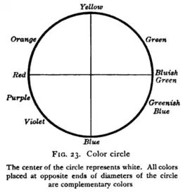
A color circle based on spectral wavelengths appears with red at one end of the spectrum and is 100% mixable violet at the other. A wedge-shaped gap represents colors that have no unique spectral frequency. These extra-spectral colors, the purples, form from an additive mixture of colors from the ends of the spectrum.
In normal human vision, wavelengths of between about 400 nm and 700 nm are represented by this incomplete circle, with the longer wavelengths equating to the red end of the spectrum. Complement colors are located directly opposite each other on this wheel. These complement colors are not identical to colors in pigment mixing (such as are used in paint), but when lights are additively mixed in the correct proportions appear as a neutral grey or white.[13]
The color circle is used for, among other purposes, illustrating additive color mixture. Combining two colored lights from different parts of the spectrum will produce a third color that appears like a light from another part of the spectrum, even though dissimilar wavelengths are involved. This type of color matching is known as metameric matching.[14] Thus, a combination of green and red light will produce the color yellow in apparent hue. The newly formed color lies between the two original colors on the color circle.
Objects may be viewed under a variety of different lighting conditions. The human visual system is able to adapt to these differences by chromatic adaptation. This aspect of the visual system is relatively easy to mislead, and optical illusions relating to color are therefore a common phenomenon. The color circle is a useful tool for examining these illusions.
Arranging spectral colors in a circle to predict admixture of light stems from work by Sir Isaac Newton. Newton's calculation of the resulting color involves three steps: First, mark on the color circle the constituent colors according to their relative weight. Second, find the barycenter of these differently weighted colors. Third, interpret the radial distance (from the center of the circle to the barycenter) as the saturation of the color, and the azimuthal position on the circle as the hue of the color. Thus, Newton's color circle is a predecessor of the modern, horseshoe-shaped CIE color diagram.
The psychophysical theory behind the color circle dates to the early color triangle of Thomas Young, whose work was later extended by James Clerk Maxwell and Hermann von Helmholtz.
Color wheels and paint color mixing
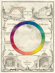
There is no straight-line relationship between colors mixed in pigment, which vary from medium to medium. With a psychophysical color circle, however, the resulting hue of any mixture of two colored light sources can be determined simply by the relative brightness and wavelength of the two lights.[14] A similar calculation cannot be performed with two paints. As such, a painter's color wheel is indicative rather than predictive, being used to compare existing colors rather than calculate exact colors of mixtures. Because of differences relating to the medium, different color wheels can be created according to the type of paint or other medium used, and many artists make their own individual color wheels. These often contain only blocks of color rather than the gradation between tones that is characteristic of the color circle.[15]
Color wheel software
A number of interactive color wheel applications are available both on the Internet and as desktop applications. These programs are used by artists and designers for picking colors for a design.
Color schemes

In color theory, a color scheme is the choice of colors used in design for a range of media. For example, the use of a white background with black text is an example of a common default color scheme in web design.
Color schemes are logical combinations of colors on the color wheel. Color schemes are used to create style and appeal. Colors that create an aesthetic feeling together commonly appear together in color schemes. A basic color scheme uses two colors that look appealing together. More advanced color schemes involve several colors in combination, usually based around a single color—for example, text with such colors as red, yellow, orange and light blue arranged together on a black background in a magazine article. Color schemes can also contain different shades of a single color; for example, a color scheme that mixes different shades of green, ranging from very light (almost white) to very dark.
Complementary colors are two colors directly across from each other; for example, red and green are complementary colors. Tetradic color palettes use four colors, a pair of complementary color pairs. For example, one could use yellow, purple, red, and green. Tetrad colors can be found by putting a square or rectangle on the color wheel. An analogous color scheme is made up of colors next to each other on the wheel. For example, red, orange, and yellow are analogous colors. Monochromatic colors are different shades of the same color. For example, light blue, indigo, and cyan blue. Complementary colors are colors across from each other on a color wheel. For example, blue and orange. Triadic colors are colors that are evenly across from each other, in a triangle over the color wheel. For example, the primary colors red, yellow, and blue are triadic colors.[16]
For a list of ways to construct color schemes, regarding properties such as warmness/achromiticness/complementariness, see color theory.
Gallery
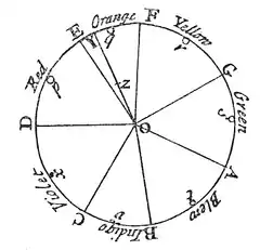 Newton's asymmetric color wheel based on musical intervals. Mixing "rays" in amounts given by the circles yields color "z" (1704)
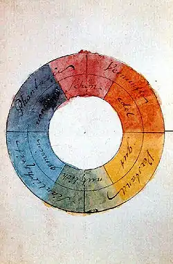 Goethe's symmetric color wheel with 'reciprocally evoked colors' (1810)
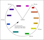 A color circle based on additive combinations of the light spectrum, after Schiffman (1990)
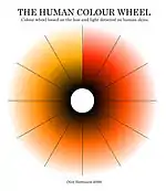 Human Color Wheel based on the hue and light detected on human skins, after Harbisson (2004–2009)
 RGB color wheel
.svg.png.webp) RYB color wheel
RYB color wheel.png.webp) Color circle based on the HSV color space, showing all colors with a value (brightness) of 255 (100%). White is at the center, and fully saturated colors are at the outer edge. It is the circular face of the HSV "color cone".
Color circle based on the HSV color space, showing all colors with a value (brightness) of 255 (100%). White is at the center, and fully saturated colors are at the outer edge. It is the circular face of the HSV "color cone".
See also
References
- Morton, J.L. "Basic Color Theory". Color Matters.
- Simon Jennings (2003). Artist's Color Manual: The Complete Guide to Working With Color. Chronicle Books. p. 26. ISBN 0-8118-4143-X.
color-wheel color-circle.
- Faber Birren (1934). Color Dimensions: Creating New Principles of Color and a Practical Equation in Color Definition. Chicago: The Crimson Press. ISBN 1-4286-5179-9.
- Joseph Anthony Gillet and William James Rolfe (1881). Elements of Natural Philosophy: For the Use of Schools and Academies. New York: Potter, Ainsworth. p. 186.
color-disc.
- Newton, Isaac (1730). Opticks: Or, A Treatise of the Reflections, Refractions, Inflections and Colours of Light. William Innys at the West-End of St. Paul's. pp. 154–158.
- Newton, Isaac (1704). Opticks. pp. 114–117.
- Briggs, David. "Newton's hue system".
- Steven K. Shevell (2003). The Science of Color. Elsevier. ISBN 0-444-51251-9.
- Linda Leal (1994). The Essentials of Psychology. Research & Education Assoc. p. 26. ISBN 0-87891-930-9.
color-circle psychology red green blue.
- Kathleen Lochen Staiger (2006). The Oil Painting Course You've Always Wanted: Guided Lessons for Beginners. Watson–Guptill. ISBN 0-8230-3259-0.
- Martha Gill (2000). Color Harmony Pastels: A Guidebook for Creating Great Color Combinations. Rockport Publishers. ISBN 1-56496-720-4.
- "Basic HTML data types". HTML 4.01 Specification. W3C. 24 December 1999.
- Krech, D., Crutchfield, R.S., Livson, N., Wilson, W.A. jr., Parducci, A. (1982) Elements of psychology (4th ed.). New York: Alfred A. Knopf. pp. 108–109.
- Schiffman, H.R. (1990) Sensation and perception: An integrated approach (3rd ed.). New York: John Wiley & Sons, pp. 252–253.
- Rodwell, J. (1987) The complete watercolour artist. London: Paul Press, pp. 94–95.
- How to create color palettes
External links
- David Briggs (2007). Hue in The Dimensions of Colour
- Interactive Color Wheel (Color Scheme Generator)
- "Colour Wheels, Charts, and Tables Through History". The Public Domain Review. Illustrated history, with links to mostly public domain images from digitized historic books.
