Hermann Zapf
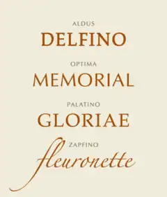
Hermann Zapf (German: [tsapf]; 8 November 1918 – 4 June 2015) was a German type designer and calligrapher who lived in Darmstadt, Germany. He was married to the calligrapher and typeface designer Gudrun Zapf-von Hesse. Typefaces he designed include Palatino, Optima, and Zapfino. He is considered one of the greatest type designers of all time.[1]
Hermann Zapf | |
|---|---|
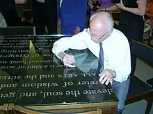 Zapf signing in May 2007 | |
| Born | 8 November 1918 |
| Died | 4 June 2015 (aged 96) Darmstadt, Germany |
| Occupation | Type designer |
| Notable work | Aldus, Palatino, Optima, Zapfino |
| Spouse | |
| Children | 1 |
| Signature | |
Early life
Zapf was born in Nuremberg[2] during turbulent times marked by the German Revolution of 1918–1919 in Munich and Berlin, the end of World War I, the exile of Kaiser Wilhelm, and the establishment of Bavaria as a free state by Kurt Eisner. In addition, the Spanish flu pandemic took hold in Europe in 1918 and 1919. Two of Zapf's siblings died of the disease.[3] Famine later struck Germany, and Zapf's mother was grateful to send him to school in 1925, where he received daily meals in a program organized by Herbert Hoover. In school, Zapf was mainly interested in technical subjects. One of his favorite books was the annual science journal Das neue Universum (The New Universe). He and his older brother experimented with electricity, building a crystal radio and an alarm system for his house. Even at this early age, Zapf was already getting involved with type, inventing cipher alphabets to exchange secret messages with his brother.
Zapf left school in 1933 with the ambition of pursuing a career in electrical engineering. However, his father had become unemployed and was in trouble with the newly established Third Reich, having been involved with trade unions,[3] and was sent to the Dachau concentration camp for a short time.
Introduction to typography
Under the new political regime, Zapf was not able to attend the Ohm Technical Institute in Nuremberg, and therefore he needed to find an apprenticeship. His teachers, aware of the new political difficulties, noticed Zapf's skill in drawing and suggested that he become a lithographer. Each company that interviewed him for an apprenticeship would ask him political questions, and every time he was interviewed, he was complimented on his work but was rejected. Ten months later, in 1934, he was interviewed by the last company in the telephone directory, and the company did not ask any political questions. They also complimented Zapf's work, but did not do lithography and did not need an apprentice lithographer. However, they allowed him to become a retoucher, and Zapf began his four-year apprenticeship in February 1934.
In 1935, Zapf attended an exhibition in Nuremberg in honor of the late typographer Rudolf Koch. This exhibition gave him his first interest in lettering. Zapf bought two books there, using them to teach himself calligraphy. He also studied examples of calligraphy in the Nuremberg city library. Soon, his master noticed his expertise in calligraphy, and Zapf's work shifted to retouching lettering and improving his colleagues' retouching.
Frankfurt
A few days after finishing his apprenticeship, Zapf left for Frankfurt. He did not bear a journeyman's certificate and thus would not be able to get a work permit at another company in Nuremberg, as they would not have been able to check on his qualifications. Zapf went to the Werkstatt Haus zum Fürsteneck, a building run by Paul Koch, son of Rudolf Koch. He spent most of his time there working in typography and writing songbooks.
Through print historian Gustav Mori, Zapf came into contact with the type foundries D. Stempel, AG, and Linotype GmbH of Frankfurt. In 1938, he designed his first printed typeface for them, Gilgengart, a Fraktur.[3][4]
War service
On 1 April 1939, Zapf was conscripted and sent to Pirmasens to help reinforce the Siegfried Line against France. As a consequence of hard labor, he developed heart trouble in a few weeks and was given a desk job, writing camp records and sports certificates in Fraktur.
World War II broke out in September, and Zapf's unit was to be taken into the Wehrmacht. However, because of his heart trouble, Zapf was not transferred to the Wehrmacht but was instead dismissed. On 1 April 1942, he was summoned again for the war effort. Zapf had been chosen for the Luftwaffe, but instead was sent to the artillery in Weimar. He did not perform well, confusing left and right during training and being too cautious and clumsy with his gun. His officers soon brought an unusually early end to his career in the artillery.
Zapf was sent back to the office and then to Jüterbog to train as a cartographer. After that, he went to Dijon and then Bordeaux, joining the staff of the First Army. In the cartography unit at Bordeaux, Zapf drew maps of Spain, especially the railway system, which could have been used to transport artillery had Francisco Franco not used narrow-gauge tracks to repair bridges after the Spanish Civil War. Zapf was happy in the cartography unit. His eyesight was so good that he could write letters 1 millimeter in height without using a magnifying glass, and this skill probably prevented him from being commissioned back into the army.
After the war had ended, Zapf was held by the French as a prisoner of war at a field hospital in Tübingen. He was treated with respect because of his artwork and, on account of his poor health, was sent home only four weeks after the end of the war. He went back to Nuremberg, which had suffered great damage in air raids.
Postwar career
Zapf taught calligraphy in Nuremberg in 1946. He returned to Frankfurt in 1947, where the type foundry Stempel offered him a position as artistic head of their printshop. They did not ask for qualifications, certificates, or references, but instead only required him to show them his sketchbooks from the war and a calligraphic piece he did in 1944 of Hans von Weber's "Junggesellentext".
One of Zapf's projects was the book Feder und Stichel ("Pen and Graver"), printed from metal plates designed by Zapf and cut by the punchcutter August Rosenberger during the war. It was printed at the Stempel printshop in 1949.
From 1948 to 1950, Zapf taught calligraphy at the Arts and Crafts School in Offenbach, giving lettering lessons twice a week to two classes of graphics students. On 1 August 1951 he married Gudrun von Hesse, who taught at the school of Städel in Frankfurt.[3][5]
Most of Zapf's work as a graphic artist was in book design. He worked for various publishing houses, including Suhrkamp Verlag, Insel Verlag, Büchergilde Gutenberg, Hanser Verlag, Dr. Ludwig Reichert Verlag, and Verlag Philipp von Zabern.
Type design
Zapf's career in type design spanned the three most recent stages of printing: hot metal composition, phototypesetting (also called cold type), and digital typesetting. His two most famous typefaces, Palatino and Optima, were designed in 1948 and 1952, respectively.[2] Palatino was designed in conjunction with August Rosenberger, with careful attention to detail. It was named after the 16th-century Italian writing master Giambattista Palatino. It became better known after it became one of the core 35 PostScript fonts in 1984, bundled with virtually all PostScript devices from laser printers to imagesetters. Optima, a flared sans-serif, was released by Stempel in 1958. Zapf intended the design to bridge serifs and sans serifs and to be suitable for both headings and continuous passages of text.[6][7]
Zapf's work reached into a range of genres. Palatino is a warm, organic design inspired by Italian Renaissance calligraphy and printing. Melior suggests the work of the great German neoclassical printer Justus Erich Walbaum but also is based on the mathematical "super-ellipse".[8] His sans serif series URW Grotesk was designed for newspaper use and presents a wide range of widths and weights, reminiscent of geometric sans serif fonts like Futura but in a more eccentric style.[9] Dan Margulis commented on his death that that "you would have to say that his historical standing will be based on the first ten years of his professional career."[10][11]
Zapf's later releases for Linotype in the 1990s and 2000s, often created in collaboration with Akira Kobayashi, were radical reformations of his previous work, often removing compromises that had been necessary in the manufacture of metal type. In this period he created Palatino Sans, a more informal modulated sans serif than Optima.
Zapf's typefaces have been widely copied, sometimes against his will. The best-known example may be Monotype's Book Antiqua, which was included in Microsoft Office and is often considered an imitation of Palatino. In 1993, Zapf resigned from ATypI (Association Typographique Internationale) over what he viewed as its hypocritical attitude toward unauthorized copying by prominent ATypI members. At a 1994 conference of the Raster Imaging and Digital Typography association in Darmstadt, Germany, a panel discussion on digital typefaces and designers' rights strongly criticized the alleged plagiarism of Zapf's Palatino, while several Microsoft attendees listened in the audience. In 1999, Microsoft worked with Zapf and Linotype to develop a new, authorized version of Palatino for Microsoft, called Palatino Linotype.
Sometimes, however, Zapf worked with a font maker to make new versions of his existing typefaces created for another company. For example, in the 1980s Zapf worked with Bitstream to make versions of many of his prior typefaces, including Palatino, Optima and Melior, all with "Zapf" in their new names.
Calligraphy
Zapf is considered one of the great calligraphers, but he did not work extensively doing commercial lettering and calligraphy. His largest calligraphic project was the "Preamble to the United Nations Charter", written in four languages, commissioned by the Pierpont Morgan Library in New York in 1960,[12] for which he received $1000. But his ideas about calligraphy indirectly influenced the look of the mid-20th century as he served as a consultant to Hallmark Cards throughout the 1960s and 70s, helping them to develop a style manual for their lettering artists. His calligraphy was primarily limited to studies and personal works of art. He also taught calligraphy as a part of his workshops every summer at Rochester Institute of Technology during the 1980s.
Computer typography
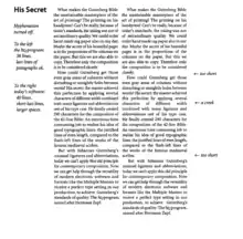
Zapf worked on typography for computer programs from the 1960s onwards. His ideas were considered radical, not taken seriously in West Germany, and rejected by the Technische Universität Darmstadt, where he lectured from 1972 to 1981. Because he had no success in Germany, Zapf went to the United States, where he lectured about computerized typesetting, and was invited to speak at Harvard University in 1964. The University of Texas at Austin was also interested in Zapf and offered him a professorship, which he did not take, because his wife opposed a move to that state.
Because Zapf's plans for the United States had come to nothing, and because their house in Frankfurt had become too small, Zapf and his wife moved to Darmstadt in 1972.
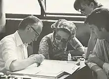
In 1976, Rochester Institute of Technology (RIT) offered Zapf a professorship in typographic computer programming, the first of its kind in the world. He taught there from 1977 to 1987, flying between Darmstadt and Rochester. There he developed his ideas further, with the help of his connections in companies such as IBM and Xerox and his discussions with computer specialists at Rochester. A number of Zapf's students from this time at RIT went on to become influential type designers, including Kris Holmes and Charles Bigelow, who together created the Lucida type family. Other prominent students include the calligrapher and type designer Julian Waters and book designer Jerry Kelly.
In 1977, Zapf and his friends Aaron Burns and Herb Lubalin founded Design Processing International, Inc., in New York and developed typographical computer software.[2] It existed until 1986, when Lubalin died. Zapf and Burns founded Zapf, Burns & Company in 1987. Burns, also an expert in typeface design and typography, was in charge of marketing until his death in 1992. Shortly before, two of their employees had stolen Zapf's ideas and founded a company of their own.
Zapf knew that he could not run an American company from Darmstadt and did not want to move to New York. Instead, he used his experience to begin the development of a typesetting program, the "Hz-program", building on the hyphenation and justification system in TeX.
During financial problems and bankruptcy of URW++ in the mid-1990s, Adobe Systems acquired the Hz patent(s) and later made some use of the concepts in their InDesign program.
Zapfino
In 1983, Zapf completed the typeface AMS Euler with Donald Knuth and graduate students in Knuth's and Charles Bigelow's digital typography program at Stanford University, including students Dan Mills, Carol Twombly, and David Siegel and Knuth's computer science PhD students Scott Kim and John Hobby, for the American Mathematical Society. Euler digital font production was eventually finished by Siegel as his M.S. thesis project in 1985. Euler is a typeface family for mathematical composition including Latin, Fraktur and Greek letters. After Siegel finished his studies at Stanford and was interested in entering the field of typography, he told Zapf his idea of making a typeface with a large number of glyph variations and wanted to start with an example of Zapf's calligraphy, which had been reproduced in a publication of the Society of Typographic Arts in Chicago.
Zapf was concerned that this was the wrong way to go, and while he was interested in creating a complicated program, he was worried about starting something new. However, Zapf remembered a page of calligraphy from his sketchbook from 1944 and considered the possibility of making a typeface from it. He had tried to create a calligraphic typeface for Stempel in 1948, but hot metal composition placed too many limits on the freedom of swash characters. Such a pleasing result could only be achieved using modern digital technology, and so Zapf and Siegel began work on the complicated software necessary. Siegel also hired Gino Lee, a programmer from Boston, Massachusetts, to work on the project.
However, just before the project was completed, Siegel wrote a letter to Zapf, saying that his girlfriend had left him and that he had lost all interest in anything. Siegel abandoned the project and started a new life, working on bringing color to Macintosh computers and later becoming an Internet design expert.[13]
The development of Zapfino had become seriously delayed until Zapf presented the project to Linotype. The company was prepared to complete it and reorganized the project. Zapf worked with Linotype to create four alphabets and various ornaments, flourishes, and other dingbats. Zapfino was released in 1998.
Later versions of Zapfino using the Apple Advanced Typography and OpenType technologies were able to make automatic ligatures and glyph substitutions (especially contextual ones, in which the nature of ligatures and substituted glyphs is determined by other glyphs nearby or even in different words), to more accurately reflect the fluid and dynamic nature of Zapf's calligraphy.
Death
Zapf died on 4 June 2015, at the age of 96 in Darmstadt, Germany.[3]
List of typefaces

Zapf designed the following typefaces:
|
|
Awards
Appearances in film
Zapf starred in the film The Art of Hermann Zapf, produced in 1967 at Hallmark Cards in Kansas City, Missouri, and in Zapf's design studio in Dreieichenhain, Germany. He was also featured in the 2007 documentary Helvetica, by Gary Hustwit. The documentary "Alphabet Magic"[21] about the life and work of Hermann Zapf and Gudrun Zapf-von Hesse, produced and conceived by their niece Professor Alexa Albrand and directed by Marita Neher, was shown in 2019 in Germany and at the Zapf Centennial celebrations that included an exhibit of their work and the Zapf Centennial Symposium at the Grolier Club in New York City.[22]
Publications
- Cusick, Rick (2011). What Our Lettering Needs: The Contribution of Hermann Zapf to Calligraphy & Type Design at Hallmark Cards. RIT Cary Graphic Arts Press. An account of Zapf's contributions to the artistry and success of Hallmark Cards.[23]
- Kelly, Jerry (2009). "Hermann Zapf: A survey of his early books". Parenthesis 16. pp. 12–15.
- Weichselbaumer, Nikolaus. Der Typograph Hermann Zapf: Eine Werkbiographie. Berlin and Boston: De Gruyter. ISBN 978-3-11-041498-1.
- Calligraphic Salutations: Hermann Zapf's Letterheadings to Paul Standard. Collection of calligraphic embellishments that appeared at the heads of letters written by Zapf to Paul Standard in the 1940s and 1950s.[24]
- August Rosenberger 1893–1980: A Tribute to One of the Greatest Masters of Punchcutting, an Art Now All but Extinct. Zapf's tribute to Rosenberger, with his recollections of their collaboration in Germany during and after World War II.[25]
- The World of Alphabets by Hermann Zapf: A Kaleidoscope of Drawings and Letterforms. CD-ROM illustrating Zapf's typographic designs.[26]
- Spend Your Alphabets Lavishly!: The Work of Hermann & Gudrun Zapf. Collection of works by Hermann and Gudrun Zapf.[27]
- Alphabet Stories: A Chronicle of Technical Developments by Hermann Zapf (Alphabetgeschichten, in the German edition). Narrative encompassing Zapf's life and work from his childhood in Nuremberg though the release of his typeface designs by Linotype GmbH.[28] The first edition was published in 2007.[29]
- The second edition, published in 2008, includes an added a two-colour insert of letterpress-printed broadsides designed by Zapf, typeset in his metal Virtuosa and printed at the RIT Cary Graphic Arts Collection.[30]
See also
References
- Kelly, Jerry. “Hermann Zapf at Ninety.” Printing history 6.6 (2009): 15–
- Montgomery, Angus (8 June 2015). "Typographer Hermann Zapf dies aged 96". Design Week. Retrieved 10 June 2015.
- Weber, Bruce (9 June 2015). "Hermann Zapf, 96, Dies; Designer Whose Letters Are Found Everywhere". The New York Times. Retrieved 10 June 2015.
- Haralambous, Yannis; Horne, P. Scott (28 November 2007). Fonts & Encodings. O'Reilly Media. p. 403. ISBN 978-0596102425.
- "Typo-Magie: Ein Nachruf auf Schriftgestalter Hermann Zapf". 8 June 2015.
- Siebert, Jürgen. "Fontshop – Hermann Zapf 1918–2015". Fontshop. Retrieved 22 August 2015.
- Stone, Sumner. "Hermann Zapf". Typographics Conference. Archived from the original on 28 September 2015. Retrieved 22 August 2015.
- Shaw, Paul (10 February 2011). "Overlooked Typefaces". Print magazine. Retrieved 2 July 2015.
- "URW Grotesk". MyFonts. URW++. Retrieved 12 September 2015.
- Zhukov, Maxim. "Comments on Typophile thread". Typophile. Archived from the original on 27 February 2015. Retrieved 12 September 2015.
- Margulis, Dan. "Facebook post on Hermann Zapf's death". Facebook. Ledet Adobe Software Training. Archived from the original on 26 February 2022. Retrieved 27 March 2016.
He participated in the 1980s trend toward faces with very large x-heights and tight letterfits; his major works in that genre, Zapf Book and Zapf International, have deservedly been forgotten
- Preamble of the charter of The United Nations: calligraphic manuscript by Hermann Zapf. Frankfurt am Main, 1960. Morgan Library & Museum, New York.
- "Zapfino: An Elegant Script Font". Olleymay. 6 June 2014. Retrieved 6 May 2020.
- Hutner, Martin; Kelly, Jerry (2004). A Century for the Century: Fine Printed Books from 1900 to 1999, Books 1900–1999. David R. Godine. p. LII. ISBN 1567922201.
- Meggs, Philip B.; Carter, Rob (15 December 1993). Typographic Specimens: The Great Typefaces. John Wiley & Sons. p. 38. ISBN 0471284297.
- Wolfson, Sam (10 June 2015). "❍✔✯♠: why we ❤ Zapf Dingbats". The Guardian. Retrieved 11 June 2015.
- Archived 19 October 2007 at the Wayback Machine
- "Goudy_Zapf | Cary Graphic Arts Collection". library.rit.edu. Retrieved 18 January 2019.
- "Staatssekretär Krämer überreicht Prof. Zapf das Bundesverdienstkreuz 1. Klasse" (in German). 25 May 2010. Archived from the original on 18 July 2011. Retrieved 30 May 2010.
- "Order of Merit for Hermann Zapf". May 2010. Retrieved 1 June 2010.
- "Alphabet Magic - Films - home". german-documentaries.de. Retrieved 24 March 2021.
- "Zapf Centennial Symposium at The Grolier Club". The Type Directors Club. Retrieved 24 March 2021.
- Cusick, Rick (22 November 2011). "What Our Lettering Needs | RIT Press". Ritpress.rit.edu. Retrieved 12 June 2015.
- "Calligraphic Salutations: Hermann Zapf's Letterheadings to Paul Standard | RIT Press". Library.rit.edu. 19 September 2007. Archived from the original on 2 September 2006. Retrieved 12 June 2015.
- Archived 2 September 2006 at the Wayback Machine
- Archived 3 October 2008 at the Wayback Machine
- Kelly, Jerry. "Spend Your Alphabets Lavishly! | RIT Press". Library.rit.edu. Retrieved 12 June 2015.
- "Alphabet Stories, by Hermann Zapf, english edition Font – Licensing Options". Linotype.com. Retrieved 12 June 2015.
- "Cary Graphic Arts Press—Alphabet Stories". Archived from the original on 24 July 2007. Retrieved 25 October 2008.
- Zapf, Hermann. "Alphabet Stories | RIT Press". Library.rit.edu. Retrieved 12 June 2015.