Text figures
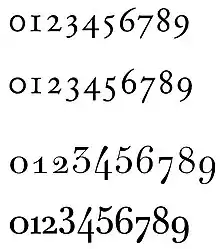
Text figures (also known as non-lining, lowercase, old style,[1] ranging, hanging, medieval, billing,[2] or antique[3] figures or numerals) are numerals designed with varying heights in a fashion that resembles a typical line of running text, hence the name. They are contrasted with lining figures (also called titling or modern figures), which are the same height as upper-case letters.[4][5] Georgia is an example of a popular typeface that employs text figures by default.


Design

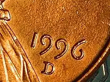
In text figures, the shape and positioning of the numerals vary as those of lowercase letters do. In the most common scheme, 0, 1, and 2 are of x-height, having neither ascenders nor descenders; 6 and 8 have ascenders; and 3, 4, 5, 7, and 9 have descenders. Other schemes exist; for example, the types cut by the Didot family of punchcutters and typographers in France between the late 18th and early 19th centuries typically had an ascending 3 and 5, a form preserved in some later French typefaces. A few other typefaces used different arrangements. Sometimes the stress of the 0 is made different from a letter o in some way, although many fonts do not do this.[6][7]
High-quality typesetting generally prefers text figures in body text: they integrate better with lowercase letters and small capitals, unlike runs of lining figures. Lining figures are called for in all-capitals settings (hence the alternative name titling figures), and may work better in tables and spreadsheets.
Although many conventional typefaces have both types of numerals in full, early digital fonts only had one or the other (with the exception of those used by professional printers). Modern OpenType fonts generally include both, and being able to switch via lnum and onum feature tags.[8] The few common digital fonts that default to using text figures include Candara, Constantia, Corbel, Hoefler Text, Georgia, Junicode, some variations of Garamond (such as the open-source EB Garamond), and FF Scala. Palatino and its clone FPL Neu support both text and lining figures.[9][10][11]
History
As the name medieval numerals implies, text figures have been in use since the Middle Ages, when Arabic numerals reached 12th century Europe, where they eventually supplanted Roman numerals.
Lining figures came out of the new middle-class phenomenon of shopkeepers’ hand-lettered signage. They were introduced to European typography in 1788, when Richard Austin cut a new font for typefounder and publisher John Bell, which included three-quarter height lining figures. They were further developed by 19th-century type designers, and largely displaced text figures in some contexts, such as newspaper and advertising typography.[12] During the period of transition from text figures to lining, a justification for the old system was that the height differences helped distinguish similar numbers, while a justification for lining figures was that they were clearer (being larger) and that they looked better by giving all page numbers the same height.[6][12] Amusingly, as several later writers have noted, the printer Thomas Curson Hansard in his landmark textbook on printing Typographia describes the new fashion as 'preposterous', but the book was printed using lining figures and the modern typefaces he also criticised throughout.[6][13]
While always popular with fine printers, text figures became rarer still with the advent of phototypesetting and early digital technologies with limited character sets and no support for alternate characters.[14] Walter Tracy noted that they were avoided by phototypesetting manufacturers since (not being of even height) they could not be miniaturised to form fraction numerals, requiring an additional set of fraction characters.[6] They made a comeback with more advanced digital typesetting systems.[15]
Modern professional digital fonts are almost universally in one or another variant of the OpenType format and encode both text and lining figures as OpenType alternate characters. Text figures are not encoded separately in Unicode, because they are not considered separate characters from lining figures, only a different way of writing the same characters.[16] Adobe's early OpenType fonts used Private Use Area for non-default sets of numerals, but the most recent ones only use OpenType features.[17]
References
- University of Chicago Press (2010). "Appendix B: Glossary". The Chicago Manual of Style (16th ed.). Chicago: University of Chicago Press. pp. 891, 899.
- Birdsall 2004, p. xi
- Birdsall 2004, p. 186
- Bringhurst 1992, p. 36
- Saller, Carol (March 14, 2012). "Old-Style Versus Lining Figures". Lingua Franca. The Chronicle of Higher Education.
- Tracy, Walter. Letters of Credit. pp. 67–70.
- Bergmann, Christoph; Hardwig, Florian (23 August 2016). "Zero vs. oh: Strategies of glyph differentiation". Isoglosse. Retrieved 12 September 2016.
- "Registered features - definitions and implementations". Microsoft. February 14, 2017. Retrieved April 24, 2018.
- Devroye, Luc (November 30, 2002). "More on the Palatino Story".
- Index of /~was/x/FPL Archived April 15, 2011, at the Wayback Machine
- (URW)++ Design & Development; Puga, Diego; Stubner, Ralf (March 13, 2008). "FPL Neu Fonts—OpenType Edition". Archived from the original on April 25, 2012.
- Hansard, Thomas Curson (1825). Typographia, an Historical Sketch of the Origin and Progress of the Art of Printing. pp. 430–1. Retrieved 12 August 2015.
- Johnson, Alfred F. (1930). "The Evolution of the Modern-Face Roman". The Library. s4-XI (3): 353–377. doi:10.1093/library/s4-XI.3.353.
- Bringhurst 1992, p. 47
- Hoefler, Jonathan. "Hoefler Text: design notes". Hoefler & Co. Retrieved 24 May 2019.
- "22". The Unicode® Standard: Version 12.0 – Core Specification (PDF). Mountain View, CA: The Unicode Consortium. 2019. p. 820. ISBN 978-1-936213-22-1. Retrieved 24 May 2019.
Some variations of decimal digits are considered glyph variants and are not separately encoded. These include the old style variants of digits, as shown in Figure 22-7.
- Personal communication from Thomas Phinney, formerly of Adobe Type
Works cited
- Birdsall, Derek (2004). Notes on Book Design. New Haven, CT: Yale University Press. ISBN 0-300-10347-6.
- Bringhurst, Robert (1992). The Elements of Typographic Style. Vancouver: Hartley & Marks. pp. 46–48. ISBN 0-88179-132-6.
External links
- Bergsland, David. "Using Numbers in the Proper Case". DT&G Design. Archived from the original on June 21, 2012.