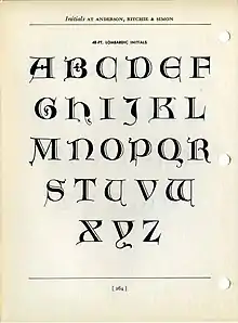
Lombardic capitals
Lombardic capitals is the name given to a type of decorative upper-case letters used in inscriptions and, typically, at the start of a section of text in medieval manuscripts.[1] They are characterized by their rounded forms with thick, curved stems. Paul Shaw describes the style as a "relative" of uncial writing.[2]

Unlike Gothic capitals, Lombardic capitals were also used to write words or entire phrases. They were used both in illuminated manuscripts and monumental inscriptions, like the bell tower of Santa Chiara, Naples. In Italian, the style is known as "Longobarda" after an earlier spelling of Lombardy (Longobardia).[3]


History
The term Lombardic comes from the study of incunabula.[4] A characteristic form of text decoration in manuscripts and early printed books with hand colouring was to use alternating red and blue Lombardic capitals for the start of each successive paragraph.[4][5] Unlike historiated or inhabited initials, Lombardic capitals are devoid of further decoration.[6]
In modern times, fonts of Lombardic capitals have been designed by many typographers, such as Frederic Goudy, who included a set as an alternative uppercase for his Goudy Text font.[7]
First, Lombardic, or the national hand of Italy, which was a development of the uncial and was first used in northern Italy. The Lombardic character is a most useful and interesting form and presents less of the fixed quality of the Roman. There are many and wide variations of it as developed by the scribes in different countries. It was the favorite form selected for initials and versals in manuscripts, which were usually painted in, in colors and gold, the solidity of the bodystrokes making it especially adaptable for this purpose. At its best this Lombardic letter preserves much of the feeling of the uncials of the sixth and seventh centuries.
— Frederic Goudy[8]
See also
References
- Harris, David (1995). The Art of Calligraphy: a practical guide to the skills and techniques (1st American ed.). London [u.a.]: Dorling Kindersley. pp. 62–4. ISBN 9780751301496.
- Shaw, Paul (1982). Black Letter Primer: an introduction to Gothic alphabets (Rev. ed.). New York: Taplinger Pub. Co. p. 52. ISBN 9780800808105.
- "calligrafie - ASDPS ARMIS ET LEO". www.armisetleo.it.
- Schneider, Karin (2014). Paläographie und Handschriftenkunde für Germanisten. Eine Einführung (3rd ed.). Berlin, Boston. p. 155. ISBN 978-3-11-033704-4.
{{cite book}}: CS1 maint: location missing publisher (link) - Hellinga, Lotte (2018). Incunabula in Transit: People and Trade. Leiden, Boston: Brill. pp. 183–184. ISBN 978-90-04-34036-7. Retrieved 27 February 2018.
- Schneider, Ulrich Johannes, ed. (2016). Textkünste. Buchrevolution um 1500 (2nd ed.). Darmstadt: Wissenschafliche Buchgesellschaft. p. 219. ISBN 978-3-8053-5100-3.
- "Goudy Text Lombardic Capitals". Monotype. Retrieved 27 February 2018.
- Goudy, Frederic W. (1922). The Alphabet. New York: Mitchell Kennerly. p. 21.
