Tint, shade and tone
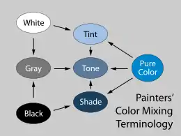
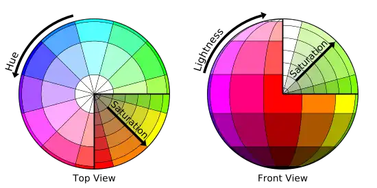
In color theory, a tint is a mixture of a color with white, which increases lightness, while a shade is a mixture with black, which increases darkness. Both processes affect the resulting color mixture's relative saturation. A tone is produced either by mixing a color with gray, or by both tinting and shading.[1] Mixing a color with any neutral color (including black, gray, and white) reduces the chroma, or colorfulness, while the hue (the relative mixture of red, green, blue, etc., depending on the colorspace) remains unchanged.

In the graphic arts, especially printmaking and drawing, "tone" has a different meaning, referring to areas of continuous color, produced by various means, as opposed to the linear marks made by an engraved or drawn line.
In common language, the term shade can be generalized to encompass any varieties of a particular color, whether technically they are shades, tints, tones, or slightly different hues.[2] Meanwhile, the term tint can be generalized to refer to any lighter or darker variation of a color (e.g. "tinted windows").[3]
When mixing colored light (additive color models), the achromatic mixture of spectrally balanced red, green, and blue (RGB) is always white, not gray or black. When we mix colorants, such as the pigments in paint mixtures, a color is produced which is always darker and lower in chroma, or saturation, than the parent colors. This moves the mixed color toward a neutral color—a gray or near-black. Lights are made brighter or dimmer by adjusting their brightness, i.e., energy level; in painting, lightness is adjusted through mixture with white, black, or a color's complement.
The Color Triangle depicting tint, shade, and tone was proposed in 1937 by Faber Birren.[4]
In art
It is common among some artistic painters to darken a paint color by adding black paint—producing colors called shades—or to lighten a color by adding white—producing colors called tints. However, this is not always the best way for representational painting, since one result is for colors to also shift in their hues. For instance, darkening a color by adding black can cause colors such as yellows, reds and oranges to shift toward the greenish or bluish part of the spectrum. Lightening a color by adding white can cause a shift towards blue when mixed with reds and oranges. (See Abney effect.)
Another practice when darkening a color is to use its opposite, or complementary, color (e.g. violet-purple added to yellowish-green) in order to neutralize it without a shift in hue, and darken it if the additive color is darker than the parent color. When lightening a color this hue shift can be corrected with the addition of a small amount of an adjacent color to bring the hue of the mixture back in line with the parent color (e.g. adding a small amount of orange to a mixture of red and white will correct the tendency of this mixture to shift slightly towards the blue end of the spectrum).

References
- Color Theory: An Essential Guide to Color-from Basic Principles to Practical Applications by Patti Mollica, page 17, ISBN 1-60058-302-4, 9781600583025
- "Definition of SHADE". www.merriam-webster.com.
- "Definition of TINT". www.merriam-webster.com.
- Birren, Faber (1937). Functional Color. New York: The Crimson Press. p. Plate 1. ISBN 978-1162978840
