Responsive web design
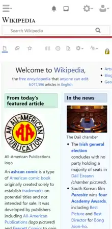
Responsive web design (RWD) or responsive design is an approach to web design that aims to make web pages render well on a variety of devices and window or screen sizes from minimum to maximum display size to ensure usability and satisfaction.[1][2]


| Cascading Style Sheets |
|---|
|
| Concepts |
|
| Philosophies |
|
| Tools |
|
| Comparisons |
|
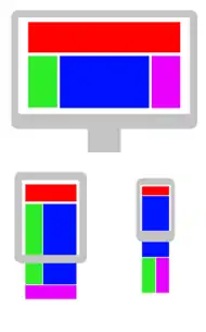
A responsive design adapts the web-page layout to the viewing environment[1] by using techniques such as fluid proportion-based grids,[3][4] flexible images,[5][6] and CSS3 media queries,[7][8][9] an extension of the @media rule,[10] in the following ways:
- The fluid grid concept calls for page element sizing to be in relative units like percentages, rather than absolute units like pixels or points.[4]
- Flexible images are also sized in relative units, so as to prevent them from displaying outside their containing element.[5]
- Media queries allow the page to use different CSS style rules based on characteristics of the device the site is being displayed on, e.g. width of the rendering surface (browser window width or physical display size).
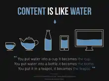
- Responsive layouts automatically adjust and adapt to any device screen size, whether it is a desktop, a laptop, a tablet, or a mobile phone.
Responsive web design became more important as users of mobile devices came to account for the majority of website visitors.[11][12] In 2015, for instance, Google announced Mobilegeddon and started to boost the page ranking of mobile-friendly sites when searching from a mobile device.[13]
Responsive web design is an example of user interface plasticity.[14]
Related concepts
Mobile first, unobtrusive JavaScript, and progressive enhancement
Mobile-first design and progressive enhancement are related concepts that predate RWD.[15] Browsers of basic mobile phones do not understand JavaScript or media queries, so a recommended practice was to create a basic web site and enhance it for smartphones and personal computers, rather than rely on graceful degradation to make a complex, image-heavy site work on mobile phones.[16][17][18][19]
Challenges, and other approaches
Luke Wroblewski has summarized some of the RWD and mobile design challenges and created a catalog of multi-device layout patterns.[20][21][22] He suggested that, compared with a simple HWD approach, device experience or RESS (responsive web design with server-side components) approaches can provide a user experience that is better optimized for mobile devices.[23][24][25] Server-side CSS generator implementation of stylesheet languages like Sass can be part of such an approach. Google has recommended responsive design for smartphone websites over other approaches.[26]
Although many publishers have implemented responsive designs, one challenge for RWD adoption was that some banner advertisements and videos were not fluid.[27] However, search advertising and (banner) display advertising came to support specific device platform targeting and different advertisement size formats for desktop, smartphone, and basic mobile devices. Different landing page URLs have been used for different platforms,[28] or Ajax has been used to display different advertisement variants on a page.[29][21][30] CSS tables permitted hybrid fixed and fluid layouts.[31]
There have been many ways of validating and testing RWD designs,[32] ranging from mobile site validators and mobile emulators to simultaneous testing tools like Adobe Edge Inspect.[33] The Chrome, Firefox and Safari browsers and developer tools have offered responsive design viewport resizing tools, as do third parties.[34][35]
History
The first site to feature a layout that adapts to browser viewport width was Audi.com launched in late 2001,[36] created by a team at razorfish consisting of Jürgen Spangl and Jim Kalbach (information architecture), Ken Olling (design), and Jan Hoffmann (interface development). Limited browser capabilities meant that for Internet Explorer, the layout could adapt dynamically in the browser whereas, for Netscape, the page had to be reloaded from the server when resized.
Cameron Adams created a demonstration in 2004.[37] By 2008, a number of related terms such as "flexible", "liquid",[38] "fluid", and "elastic" were being used to describe layouts. CSS3 media queries were almost ready for prime time in late 2008/early 2009.[39] Ethan Marcotte coined the term responsive web design[40]—and defined it to mean fluid grid / flexible images / media queries—in a May 2010 article in A List Apart.[1] He described the theory and practice of responsive web design in his brief 2011 book titled Responsive Web Design. Responsive design was listed as #2 in Top Web Design Trends for 2012 by .net magazine after progressive enhancement at #1.[41]
Mashable called 2013 the Year of Responsive Web Design.[42]
See also
- Adaptive web design
- Bootstrap (front-end framework)
- CSS framework
- Em (typography) § CSS
- Foundation (framework)
- Tableless web design
References
- Marcotte, Ethan (May 25, 2010). "Responsive Web design". A List Apart.
- Schade, Amy (May 4, 2014). "Responsive Web Design (RWD) and User Experience". Nielsen Norman Group. Retrieved October 19, 2017.
- "Core concepts of Responsive Web design". September 8, 2014.
- Marcotte, Ethan (March 3, 2009). "Fluid Grids". A List Apart.
- Marcotte, Ethan (June 7, 2011). "Fluid images". A List Apart.
- Hannemann, Anselm (September 7, 2012). "The road to responsive images". net Magazine.
- Gillenwater, Zoe Mickley (December 15, 2010). Examples of flexible layouts with CSS3 media queries. Stunning CSS3. p. 320. ISBN 978-0-321-722133.
- Gillenwater, Zoe Mickley (October 21, 2011). "Crafting quality media queries".
- "Responsive design—harnessing the power of media queries". Google Webmaster Central. April 30, 2012.
- "@media rule". w3.org. W3C.
- "Cisco Visual Networking Index: Global Mobile Data Traffic Forecast Update 2014–2019 White Paper". Cisco. January 30, 2015. Retrieved August 4, 2015.
- "Mobile share of U.S. organic search engine visits 2021". Statista. Retrieved October 29, 2021.
- "Official Google Webmaster Central Blog: Rolling out the mobile-friendly update". Official Google Webmaster Central Blog. Retrieved August 4, 2015.
- Thevenin, D.; Coutaz, J. (2002). "Plasticity of User Interfaces: Framework and Research Agenda". Proc. Interact'99, A. Sasse & C. Johnson Eds, IFIP IOS Press. Edinburgh. pp. 110–117.
- "What is Responsive Web Design". July 23, 2012.
- Wroblewski, Luke (November 3, 2009). "Mobile First".
- Firtman, Maximiliano (July 30, 2011). Programming the Mobile Web. pp. 512. ISBN 978-0-596-80778-8.
- "Graceful degradation versus progressive enhancement". February 3, 2009. Archived from the original on November 13, 2014.
- Parker, Todd; Wachs, Maggie Costello; Jehl, Scott (February 2010). Designing with Progressive Enhancement. p. 456. ISBN 978-0-321-65888-3. Retrieved March 1, 2010.
- Wroblewski, Luke (May 17, 2011). "Mobilism: jQuery Mobile".
- Wroblewski, Luke (February 6, 2012). "Rolling Up Our Responsive Sleeves".
- Wroblewski, Luke (March 14, 2012). "Multi-Device Layout Patterns".
- Wroblewski, Luke (February 29, 2012). "Responsive Design ... or RESS".
- Wroblewski, Luke (September 12, 2011). "RESS: Responsive Design + Server Side Components".
- Andersen, Anders (May 9, 2012). "Getting Started with RESS".
- "Building Smartphone-Optimized Websites".
- Snyder, Matthew; Koren, Etai (April 30, 2012). "The state of responsive advertising: the publishers' perspective". .net Magazine.
- "Google Partners Help". google.com. Retrieved May 21, 2015.
- "Server-Side Device Detection: History, Benefits And How-To". Smashing magazine. September 24, 2012.
- JavaScript and Responsive Web Design Google Developers
- "The Role of Table Layouts in Responsive Web Design". Web Design Tuts+. Retrieved May 21, 2015.
- Young, James (August 13, 2012). "Top responsive web design problems... testing". .net Magazine.
- Rinaldi, Brian (September 26, 2012). "Browser testing... with Adobe Edge Inspect".
- "Responsive Design View". Mozilla Developer Network. Retrieved May 21, 2015.
- Malte Wassermann. "Responsive design testing tool – Viewport Resizer – Emulate various screen resolutions - Best developer device testing toolbar". maltewassermann.com. Retrieved May 21, 2015.
- Kalbach, Jim (July 22, 2012). "The First Responsive Design Website: Audi (circa 2002)."
- Adams, Cameron (September 21, 2004). "Resolution dependent layout: Varying layout according to browser width". The Man in Blue.
- "G146: Using liquid layout". w3.org. Retrieved May 21, 2015.
- "Media Queries". w3.org. Retrieved May 21, 2015.
- "OutSeller Group - Organize, Optimize, Maximize". outseller.net. Retrieved May 21, 2015.
- Grannell, Craig (January 9, 2012). "15 top web design and development trends for 2012". .net Magazine. Archived from the original on September 11, 2013. Retrieved October 29, 2021.
- Cashmore, Pete (December 11, 2012). "Why 2013 Is the Year of Responsive Web Design".
