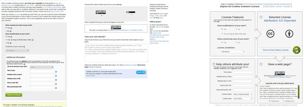
Creative Commons is proud to announce the launch of our new license chooser tool. The license chooser has been completely redesigned for greater clarity and ease of use. While the original license chooser was successful at simplifying the act of selecting a license and applying it to one’s work, its linear workflow resembled a registration process. Furthermore, as the tool had been extended numerous times, its interface became more and more cluttered. While the redesign is a total user interface overhaul, feature-wise there isn’t anything new that wasn’t already somewhere in the license engine. This may come as a surprise to many users familiar with the old tool.

From left to right: The original chooser’s selection page, the previous chooser’s results page, and the recently redesigned interactive license chooser.
CC BY
First and foremost, the license chooser is not a registration tool. It never was. But the old chooser’s interface was a form you would fill out and submit to our server. The server would then return a page showing what license was chosen by the user, and provided HTML that the user could copy and paste onto their website. That page also provided other information and options for marking one’s work. These additional options were tucked to the side, much like fine print, so most users ignored it. What was going on here was that the form you filled out added metadata about the work you were licensing; the HTML on the results page contained that information in a standardized way so that computer programs (like search engines) could read it. The new license chooser does away with the Submit button and more clearly explains what the metadata fields are, and that they are completely optional.
The license chooser does not generate licenses. There are six Creative Commons licenses available, which work internationally, and additional ports of these six licenses exist for specific legal jurisdictions. The license chooser is an exploration tool. To underscore that, the new chooser combines the selection and results pages into four simple panels. Some information that was already on the license deeds is presented in the chooser now. This creates a nonlinear work flow: adjusting information in one panel has an impact on the contents of other panels. This encourages a kind of back-and-forth interaction, which both exposes options that may have not been clear before (like embeddable XMP metadata instead of HTML, or a simple notice for offline works) and allows the user to make a more informed decision about selecting the license most appropriate to their circumstances and the tradeoffs between various options.
We’ve gotten a few questions about the “This is a Free Culture license” and “This is not a Free Culture license” messages on the chooser. The concept of Free Culture has its roots in the history of free and open source software, and it’s an important philosophical underpinning to the CC license set. In English, the word “free” means either something without cost, or something that is unrestricted. The “free” in Free Culture refers to this later case. As with free software, it’s “free as in freedom, not as in free beer.”
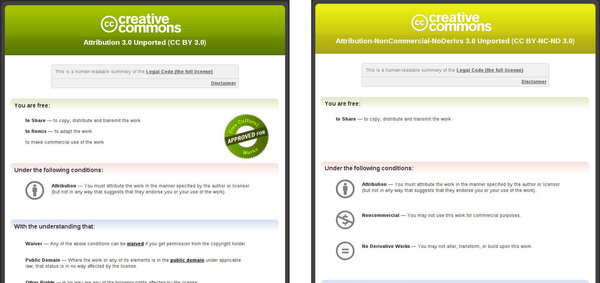
Our license deed pages already contained information about whether the license was a Free Culture license or not. For example, Attribution-Sharealike is a Free Culture license. The deed has a green color scheme and a badge. On the other hand, Attribution-NonCommercial-NoDerivs includes restrictions that make it by definition not a Free Culture license. Thus, it has a different color scheme and no badge. Because it’s unlikely that users will open the deeds and compare them side by side, the new license chooser includes this information in the selected license panel; as well as links to more information and newly written help text that discusses the advantages and disadvantages in selecting a Free Culture license. Ultimately, the user should select the license they believe is most appropriate for their work given the circumstances of publishing.

A Free Culture approved license deed is seen on the left. The license deed on the right indicates that it is not for a Free Culture license.
CC BY
We feel the new interactive license chooser is a dramatic improvement, and it is exciting to see that simply better organizing the tool and adopting a minimalistic design has had the effect of making such a complex tool more accessible and better exposing users to the ideas behind the CC licenses and infrastructure.


Thank you very much! I really like the new design and that the new tool raises more awareness for the non-free licenses. Where can I find the link to the “newly written help text that discusses the advantages and disadvantages in selecting a Free Culture license”?
Congrats to the new chooser! It really may help those who are not familiar with the CC license models. I would like to see a “seventh” license which allows translations. De facto it were two. If a text is published under BY-NC-ND or BY-ND, a translation is not allowed, because it is a derived work. The purpose of a translation however is to keep the original text as intact as possible. The license which allows translation should not allow re-arranging or continue or expand a text or remix it or parts of it with other texts or text parts. Alternatively to a new license, there could be a hint somewhere in the chooser, that you kill any translation with ND. The status quo is a mess for translators, because if the author gives you the permission to translate, you have to note that together with the original license in your credit.
Where can I find the link to the “newly written help text that discusses the advantages and disadvantages in selecting a Free Culture license”?
The new chooser looks good and should make it easier to pick your specific license, or at least explore the options.
@Bruno – Getting into translations is going to be a real pain, but do you want your license to restrict how/what you translate? Including that specific license would muddy the water more than help.