CPM and PERT Charts

CPM Chart
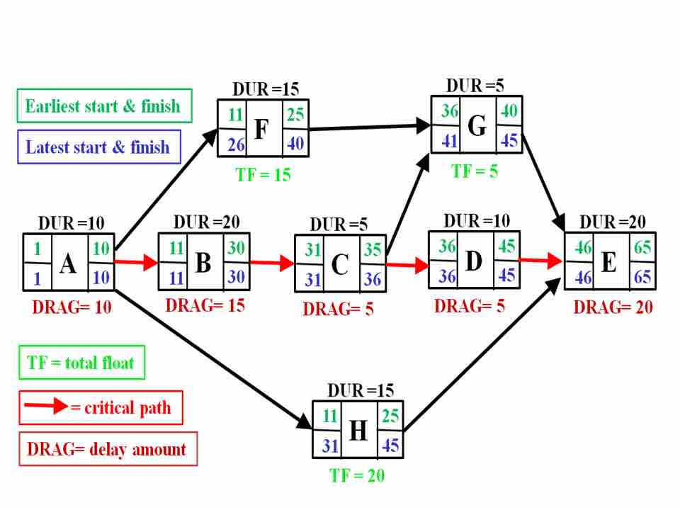
A CPM chart is similar to a PERT chart but includes more detail about the latest and earliest possible times at which each stage of the project must be completed. The earliest possible time (in green) are calculated by determining the earliest start times of all activities on the critical path before that activity. The latest possible times (in blue) are calculated by adding all of the latest possible times of the activities before the critical path. In this CPM chart, the critical path is A-B-C-D-E since that pathway takes the most time to complete of any of the other potential pathways available. The total float time (lime green), or TF, represents the amount of time flexibility a task has between start and end times.
Source
Boundless vets and curates high-quality, openly licensed content from around the Internet. This particular resource used the following sources: