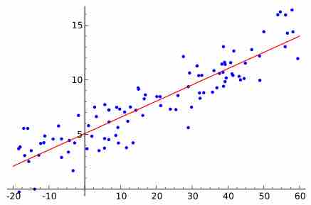
Linear Regression vs. Graph of Averages
Linear (straight-line) relationships between two quantitative variables are very common in statistics. Often, when we have a scatterplot that shows a linear relationship, we'd like to summarize the overall pattern and make predictions about the data. This can be done by drawing a line through the scatterplot. The regression line drawn through the points describes how the dependent variable
In most cases, a line will not pass through all points in the data. A good line of regression makes the distances from the points to the line as small as possible. The most common method of doing this is called the "least-squares" method. The least-squares regression line is of the form
Sometimes, a graph of averages is used to show a pattern between the
The points on a graph of averages do not usually line up in a straight line, making it different from the least-squares regression line. The graph of averages plots a typical

Least Squares Regression Line
Random data points and their linear regression.