

Map Details - US Stroke Death Rates 2000-2006, by County
 ShareCompartir
Impact Statement
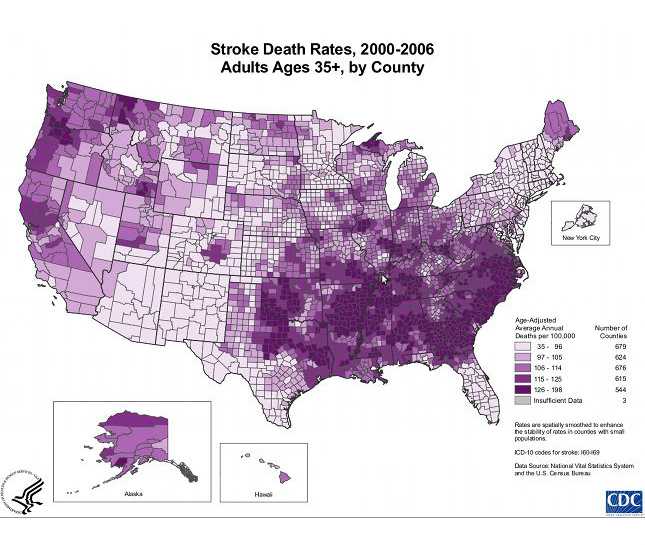
The map shows that concentrations of counties with the highest stroke death rates – meaning the top quintile – are located primarily in the Southeast, with heavy concentrations of high-rate counties in Georgia, Alabama, Mississippi, and Arkansas. Pockets of high-rate counties also are found in Tennessee, Oklahoma, parts of Texas, and along the coastal plains of North Carolina and South Carolina.
Purpose/Findings
This map was created as part of a series of maps displayed on the Division for Heart Disease and Stroke Prevention web site showing heart disease and stroke hospitalizations and deaths. These maps document the large geographic and population-based disparities that exist in cardiovascular disease across the United States. They are intended to be used to inform policy makers and researchers about the disproportionate geographic burden of cardiovascular disease in the U.S.
Software Used
ArcGIS 9.3 ESRI
Data Used
National Center for Health Statistics Vital Statistics Compressed Mortality Files 2000-2006, U.S. Census Bureau County Population Estimates 2000-2006 from Vintage 2006 data.
Methods Used
ICD-10 codes for stroke: I60-I69. Age-adjusted death rates for adults 35 years and older were calculated using the 2000 U.S. standard population and are displayed by county per 100,000 total population. Rates were spatially smoothed to enhance the stability of rates in counties with small populations by using a spatial moving average. Deaths (numerators) and population counts (person–year denominators) for each county were combined with the deaths and population counts of the immediate neighboring counties (i.e., contiguous counties) and then divided to produce an average rate. A county was determined to have insufficient data for the display of the death rate if the total number of deaths in that county plus its neighbors was fewer than 20 during the specified time period or if the population count was less than 5 during the specified time period. For the contiguous U.S., we used an Albers conic equal area projection; for Alaska, we used a Miller’s Cylindrical projection; and for Hawaii, we used geographic coordinates. Alaska and Hawaii are not in proper geographic scale relative to the continental U.S.
Contact the Submitter of this Map
Linda Schieb, Epidemiogy, Centers for Disease Control and Prevention
(770) 488-5348
lschieb@cdc.gov
How to Cite this Map
Stroke Death Rates, 2000-2006, Adults Ages 35+, by County Schieb, Linda, CDC, [TODAY’S DATE].
- Page last reviewed: July 7, 2017
- Page last updated: July 7, 2017
- Content source: