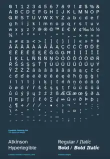
Atkinson Hyperlegible
Atkinson Hyperlegible is a freely available typeface built around a grotesque sans-serif core, intended to be optimally legible for readers who are partially visually impaired, with all characters maximally distinguishable from one another. It was developed by the Braille Institute of America in collaboration with Applied Design Works and is available under the SIL Open Font License. It won Fast Company's Innovation by Design Award for Graphic Design in 2019 and was shortlisted for a graphic design award by Dezeen in 2020.
 | |
| Category | Sans-serif |
|---|---|
| Classification | Grotesque |
| Designer(s) | Applied Design Works |
| Foundry | Braille Institute |
| Date created | 2019 |
| Website | brailleinstitute |
History

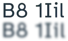
The project began as part of a visual rebranding at the Braille Institute,[1] which contracted the studio Applied Design Works to work with a specialist in low-vision conditions from the Braille Institute and a panel of people with such conditions.[2] Most students that the Braille Institute works with are not fully blind and do not use the tactile writing system with which the institute shares a name.[3] Applied Design Works looked for a typeface that would suit the Braille Institute's needs but were unable to find one.[3] Experimenting with both serif and sans-serif fonts including Times New Roman and Frutiger, they found that distinguishing among homoglyphs, and even among some characters that do not appear very similar to fully sighted people, was difficult for partially visually impaired people because of these fonts' focus on uniformity. Thus the project shifted to creating a typeface that would be as legible as possible for the community the Braille Institute serves.[1]
Applied Design Works' creative director, Craig Dobie, put Elliott Scott in charge of designing the typeface.[1] Building around a grotesque sans-serif core,[4] the Applied Designs Works team worked to make sure that none of the typeface's glyphs could be mistaken for any other, consulting with clients of the Braille Institute and familiarizing themselves with research into legibility.[3] The Braille Institute named the finished product after the institute's founder, J. Robert Atkinson,[5] and released it on its website through a custom license;[6] in 2021, they made it available through Google Fonts under the SIL Open Font License.[7][8]
In 2019, Atkinson Hyperlegible won Fast Company's Innovation by Design Award for Graphic Design.[1] The next year, it was shortlisted for a graphic design award by Dezeen,[9] losing to a series of heat-reactive stamps that illustrate climate change.[10]
Design

Atkinson Hyperlegible contains four styles, each of 335 glyphs: regular, bold, italics, and italics bold. It supports diacritics in 27 languages.[4]
Elliott Scott of Applied Design Works and studio creative director Craig Dobie made the decision "to break a lot of rules that a lot of designers will care about",[1] for instance adding serifs to the uppercase I but not the uppercase T[2] and giving the uppercase F a significantly longer tie (middle bar) than the uppercase E.[1] Mark Wilson of Fast Company writes:[1]
Stare too long at its quirks, and Atkinson Hyperlegible almost feels like it has an identity crisis, as if a dozen fonts were smashed together to make one. But typed out on a page, it's been treated with careful kerning that the average eye just kind of accepts, as if it was any other typeface.
Other efforts to make letters distinct include exaggerating letters' shapes and angling their spurs. There are many circles in Atkinson Hyperlegible, a nod to braille dots and the Braille Institute.[2]
References
- Wilson, Mark (19 September 2019). "This typeface hides a secret in plain sight. And that's the point". Innovation by Design. Fast Company. New York City. Retrieved 10 November 2022.
- Crook, Lizzie (11 September 2020). "Atkinson Hyperlegible typeface is designed for visually impaired readers". Dezeen. London. Retrieved 10 November 2022.
- Mangan, Tom (9 June 2022) [8 November 2019]. "New Typeface Boosts Legibility for Low Vision Readers". All About Vision. Retrieved 10 November 2022.
- Budrick, Callie (14 October 2020). "The Hyperlegible Typeface Changing How We See Print". Design Inspiration. Print. Retrieved 10 November 2022.
- Marsden, Rhodri (23 August 2021). "What's in a font? How typography can help us read better". The National. Abu Dhabi, UAE. Retrieved 10 November 2022.
- "Download the Atkinson Hyperlegible Font". Braille Institute of America. Retrieved 23 September 2021.
- "Braille Institute's Atkinson Hyperlegible Typeface Now Available on Google Fonts" (Press release). Braille Institute of America. 5 August 2021. Retrieved 18 January 2023.
- "Atkinson Hyperlegible". Google Fonts. Retrieved 10 November 2022.
- "Shortlists". Dezeen Awards 2020. Dezeen. London. Retrieved 10 November 2022.
- "Climate Change Stamps | Winner". Dezeen Awards 2020. Dezeen. London. Retrieved 10 November 2022.
External links
- Atkinson Hyperlegible at the Braille Institute of America website
- Summary document at the Braille Institute of America website
- Atkinson Hyperlegible at Google Fonts
- atkinson-hyperlegible on GitHub