Homoglyph
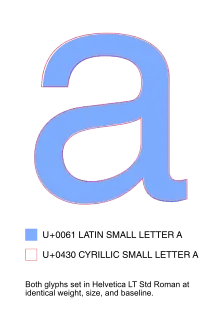
In orthography and typography, a homoglyph is one of two or more graphemes, characters, or glyphs with shapes that appear identical or very similar but may have differing meaning. The designation is also applied to sequences of characters sharing these properties.

In 2008, the Unicode Consortium published its Technical Report #36[1] on a range of issues deriving from the visual similarity of characters both in single scripts, and similarities between characters in different scripts.
A notable example of homoglyphic confusion arose from the use of a ⟨y⟩ to represent a ⟨þ⟩ (thorn) when setting older English texts in typefaces that do not contain the latter character. It has led in modern times to such phenomena as Ye olde shoppe, implying incorrectly that the word the was formerly written ye /jiː/ rather than þe.
Examples of homoglyphic symbols are (a) the diaeresis and umlaut (both a pair of dots, but with different meaning, although encoded with the same code points); and (b) the hyphen and minus sign (both a short horizontal stroke, but with different meaning, although often encoded with the same code point). Among digits and letters, digit 1 and lowercase l are always encoded separately but in many typefaces are given very similar glyphs, and digit 0 and capital O are always encoded separately but in many typefaces are given very similar glyphs. Virtually every example of a homoglyphic pair of characters can potentially be differentiated graphically with clearly distinguishable glyphs and separate code points, but this is not always done. Typefaces that do not emphatically distinguish the one/el and zero/oh homoglyphs are considered unsuitable for writing formulas, URLs, source code, IDs and other text where characters cannot always be differentiated without context. Fonts which distinguish glyphs by means of a slashed zero, for example, are preferred for those uses.
The term homograph is sometimes used synonymously with homoglyph, but in the usual linguistic sense, homographs are words that are spelled the same but have different meanings, a property of words, not characters.
(Synoglyphs are glyphs that look different but mean the same thing. Synoglyphs are also known informally as display variants.)
Umlaut and diaresis
In the days of mechanical typewriters these were typed with the same key, which was also used for a double inverted comma. However the umlaut originated specifically as a pair of short vertical lines (not two dots) (see Sutterlin). Incidentally the two dots above the letter E in Albanian are described as a diaresis but do not fulfil the function of a diaresis. [2]
0 and O; 1, l and I
Two common and important sets of homoglyphs in use today are the digit zero and the capital letter O (i.e. 0 and O); and the digit one, the lowercase letter L and the uppercase i (i.e. 1, l and I). In the early days of mechanical typewriters there was very little or no visual difference between these glyphs, and typists treated them interchangeably as keyboarding shortcuts. In fact, most keyboards did not even have a key for the digit "1", requiring users to type the letter "l" instead, and some also omitted 0. As these same typists transitioned in the 1970s and 1980s to being computer keyboard operators, their old keyboarding habits continued with them, and was an occasional source of confusion.
Most current type designs carefully distinguish between these homoglyphs, usually by drawing the digit zero narrower and drawing the digit one with prominent serifs. Early computer print-outs went even further and marked the zero with a slash or dot, which led to a new conflict involving the Scandinavian letter "Ø" and the Greek letter Φ (phi). The redesigning of character types to differentiate these characters has meant less confusion. The degree to which two different characters appear the same to a given observer is called the "visual similarity".[3]
Some type designs conform to the DIN 1450 legibility standard by carefully designing such characters to be easy to distinguish: slashed zero to distinguish it from capital O; lowercase l with a tail and uppercase I with serifs to distinguish it from the digit 1; distinguishing the numeral 5 from the capital S; etc.[4]
Multi-letter homoglyphs
.jpg.webp)
Some other combinations of letters look similar, for instance rn looks similar to m, cl looks similar to d, and vv looks similar to w.
In certain narrow-spaced fonts (such as Tahoma), placing the letter c next to a letter such as j, l or i will create a homoglyph, such as cj cl ci (g d a).
When some characters are placed next to each other, seen together at a glance they give the visual impression of another, unrelated character. A more precise way of saying this is that some typographic ligatures can look similar to standalone glyphs. For example, the fi ligature (fi) can look similar to A in some typefaces or fonts. This potential for confusion is sometimes an argument made against the use of ligatures.
Unicode homoglyphs

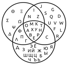
The Unicode character set contains many strongly homoglyphic characters, known as "confusables".[1] These present security risks in a variety of situations (addressed in UTR#36)[5] and have recently been called to particular attention in regard to internationalized domain names. One might deliberately spoof a domain name by replacing one character with its homoglyph, thus creating a second domain name, not readily distinguishable from the first, that can be exploited in phishing (see main article IDN homograph attack). In many fonts the Greek letter 'Α', the Cyrillic letter 'А' and the Latin letter 'A' are visually identical, as are the Latin letter 'a' and the Cyrillic letter 'а' (the same can be applied to the Latin letters "aBceHKopTxy" and the Cyrillic letters "аВсеНКорТху"). A domain name can be spoofed simply by substituting one of these forms for another in a separately registered name. There are also many examples of near-homoglyphs within the same script such as 'í' (with an acute accent) and 'i', É (E-acute) and Ė (E dot above) and È (E-grave), Í (with an acute accent) and ĺ (Lowercase L with acute). When discussing this specific security issue, any two sequences of similar characters may be assessed in terms of its potential to be taken as a 'homoglyph pair', or if the sequences clearly appear to be words, as 'pseudo-homographs' (noting again that these terms may themselves cause confusion in other contexts). In the Chinese language, many simplified Chinese characters are homoglyphs of the corresponding traditional Chinese characters.
Efforts by TLD registries and Web browser designers are under way to minimize the risks of homoglyphic confusion. Commonly, this is achieved by prohibiting names which mix character sets from multiple languages (toys-Я-us.org, using the Cyrillic letter Я, would be invalid, but wíkipedia.org and wikipedia.org still exist as different websites); Canada's .ca registry goes one step further by requiring names which differ only in diacritics to have the same owner and same registrar.[6] The handling of Chinese characters varies: in .org and .info registration of one variant renders the other unavailable to anyone, while in .biz the traditional and simplified versions of the same name are delivered as a two-domain bundle which both point to the same domain name server.
Relevant documentation will be found both on the developers' Web sites, and on an IDN Forum[7] provided by ICANN.
Canonicalization
Homoglyphs of all kinds can be detected through a process called 'dual canonicalization'.[3] The first step in this process is to identify homoglyph sets, namely characters appearing the same to a given observer. From here, a single token is specified to represent the homoglyph set. This token is called a canon. The next step is to convert each character in the text to the corresponding canon in a process called canonicalization. If the canons of two runs of text are the same but the original text is different, then a homoglyph exists in the text.
See also
- IDN homograph attack – Visually similar letters in domain names
- Duplicate characters in Unicode
- Vehicle registration plates of Bosnia and Herzegovina use only numbers and letters that look the same in the Latin and Cyrillic alphabets.
- Yaminjeongeum, South Korean language game of intentionally substituting Hangul characters for homoglyphs.
- Allograph – Letters with alternative shapes
References
- "UTR #36: Unicode Security Considerations". www.unicode.org.
- Describing these as homoglyphs is questionable as there are probably no languages in which the glyph can fulfil both these roles. It would be just as valid to describe, say, a grave accent as a homoglyph because it fulfils different roles in different languages.
- Helfrich, James; Neff, Rick (2012). "Dual canonicalization: An answer to the homograph attack". 2012 e Crime Researchers Summit. eCrime Researchers Summit (eCrime), 2012. pp. 1–10. doi:10.1109/eCrime.2012.6489517. ISBN 978-1-4673-2543-1.
- Nigel Tao, Chuck Bigelow, and Rob Pike. Go fonts: DIN Legibility Standard". 2016.
- "UTR #36: Unicode Security Considerations". unicode.org.
- "Register a .CA in French!". Archived from the original on 2013-03-28. Retrieved 2013-03-29.
- "ICANN Email Archives: [idn-guidelines]". forum.icann.org.
External links
- https://www.unicode.org/Public/security/latest/confusables.txt - recommended confusable mapping for IDN.