Qualitative Data
Recall the difference between quantitative and qualitative data. Quantitative data are data about numeric values. Qualitative data are measures of types and may be represented as a name or symbol. Statistics that describe or summarize can be produced for quantitative data and to a lesser extent for qualitative data. As quantitative data are always numeric they can be ordered, added together, and the frequency of an observation can be counted. Therefore, all descriptive statistics can be calculated using quantitative data. As qualitative data represent individual (mutually exclusive) categories, the descriptive statistics that can be calculated are limited, as many of these techniques require numeric values which can be logically ordered from lowest to highest and which express a count. Mode can be calculated, as it it the most frequency observed value. Median, measures of shape, measures of spread such as the range and interquartile range, require an ordered data set with a logical low-end value and high-end value. Variance and standard deviation require the mean to be calculated, which is not appropriate for categorical variables as they have no numerical value.
Graphing Qualitative Data
There are a number of ways in which qualitative data can be displayed. A good way to demonstrate the different types of graphs is by looking at the following example:
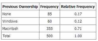
When Apple Computer introduced the iMac computer in August 1998, the company wanted to learn whether the iMac was expanding Apple's market share. Was the iMac just attracting previous Macintosh owners? Or was it purchased by newcomers to the computer market, and by previous Windows users who were switching over? To find out, 500 iMac customers were interviewed. Each customer was categorized as a previous Macintosh owners, a previous Windows owner, or a new computer purchaser. The qualitative data results were displayed in a frequency table.

Frequency Table for Mac Data
The frequency table shows how many people in the study were previous Mac owners, previous Windows owners, or neither.
The key point about the qualitative data is that they do not come with a pre-established ordering (the way numbers are ordered). For example, there is no natural sense in which the category of previous Windows users comes before or after the category of previous iMac users. This situation may be contrasted with quantitative data, such as a person's weight. People of one weight are naturally ordered with respect to people of a different weight.
Pie Charts
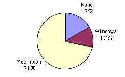
One way in which we can graphically represent this qualitative data is in a pie chart. In a pie chart, each category is represented by a slice of the pie. The area of the slice is proportional to the percentage of responses in the category. This is simply the relative frequency multiplied by 100. Although most iMac purchasers were Macintosh owners, Apple was encouraged by the 12% of purchasers who were former Windows users, and by the 17% of purchasers who were buying a computer for the first time .

Pie Chart for Mac Data
The pie chart shows how many people in the study were previous Mac owners, previous Windows owners, or neither.
Pie charts are effective for displaying the relative frequencies of a small number of categories. They are not recommended, however, when you have a large number of categories. Pie charts can also be confusing when they are used to compare the outcomes of two different surveys or experiments.
Here is another important point about pie charts. If they are based on a small number of observations, it can be misleading to label the pie slices with percentages. For example, if just 5 people had been interviewed by Apple Computers, and 3 were former Windows users, it would be misleading to display a pie chart with the Windows slice showing 60%. With so few people interviewed, such a large percentage of Windows users might easily have accord since chance can cause large errors with small samples. In this case, it is better to alert the user of the pie chart to the actual numbers involved. The slices should therefore be labeled with the actual frequencies observed (e.g., 3) instead of with percentages.
Bar Charts
Bar charts can also be used to represent frequencies of different categories . Frequencies are shown on the Y axis and the type of computer previously owned is shown on the X axis. Typically the Y-axis shows the number of observations rather than the percentage of observations in each category as is typical in pie charts.

Bar Chart for Mac Data
The bar chart shows how many people in the study were previous Mac owners, previous Windows owners, or neither.