Choropleth map
A choropleth map (from Greek χῶρος (choros) 'area/region', and πλῆθος (plethos) 'multitude') is a type of statistical thematic map that uses pseudocolor, meaning color corresponding with an aggregate summary of a geographic characteristic within spatial enumeration units, such as population density or per-capita income.[1][2][3]
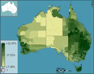
Choropleth maps provide an easy way to visualize how a variable varies across a geographic area or show the level of variability within a region. A heat map or isarithmic map is similar but uses regions drawn according to the pattern of the variable, rather than the a priori geographic areas of choropleth maps. The choropleth is likely the most common type of thematic map because published statistical data (from government or other sources) is generally aggregated into well-known geographic units, such as countries, states, provinces, and counties, and thus they are relatively easy to create using GIS, spreadsheets, or other software tools.
History
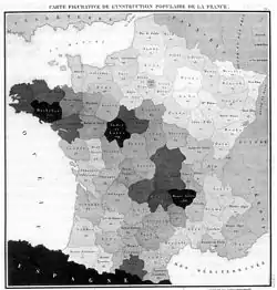
The earliest known choropleth map was created in 1826 by Baron Pierre Charles Dupin, depicting the availability of basic education in France by department.[4] More "cartes teintées" ("tinted maps") were soon produced in France to visualize other "moral statistics" on education, disease, crime, and living conditions.[5]: 158 Choropleth maps quickly gained popularity in several countries due to the increasing availability of demographic data compiled from national Censuses, starting with a series of choropleth maps published in the official reports of the 1841 Census of Ireland.[6] When Chromolithography became widely available after 1850, color was increasingly added to choropleth maps.[5]: 193
The term "choropleth map" was introduced in 1938 by the geographer John Kirtland Wright, and was in common usage among cartographers by the 1940s.[7][8] Also in 1938, Glenn Trewartha reintroduced them as "ratio maps", but this term did not survive.[9]
Structure
A choropleth map brings together two datasets: spatial data representing a partition of geographic space into distinct districts, and statistical data representing a variable aggregated within each district. There are two common conceptual models of how these interact in a choropleth map: in one view, which may be called "district dominant", the districts (often existing governmental units) are the focus, in which a variety of attributes are collected, including the variable being mapped. In the other view, which may be called "variable dominant", the focus is on the variable as a geographic phenomenon (say, the Latino population), with a real-world distribution, and the partitioning of it into districts is merely a convenient measurement technique.[10]

Geometry: aggregation districts
In a choropleth map, the districts are usually previously defined entities such as governmental or administrative units (e.g., counties, provinces, countries), or districts created specifically for statistical aggregation (e.g., census tracts), and thus have no expectation of correlation with the geography of the variable. That is, boundaries of the colored districts may or may not coincide with the location of changes in the geographic distribution being studied. This is in direct contrast to chorochromatic and isarithmic maps, in which region boundaries are defined by patterns in the geographic distribution of the subject phenomenon.
Using pre-defined aggregation regions has a number of advantages, including: easier compilation and mapping of the variable (especially in the age of GIS and the Internet with its many sources of data), recognizability of the districts, and the applicability of the information to further inquiry and policy tied to the individual districts. A prime example of this would be elections, in which the vote total for each district determines its elected representative.
However, it can result in a number of issues, generally due to the fact that the constant color applied to each aggregation district makes it look homogeneous, masking an unknown degree of variation of the variable within the district. For example, a city may include neighborhoods of low, moderate, and high family income, but be colored with one constant "moderate" color. Thus, real-world spatial patterns may not conform to the regional unit symbolized.[11] Because of this, issues such as the ecological fallacy and the modifiable areal unit problem (MAUP) can lead to major misinterpretations of the data depicted, and other techniques are preferable if one can obtain the necessary data.[12][13][14]
These issues can be somewhat mitigated by using smaller districts, because they show finer variations in the mapped variable, and their smaller visual size and increased number reduces the likelihood that the map user makes judgments about the variation within a single district. However, they can make the map overly complex, especially if there is not a meaningful geographic pattern in the variable (i.e., the map looks like randomly scattered colors). Although representing specific data in large regions can be misleading, the familiar district shapes can make the map clearer and easier to interpret and remember.[15] The choice of regions will ultimately depend on the map's intended audience and purpose. Alternatively, the dasymetric technique can sometimes be employed to refine the region boundaries to more closely match actual changes in the subject phenomenon.
Because of these issues, for many variables, one may prefer an isarithmic (for a quantitative variable) or chorochromatic map (for a qualitative variable), in which the region boundaries are based on the data itself. However, in many cases such detailed information is simply not available, and the choropleth map is the only feasible option.
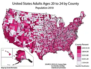
Property: aggregate statistical summaries
The variable to be mapped may come from a wide variety of disciplines in the human or natural world, although human topics (e.g. demographics, economics, agriculture) are generally more common because of the role of governmental units in human activity, which often leads to the original collection of the statistical data. The variable can also be in any of Stevens' levels of measurement: nominal, ordinal, interval, or ratio, although quantitative (interval/ratio) variables are more commonly used in choropleth maps than qualitative (nominal/ordinal) variables. It is important to note that the level of measurement of the individual datum may be different than the aggregate summary statistic. For example, a census may ask each individual for his or her "primary spoken language" (nominal), but this may be summarized over all of the individuals in a county as "percent primarily speaking Spanish" (ratio) or as "predominant primary language" (nominal).
Broadly speaking, a choropleth map may represent two types of variables, a distinction common to physics and chemistry as well as Geostatistics and spatial analysis:
- A spatially extensive variable (sometimes called a global property) is one that can apply only to the entire district, commonly in the form of total counts or amounts of a phenomenon (akin to Mass or weight in physics). Extensive variables are said to be accumulative over space; for example, if the population of the United Kingdom is 65 million, it is not possible that the populations of England, Wales, Scotland, and Northern Ireland could also be 65 million. Instead, their total populations must sum (accumulate) to calculate the total population of the collective entity. However, while it is possible to map an extensive variable in a choropleth map, this is almost universally discouraged because patterns can be easily misinterpreted. For example, if a choropleth map assigned a particular shade of red to total populations between 60 and 70 million, a situation in which United Kingdom (as a single district) has 65 million inhabitants would be indistinguishable from a situation in which the four constituent countries each had 65 million inhabitants, even though these are vastly different geographic realities. Another source of interpretation error is that if a large district and a small district have the same value (and thus the same color), the larger one will naturally look like more.[16] Other types of thematic maps, especially proportional symbols and cartograms, are designed to represent extensive variables and are generally preferred.[1]: 131
- A spatially intensive variable, also known as a field, statistical surface, or localized variable, represents a property that could be measured at any location (a point or small area, depending on its nature) in space, independent of any boundaries, although its variation over a district can be summarized as a single value. Common intensive variables include densities, proportions, rates of change, mean allotments (e.g., GDP per capita), and descriptive statistics (e.g., mean, median, standard deviation). Intensive variables are said to be distributive over space; for example, if the population density of the United Kingdom is 250 people per square kilometer, then it would be reasonable to estimate (in the absence of any other data) that the most likely (if not actually correct) density of each of the five constituent countries is also 250/km2. Traditionally in cartography, the predominant conceptual model for this kind of phenomenon has been the statistical surface, in which the variable is imagined as a third-dimension "height" above the two-dimensional space that varies continuously.[17] In Geographic information science, the more common conceptualization is the field, adopted from Physics and usually modeled as a scalar function of location. Choropleth maps are better suited to intensive variables than extensive; if a map user sees the United Kingdom filled with a color for "100-200 people per square km", estimating that Wales and England may each have 100-200 people per square km may not be accurate, but it is possible and a reasonable estimate.
Normalization
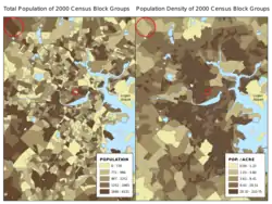
Normalization is the technique of deriving a spatially intensive variable from one or more spatially extensive variables, so that it can be appropriately used in a choropleth map.[3] It is similar, but not identical, to the technique of normalization or standardization in statistics. Typically, it is accomplished by computing the ratio between two spatially extensive variables.[12]: 252 Although any such ratio will result in an intensive variable, only a few are especially meaningful and commonly used in choropleth maps:
- Density = total / area. Example: population density
- Proportion = subgroup total / grand total. Example: Wealthy households as a percentage of all households.
- Mean allocation = total amount / total individuals. Example: gross domestic product per capita (total GDP / total population)
- Rate of change = total at later time / total at earlier time. Example: annual population growth rate.
These are not equivalent, nor is one better than another. Rather, they tell different aspects of a geographic narrative. For example, a choropleth map of the population density of the Latino population in Texas visualizes a narrative about the spatial clustering and distribution of that group, while a map of the percent Latino visualizes a narrative of composition and predominance. Failure to employ proper normalization will lead to an inappropriate and potentially misleading map in almost all cases.[3][16][18] This is one of the most common mistakes in cartography, with one study finding that at one point, more than half of United States COVID-19 dashboards hosted by state governments were not employing normalization to their choropleth maps.[18]
Classification
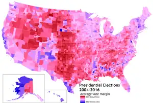
Every choropleth map has a strategy for mapping values to colors. A classified choropleth map separates the range of values into classes, with all of the districts in each class being assigned the same color. An unclassed map (sometimes called n-class) directly assigns a color proportional to the value of each district. Starting with Dupin's 1826 map, classified choropleth maps have been far more common.[2] It is likely that this was originally due to the greater simplicity of applying a limited set of tints; only in the age of computerized cartography have unclassed choropleth maps even been feasible, and until recently, they were still not easy to create in most mapping software.[19][2][20][21] Waldo R. Tobler, in formally introducing the unclassed scheme in 1973, asserted that it was a more accurate depiction of the original data, and stated that the primary argument in favor of classification, that it is more readable, needed to be tested.[2] The debate and experiments that followed came to the general conclusion that the primary advantage of unclassed choropleth maps, in addition to Tobler's assertion of raw accuracy, was that they allowed readers to see subtle variations in the variable, without leading them to believe that the districts the fell into the same class had identical values. Thus, they are able to better see the general patterns in the geographic phenomenon, but not the specific values.[1]: 109 [22][23] The primary argument in favor of classed choropleth maps is that it is easier for readers to process, due to the fewer number of distinct shades to recognize, which reduces cognitive load and allows them to precisely match the colors in the map to the values listed in the legend.[2][20][21]
Classification is performed by establishing a classification rule, a series of thresholds that partitions the quantitative range of variable values into a series of ordered classes. For example, if a dataset of annual Median income by U.S. county includes values between US$20,000 and $150,000, it could be broken into three classes at thresholds of $45,000 and $83,000. To avoid confusion, any classification rule should be mutually exclusive and collectively exhaustive, meaning that any possible value falls into exactly one class. For example, if a rule establishes a threshold at the value 6.5, it needs to be clear about whether a district with a value of exactly 6.5 will be classified into the lower or upper class (i.e., whether the definition of the lower class is <6.5 or ≤6.5 and whether the upper class is >6.5 or ≥6.5). A variety of types of classification rules have been developed for choropleth maps:[24][1]: 87
- Exogenous rules import thresholds without regard for patterns in the data at hand.
- Established rules are those already in common use due to past scientific research or official policy. An example would be using government tax brackets or a standard Poverty threshold when classifying income levels.
- Ad hoc or Common sense strategies are essentially invented by the cartographer using thresholds that have some intuitive sense. An example would be classifying incomes according to what the cartographer believes to be "rich," "middle class," and "poor." These strategies are generally not advised unless all other methods are not feasible.
- Endogenous rules are based on patterns in the dataset itself.
- Natural breaks rules look for natural clusters in the data, in which large numbers of districts have similar values with large gaps between them. If this is the case, such clusters are probably geographically meaningful.
- The Jenks natural breaks optimization, developed by George F. Jenks, is a heuristic algorithm for automatically identifying such clusters if they exist; it is essentially a one-dimensional form of the k-means clustering algorithm.[25] If natural clusters do not exist, the breaks it generates are often recognized as a good compromise between the other methods, and it is commonly the default classifier used in GIS software.
- Equal intervals or an arithmetic progression divides the range of values so that each class has an equal range of values: (max - min)/n. For example, the income range above ($20,000 - $150,000) would be divided into four classes at $52,500, $85,000, and $117,500.
- A standard deviation rule also generates equal ranges of value, but rather than starting with the minimum and maximum values, it starts at the arithmetic mean of the data and establishes a break at each multiple of a constant number of standard deviations above and below the mean.
- Quantiles divides the dataset so each class has an equal number of districts. For example, if the 3,141 counties of the United States were divided into four quantile classes (i.e., quartiles), then the first class would include the 785 poorest counties, then the next 785. Adjustments may need to be made when the number of districts does not divide evenly, or when identical values straddle the threshold.
- A Geometric progression rule divides the range of values so the ratio of thresholds is constant (rather than their interval as in an arithmetic progression). For example, the income range above would be divided using a ratio of 2 with thresholds at $40,000 and $80,000. This type of rule is commonly used when the frequency distribution of the data has a very high positive skew, especially if it is geometric or exponential.
- A nested means or Head/tail Breaks rule is an algorithm that recursively divides the data set by setting a threshold at the arithmetic mean, then subdividing each of the two created classes at their respective means, and so on. Thus, the number of classes is not arbitrary, but must be a power of two (2, 4, 8, etc.). It has been suggested that this also works well for highly skewed distributions.
- Natural breaks rules look for natural clusters in the data, in which large numbers of districts have similar values with large gaps between them. If this is the case, such clusters are probably geographically meaningful.
Because calculated thresholds can often be at precise values that are not easily interpretable by map readers (e.g., $74,326.9734), it is common to create a modified classification rule by rounding threshold values to a similar simple number. A common example is a modified geometric progression that subdivides powers of ten, such as [1, 2.5, 5, 10, 25, 50, 100, ...] or [1, 3, 10, 30, 100, ...].
Color progression
The final element of a choropleth map is the set of colors used to represent the different values of the variable. There are a variety of different approaches to this task, but the primary principle is that any order in the variable (e.g., low to high quantitative values) should be reflected in the perceived order of the colors (e.g., light to dark), as this will allow map readers to intuitively make "more vs. less" judgements and see trends and patterns with minimal reference to the legend.[1]: 114 A second general guideline, at least for classified maps, is that the colors should be easily distinguishable, so the colors on the map can be unambiguously matched to those in the legend to determine the represented values. This requirement limits the number of classes that can be included; for shades of gray, tests have shown that when value alone is used (e.g., light to dark, whether gray or any single hue), it is difficult to practically use more than seven classes.[18][26] If differences in hue and/or saturation are incorporated, that limit increases significantly to as many as 10-12 classes. The need for color discrimination is further impacted by color vision deficiencies; for example, color schemes that use red and green to distinguish values will not be useful for a significant portion of the population.[27]
The most common types of color progressions used in choropleth (and other thematic) maps include:[28][29]
- A Sequential progression represents variable values as color value
- A Grayscale progression uses only shades of gray.
 Grayscale progression
 - A Single-hue progression fades from a dark shade of the chosen color (or gray) to a very light or white shade of relatively the same hue. This is a common method used to map magnitude. The darkest hue represents the greatest number in the data set and the lightest shade representing the least number.
 Single hue progression
 - A Partial-spectral progression uses a limited range of hues to add more contrast to the value contrast, enabling a larger number of classes to be used. Yellow is commonly used for the lighter end of the progression due to its natural apparent lightness. Common hue ranges are yellow-green-blue and yellow-orange-red.
 Partial spectral progression
- A Grayscale progression uses only shades of gray.
- A Divergent or Bi-polar progression is essentially two sequential color progressions (of the types above) joined with a common light color or white. They are normally used to represent positive and negative values or divergence from a central tendency, such as the mean of the variable being mapped. For example, a typical progression when mapping temperatures is from dark blue (for cold) to dark red (for hot) with white in the middle. These are often used when the two extremes are given value judgements, such as showing the "good" end as green and the "bad" end as red.[30]
 Bi-polar color progression
 - A Spectral progression uses a wide range of hues (possibly the entire color wheel) without intended differences in value. This is most commonly used when there is an order to the values, but it is not a "more vs. less" order, such as seasonality. It is frequently used by non-cartographers in situations where other color progressions would be much more effective.[31][32]
 Full-spectral color progression
 - A Qualitative progression uses a scattered set of hues in no particular order, with no intended difference in value. This is most commonly used with nominal categories in a qualitative choropleth map, such as "most prevalent religion."
 Qualitative color progression
Bivariate choropleth maps
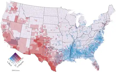
It is possible to represent two (and sometimes three) variables simultaneously on a single choropleth map by representing each with a single-hue progression and blending the colors of each district. This technique was first published by the U.S. Census Bureau in the 1970s, and has been used many times since, to varying degrees of success.[33] This technique is generally used to visualize the correlation and contrast between two variables hypothesized to be closely related, such as educational attainment and income. Contrasting but not complementary colors are generally used, so that their combination is intuitively recognized as "between" the two original colors, such as red+blue=purple. The technique works best when the geography of the variable has a high degree of spatial autocorrelation, so that there are large regions of similar colors with gradual changes between them; otherwise the map can look like a confusing mix of random colors.[12]: 331 They have been found to be more easily used if the map includes a carefully designed legend and an explanation of the technique.[34]
Legend
A choropleth map uses ad hoc symbols to represent the mapped variable. While the general strategy may be intuitive if a color progression is chosen that reflects the proper order, map readers cannot decipher the actual value of each district without a legend. A typical choropleth legend for a classed choropleth map includes a series of sample patches of the symbol for each class, with a text description of the corresponding range of values. On an unclassed choropleth map, it is common for the legend to show a smooth color gradient between the minimum and maximum values, with two or more points along it labeled with corresponding values.[1]: 111
An alternative approach is the histogram legend, which includes a histogram showing the frequency distribution of the mapped variable (i.e., the number of districts in each class). Each class may be represented by a single bar with its width determined by its minimum and maximum threshold values and its height calculated such that the box area is proportional to the number of districts included, then colored with the map symbol used for that class. Alternatively, the histogram may be divided into a large number of bars, such that each class includes one or more bars, symbolized according to its symbol in the map.[35] This form of legend shows not only the threshold values for each class, but gives some context for the source of those values, especially for endogenous classification rules that are based on the frequency distribution, such as quantiles. However, they are not currently supported in GIS and mapping software, and must typically be constructed manually.
See also
- Cartograms, which are often colored as choropleths.
- Chorochromatic map
- Dasymetric map
- Dot distribution map
- Heat map
- MacChoro
- Proportional symbol map
References
- Dent, Borden D.; Torguson, Jeffrey S.; Hodler, Thomas W. (2009). Cartography: Thematic Map Design (6th ed.). McGraw-Hill.
- Tobler, Waldo (1973). "Choropleth Maps Without Class Intervals?". Geographical Analysis. 5 (3): 262–265. doi:10.1111/j.1538-4632.1973.tb01012.x. Retrieved 11 March 2022.
- Adams, Aaron; Chen, Xiang; Li, Weidong; Zhang, Chuanrong (2020). "The disguised pandemic: the importance of data normalization in COVID-19 web mapping". Public Health. 183: 36–37. doi:10.1016/j.puhe.2020.04.034. PMC 7203028. PMID 32416476.
- Dupin, Charles (1826). Carte figurative de l'instruction populaire de la France. Bruxelles: s.n.
- Robinson, Arthur H. (1982). Early Thematic Mapping in the History of Cartography. University of Chicago Press.
- Ireland (1843). Report of the commissioners appointed to take the census of Ireland for the year 1841. Dublin: H.M. Stationery Office. p. lv.
- John Kirtland Wright (1938). "Problems in Population Mapping" in Notes on statistical mapping, with special reference to the mapping of population phenomena, p.12.
- Raisz, Erwin (1948). General Cartography (2nd ed.). McGraw-Hill. p. 249.
- Trewartha, Glenn T. (January 1938). "Ratio Maps of China's Farms and Crops". Geographical Review. 28 (1): 102–111. doi:10.2307/210569. JSTOR 210569.
- Chrisman, Nicholas (2002). Exploring Geographic Information Systems (2nd ed.). Wiley. p. 65. ISBN 0-471-31425-0.
- Jenks, George F.; Caspall, Fred C. (June 1971). "Error on Choroplethic Maps: Definition, Measurement, Reduction". Annals of the Association of American Geographers. 61 (2): 217–244. doi:10.1111/j.1467-8306.1971.tb00779.x. ISSN 0004-5608.
- T. Slocum, R. McMaster, F. Kessler, H. Howard (2009). Thematic Cartography and Geovisualization, Third Edn, page 252. Pearson Prentice Hall: Upper Saddle River, NJ.
- Openshaw, Stan (1983). The Modifiable Areal Unit Problem (PDF). ISBN 0-86094-134-5.
- Chen, Xiang; Ye, Xinyue; Widener, Michael J.; Delmelle, Eric; Kwan, Mei-Po; Shannon, Jerry; Racine, Racine F.; Adams, Aaron; Liang, Lu; Peng, Jia (27 December 2022). "A systematic review of the modifiable areal unit problem (MAUP) in community food environmental research". Urban Informatics. 1. doi:10.1007/s44212-022-00021-1.
- Rittschof, Kent (1998). "Learning and Remembering from Thematic Maps of Familiar Regions". Educational Technology Research and Development. 46: 19–38. doi:10.1007/BF02299827. S2CID 145086925.
- Mark Monmonier (1991). How to Lie with Maps. pp. 22–23. University of Chicago Press
- Jenks, George F. (1963). "Generalization in Statistical Mapping". Annals of the Association of American Geographers. 53 (1): 15. doi:10.1111/j.1467-8306.1963.tb00429.x.
- Adams, Aaron M.; Chen, Xiang; Li, Weidong; Chuanrong, Zhang (27 July 2023). "Normalizing the pandemic: exploring the cartographic issues in state government COVID-19 dashboards". Journal of Maps. 19 (5): 1–9. doi:10.1080/17445647.2023.2235385.
- Kelly, Brett (2017). "Review of Unclassed Choropleth Mapping". Cartographic Perspectives (86): 30. doi:10.14714/CP86.1424.
- Dobson, Michael W. (October 1973). "Choropleth Maps without Class Intervals? A Comment". Geographical Analysis. 5 (4): 358–360. doi:10.1111/j.1538-4632.1973.tb00498.x.
- Dobson, Michael W.; Peterson, Michael P. (1980). "Unclassed Choropleth Maps: A Comment, A Reply". The American Cartographer. 7 (1): 78–81. doi:10.1559/152304080784522928.
- Peterson, Michael P. (1979). "An Evaluation of Unclassed Crossed-Line Choropleth Mapping". The American Cartographer. 6 (1): 21–37. doi:10.1559/152304079784022736.
- Muller, Jean-Claude (June 1979). "Perception of Continuously Shaded Maps". Annals of the Association of American Geographers. 69 (2): 240. doi:10.1111/j.1467-8306.1979.tb01254.x.
- Kraak, Menno-Jan; Ormeling, Ferjan (2003). Cartography: Visualization of Spatial Data (2nd ed.). Prentice Hall. pp. 116–121. ISBN 978-0-13-088890-7.
- Jenks, George F. 1967. "The Data Model Concept in Statistical Mapping", International Yearbook of Cartography 7: 186–190.
- Monmonier, Mark (1977). Maps, Distortion, and Meaning. Association of American Geographers.
- Olson, Judy M.; Brewer, Cynthia (1997). "An evaluation of color selections to accommodate map users with color-vision impairments". Annals of the Association of American Geographers. 87 (1): 103–134. doi:10.1111/0004-5608.00043.
- Robinson, A.H., Morrison, J.L., Muehrke, P.C., Kimmerling, A.J. & Guptill, S.C. (1995) Elements of Cartography. (6th Edition), New York: Wiley.
- Brewer, Cynthia A. "Color use guidelines for mapping and visualization". In MacEachren, Alan M.; Taylor, D.R.F. (eds.). Visualization in Modern Cartography. Pergamon. pp. 123–147.
- Patricia Cohen (9 August 2011). "What Digital Maps Can Tell Us About the American Way". New York Times.
- Light; et al. (2004). "The End of the Rainbow? Color Schemes for Improved Data Graphics" (PDF). Eos. 85 (40): 385–91. Bibcode:2004EOSTr..85..385L. doi:10.1029/2004EO400002.
- Stauffer, Reto. "Somewhere over the Rainbow". HCL Wizard. Retrieved 14 August 2019.
- Meyer, Morton A.; Broome, Frederick R.; Schweitzer, Richard H. Jr. (1975). "Color Statistical Mapping by the U.S. Bureau of the Census". The American Cartographer. 2 (2): 101–117. doi:10.1559/152304075784313250.
- Olson, Judy M. (1981). "Spectrally encoded two-variable maps". Annals of the Association of American Geographers. 71 (2): 259–276. doi:10.1111/j.1467-8306.1981.tb01352.x.
- Kumar, Naresh (2004). "Frequency Histogram Legend in the Choropleth Map: A Substitute to Traditional Legends". Cartography and Geographic Information Science. 31 (4): 217–236. doi:10.1559/1523040042742411. S2CID 119795925.
Further reading
- Dent, Borden; Torguson, Jeffrey; Hodler, Thomas (21 August 2008). Cartography Thematic Map Design. McGraw-Hill. ISBN 978-0-072-94382-5.