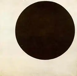
Op art
Op art, short for optical art, is a style of visual art that uses optical illusions.[1]
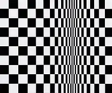
Op artworks are abstract, with many better-known pieces created in black and white. Typically, they give the viewer the impression of movement, hidden images, flashing and vibrating patterns, or swelling or warping.
History

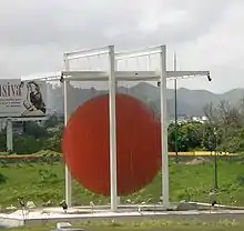
Illusionism, focused on the perception of extended space within a flat picture, is found from the earliest points of art history. However, the antecedents of op art, in terms of graphic effects and concern for exotic optical illusions, can be traced back to Neo-Impressionism, Cubism, Futurism, Constructivism and Dada.[2] The Divisionists, a group of Neo-Impressionist painters, attempted to increase the apparent luminosity of their paintings through recourse to optics and optical illusions.[3] László Moholy-Nagy produced photographic op art and taught the subject in the Bauhaus; one of his lessons consisted of making his students produce holes in cards and then photographing them.
Time magazine coined the term op art in 1964, in response to Julian Stanczak's show Optical Paintings at the Martha Jackson Gallery, to mean a form of abstract art (specifically non-objective art) that uses optical illusions.[4][5] Works now described as "op art" had been produced for several years before Time's 1964 article. For instance, Victor Vasarely's painting Zebras (1938) is made up entirely of curvilinear black and white stripes not contained by contour lines. Consequently, the stripes appear to both meld into and burst forth from the surrounding background. Also, the early black and white "dazzle" panels that John McHale installed at the This Is Tomorrow exhibit in 1956 and his Pandora series at the Institute of Contemporary Arts in 1962 demonstrate proto-op art tendencies. Martin Gardner featured op art and its relation to mathematics in his July 1965 Mathematical Games column in Scientific American. In Italy, Franco Grignani, who originally trained as an architect, became a leading force of graphic design where op art or kinetic art was central. His Woolmark logo (launched in Britain in 1964) is probably the most famous of all his designs.[6]


Op art perhaps more closely derives from the constructivist practices of the Bauhaus.[7] This German school, founded by Walter Gropius, stressed the relationship of form and function within a framework of analysis and rationality. Students learned to focus on the overall design or entire composition to present unified works. Op art also stems from trompe-l'œil and anamorphosis. Links with psychological research have also been made, particularly with Gestalt theory and psychophysiology.[2] When the Bauhaus was forced to close in 1933, many of its instructors fled to the United States. There, the movement took root in Chicago and eventually at the Black Mountain College in Asheville, North Carolina, where Anni and Josef Albers eventually taught.[8]
Op artists thus managed to exploit various phenomena," writes Popper, "the after-image and consecutive movement; line interference; the effect of dazzle; ambiguous figures and reversible perspective; successive colour contrasts and chromatic vibration; and in three-dimensional works different viewpoints and the superimposition of elements in space.[2]
In 1955, for the exhibition Mouvements at the Denise René gallery in Paris, Victor Vasarely and Pontus Hulten promoted in their "Yellow manifesto" some new kinetic expressions based on optical and luminous phenomenon as well as painting illusionism. The expression kinetic art in this modern form first appeared at the Museum für Gestaltung of Zürich in 1960, and found its major developments in the 1960s. In most European countries, it generally includes the form of optical art that mainly makes use of optical illusions, like op art, as well as art based on movement represented by Yacov Agam, Carlos Cruz-Diez, Jesús Rafael Soto, Gregorio Vardanega or Nicolas Schöffer. From 1961 to 1968, the Groupe de Recherche d'Art Visuel (GRAV) founded by François Morellet, Julio Le Parc, Francisco Sobrino, Horacio Garcia Rossi, Yvaral, Joël Stein and Vera Molnár was a collective group of opto-kinetic artists that—according to its 1963 manifesto—appealed to the direct participation of the public with an influence on its behavior, notably through the use of interactive labyrinths.
Some members of the group Nouvelle tendance (1961–1965) in Europe also were engaged in op art as Almir Mavignier and Gerhard von Graevenitz, mainly with their serigraphics. They studied optical illusions. The term op irritated many of the artists labeled under it, specifically including Albers and Stanczak. They had discussed upon the birth of the term a better label, namely perceptual art.[9] From 1964, Arnold Schmidt (Arnold Alfred Schmidt) had several solo exhibitions of his large, black and white shaped optical paintings exhibited at the Terrain Gallery in New York.[10]
The Responsive Eye
In 1965, between February 23 and April 25, an exhibition called The Responsive Eye, created by William C. Seitz, was held at the Museum of Modern Art in New York City and toured to St. Louis, Seattle, Pasadena, and Baltimore.[11][12] The works shown were wide-ranging, encompassing the minimalism of Frank Stella and Ellsworth Kelly, the smooth plasticity of Alexander Liberman, the collaborative efforts of the Anonima group, alongside the well-known Victor Vasarely, Julian Stanczak, Richard Anuszkiewicz, Wen-Ying Tsai, Bridget Riley and Getulio Alviani. The exhibition focused on the perceptual aspects of art, which result both from the illusion of movement and the interaction of color relationships.
The exhibition was a success with the public (visitor attendance was over 180,000),[13] but less so with the critics.[14] Critics dismissed op art as portraying nothing more than trompe-l'œil, or tricks that fool the eye. Regardless, the public's acceptance increased, and op art images were used in a number of commercial contexts. One of Brian de Palma's early works was a documentary film on the exhibition.[15]
Method of operation
Black-and-white and the figure-ground relationship
Op art is a perceptual experience related to how vision functions. It is a dynamic visual art that stems from a discordant figure-ground relationship that puts the two planes—foreground and background—in a tense and contradictory juxtaposition. Artists create op art in two primary ways. The first, best known method, is to create effects through pattern and line. Often these paintings are black and white, or shades of gray (grisaille)—as in Bridget Riley's early paintings such as Current (1964), on the cover of The Responsive Eye catalog. Here, black and white wavy lines are close to one another on the canvas surface, creating a volatile figure-ground relationship. Getulio Alviani used aluminum surfaces, which he treated to create light patterns that change as the watcher moves (vibrating texture surfaces). Another reaction that occurs is that the lines create after-images of certain colors due to how the retina receives and processes light. As Goethe demonstrates in his treatise Theory of Colours, at the edge where light and dark meet, color arises because lightness and darkness are the two central properties in the creation of color.
Color
Beginning in 1965 Bridget Riley began to produce color-based op art;[16] however, other artists, such as Julian Stanczak and Richard Anuszkiewicz, were always interested in making color the primary focus of their work.[17] Josef Albers taught these two primary practitioners of the "Color Function" school at Yale in the 1950s. Often, colorist work is dominated by the same concerns of figure-ground movement, but they have the added element of contrasting colors that produce different effects on the eye. For instance, in Anuszkiewicz's "temple" paintings, the juxtaposition of two highly contrasting colors provokes a sense of depth in illusionistic three-dimensional space so that it appears as if the architectural shape is invading the viewer's space.
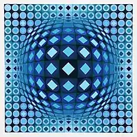 Victor Vasarely, Kezdi-Ga, 1970, Serigraph, Edition of 250, 20 × 20 in
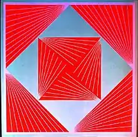 Intrinsic Harmony, by Richard Anuszkiewicz, 1965
Similarities with other art styles
Although op art is a unique style, it has similarities with styles such as abstract expressionism (color field painting). Although color field painting does not give us illusions, similarities can still be found. We can see that both of these styles are minimalist, only a few colors prevail, and no object or plot is shown. These styles can cause us emotion, since there is no clear plot, the human mind itself imagines and interprets it in its own way. Cold colors are usually associated with sadness, while warm colors are associated with joy. Also, op art and color field painting are characterized by the fact that the image is aesthetic and orderly.
Exhibitions
- L'Œil moteur: Art optique et cinétique 1960–1975, Musée d'art moderne et contemporain, Strasbourg, France, May 13–September 25, 2005.
- Op Art, Schirn Kunsthalle, Frankfurt, Germany, February 17–May 20, 2007.
- The Optical Edge, The Pratt Institute of Art, New York, March 8–April 14, 2007.
- Optic Nerve: Perceptual Art of the 1960s, Columbus Museum of Art, Columbus, Ohio, February 16–June 17, 2007.
- CLE OP: Cleveland Op Art Pioneers, Cleveland Museum of Art, Cleveland, Ohio, April 9, 2011 – February 26, 2012
- Bridget Riley has had several international exhibitions (e.g. Dia Center, New York, 2000; Tate Britain, London, 2003; Museum of Contemporary Art, Sydney, 2004).
See also
- List of op artists
- Divisionism
- Kinetic art
- Binakael (similar patterns in traditional Filipino textiles)
- Chubb illusion
- Cornsweet illusion
- Impossible object
- Lilac chaser
- M. C. Escher
- Mach bands
- Multistable perception
- Optical illusion
- Pattern glare
- Perception
- Peripheral drift illusion
- Same color illusion
- Trompe-l'œil
- Zero (art)
References
- Artspeak, Robert Atkins, ISBN 978-1-55859-127-1
- "The Collection - MoMA". The Museum of Modern Art. Retrieved November 5, 2017.
- Lee, Alan. "Seurat and Science." Art History 10 (June 1987): 203-24.
- Jon Borgzinner. "Op Art", Time, October 23, 1964.
- "Op-Art: History, Characteristics". www.Visual-Arts-Cork.com. Retrieved November 5, 2017.
- "The Hypnotic, Mind-bending Work of Italian Designer Franco Grignani". Eye on Design. 2019-06-28. Retrieved 2019-12-15.
- "Op-Art: History, Characteristics". www.visual-arts-cork.com. Retrieved 2019-12-15.
- "Black Mountain College Movement Overview". The Art Story. Retrieved 2019-12-15.
- Bertholf. "Julian Stanczak: Decades of Light" Yale Press
- "A Brief History of the Terrain Gallery". TerrainGallery.org. Archived from the original on April 3, 2010. Retrieved November 5, 2017.
- Seitz, William C. (1965). The Responsive Eye (exhibition catalog) (PDF). New York: Museum of Modern Art. OCLC 644787547. Retrieved January 23, 2016.
- "The Responsive Eye" (PDF) (Press release). New York: Museum of Modern Art. February 25, 1965. Retrieved January 23, 2016.
- Gordon Hyatt (writer and producer), Mike Wallace (presenter) (1965). The Responsive Eye (Television production). Columbia Broadcasting System, Inc. Archived from the original on 2013-01-03. (Available on YouTube in three sections.)
- "MoMA 1965: The Responsive Eye". CoolHunting.com. Archived from the original on September 28, 2009. Retrieved November 5, 2017.
- Brian De Palma (director) (1966). The Responsive Eye (Motion picture).
- Hopkins, David (September 14, 2000). After Modern Art 1945-2000. OUP Oxford. p. 147. ISBN 9780192842343. Retrieved November 5, 2017 – via Google Books.
- See Color Function Painting: The Art of Josef Albers, Julian Stanczak, and Richard Anuszkiewicz, Wake Forest University, reprinted 2002.
Bibliography
- Frank Popper, Origins and Development of Kinetic Art, New York Graphic Society/Studio Vista, 1968
- Frank Popper, From Technological to Virtual Art, Leonardo Books, MIT Press, 2007
- Seitz, William C. (1965). The Responsive Eye (PDF). New York: Museum of Modern Art. Exhibition catalog.
{{cite book}}: CS1 maint: postscript (link)

