Postmodern architecture
Postmodern architecture is a style or movement which emerged in the late 1950s as a reaction against the austerity, formality, and lack of variety of modern architecture, particularly in the international style advocated by Philip Johnson and Henry-Russell Hitchcock. The movement was introduced by the architect and urban planner Denise Scott Brown and architectural theorist Robert Venturi in their 1972 book Learning from Las Vegas. The style flourished from the 1980s through the 1990s, particularly in the work of Scott Brown & Venturi, Philip Johnson, Charles Moore and Michael Graves. In the late 1990s, it divided into a multitude of new tendencies, including high-tech architecture, neo-futurism, new classical architecture, and deconstructivism.[1] However, some buildings built after this period are still considered postmodern.[2]
    .jpg.webp) 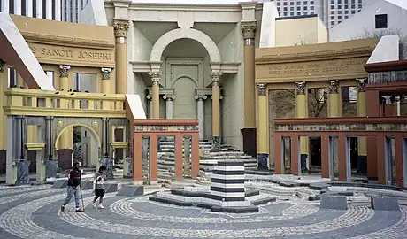 From top, left to right: Vanna Venturi House (1964) by Robert Venturi; Team Disney building in Burbank, California (1990) by Michael Graves; Guild House (1963) in Philadelphia by Robert Venturi; 550 Madison Avenue (1984) by Philip Johnson to; One PPG Place (1984) in Pittsburgh by Philip Johnson; Piazza d'Italia, New Orleans by Charles Moore (1978). | |
| Years active | Late 1950s–early-to-mid 2000s |
|---|---|
| Country | International |
| Influences | International style and modern |
| Postmodernism |
|---|
| Preceded by Modernism |
| Postmodernity |
| Fields |
| Related |
| Criticism of postmodernism |
Origins
Postmodern architecture emerged in the late 1950s as a reaction against the perceived shortcomings of modern architecture, particularly its rigid doctrines, its uniformity, its lack of ornament, and its habit of ignoring the history and culture of the cities where it appeared. In 1966, Venturi formalized the movement in his book, Complexity and Contradiction in Architecture. Venturi summarized the kind of architecture he wanted to see replace modernism:
I speak of a complex and contradictory architecture based on the richness and ambiguity of modern experience, including that experience which is inherent in art. ... I welcome the problems and exploit the uncertainties. ... I like elements which are hybrid rather than "pure", compromising rather than "clean" ... accommodating rather than excluding. ... I am for messy vitality over obvious unity. ... I prefer "both-and" to "either-or", black and white, and sometimes gray, to black or white. ... An architecture of complexity and contradiction must embody the difficult unity of inclusion rather than the easy unity of exclusion.[3]
In place of the functional doctrines of modernism, Venturi proposed giving primary emphasis to the façade, incorporating historical elements, a subtle use of unusual materials and historical allusions, and the use of fragmentation and modulations to make the building interesting.[4] Accomplished architect and urban planner Denise Scott Brown, who was Venturi's wife, and Venturi wrote Learning from Las Vegas (1972), co-authored with Steven Izenour, in which they further developed their joint argument against modernism. They urged architects to take into consideration and to celebrate the existing architecture in a place, rather than to try to impose a visionary utopia from their own fantasies. This was in line with Scott Brown's belief that buildings should be built for people, and that architecture should listen to them. Scott Brown and Venturi argued that ornamental and decorative elements "accommodate existing needs for variety and communication". The book was instrumental in opening readers' eyes to new ways of thinking about buildings, as it drew from the entire history of architecture—both high-style and vernacular, both historic and modern—and In response to Mies van der Rohe's famous maxim "Less is more", Venturi responded, to "Less is a bore." Venturi cited the examples of his wife's and his own buildings, Guild House, in Philadelphia, as examples of a new style that welcomed variety and historical references, without returning to academic revival of old styles.[5]
In Italy at about the same time, a similar revolt against strict modernism was being launched by the architect Aldo Rossi, who criticized the rebuilding of Italian cities and buildings destroyed during the war in the modernist style, which had had no relation to the architectural history, original street plans, or culture of the cities. Rossi insisted that cities be rebuilt in ways that preserved their historical fabric and local traditions. Similar ideas were and projects were put forward at the Venice Biennale in 1980. The call for a post-modern style was joined by Christian de Portzamparc in France and Ricardo Bofill in Spain, and in Japan by Arata Isozaki.[6]
Notable postmodern buildings and architects
Robert Venturi
 The Guild House in Philadelphia by Robert Venturi (1960–1963)
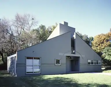 Vanna Venturi House by Robert Venturi (1964)
 Fire Station Number 4 in Columbus, Indiana (1968)
 Wisma 46 in Jakarta by Robert Venturi (1996)
 Carson Hall, Dartmouth College in Hanover, New Hampshire
 Trabant Center at the University of Delaware in Newark, DE (1996)
 Episcopal Academy Chapel
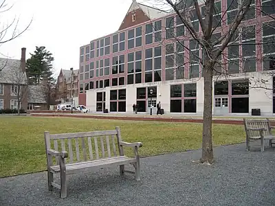 Frist Campus Center at Princeton University (2000)
Robert Venturi (1925–2018) was both a prominent theorist of postmodernism and an architect whose buildings illustrated his ideas. After studying at the American Academy in Rome, he worked in the offices of the modernists Eero Saarinen and Louis Kahn until 1958, and then became a professor of architecture at Yale University. One of his first buildings was the Guild House in Philadelphia, built between 1960 and 1963, and a house for his mother in Chestnut Hill, in Philadelphia. These two houses became symbols of the postmodern movement. He went on to design, in the 1960s and 1970s, a series of buildings which took into account both historic precedents, and the ideas and forms existing in the real life of the cities around them.[7]
Michael Graves
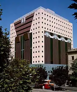 Portland Building by Michael Graves (1982)
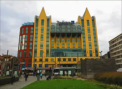 Radisson Blu Astrid Hotel in Antwerp (1993)
 The Denver Public Library by Michael Graves (1995)
 IFC building in Washington, D.C. (1996)
.jpg.webp) Castalia building in The Hague (1998)
Castalia building in The Hague (1998)
Michael Graves (1934–2015) designed two of the most prominent buildings in the postmodern style, the Portland Building and the Denver Public Library. He later followed up his landmark buildings by designing large, low-cost retail stores for chains such as Target and J.C. Penney in the United States, which had a major influence on the design of retail stores in city centers and shopping malls. In his early career, he, along with the Peter Eisenman, Charles Gwathmey, John Hejduk and Richard Meier, was considered one of the New York Five, a group of advocates of pure modern architecture, but in 1982 he turned toward postmodernism with the Portland Building, one of the first major structures in the style. The building has since been added to the National Register of Historic Places.[7]
Charles Moore

 National Dong Hwa University by Charles Moore (1992)
 Beverly Hills Civic Center by Charles Moore (1990)
The most famous work of architect Charles Moore (1925–1993) is the Piazza d'Italia in New Orleans (1978), a public square composed of an exuberant collection of pieces of famous Italian Renaissance architecture. Drawing upon the Spanish Revival architecture of the city hall, Moore designed the Beverly Hills Civic Center in a mixture of Spanish Revival, Art Deco and postmodern styles. It includes courtyards, colonnades, promenades, and buildings, with both open and semi-enclosed spaces, stairways and balconies.[8]
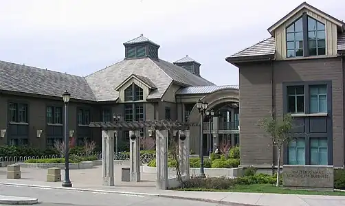
The Haas School of Business at the University of California, Berkeley blends in with both the neo-Renaissance architecture of the Berkeley campus and with picturesque early 20th century wooden residential architecture in the neighboring Berkeley Hills.
Philip Johnson
 550 Madison Avenue (Formerly AT&T Building) in Manhattan, New York City, by Philip Johnson (1982)
 Bank of America Center in Houston, Texas by Philip Johnson (1983)
.jpg.webp) PPG Place, Pittsburgh, Pennsylvania by Philip Johnson (1979–1984)
PPG Place, Pittsburgh, Pennsylvania by Philip Johnson (1979–1984)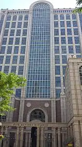 500 Boylston Street building in Boston, Massachusetts, by Philip Johnson (1989)
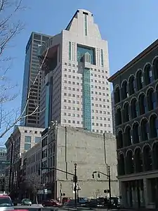
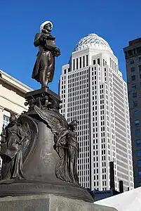 400 West Market in Louisville, Kentucky by Philip Johnson (1993)
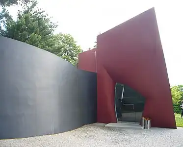 Glass house Pavilion for the Glass House in New Canaan, Connecticut (1995)
Philip Johnson (1906–2005) began his career as a pure modernist. In 1935, he co-authored the famous catalog of the Museum of Modern Art exposition on the International Style, and studied with Walter Gropius and Marcel Breuer at Harvard. His Glass House in New Canaan, Connecticut (1949), inspired by a similar house by Ludwig Mies van der Rohe became an icon of the modernist movement. He worked with Mies on another iconic modernist project, the Seagrams Building in New York City. However, in the 1950s, he began to include certain playful and mannerist forms into his buildings, such as the Synagogue of Port Chester (1954–1956), with a vaulted plaster ceiling and narrow colored windows, and the Art Gallery of the University of Nebraska (1963). However, his major buildings in the 1970, such as IDS Center in Minneapolis (1973) and Pennzoil Place in Houston (1970–1976), were massive, sober, and entirely modernist.[9]
With the AT&T Building (now named 550 Madison Avenue) (1978–1982), Johnson turned dramatically toward postmodernism. The building's most prominent feature is a purely decorative top modeled after a piece of Chippendale furniture, and it has other more subtle references to historical architecture. His intention was to make the building stand out as a corporate symbol among the modernist skyscrapers around it in Manhattan, and he succeeded; it became the best-known of all postmodern buildings. Soon afterward he completed another postmodern project, PPG Place in Pittsburgh, Pennsylvania (1979–1984), a complex of six glass buildings for the Pittsburgh Plate Glass Company. These buildings have neo-gothic features, including 231 glass spires, the largest of which is 82 feet (25 m) high.[10]
In 1995, he constructed a postmodern gatehouse pavilion for his residence, Glass House. The gatehouse, called "Da Monstra", is 23 feet high, made of gunite, or concrete shot from a hose, colored gray and red. It is a piece of sculptural architecture with no right angles and very few straight lines, a predecessor of the sculptural contemporary architecture of the 21st century.[10]
Frank Gehry
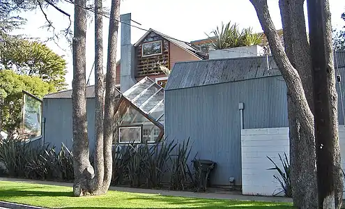 Gehry residence in Santa Monica (1978)
 Norton Beach House, Venice, California (1983)
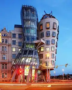 Dancing House in Prague (1996)
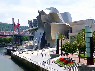 Guggenheim Bilbao, Bilbao, Spain (1997)
Frank Gehry (born 1929) was a major figure in postmodernist architecture, and is one of the most prominent figures in contemporary architecture. After studying at the University of Southern California in Los Angeles and then the Harvard Graduate School of Design, he opened his own office in Los Angeles in 1962. Beginning in the 1970s, he began using prefabricated industrial materials to construct unusual forms on private houses in Los Angeles, including, in 1978, his own house in Santa Monica. He broke their traditional design giving them an unfinished and unstable look. His Schnabel House in Los Angeles (1986–1989) was broken into individual structures, with a different structure for every room. His Norton Residence in Venice, California (1983) built for a writer and former lifeguard, had a workroom modeled after a lifeguard tower overlooking the Santa Monica beach. In his early buildings, different parts of the buildings were often different bright colors. In the 1980s he began to receive major commissions, including the Loyola Law School (1978–1984), and the California Aerospace Museum (1982–1984), then international commissions in the Netherlands and Czech Republic. His "Dancing House" in Prague (1996), constructed with an undulating façade of plaques of concrete; parts of the walls were composed of glass, which revealed the concrete pillars underneath. His most prominent project was the Guggenheim Bilbao museum (1991–1997), clad in undulating skins of titanium, a material which until then was used mainly in building aircraft, which changed color depending upon the light. Gehry was often described as a proponent of deconstructivism, but he refused to accept that or any other label for his work.[11]
César Pelli
 200 Liberty Street, formerly One World Financial Center in New York City (1986)
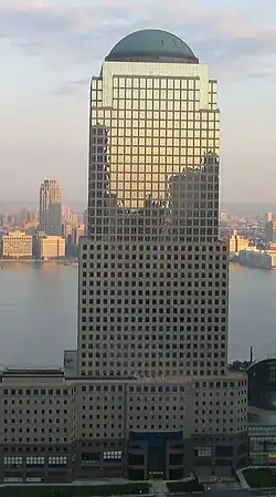 225 Liberty Street, formerly Two World Financial Center in New York City (1987)
 200 Vesey Street, formerly Three World Financial Center, and American Express Tower, in New York City (1985)
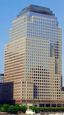 250 Vesey Street, formerly Four World Financial Center in New York City (1986)
.jpg.webp) The Petronas Towers, also known as Petronas Twin Towers, in Kuala Lumpur, Malaysia (1996)
The Petronas Towers, also known as Petronas Twin Towers, in Kuala Lumpur, Malaysia (1996)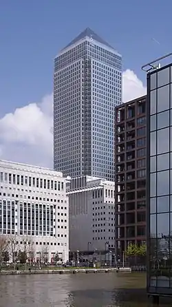 One Canada Square in Canary Wharf, London, (1991)
César Pelli (October 12, 1926 – July 19, 2019) was an Argentine architect who designed some of the world's tallest buildings and other major urban landmarks.[12] Two of his most notable projects are the Petronas Towers in Kuala Lumpur[13] and the World Financial Center in New York City.[14] The American Institute of Architects named him one of the ten most influential living American architects in 1991 and awarded him the AIA Gold Medal in 1995.[12][15] In 2008, the Council on Tall Buildings and Urban Habitat presented him with The Lynn S. Beedle Lifetime Achievement Award.[16][17][lower-alpha 1] In 1977, Pelli was selected to be the dean of the Yale School of Architecture in New Haven, Connecticut, and served in that post until 1984.[22] Shortly after Pelli arrived at Yale, he won the commission to design the expansion and renovation of the Museum of Modern Art in New York, which resulted in the establishment of his own firm, Cesar Pelli & Associates.[23][22][24] The museum's expansion/renovation and the Museum of Modern Art Residential Tower were completed 1984; the World Financial Center in New York, which includes the grand public space of the Winter Garden, was completed in 1988.[14] Among other significant projects during this period are the Crile Clinic Building in Cleveland, Ohio, completed 1984; Herring Hall at Rice University in Houston, Texas (also completed 1984); completion in 1988 of the Green Building at the Pacific Design Center in West Hollywood, California; and the construction of the Wells Fargo Center in Minneapolis, Minnesota, in 1989.[25]
Pelli was named one of the ten most influential living American Architects by the American Institute of Architects in 1991. In 1995, he was awarded the American Institute of Architects Gold Medal.[12][15] In May 2004, Pelli was awarded an honorary Doctor of Humane Letters degree from the University of Minnesota Duluth where he designed Weber Music Hall.[26] In 2005, Pelli was honored with the Connecticut Architecture Foundation's Distinguished Leadership Award.[27]
Buildings designed by Pelli during this period are marked by further experimentation with a variety of materials (most prominently stainless steel) and his evolution of the skyscraper. One Canada Square at Canary Wharf in London (opened in 1991); Plaza Tower in Costa Mesa, California (completed 1991); and the NTT Headquarters in Tokyo (finished 1995) were preludes to a landmark project that Pelli designed for Kuala Lumpur, Malaysia.[25] The Petronas Towers were completed in 1997, sheathed in stainless steel and reflecting Islamic design motifs.[28] The dual towers were the world's tallest buildings until 2004.[29] That year, Pelli received the Aga Khan Award for Architecture for the design of the Petronas Towers[30] Pelli's design for the National Museum of Art in Osaka, Japan, was completed 2005, the same year that Pelli's firm changed its name to Pelli Clarke Pelli Architects to reflect the growing roles of senior principals Fred W. Clarke and Pelli's son Rafael.[28]
Postmodernism in Europe
.jpg.webp) Hanse-Viertel, a store gallery in Hamburg, Northern Germany, by Gerkan, Marg and Partners (1980)
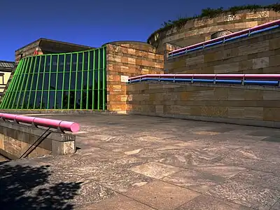
Hanse-Viertel, a store gallery in Hamburg, Northern Germany, by Gerkan, Marg and Partners (1980) State University of Music and Performing Arts in Stuttgart, Germany by James Stirling (1980s)
.jpg.webp) Amoreiras towers in Lisbon, by Tomás Taveira (1985)
Amoreiras towers in Lisbon, by Tomás Taveira (1985)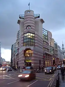 No 1 Poultry, an office building and shops in London, by James Stirling (completed 1997)
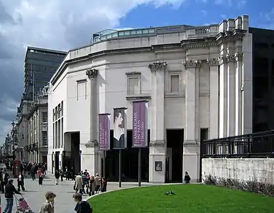 Sainsbury Wing of the National Gallery in London by Robert Venturi (1991)
 Top of the Messeturm in Frankfurt
.jpg.webp)
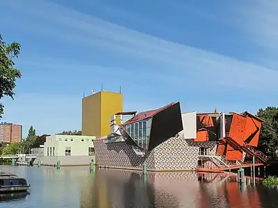 The Groninger Museum, Netherlands, by Alessandro Mendini et al., (completed 1994)
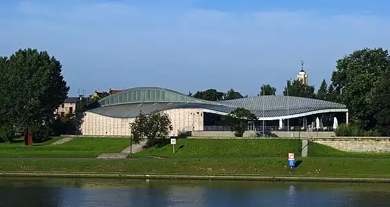 Manggha Museum of Japanese Art and Technology in Cracow, Poland, by Arata Isozaki and Krzysztof Ingarden (1994)
.jpg.webp)
While postmodernism was best known as an American style, notable examples also appeared in Europe. In 1991 Robert Venturi completed the Sainsbury Wing of the National Gallery in London, which was modern but harmonized with the neoclassical architecture in and around Trafalgar Square. The German-born architect Helmut Jahn (1940–2021) constructed the Messeturm skyscraper in Frankfurt, Germany, a skyscraper adorned with the pointed spire of a medieval tower.[33]
One of the early postmodernist architects in Europe was James Stirling (1926–1992). He was a first critic of modernist architecture, blaming modernism for the destruction of British cities in the years after World War II. He designed colorful public housing projects in the postmodern style, as well as the Neue Staatsgalerie in Stuttgart, Germany (1977–1983) and the Kammertheater in Stuttgart (1977–1982), as well as the Arthur M. Sackler Museum at Harvard University in the United States.[34]
One of the most visible examples of the postmodern style in Europe is the SIS Building in London by Terry Farrell (1994). The building, next to the Thames, is the headquarters of the British Secret Intelligence Service. In 1992, Deyan Sudjic described it in The Guardian as an "epitaph for the 'architecture of the eighties. ... It's a design which combines high seriousness in its classical composition with a possible unwitting sense of humour. The building could be interpreted equally plausibly as a Mayan temple or a piece of clanking art deco machinery'.[35]
The Italian architect Aldo Rossi (1931–1997) was known for his postmodern works in Europe, the Bonnefanten Museum in Maastricht, the Netherlands, completed in 1995. Rossi was the first Italian to win the most prestigious award in architecture, the Pritzker Prize, in 1990. He was noted for combining rigorous and pure forms with evocative and symbolic elements taken from classical architecture.[36]
The Spanish architect Ricardo Bofill (born 1939) is also known for his early postmodern works, including a residential complex in the form of a castle with red walls at Calp on the coast of Spain (1973) and the social housing complex Les Espaces d'Abraxas (1983) in Noisy-le-Grand, France.
The works of Austrian architect Friedensreich Hundertwasser (1928–2000) are occasionally considered a special expression of postmodern architecture.
Postmodernism in Japan
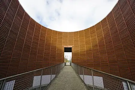 The Museum of Wood Culture by Tadao Ando (1995)
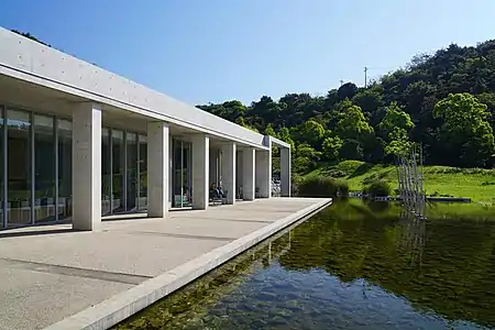 Bennesse House in Naoshima, Kagawa, Japan by Tadao Ando
.jpg.webp)
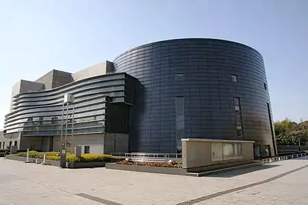 Kyoto Concert Hall in Kyoto, Japan by Isozaki Arata (1995)
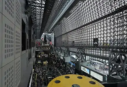 Kyoto Train Station in Kyoto by Hiroshi Hara (1991–1997)
The Japanese architects Tadao Ando (born 1941) and Isozaki Arata (born 1931) introduced the ideas of the postmodern movement to Japan. Before opening his studio in Osaka in 1969, Ando traveled widely in North America, Africa and Europe, absorbing European and American styles, and had no formal architectural education, though he taught later at Yale University (1987), Columbia University (1988) and Harvard University (1990). Most of his buildings were constructed of raw concrete in cubic forms, but had wide openings which brought in light and views of the nature outside. Beginning in the 1990s, he began using wood as a building material, and introduced elements of traditional Japanese architecture, particularly in his design of the Museum of Wood Culture (1995). His Bennesse House in Naoshima, Kagama, has elements of classic Japanese architecture and a plan which subtly integrates the house into the natural landscape, He won the Pritzker Prize, the most prestigious award in architecture, in 1995.[37]
Isozaki Arata worked two years in the studio of Kenzo Tange (1913–2005), before opening his own firm in Tokyo in 1963. His Museum of Contemporary Art in Nagi artfully combined wood, stone and metal, and joined three geometric forms, a cylinder, a half-cylinder and an extended block, to present three different artists in different settings. His Art Tower in Mito, Japan (1986–1990) featured a postmodernist Titanium and Stainless Steel tower that rotated upon its own axis. In addition to museums and cultural centers in Japan, he designed the Museum of Contemporary Art, Los Angeles (MOCA), (1981–1986), and the COSI Columbus science museum and research center in Columbus, Ohio.[38]
Concert halls – Sydney Opera House and the Berlin Philharmonic
.jpg.webp) The Sydney Opera House by Jørn Utzon (1957–1973)
The Sydney Opera House by Jørn Utzon (1957–1973)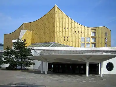 Façade of the Berliner Philharmonie by Hans Scharoun (1963)
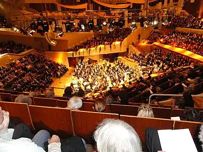 "Vineyard Style"; The orchestra surrounded by the audience in the Berlin Philharmonic
The Sydney Opera House in Sydney, Australia, by the Danish architect Jørn Utzon (1918–2008), is one of the most recognizable of all works of postwar architecture, and spans the transition from modernism to postmodernism. Construction began in 1957, but it was not completed until 1973 due to difficult engineering problems and growing costs. The giant shells of concrete soar over the platforms which form the roof of the hall itself. The architect resigned before the structure was completed, and the interior was designed largely after he left the project. The influence of the Sydney Opera House, can be seen in later concert halls with soaring roofs made of undulating stainless steel.[39]
One of the most influential buildings of the postmodern period was the Berlin Philharmonic, designed by Hans Scharoun (1893–1972) and completed in 1963. The exterior, with its sloping roofs and glided façade, was a distinct break from the earlier, more austere modernist concert halls. The real revolution was inside, where Scharoun placed the orchestra in the center, with the audience seated on terraces around it. He described it this way: "The form given to the hall is inspired by a landscape; In the center is a valley, at the bottom of which is found the orchestra. Around it on all sides rise the terraces, like vineyards. Corresponding to an earthly landscape, the ceiling above appears like a sky." Following his description, future concert halls, such as the Walt Disney Concert Hall by Frank Gehry in Los Angeles, and the Philharmonie de Paris of Jean Nouvel (2015) used the term "vineyard style" and placed the orchestra in the center, instead of on a stage at the end of the hall.[40]
Characteristics


.jpg.webp) Contradiction (in this case, the mix between monumental curving forms, columns, bossages, but also other Classical elements, and High-Tech glazing, with highly saturated colours) - Neue Staatsgalerie, Stuttgart, Germany, by James Stirling (1984)[43]
Contradiction (in this case, the mix between monumental curving forms, columns, bossages, but also other Classical elements, and High-Tech glazing, with highly saturated colours) - Neue Staatsgalerie, Stuttgart, Germany, by James Stirling (1984)[43]_(cropped).jpg.webp) Stripes on facades - No 1 Poultry, London, by James Stirling (designed in 1988 but built in 1997)[44]
Stripes on facades - No 1 Poultry, London, by James Stirling (designed in 1988 but built in 1997)[44] Quotations (uses of elements and ornaments taken from pre-Modernist styles, often highly simplified) - Dolphin Hotel, Orlando, Florida, US, with urn tops that are reminiscent of urns that decorate corners, tops and roof railings of Classical buildings and furniture, by Michael Graves (1989)[45]
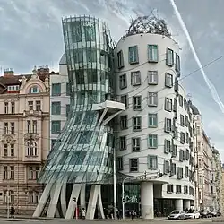 Assymetry - Dancing House, Prague, the Czech Republic, by Vlado Milunić and Franck Gehry (1992-1996)
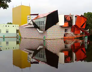 Complexity - Groninger Museum, Groningen, the Netherlands, by Alessandro Mendini with Michele de Lucci, Philippe Starck and Coop Himmelb(l)au (1994)[46]
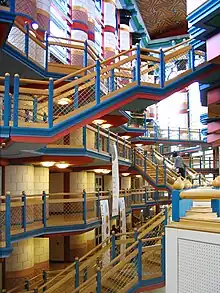 Polychromy and highly saturated colours - Main hall of the Judge Business School, University of Cambridge, England, by John Outram (1995)[47]
Complexity and contradiction
Postmodern architecture first emerged as a reaction against the doctrines of modern architecture, as expressed by modernist architects including Le Corbusier and Ludwig Mies van der Rohe. In place of the modernist doctrines of simplicity as expressed by Mies in his famous "less is more;" and functionality, "form follows function" and the doctrine of Le Corbusier that "a house is a machine to live in," postmodernism, in the words Robert Venturi, offered complexity and contradiction. Postmodern buildings had curved forms, decorative elements, asymmetry, bright colours, and features often borrowed from earlier periods. Colours and textures were unrelated to the structure or function of the building. Rejecting the "puritanism" of modernism, it called for a return to ornament, and an accumulation of citations and collages borrowed from past styles. It borrowed freely from classical architecture, rococo, neoclassical architecture, the Vienna Secession, the British Arts and Crafts movement, the German Jugendstil.[49]
Postmodern buildings often combined astonishing new forms and features with seemingly contradictory elements of classicism. James Stirling the architect of the Neue Staatsgalerie in Stuttgart, Germany (1984), described the style as "representation and abstraction, monumental and informal, traditional and high-tech."[50]
Fragmentation
Postmodern architecture often breaks large buildings into several different structures and forms, sometimes representing different functions of those parts of the building. With the use of different materials and styles, a single building can appear like a small town or village. An example is the Abteiberg Museum by Hans Hollein in Mönchengladbach (1972–1974).[51]
Asymmetric and oblique forms
Asymmetric forms are one of the trademarks of postmodernism. In 1968, the French architect Claude Parent and philosopher Paul Virilio designed the church Saint-Bernadette-du-Banlay in Nevers, France, in the form of a massive block of concrete leaning to one side. Describing the form, they wrote: "a diagonal line on a white page can be a hill, or a mountain, or slope, an ascent, or a descent." Parent's buildings were inspired in part by concrete German blockhouses he discovered on the French coast which had slid down the cliffs, but were perfectly intact, with leaning walls and sloping floors. Postmodernist compositions are rarely symmetric, balanced and orderly. Oblique buildings which tilt, lean, and seem about to fall over are common.[52]
Polychromy
Color is an important element in many postmodern buildings; to give the façades variety and personality, colored glass is sometimes used, or ceramic tiles, or stone. The buildings of Mexican architect Luis Barragan offer bright sunlight color that give life to the forms.
Humor and "camp"
Humor is a particular feature of many postmodern buildings, particularly in the United States. An example is the Binoculars Building in the Venice neighborhood of Los Angeles, designed by Frank Gehry in collaboration with the sculptor Claes Oldenburg (1991–2001). The gateway of the building is in the form of an enormous pair of binoculars; cars enter the garage passing under the binoculars. "Camp" humor was popular during the postmodern period; it was an ironic humor based on the premise that something could appear so bad (such as a building that appeared about to collapse) that it was good. In 1964, American critic Susan Sontag defined camp as a style which put its accent on the texture, the surface, and style to the detriment of the content, which adored exaggeration, and things which were not what they seemed. Postmodern architecture sometimes used the same sense of theatricality, sense of the absurd and exaggeration of forms.[53]
The aims of postmodernism, which include solving the problems of Modernism, communicating meanings with ambiguity, and sensitivity for the building's context, are surprisingly unified for a period of buildings designed by architects who largely never collaborated with each other. These aims do, however, leave room for diverse implementations as can be illustrated by the variety of buildings created during the movement.
Theories of postmodern architecture
The characteristics of postmodernism allow its aim to be expressed in diverse ways. These characteristics include the use of sculptural forms, ornaments, anthropomorphism and materials which perform trompe-l'œil. These physical characteristics are combined with conceptual characteristics of meaning. These characteristics of meaning include pluralism, double coding, flying buttresses and high ceilings, irony and paradox, and contextualism.
The sculptural forms, not necessarily organic, were created with much ardor. These can be seen in Hans Hollein's Abteiberg Museum (1972–1982). The building is made up of several building units, all very different. Each building's forms are nothing like the conforming rigid ones of Modernism. These forms are sculptural and are somewhat playful. These forms are not reduced to an absolute minimum; they are built and shaped for their own sake. The building units all fit together in a very organic way, which enhances the effect of the forms.
After many years of neglect, ornament returned. Frank Gehry's Venice Beach house, built in 1986, is littered with small ornamental details that would have been considered excessive and needless in Modernism. The Venice Beach House has an assembly of circular logs which exist mostly for decoration. The logs on top do have a minor purpose of holding up the window covers. However, the mere fact that they could have been replaced with a practically invisible nail, makes their exaggerated existence largely ornamental. The ornament in Michael Graves' Portland Municipal Services Building ("Portland Building") (1980) is even more prominent. The two obtruding triangular forms are largely ornamental. They exist for aesthetic or their own purpose.
Postmodernism, with its sensitivity to the building's context, did not exclude the needs of humans from the building. Carlo Scarpa's Brion Cemetery (1970–1972) exemplifies this. The human requirements of a cemetery is that it possesses a solemn nature, yet it must not cause the visitor to become depressed. Scarpa's cemetery achieves the solemn mood with the dull gray colors of the walls and neatly defined forms, but the bright green grass prevents this from being too overwhelming.
Postmodern buildings sometimes utilize trompe-l'œil, creating the illusion of space or depths where none actually exist, as has been done by painters since the Romans. The Portland Building (1980) has pillars represented on the side of the building that to some extent appear to be real, yet they are not.
The Hood Museum of Art (1981–1983) has a typical asymmetrical façade which was at the time prevalent throughout postmodern buildings.
Robert Venturi's Vanna Venturi House (1962–1964) illustrates the postmodernist aim of communicating a meaning and the characteristic of symbolism. The façade is, according to Venturi, a symbolic picture of a house, looking back to the 18th century. This is partly achieved through the use of symmetry and the arch over the entrance.
Perhaps the best example of irony in postmodern buildings is Charles Moore's Piazza d'Italia (1978). Moore quotes (architecturally) elements of Italian renaissance and Roman Antiquity. However, he does so with a twist. The irony comes when it is noted that the pillars are covered with steel. It is also paradoxical in the way he quotes Italian antiquity far away from the original in New Orleans.[54]
Double coding meant the buildings convey many meanings simultaneously. The Sony Building in New York does this very well. The building is a tall skyscraper which brings with it connotations of very modern technology. Yet, the top contradicts this. The top section conveys elements of classical antiquity. This double coding is a prevalent trait of postmodernism.
The characteristics of postmodernism were rather unified given their diverse appearances. The most notable among their characteristics is their playfully extravagant forms and the humour of the meanings the buildings conveyed.
Postmodern architecture as an international style – the first examples of which are generally cited as being from the 1950s – but did not become a movement until the late 1970s[55] and continues to influence present-day architecture. Postmodernity in architecture is said to be heralded by the return of "wit, ornament and reference" to architecture in response to the formalism of the International Style of modernism. As with many cultural movements, some of postmodernism's most pronounced and visible ideas can be seen in architecture. The functional and formalized shapes and spaces of the modernist style are replaced by diverse aesthetics: styles collide, form is adopted for its own sake, and new ways of viewing familiar styles and space abound. Perhaps most obviously, architects rediscovered past architectural ornament and forms which had been abstracted by the Modernist architects.
Postmodern architecture has also been described as neo-eclectic, where reference and ornament have returned to the façade, replacing the aggressively unornamented modern styles. This eclecticism is often combined with the use of non-orthogonal angles and unusual surfaces, most famously in the State Gallery of Stuttgart by James Stirling and the Piazza d'Italia by Charles Moore. The Scottish Parliament Building in Edinburgh has also been cited as being of postmodern vogue.
Modernist architects may regard postmodern buildings as vulgar, associated with a populist ethic, and sharing the design elements of shopping malls, cluttered with "gew-gaws". Postmodern architects may regard many modern buildings as soulless and bland, overly simplistic and abstract. This contrast was exemplified in the juxtaposition of the "whites" against the "grays," in which the "whites" were seeking to continue (or revive) the modernist tradition of purism and clarity, while the "grays" were embracing a more multifaceted cultural vision, seen in Robert Venturi's statement rejecting the "black or white" world view of modernism in favor of "black and white and sometimes gray." The divergence in opinions comes down to a difference in goals: modernism is rooted in minimal and true use of material as well as absence of ornament, while postmodernism is a rejection of strict rules set by the early modernists and seeks meaning and expression in the use of building techniques, forms, and stylistic references.
One building form that typifies the explorations of postmodernism is the traditional gable roof, in place of the iconic flat roof of modernism. Shedding water away from the center of the building, such a roof form always served a functional purpose in climates with rain and snow, and was a logical way to achieve larger spans with shorter structural members, but it was nevertheless relatively rare in Modernist buildings.[lower-alpha 2] However, postmodernism's own modernist roots appear in some of the noteworthy examples of "reclaimed" roofs. For instance, Robert Venturi's Vanna Venturi House breaks the gable in the middle, denying the functionality of the form, and Philip Johnson's 1001 Fifth Avenue building in Manhattan[lower-alpha 3] advertises a mansard roof form as an obviously flat, false front. Another alternative to the flat roofs of modernism would exaggerate a traditional roof to call even more attention to it, as when Kallmann McKinnell & Wood's American Academy of Arts and Sciences in Cambridge, Massachusetts, layers three tiers of low hipped roof forms one above another for an emphatic statement of shelter.
Relationship to previous styles

A new trend became evident in the last quarter of the 20th century as some architects started to turn away from modern functionalism which they viewed as boring, and which some of the public considered unwelcoming and even unpleasant. These architects turned toward the past, quoting past aspects of various buildings and melding them together (even sometimes in an inharmonious manner) to create a new means of designing buildings. A vivid example of this new approach was that postmodernism saw the comeback of columns and other elements of premodern designs, sometimes adapting classical Greek and Roman examples.[lower-alpha 4] In Modernism, the traditional column (as a design feature) was treated as a cylindrical pipe form, replaced by other technological means such as cantilevers, or masked completely by curtain wall façades. The revival of the column was an aesthetic, rather than a technological necessity. Modernist high-rise buildings had become in most instances monolithic, rejecting the concept of a stack of varied design elements for a single vocabulary from ground level to the top, in the most extreme cases even using a constant "footprint" (with no tapering or "wedding cake" design), with the building sometimes even suggesting the possibility of a single metallic extrusion directly from the ground, mostly by eliminating visual horizontal elements—this was seen most strictly in Minoru Yamasaki's World Trade Center buildings.
Another return was that of the "wit, ornament and reference" seen in older buildings in terra cotta decorative façades and bronze or stainless steel embellishments of the Beaux-Arts and Art Deco periods. In postmodern structures this was often achieved by placing contradictory quotes of previous building styles alongside each other, and even incorporating furniture stylistic references at a huge scale.
Contextualism, a trend in thinking in the later parts of 20th century, influences the ideologies of the postmodern movement in general. Contextualism is centered on the belief that all knowledge is "context-sensitive". This idea was even taken further to say that knowledge cannot be understood without considering its context. While noteworthy examples of modern architecture responded both subtly and directly to their physical context,[lower-alpha 5] postmodern architecture often addressed the context in terms of the materials, forms and details of the buildings around it—the cultural context.
Roots of postmodernism
.jpg.webp)
The postmodernist movement is often seen (especially in the US) as an American movement, starting in America around the 1960s–1970s and then spreading to Europe and the rest of the world, to remain right through to the present. In 1966, however, the architectural historian Sir Nikolaus Pevsner spoke of a revived Expressionism as being "a new style, successor to my International Modern of the 1930s, a post-modern style", and included as examples Le Corbusier's work at Ronchamp and Chandigarh, Denys Lasdun at the Royal College of Physicians in London, Richard Sheppard at Churchill College, Cambridge, and James Stirling's and James Gowan's Leicester Engineering Building, as well as Philip Johnson's own guest house at New Canaan, Connecticut. Pevsner disapproved of these buildings for their self-expression and irrationalism, but he acknowledged them as "the legitimate style of the 1950s and 1960s" and defined their characteristics. The job of defining postmodernism was subsequently taken over by a younger generation who welcomed rather than rejected what they saw happening and, in the case of Robert Venturi, contributed to it.
The aims of postmodernism or late-modernism begin with its reaction to modernism; it tries to address the limitations of its predecessor. The list of aims is extended to include communicating ideas with the public often in a then humorous or witty way. Often, the communication is done by quoting extensively from past architectural styles, often many at once. In breaking away from modernism, it also strives to produce buildings that are sensitive to the context within which they are built.
Postmodernism has its origins in the perceived failure of modern architecture.[57] Its preoccupation with functionalism and economical building meant that ornaments were done away with and the buildings were cloaked in a stark rational appearance. Many felt the buildings failed to meet the human need for comfort both for body and for the eye, that modernism did not account for the desire for beauty. The problem worsened when some already monotonous apartment blocks degenerated into slums. In response, architects sought to reintroduce ornament, color, decoration and human scale to buildings. Form was no longer to be defined solely by its functional requirements or minimal appearance.
Changing pedagogies
Critics of the reductionism of modernism often noted the abandonment of the teaching of architectural history as a causal factor. The fact that a number of the major players in the shift away from modernism were trained at Princeton University's School of Architecture, where recourse to history continued to be a part of design training in the 1940s and 1950s, was significant. The increasing rise of interest in history had a profound impact on architectural education. History courses became more typical and regularized. With the demand for professors knowledgeable in the history of architecture, program were developed including the Advanced Masters-Level Course in the History and Theory of Architecture offered by Dalibor Vesely and Joseph Rykwert at the University of Essex in England between 1968 and 1978. It was the first of its kind.
Other programs followed suit, including several PhD programs in schools of architecture that arose to differentiate themselves from art history PhD programs, where architectural historians had previously trained. In the US, MIT and Cornell were the first, created in the mid-1970s, followed by Columbia, Berkeley, and Princeton. Among the founders of new architectural history programs were Bruno Zevi at the Institute for the History of Architecture in Venice, Stanford Anderson and Henry Millon at MIT, Alexander Tzonis at the Architectural Association, Anthony Vidler at Princeton, Manfredo Tafuri at the University of Venice, Kenneth Frampton at Columbia University, and Werner Oechslin and Kurt Forster at ETH Zürich.[58]
The creation of these programs was paralleled by the hiring, in the 1970s, of professionally trained historians by schools of architecture: Margaret Crawford (with a PhD from UCLA) at SCI-Arc; Elisabeth Grossman (PhD, Brown University) at Rhode Island School of Design; Christian Otto[59] (PhD, Columbia University) at Cornell University; Richard Chafee (PhD, Courtauld Institute) at Roger Williams University; and Howard Burns (MA Kings College) at Harvard, to name just a few examples. A second generation of scholars then emerged that began to extend these efforts in the direction of what is now called "theory": K. Michael Hays (PhD, MIT) at Harvard, Mark Wigley (PhD, Auckland University) at Princeton (now at Columbia University), and Beatriz Colomina (PhD, School of Architecture, Barcelona) at Princeton; Mark Jarzombek (PhD MIT) at Cornell (now at MIT), Jennifer Bloomer (PhD, Georgia Tech) at Iowa State and Catherine Ingraham (PhD, Johns Hopkins) now at Pratt Institute.
Postmodernism with its diversity possesses sensitivity to the building's context and history, and the client's requirements. The postmodernist architects often considered the general requirements of the urban buildings and their surroundings during the building's design. For example, in Frank Gehry's Venice Beach House, the neighboring houses have a similar bright flat color. This vernacular sensitivity is often evident, but other times the designs respond to more high-style neighbors. James Stirling's Arthur M. Sackler Museum at Harvard University features a rounded corner and striped brick patterning that relate to the form and decoration of the polychromatic Victorian Memorial Hall across the street, although in neither case is the element imitative or historicist.
Subsequent movements
Following the postmodern riposte against modernism, various trends in architecture established, though not necessarily following principles of postmodernism. Concurrently, the recent movements of New Urbanism and New Classical Architecture promote a sustainable approach toward construction, that appreciates and develops smart growth, architectural tradition and classical design.[60][61] This in contrast to modernist and globally uniform architecture, as well as leaning against solitary housing estates and suburban sprawl.[62] Both trends started in the 1980s. The Driehaus Architecture Prize is an award that recognizes efforts in New Urbanism and New Classical Architecture, and is endowed with a prize money twice as high as that of the modernist Pritzker Prize.[63] Some postmodern architects, such as Robert A. M. Stern and Albert, Righter, & Tittman, have moved from postmodern design to new interpretations of traditional architecture.[57]
The Neo-Andean style takes a similar approach to ornamentation as broader postmodernism. First brought to attention in 1996, the style is notable for being designed and championed by indigenous Peruvians and Bolivians, and takes inspiration from ancient Inca and Andean designs.[64][65]
Postmodern architects
Some of the best-known and influential architects in the postmodern style are:
- Joel Bergman
- Barbara Bielecka
- Ricardo Bofill
- John Burgee
- Peter Eisenman
- Terry Farrell
- Frank Gehry
- James Gowan
- Michael Graves
- Hans Hollein
- Arata Isozaki
- Helmut Jahn
- Jon Jerde
- Philip Johnson[66]
- Edward Jones
- Hans Kollhoff
- Ricardo Legorreta
- Ernst Lohse
- Charles Moore
- William Pedersen
- César Pelli
- Boris Podrecca
- John C. Portman Jr.
- Paolo Portoghesi
- Antoine Predock
- Kevin Roche
- Aldo Rossi
- Carlo Scarpa
- Denise Scott Brown
- Robert A. M. Stern
- James Stirling
- Tomás Taveira
- Siavash Teimouri
- Robert Venturi
- Michael Wilford
- James Wines
- Eberhard Zeidler
- Éolo Maia
- Chu-yuan Lee
Other examples of postmodern architecture

_52.jpg.webp) Park of Can Sabaté Barcelona, by Daniel Navas, Neus Solé and Imma Jansana. completed 1984
Park of Can Sabaté Barcelona, by Daniel Navas, Neus Solé and Imma Jansana. completed 1984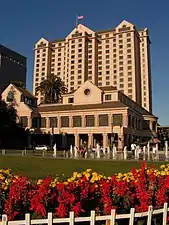 The Fairmont, San Jose CA. Completed 1987
 Marriott Marquis, San Francisco, CA. Completed 1989

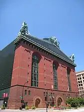 The Harold Washington Library in Chicago, Illinois, by Hammond, Beeby & Babka, completed 1991
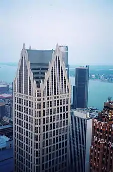


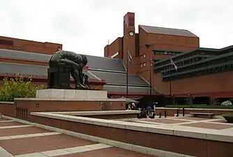


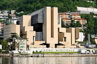
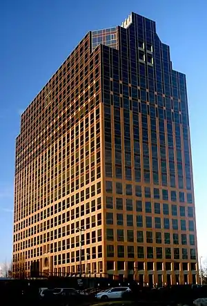 One Towne Square in Southfield, Michigan.
See also
- Charles Jencks
- New classical architecture, a reference style to historical architecture, emerged from postmodernism. It creates more accurate references of historical architecture styles.
- Third Bay Tradition
Explanatory footnotes
- Pelli studied architecture at the Universidad Nacional de Tucumán.[18][19] He graduated in 1949, after which he designed low-cost housing projects.[20] In 1952, he attended the University of Illinois School of Architecture in the United States for advanced study in architecture, and received his Master of Science in Architecture degree in 1954.[14][21]
- These Modernist buildings were, after all, "machines for living," according to LeCorbusier, and machines did not usually have gabled roofs.
- 1001 Fifth Avenue building in Manhattan is not to be confused with Portland's Congress Center, once referred to by the same name.
- But postmodernism did not advocate simply recreating classical designs, as had been done in neoclassical architecture.
- Modern architectural response analyzed by Thomas Schumacher in "Contextualism: Urban Ideals and Deformations", and by Colin Rowe and Fred Koetter in Collage City[56]
Citations
- Hopkins 2014, p. 200.
- Katherine McGrath (18 February 2020). "15 Playfully Bold Examples of Postmodern Architecture". Architectural Digest.
- Cited in review of Robert Venturi's "Complexities and Contradiction in Architecture" by Martino Stierli, in Architectural Review, 22 December 2016
- Ghirardo 1997, p. 18.
- Ghirardo 1997, p. 17.
- Ghirardo 1997, pp. 17–23.
- Taschen 2016, p. 638.
- Allen John Scott, Edward W. Soja, The City: Los Angeles and Urban Theory at the End of the Twentieth Century, Los Angeles,
- Taschen 2016, pp. 314–317.
- Taschen 2016, p. 317.
- Taschen 2016, pp. 220–223.
- "Master of the Schuylkill – Architect César Pelli". Patriot Harbor Lines. Retrieved September 12, 2016.
- "A Conversation with Cesar Pelli". New Haven Living. July 2013. Retrieved September 12, 2016.
- "Cesar Pelli: Connections". National Building Museum. Retrieved September 12, 2016.
- Benjamin Forgey. "COMSAT Alumni & Retirees Association". COMARA.org. Retrieved April 21, 2013.
- "2008 Lynn S. Beedle Award Winner". Council on Tall Buildings and Urban Habitat. Retrieved May 17, 2012.
- "César Pelli: 'I avoided a style'". La Gaceta. June 10, 2012. Retrieved September 12, 2016.
- Marcelo Gardinetti (June 2012). "César Pelli Tucuman". Technne. Retrieved September 12, 2016.
- Charles E. Gagit Jr. (June 1, 2015). The Groundbreakers: Architects in American History Their Places and Times. Transaction Publishers.
- Murphy, Brian (July 19, 2019). "César Pelli, celebrated architect of sweep and harmony, dies at 92". The Washington Post.
- "Cesar Pelli gives convocation address at University of Illinois". Pelli Clarke Pelli Architects. May 17, 2014. Retrieved September 12, 2016.
- Charles E. Gagit, Jr. (June 1, 2015). The Groundbreakers: Architects in American History Their Places and Times. Transaction Publishers.
- Nicholas Von Hoffman (February 28, 2005). "Cesar Pelli Architecture and Design". Architectural Digest. Retrieved September 12, 2016.
- Paola Singer (May 10, 2016). "César Pelli and His Nonchalant Architecture". Surface Magazine. Retrieved September 12, 2016.
- Michael J. Crosbie. "Introduction: A Conversation with Cesar Pelli." Cesar Pelli: Selected and Current Works. Mulgrave: Images Publishing Group, 1993.
- "UMD to honor Weber Music Hall architect at commencement May 13". Budgeteer News. April 30, 2004. Retrieved September 12, 2016.
- Connecticut Architecture Foundation Archived October 9, 2017, at the Wayback Machine. Retrieved November 30, 2016.
- Michael J. Crosbie. Pelli Clarke Pelli Architects. Basel: Birkhäuser Verlag, 2013.
- "Petronas Twin Towers". Culture Now. Retrieved September 12, 2016.
- Linda Hales (November 27, 2004). "The Spirit Behind the Aga Khan Awards". Washington Post. Retrieved September 12, 2016.
- Postmodern landscape architecture: theoretical, compositional characteristics and design elements with the analysis of 25 projects. Anna EPLÉNYI, Brigitta OLÁH-CHRISTIAN 2015
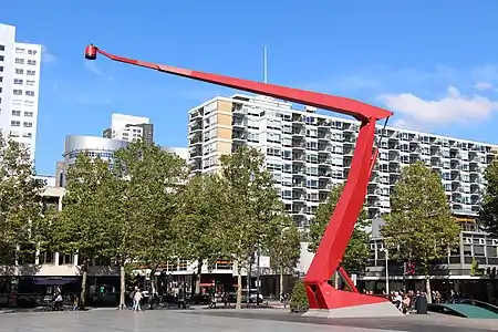
- Nieuw ontwerp Schouwburgplein bekend 12.02.10 https://www.rijnmond.nl/nieuws/18748/nieuw-ontwerp-schouwburgplein-bekend
- De Bure 2015, p. 48.
- Taschen 2016, p. 604).
- The Guardian, London, June 19, 1992
- Prima 2006, p. 353.
- Taschen 2016, pp. 24–27.
- Taschen 2016, pp. 304–305.
- Taschen 2016, p. 634.
- De Bure 2015, p. 160.
- Hopkins, Owen (2020). Postmodern Architecture - Less is a Bore. Phaidon. p. 78. ISBN 978-0-7148-7812-6.
- Hugh Honour, John Fleming (2009). A World History of Art - Revised Seventh Edition. Laurence King Publishing. p. 867. ISBN 978-1-85669-584-8.
- Hall, William (2019). Stone. Phaidon. p. 79. ISBN 978-0-7148-7925-3.
- Gura, Judith (2017). Postmodern Design Complete. Thames & Hudson. p. 141. ISBN 978-0-500-51914-1.
- Hopkins, Owen (2020). Postmodern Architecture - Less is a Bore. Phaidon. p. 198. ISBN 978-0-7148-7812-6.
- Hopkins 2014, p. 73.
- Gura, Judith (2017). Postmodern Design Complete. Thames & Hudson. p. 120. ISBN 978-0-500-51914-1.
- Hopkins, Owen (2020). Postmodern Architecture - Less is a Bore. Phaidon. p. 102. ISBN 978-0-7148-7812-6.
- De Bure, 2015 & pages 47–49.
- Hopkins 2014, p. 202.
- Hopkins 2014, pp. 200–201.
- De Bure 2015, p. 161.
- Hopkins 2014, p. 203.
- Heinrich Klotz, "The History of Postmodern Architecture", MIT Press, Cambridge Massachusetts, 1988
- Pardis, Tom W. (ed.). "Postmodern.com architecture website". Flagstaff, AZ: Northern Arizona University. Archived from the original on 2009-07-08. Retrieved 2009-09-17 – via jan.ucc.nau.edu.
site moved to Paradis, Tom W. (ed.). "American Architectural Styles: An Introduction". Retrieved 2020-06-03. - Nesbitt, Kate (1996). Theorizing A New Agenda for Architecture: An Anthology of Architectural Theory 1965-1995. New York: Princeton Architectural Press. p. 294. ISBN 1-56898-053-1.
- McAlester, Virginia Savage (2013). A Field Guide to American Houses. Alfred A. Knopf. pp. 664–665, 668–669. ISBN 978-1-4000-4359-0.
- Mark Jarzombek, "The Disciplinary Dislocations of Architectural History," Journal of the Society of Architectural Historians 58/3 (September 1999), p. 489. See also other articles in that issue by Eve Blau, Stanford Anderson, Alina Payne, Daniel Bluestone, Jeon-Louis Cohen and others.
- Cornell University Dept. of Architecture website
- Charter of the New Urbanism
- "Beauty, Humanism, Continuity between Past and Future". Traditional Architecture Group. Archived from the original on 5 March 2018. Retrieved 23 March 2014.
- Issue Brief: Smart-Growth: Building Livable Communities. American Institute of Architects. Retrieved on 2014-03-23.
- "Driehaus Prize". Notre Dame School of Architecture. Retrieved 23 March 2014.
Together, the $200,000 Driehaus Prize and the $50,000 Reed Award represent the most significant recognition for classicism in the contemporary built environment
- "United States Embassy Chancery Building". Architectural Record. 184: 84. 1996.
- Flores, Paola (5 July 2014). "From street stall to mini-mansion". Toronto Star.
- Caniglia, Julie (December 1999). "Cathedral of Hope". Out. Here Publishing. p. 46. ISSN 1062-7928.
General and cited references
- Bony, Anne (2012). L'Architecture Moderne (in French). Larousse. ISBN 978-2-03-587641-6.
- De Bure, Gilles (2015). Architecture contemporaine- le guide (in French). Flammarion. ISBN 978-2-08-134385-6.
- Ghirardo, Diane (1996). Architecture after Modernism. Thames and Hudson. ISBN 2-87811-123-0.
- Hopkins, Owen (2014). Les styles en architecture- guide visuel (in French). Dunod. ISBN 978-2-10-070689-1.
- Klotz, Heinrich (1998). History of Post-Modern Architecture. Cambridge, MA: MIT Press. ISBN 0-262-11123-3.
- Poisson, Michel (2009). 1000 Immeubles et monuments de Paris (in French). Parigramme. ISBN 978-2-84096-539-8.
- Prina, Francesca; Demaratini, Demartini (2006). Petite encyclopédie de l'architecture (in French). Solar. ISBN 2-263-04096-X.
- Taschen, Aurelia and Balthazar (2016). L'Architecture Moderne de A à Z (in French). Bibliotheca Universalis. ISBN 978-3-8365-5630-9.
- Robert Venturi (1977). Learning from Las Vegas: The Forgotten Symbolism of Architectural Form. Cambridge, MA: MIT Press, ISBN 0-262-22015-6.
.jpg.webp)