This article was co-authored by Travis Peters. Travis Peters is an Advertising Expert and the CEO and Founder of the ad agency EightPM. With over 15 years of experience, he specializes in implementing marketing and advertising techniques across traditional and digital media. The commitment to collaboration and a hands-on approach by Travis and his team at EightPM have led to features in various platforms including Forbes, Ad Age, and The Austin Business Journal.
There are 9 references cited in this article, which can be found at the bottom of the page.
This article has been viewed 69,217 times.
Classic advertising flyers are still a great way for businesses to catch the eye of potential customers and share their services and benefits. They are especially useful for showcasing specific events or sales. To be effective, your advertising flyer needs eye-catching and well-organized visuals. All the text content on your flyer should be concise and easy to read and comprehend.
Steps
Creating Content for Your Flyer
-
1Keep the information in your flyer brief. When you’re using a flyer as an advertisement, you want it to be clear and effective. Someone should be able to walk by, glance at your flyer, and understand your main selling point or service within a few seconds.
- Spend time brainstorming. Write a list of the things that you want people to take away from your flyer. Narrow that down to a single phrase or a few phrases.
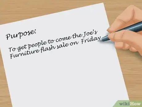
- Write down the main purpose of your flyer. For example, one purpose might be: “To get people to come the Joe’s Furniture flash sale on Friday.” This will help you clarify exactly what your flyer needs to convey.
- You don’t want any paragraphs or large chunks of text in your flyer.
-
2Write out the benefits of your product or service. When you’re creating the content for your flyer, you want to focus on the benefit to the customer rather than on your company itself.
- Use words like “you” and “your” instead of “we” or “I”.
- Create a bullet list of reasons why a person will benefit from using your service or coming to a specific sale or event.
Advertisement -
3Write a call to action.[1] A call to action makes your advertising flyer active rather than passive. It asks the person to interact with your business or service in a way that is direct.
- Use an imperative, direct statement.
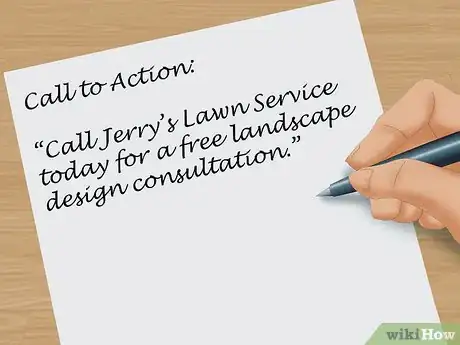
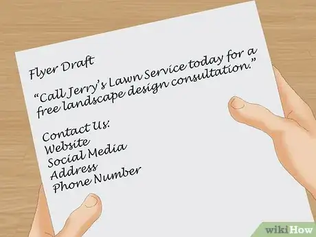
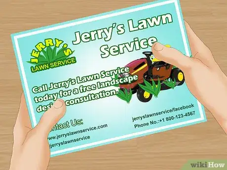
- For example, write, “Call Jerry’s Lawn Service today for a free landscape design consultation.”
-
4Add contact information. An advertising flyer is primarily meant to get a customer or consumer to look for more information on your company or service. You want to make sure to let them know how to easily contact your company or find your brick-and-mortar store.
- You want to include multiple types of contact information directly on your flyer.
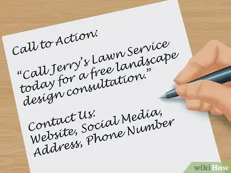
- Have a link to your website, social media, an address, and a phone number.
-
5Proofread the information for your flyer.[2] When you’re making an advertising flyer, you don’t want to have mistakes within the flyer. This makes your company look unprofessional, and it makes customers less likely to trust the information in your flyer.
- Make sure everything is correct on a grammatical level.
- Also, recheck your contact information to make sure there are no typos in your phone number or address.
Getting Graphics for Your Advertisement
-
1Include one or two large visuals.[3] When you’re designing your flyer, it can be tempting to use lots of eye-catching graphics on the page. It is much more effective, however, to use one or two large visuals to grab the attention of a passerby.
- Use high quality photographs. And, if you do use a photograph, make sure the image is easy to decipher. Don’t use a photograph with too many small, complicated details.
- You can find free stock images or clip art online to supplement your flyer.
- Make sure your flyer has at least one visual. This will help you to break up your text.
-
2Consider your budget. The design of your flyer will be impacted by how much money you have to spend on printing and on how many flyers you plan to print.
- If you can’t print in color, focus on clip art or shapes that will help to supplement your texts, rather than photographs. Photographs printed in black and white and low resolution can look unclear and grainy.
- Printing in black ink on colored paper can be a great way to draw attention to your flyer without spending too much money on printing.
- If you do have a larger budget, consider printing in full color on white paper for a fully customizable flyer.
-
3Use your business logo.[4] If your business or service has a logo, you want to make sure that you use it on your flyer. A logo helps people to recognize and remember your business.
- Make the logo prominent on the flyer.
- If the logo is in color, consider incorporating your company colors into other parts of the flyer like the font.
- Always follow your brand guide when creating an advertising flyer.[5]
Laying Out Your Advertising Flyer
-
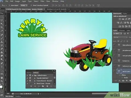
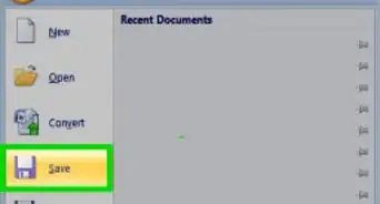
1Choose a program to make your flyer.[6] Depending on your level of design ability, you may want to use a premade template for your flyer or create your own template.
- You can use a variety of programs to create flyers. Use one that you are comfortable with already.
- Programs that you can use to make flyers include Adobe InDesign, Microsoft Word, Adobe Photoshop, and Microsoft PowerPoint.
- Create a new document, and start adding the components of your flyer.
-
2Make the name of your business or group prominent.[7] This is the most important part of your document. Above all, you want people who see your flyer to remember your business name and what you do.
- Make the name of your business in a larger font than most of the other content in your flyer.
- Center your business name. This will help draw the eye toward it.
-
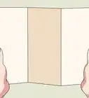
3Use borders and lines to organize your flyer.[8] You want to create a visual experience that is streamlined, rather than cluttered, so that readers quickly receive your message. Geometric lines and organization will help you to create a flyer that is easy for people to quickly understand.
- Divide your flyer into sections with borders. Using a grid can help you to create a symmetrical document, and maximize your space.
- Put the call to action in one box and your contact information in another.
-
4Test the readability of your flyer.[9] Once you’ve finished the design of your flyer, you want to make sure that it is readable. Ask other people to take a look at it. Do they find any parts confusing?
- Take a step back from your flyer. Try looking at it from different angles and distances. Can you still read it?
- Remove any information or image that takes away from the overall flyer or is distracting.
Expert Q&A
-
QuestionHow do I make a professional-looking flyer?
 Travis PetersTravis Peters is an Advertising Expert and the CEO and Founder of the ad agency EightPM. With over 15 years of experience, he specializes in implementing marketing and advertising techniques across traditional and digital media. The commitment to collaboration and a hands-on approach by Travis and his team at EightPM have led to features in various platforms including Forbes, Ad Age, and The Austin Business Journal.
Advertising Expert Keep your flyer in line with your brand guide. Colors, fonts, and messaging should be uniform and cohesive with your brand and audience.
References
- ↑ http://www.businessdictionary.com/definition/call-to-action.html
- ↑ http://writing.wisc.edu/Handbook/Proofreading.html
- ↑ http://www.businessknowhow.com/marketing/flyer.htm
- ↑ https://www.entrepreneur.com/article/71902
- ↑ Travis Peters. Advertising Expert. Expert Interview. 2 June 2021.
- ↑ https://helpx.adobe.com/indesign/how-to/make-flyer.html
- ↑ http://fitsmallbusiness.com/business-flyers/
- ↑ http://business.tutsplus.com/articles/10-design-tips-to-make-a-professional-business-flyer--cms-26226
- ↑ https://www.entrepreneur.com/article/179020
