This article was co-authored by wikiHow Staff. Our trained team of editors and researchers validate articles for accuracy and comprehensiveness. wikiHow's Content Management Team carefully monitors the work from our editorial staff to ensure that each article is backed by trusted research and meets our high quality standards.
There are 11 references cited in this article, which can be found at the bottom of the page.
This article has been viewed 123,836 times.
Learn more...
An informative brochure can be a great way to present various educational topics at a glance. To make your own brochure, you'll first need to learn a little about the subject you've been assigned. Once you've decided what sort of content you want to include, organize your information into a simple, easy-to-read format, complete with eye-catching visual elements like pictures and a title. You can then fold up your finished brochure for maximum style and readability.
Steps
Formatting Your Brochure
-
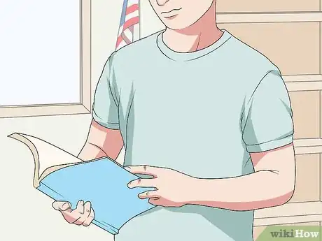
1Research your topic thoroughly and decide what information to include. Before you begin putting your brochure together, you'll need to know a little bit about the subject you've chosen or been assigned. Review your textbook, notes, and homework assignments to learn as much as you can. The more familiar you are with the material, the better your brochure will turn out.[1]
- Other resources, such as the encyclopedia and various educational websites, can help you dive deeper into your topic. Only use sources that have been approved by your teacher, and be sure to cite your external sources on the last page of your brochure.
- Think about the best way to present your topic. You might offer a general overview of a complex subject, or zoom in on one or two specific points. The best brochures display information in a simple, focused way.[2]
- If you're making a brochure on the Declaration of Independence, for example, you'd want to briefly summarize what the document says and name all of the people who signed it.
Tip: With a brochure, you have a limited amount of space to work with. Only include information that’s relevant to your topic and helps you get your main ideas across.
-
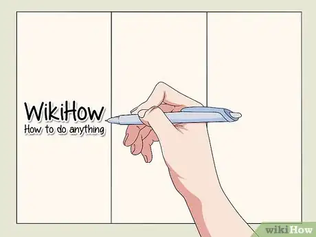
2Make the first panel of your brochure the title page. Put your title front and center on the outermost panel, the one that will be visible while the brochure is folded. That way, it will be the first thing your reader sees. Beneath your title, display your full name to make it clear who created the brochure.[3]
- Try to come up with a title that's short, punchy, and easy to remember. The title of your brochure should let your reader know what to expect right away.
- For a brochure about climate change, you could go with a straightforward title like “Climate Change,” or think of something more attention-grabbing, such as “Climate Change: The Silent Killer.”
Advertisement -
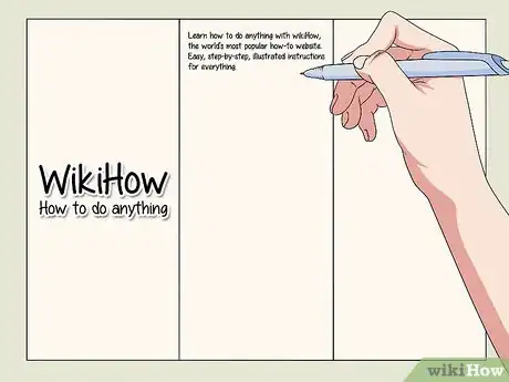
3Provide a brief outline of your topic on the first interior panel. In 3-5 sentences, give your reader a general introduction to the subject you'll be exploring in your brochure. Your introduction will set the stage for the rest of the brochure and help the reader better understand the information they're about to be given.
- An introduction to a geography brochure on the Maldives might say something like this: “The Maldives is a country in Asia located south of India and Sri Lanka. It is made up of a chain of 26 small islands. The Maldives have a sunny, tropical climate, which makes it a popular getaway for vacationers from around the world.”
-
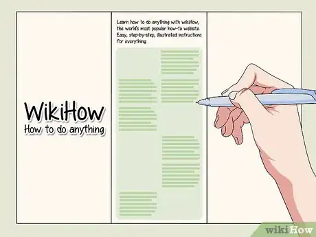
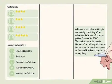
4Use each remaining interior panel to discuss a separate subtopic. The inside of your brochure is where you'll actually present the facts you've collected about your subject. Devote each panel to a single subject to prevent information on one subtopic from spilling over into the next page. Writing in short sentences or even bullet points can also make it easier for your reader to follow along.
- Think about whether you want a basic single-fold brochure or a traditional tri-fold brochure. Single-fold styles tend to work best for shorter, more straightforward topics, whereas tri-fold brochures make it easier to organize lots of information in a manageable way.
- For a brochure about dietary nutrients, you might use a portion of each of the three interior panels to explain the role of proteins, fats, and carbohydrates.
- In some cases, the amount of information you have to discuss will determine how many pages your brochure will end up being. In others, your teacher may specify a certain number of pages. Make sure you follow instructions carefully.
-
5Give a short summary of your topic on the back page of your brochure. End your brochure by offering your reader a quick recap of the most important points you covered in the preceding panels. Use simple, direct language to clear up any confusion they may have about what they've just read.[4]
- A good rule of thumb is to include at least one key detail from each of your interior panels in your summary on the final panel.
- You can either leave the center outside panel blank or use it to list any external sources you used to do your research, such as books or websites.
Designing Your Brochure
-
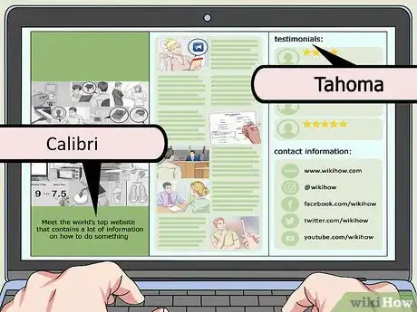
1Choose simple, legible fonts to make your brochure easy on the eyes. Brochures are meant to be read quickly and easily. For this reason, standard fonts and lettering styles are preferable to more elaborate ones. A common typeface like Arial, Sans Serif, or Times New Roman will work just fine, in most cases.[5]
- If you're designing your brochure on the computer, it's best to stick to a font size somewhere in the 9-10.5 range for your main text, since the panels are smaller than ordinary documents. You can go slightly larger for things like headings and titles.
- When hand-making a brochure, always print your letters rather than writing them in cursive.
-
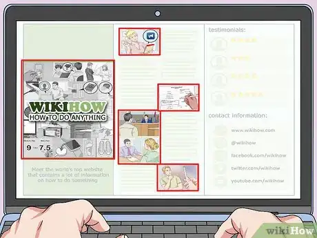
2Incorporate pictures and other graphic elements throughout. Pictures are useful for breaking up big chunks of text on the panel and giving your reader something interesting to look at. They tend to work best when they accompany an important piece of information. Place your images on one side of the page near the margins and format your text around them to make the best use of the space you have.[6]
- Add your own hand-drawn illustrations or download images from the Internet that are appropriate for your topic.
- Avoid adding more than about 2 pictures per page. Too many can quickly become distracting and result in a cluttered, amateurish look.
- Don't forget that you'll need to provide citations for the images you include as well to let your reader know where you found them.
-
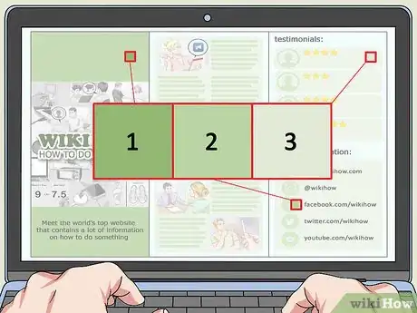
3Use color to add style and emphasis. Making your title and headings a different color than your main text, for instance, can create contrast and signal to your reader that they're encountering something new. You could also include full-color pictures for more vibrant detail, or even print or draw on colored paper in a light shade that won't clash with your lettering.[7]
- You can easily change your font color using the text editor tools in your editing program of choice. If you're creating your brochure by hand, grab some colored pencils or markers for when you want to add a little flair.
Warning: Try to limit your palette to about 2-3 colors. Otherwise, your brochure could end up looking tacky and overwhelming.
Putting Your Brochure Together
-
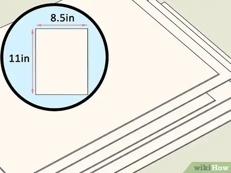
1Make your brochure by hand using heavy paper and basic art supplies. For the brochure itself, start with a sheet of typing or construction paper that's at least 8.5 in (22 cm) x 11 in (28 cm). Write out your information with a permanent black ink pen, then use colored pencils or markers to add pictures and other stylistic accents.
- The paper you're using should be thick enough to hold up to folding, and big enough to be easily readable.[8]
- Flip through old magazines and see if you can find photos related to your topic in some way. Cut these out and glue them to your paper to make use of higher-quality images.
-
2Use editing software if you want to design your brochure digitally. These days, most editing programs come with premade templates for brochures and similar documents. One of these can take all of the guesswork out of designing your brochure. Just select the template you want to use and fill out the corresponding blank sections with your text, pictures, and other elements.[9]
- You can also use your template as a starting point and make whatever changes you want to the size, color, and placement of your text and images. This makes it possible to fully customize your brochure in a snap.
- Keep in mind that the most powerful photo and document editors often have a steep learning curve. For this reason, they may not be the best option if you don't have much time to make your brochure.
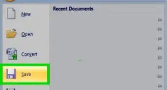
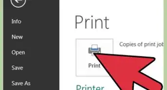
- Take a few moments to make sure your brochure is complete, properly formatted, and free of spelling or grammatical errors. When you're satisfied with the way it looks, select the “Print” option in the toolbar of your design program.[10]
Tip: Programs like Photoshop, InDesign, Illustrator, Scribus, and Inkscape are all popular options for designing documents.
-
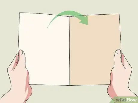
3Fold the paper in half widthwise to make a basic single-fold brochure. Gently bend the paper in the middle to bring the outer edges together, making sure the corners are neatly aligned. Then, pinching the edges together with one hand, slide the pad of your finger down the center of the sheet to create a crease. Your finished brochure will open just like a book.[11]
- Be sure to choose a folding technique that works with the layout of your brochure.
- For best results, do your folding on a table, desk, countertop, or similar flat, stable surface.
- A single-fold style works best for brochures that contain lots of images, graphs, or visual elements that call for a little extra room.[12]
-
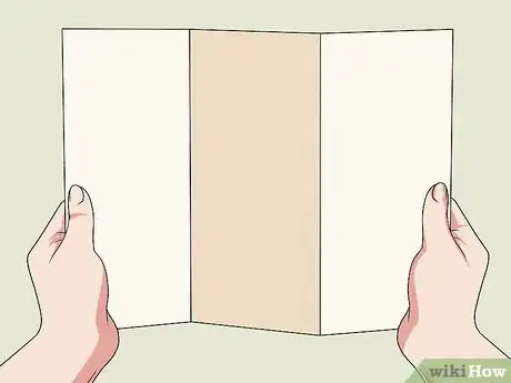
4Divide the paper into thirds for a traditional tri-fold brochure. Set your brochure on your work surface with the title panel face down to your left. Gather up the outer right edge of the paper and carefully fold it over to the left until it covers half of the remaining sheet. Double-check that the fold is straight and precise, then crease the bent edge. Fold and crease the remaining ⅓ of the sheet from the left to complete your tri-fold brochure.[13]
- After folding your brochure, the title panel should be on top facing up, with the insert panel directly under it.
- Tri-fold brochures give you the option of presenting your information sequentially or arranging it into separate panels for a more varied look.[14]
Community Q&A
-
QuestionWhich size of paper should we use to make a brochure?
 TheFreshArtistCommunity AnswerThe standard sizes for making a brochure are: 8.5 x 11 / 8.5 x 14 / 11 x 17 / 11 x 25.5 You can choose which size is suitable for the quantity of the information you want to give.
Things You’ll Need
- Computer
- Document design program
- Typing paper or other thick, heavy paper
- Black ink pen
- Colored pencils, and other art supplies
- Printer for photos
References
- ↑ https://blog.flipsnack.com/pamphlet-design-ideas-examples-and-tips/
- ↑ https://www.creativebloq.com/graphic-design-tips/how-to-design-a-brochure-123267
- ↑ https://www.entrepreneur.com/article/179020
- ↑ https://academichelp.net/business-writing-help/write-brochure.html
- ↑ https://theblog.adobe.com/make-a-lasting-impression-with-these-tips-for-designing-a-brochure/
- ↑ https://www.entrepreneur.com/article/179020
- ↑ https://www.businessknowhow.com/directmail/ideas/brochures.htm
- ↑ https://www.entrepreneur.com/article/179020
- ↑ https://creativemarket.com/blog/a-simple-guide-to-edit-a-brochure-template
- ↑ https://www.youtube.com/watch?v=9CmJ-1DzK3M&feature=youtu.be&t=2
- ↑ https://bizfluent.com/how-5263179-fold-paper-brochure.html
- ↑ https://www.prepressure.com/finishing/how-to-fold-a-brochure
- ↑ https://www.youtube.com/watch?v=58qJF0qKOwc&feature=youtu.be&t=52
- ↑ https://bizfluent.com/how-5263179-fold-paper-brochure.html
