Traffic signs by country
This article is a summary of traffic signs used in each country.
Africa
Generally, road signs in African countries closely follow those used in Europe, but most African countries have not ratified the Vienna Convention on Road Signs and Signals.[1]
Although the Trans-African Highway network exists, Trans-African route numbers, however, are not signed at all in any African country, except Kenya and Uganda where the Mombasa–Nairobi–Kampala–Fort Portal section (or the Kampala–Kigali feeder road) of Trans-African Highway 8 is sometimes referred to as the "Trans-Africa Highway".[2]

Angola
Road signs in Angola are particularly modelled on the Portuguese road signs since Angola is a former Portuguese colony.
Botswana
Mauritius
Road signs in Mauritius are regulated by the Traffic Signs Regulations 1990. They are particularly modelled on the British road signs since Mauritius is a former British colony. Mauritius has left-hand traffic.
Sierra Leone
Road signs in Sierra Leone are standardized road signs and closely follow those used in Italy with certain distinctions. They are written in English.
Asia

Road signs in Asia differ by country. Typically, Asian countries closely follow Europe in terms of road sign design, which means they are influenced by both the Vienna Convention on Road Signs and Signals and road signage standards of the European Union.[1] In Cambodia, Thailand, the Philippines, Malaysia and Indonesia, conventions in signage tend to resemble United States signage conventions more so than European and Asian conventions (resulting in warning signs being diamond and yellow instead of triangular and white), the only difference being the use of blue circle instead of the letter E or P.
Asian Highway signs are marked using white letters on a dark blue background. In Turkey and Russia, European route numbers are indicated using white characters on a green rectangle and are signposted; however this is not the case in many other Asian countries.
Armenia
Road signs in Armenia are similar to those used in the Soviet Union before its collapse in 1991. Modern road signs used in Armenia are generally the same as those used in Russia, with the exception that inscriptions on road signs are written in both Armenian and English, and the "Stop sign" is written in these two languages.
Azerbaijan
Bangladesh
Brunei
Cambodia
In Cambodia, road signs are prescribed by the Ministry of Public Works and Transport, of Cambodia.[3] Cambodian road signage practice closely follows those used in Europe, with the exception of warning signs which follow the American MUTCD, matching the designs used in neighbouring Thailand, Malaysia and Indonesia.
Road signs in Cambodia use Helvetica for English language text.
China
A variety of road signs are used in mainland China, specified in the Guobiao standard GB 5678–2009. Most road signs in China, like warning signs, appear to adopt the practices of the ISO standards not intended for use in traffic signage, which are ISO 3864 and ISO 7010.
- Warning signs in China are triangular with a black border, yellow background and black symbol.
- Mandatory signs generally follow European conventions (circular with red border/blue circle) with some local variations.
Direction signs have these colours:
- Green for expressways
- Brown for tourist attractions
- Blue for other roads
- Occasionally, black on white is used for directions to local facilities.
Road signs in China use FHWA Series E and Helvetica for English language text.
Hong Kong
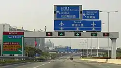

Hong Kong's traffic signs follow the British road sign conventions and are bi-lingual in English and Chinese (English on top, and Traditional Chinese characters at the bottom).
Macau
Road signs in Macau are inherited from pre-1994/1998 reform Portuguese road signages. They are written in Chinese and Portuguese.
Taiwan
Road signs in Taiwan are reminiscent of the early 1940s Japanese road signage, which was used in Japan itself until 1950,[4] this means that Taiwan is lenient towards European road signs in terms of road sign design, but with some influences from road signs used in Japan and China.
Road signs in Taiwan use FHWA Series E and Arial for English language text.
Georgia
Road signs in Georgia are mostly inherited from road signs used in neighboring post-Soviet states such as Russia, Armenia and Azerbaijan, but with some modifications in design. Inscriptions on road signs are usually written in Georgian and English.
India
Road signs in the Republic of India are similar to those used in some parts of the United Kingdom, except that they are multilingual. Most urban roads and state highways have signs in the state language and English. National highways have signs in the state language and English.
Indonesia

Iran
Road signs in Iran mainly follow the Vienna Convention. Signs are in Persian and English.
Israel
Road signs in Israel mainly follow the Vienna Convention, but have some variants.
Japan

Road signs in Japan are either controlled by local police authorities under Road Traffic Law (道路交通法, Dōro Kōtsūhō) or by other road-controlling entities including Ministry of Land, Infrastructure, Transport and Tourism, local municipalities, NEXCO (companies controlling expressways), under Road Law (道路法, Dōrohō). Most of the design of the road signs in Japan are similar to the signs on the Vienna Convention, except for some significant variances, such as stop sign with a red downward triangle. The main signs are categorized into four meaning types:
- Guidance (white characters on blue in general – on green in expressways),
- Warning (black characters and symbols on yellow diamond),
- Regulation (red or blue circle, depending on prohibition or regulation),
- And instruction (mostly white characters or symbols on blue square).
Kazakhstan
Road signs in Kazakhstan are similar in design to road signs used in neighboring Russia, as well as in most post-Soviet states. Inscriptions on road signs, including the names of settlements and streets, are usually written in two languages: Kazakh and Russian.
Korea
Both North Korea and South Korea developed their own road signage systems.
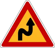
Road signs in South Korea are standardised and regulated by the Korean Road Traffic Authority. South Korean road signage closely follows those used in Europe, but with some influences from road signs in Japan. Similar to road signs of Poland and Greece, road signs are triangular, have a yellow background and a red border. Like other countries, the signs use pictograms to display their meaning.
Road signs in North Korea differ by locale. Most of the time, they tend to closely follow China in design (but identically), and some road signs are unique to North Korea (such as an exclamation mark drawn on another sign to indicate other dangers), so they never appear elsewhere.
South Korea keeps close to the Vienna Convention on Road Signs and Signals as South Korea is an original signatory. On the other hand, North Korea is not a signatory to the convention and instead designs its own signs, creating confusion.[5]
Kyrgyzstan
Laos
Malaysia
Mongolia
Nepal
Pakistan
Philippines
_sign.svg.png.webp)
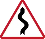
Road signs in the Philippines are standardized in the Road Signs and Pavement Markings Manual, published by the Department of Public Works and Highways. Philippine road signage practice closely follow those used in Europe, but with local adaptations and some minor influences from the US MUTCD and Australian road signs. However, some road signs may differ by locale, and mostly diverge from the national standard. For example, the Metropolitan Manila Development Authority (MMDA) has used pink and light blue in its signage for which it has been heavily criticised.[6][7]
Road signs in the Philippines are classified as:
- Regulatory signs
- Warning signs
- Guide signs
- Expressway signs
- Traffic instruction signs
Regulatory road signs – other than the stop and give way signs – are generally circular, with (for prohibitions) a black symbol on a white background within a red border, or (for mandatory instructions) a white symbol on a blue background. In some cases circular regulatory signs are placed on white rectangular panels together with text supplementing their meanings.
Most warning signs display a black symbol on a white background within a red-bordered equilateral triangle. Since 2012, however, a more visibly distinctive design (taken from that used for school signs in the US) has been adopted for pedestrian-related signs: these consist of a fluorescent yellow-green pentagon with black border and symbol. Additional panels may be placed below signs to supplement their meanings.
Guide signs are divided into directional signs, service area signs, route markers, and tourist-related signs, with influence from both American and Australian practice. Directional signs use a green background with white letters and arrows. Service area signs use a blue background with white letters, arrows, and symbols. Tourist-related signs use a brown background with white letters, arrows, and symbols. The route marker sign, excluding the AH26 route marker, is based on the Australian National Route marker, but reserved for future use.
Signs on expressways mostly take elements from Australian motorway/freeway signs. Exit signs, wrong way signs and start/end of expressway signs are very similar to Australian freeway signage. Traffic instruction signs are textual signs used to supplement warning and regulatory signs.
Russia
Road signs in the Asian part of Russia follow the Vienna Convention, specified in the GOST standard 52290-2004[8] (the Soviet Union was an original signatory to the convention, but only a few Post-Soviet states are signatories to the convention). However, direction signs in the Asian part of Russia omit European route numbers, replaced by Asian route numbers, which are dark blue in background with white lettering, with a few exceptions.
Saudi Arabia
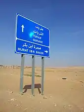
Road signs in Saudi Arabia frequently show their text both in Arabic and English. Road signs also indicate which part of the road is for Muslims, and which part is for non-Muslims, for instance near Mecca.[9]
Singapore
Singapore's traffic signs closely follow British road sign conventions, although the government has introduced some changes to them.
Sri Lanka
Road signs in Sri Lanka are standardized road signs and closely follow those used in Europe with certain distinctions. A number of changes have introduced road signs that suit local roads and systems. Sri Lankan government announced by a gazette that aimed to give signage a face-lift and introduce over 100 new road traffic signs.
Thailand

Road signs in Thailand are standardised and are uniform throughout the country. Since the late twentieth century, Thai road signage practice closely follows the designs used in the United States, Europe and Japan. Road signs are often written in Thai language and display in metric units. In tourist areas, English is also used for important public places such as tourist attractions, airports, railway stations, and immigration checkpoints. Destinations on direction signage is written are written in both Thai and English.
Road signs in Thailand are classified as:
- Priority signs
- Prohibitory signs
- Mandatory signs
- Warning signs
- Direction signs
Turkey
United Arab Emirates
Uzbekistan
Vietnam
Road signs in Vietnam are standardized road signs closely follow those used in China with certain distinctions. They are written in Vietnamese.
Yemen
Road signs in Yemen are standardized road signs and closely follow those used in Germany with certain distinctions. They are written in Arabic and English.
Europe
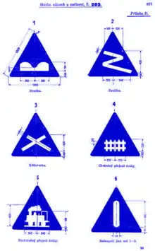

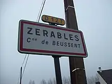
The standardization of traffic signs in Europe commenced with the signing of the 1931 Geneva Convention concerning the Unification of Road Signals by several countries.[10] The 1931 Convention rules were developed in the 1949 Geneva Protocol on Road Signs and Signals[11] and a European Agreement supplementing the 1949 Protocol.[12]
In 1968, the European countries signed the Vienna Convention on Road Traffic treaty, with the aim of standardizing traffic regulations in participating countries to facilitate international road traffic and to increase road safety. Part of the treaty was the Vienna Convention on Road Signs and Signals, which defined the traffic signs and signals. As a result, in Western Europe the traffic signs are well standardized, although there are still some country-specific exceptions, mostly dating from the pre-1968 era.
The principle of the European traffic sign standard is that certain shapes and colours are to be used with consistent meanings:
- Triangular signs (black symbols on a white or yellow background) warn of dangers. The Vienna Convention additionally allows an alternative shape for such signs, namely a right-angled diamond – although in Europe this shape is regularly used only in the Republic of Ireland.
- Regulatory signs are round: those indicating a prohibition or limit are black on white (or yellow) with a red border; those giving a mandatory order are white on blue.
- Informational and various other secondary signs are of rectangular shape.
- The animals which may be depicted on warning signs include cattle, deer, ducks, elk, frogs, horses, sheep, monkeys (in Gibraltar), and polar bears (on Svalbard). The Convention allows any animal image to be used.
Directional signs ("guide signs" in American parlance) have not been harmonized under the convention, at least not on ordinary roads. As a result, there are substantial differences in directional signage throughout Europe. Differences apply to the choice of typeface, arrows and, most notably, colours. The convention does, however, specify that the type of directional signage used should, for each country, distinguish limited-access roads ("motorways") from ordinary, all-purpose roads.
Directional signage on motorways uses:
- white-on-green in, for example, Albania, Bosnia and Herzegovina, Bulgaria, Croatia, Cyprus, the Czech Republic, Denmark, Finland, Greece, Italy, North Macedonia, Romania, Serbia, Slovakia, Slovenia, Sweden, Switzerland, and Turkey
- white-on-blue in, for example, Austria, Belarus, Belgium, France, Germany, Hungary, Luxembourg, the Netherlands, Norway, Poland, Portugal, the Republic of Ireland, Spain, and the United Kingdom.
Differences are greater for non-motorways:
- White-on-blue in Italy, Switzerland, Sweden, the Czech Republic, Greece, Cyprus, Slovakia, Bulgaria, Romania, Latvia, Estonia, Finland, Turkey, and the Netherlands (in this case the same as on motorways).
- White-on-green in the United Kingdom, the Republic of Ireland, Poland, France, Hungary, and Portugal (only on the few primary roads that still have not been transformed in motorways),
- Black-on-yellow in Bosnia and Herzegovina, Germany, Luxembourg, Norway, Slovenia, Serbia, and Croatia.
- Red-on-white in Denmark (though white-on-blue on motorway exits and all overhead gantries)
- Black-on-white in Austria and Spain.[13]
The black-on-white signposting of secondary roads distinguishes them from primary roads in Andorra, Finland, France, Portugal, the Republic of Ireland, Switzerland, and the United Kingdom. In Germany, Hungary, Italy, Romania, and Sweden black-on-white indicates urban-only roads or urban destinations.
The signposting of road numbers also differs greatly, except that European route numbers, if displayed, are always indicated using white characters on a green rectangle. European route numbers are, however, not signed at all in the United Kingdom, Albania, Iceland and Andorra.
The Convention recommends that certain signs – such as "STOP", "ZONE", etc. – be in English; however, use of the local language is also permitted. If a language uses non-Latin characters, a Latin-script transliteration of the names of cities and other important places should also be given. Road signs in the Republic of Ireland are bilingual, using Irish and English. Wales similarly uses bilingual Welsh–English signs, while some parts of Scotland have bilingual Scottish Gaelic–English signs. Finland also uses bilingual signs, in Finnish and Swedish. Signs in Belgium are in French, Dutch, or German depending on the region. In the Brussels Capital Region, road signs are in both French and Dutch. Signs in Switzerland are in French, German, Italian, or Romansh depending on the canton.
European countries – with the notable exception of the United Kingdom, where distances and lengths are indicated in miles, yards, feet, and inches, and speed limits are expressed in miles per hour – use the metric system on road signs.
For countries driving on the left, the convention stipulates that the traffic signs should be mirror images of those used in countries driving on the right. This practice, however, is not systematically followed in the four European countries driving on the left; United Kingdom, Cyprus, Malta and the Republic of Ireland. The convention permits the use of two background colours for danger and prohibition signs: white or yellow. Most countries use white, with a few – such as Finland, Iceland, Poland, and Sweden – opting for yellow as this tends to improve the winter-time visibility of signs in areas where snow is prevalent. In some countries, such as France or Italy, white is the normal background colour for such signs, but yellow is used for temporary signage (as, for example, at road works).
European traffic signs have been designed with the principles of heraldry in mind; i.e., the sign must be clear and able to be resolved at a glance. Most traffic signs conform to heraldic tincture rules, and use symbols rather than written texts for better semiotic clarity.
Albania
Albanian road signs are similar to Italian road signs, hence both follow the same convention on road sign design set out by the Vienna Convention on Road Signs and Signals.
Andorra
Road signs in Andorra are similar to those set out in the Vienna Convention on Road Signs and Signals. Its direction signage is always white.[14]
Unlike other European countries such as the United Kingdom, France and Belgium, all routes in Andorra are not numbered. This can cause problems for drivers from neighbouring European countries when trying to find an international destination.
Austria
Belarus
Road signs in Belarus are visually not much different from road signs used in neighboring post-Soviet countries like Russia and Ukraine. Inscriptions on road signs, including names of settlements, are written in Belarusian or Russian, most often in Belarusian.
Belgium
Bosnia and Herzegovina
Croatia
Croatian road signs follow the Vienna convention (SFR Yugoslavia was the original signatory for Croatia, which is now a contracting party itself). The most common signs are:
- Yellow and black signs for direction.
- Blue and white signs for information.
- White-on-green signs are used on the highways.
In the first years following Croatia's independence, its traffic signs were the same as in the rest of the former Yugoslavia. In the early 2000s, replacement of the yellow background of warning signs began, and new signs now use a white background.
The signage typeface is SNV, as with the other countries of the former Yugoslavia.
Czech Republic
Denmark
Estonia
Finland
France
Germany
Greece
Hungary
Iceland
Iceland is not a signatory to the Vienna Convention on Road Signs and Signals, but they do follow the Vienna Convention guidelines, however, they use a variant of the colour scheme and minor design changes similar to the signs in Sweden.
Ireland

Until the partition of Ireland in 1922 and the independence of the Irish Free State (now the Republic of Ireland), British standards applied across the island. In 1926 road sign standards similar to those used in the UK at the time were adopted.[15] Law requires that the signs be written in both Irish and English.
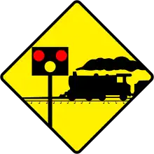
In 1956, road signs in the Republic were changed from the UK standard with the adoption of US-style "diamond" signs for many road hazard warnings (junctions, bends, railway crossings, traffic lights).[16] Some domestic signs were also invented, such as the keep-left sign (a black curved arrow pointing to the upper-left, although some are similar to the European "white arrow on blue disk" signs), while some other signs are not widely adopted outside Ireland, such as the no-entry sign (a black arrow pointing ahead in a white circle with a red slashed circumference).
Directional signage is similar to current United Kingdom standards. The same colours are used for directional signs in Ireland as in the UK, and the UK Transport and Motorway fonts are used. Unlike Wales and Scotland, where Welsh and Gaelic place-names use the upright Transport face, Irish place-names are rendered in an italic face.
In January 2005 Ireland adopted metric speed limits. Around 35,000 existing signs were replaced and a further 23,000 new signs erected bearing the speed limit in kilometres per hour. To avoid confusion with the old signs, each speed limit sign now has "km/h" beneath the numerals. Also, since the adoption of signs based on the Warboys Committee standard in 1977, Irish directional signs have used the metric system; however, unlike with the later speed limit changeover, there was no effort made to change the existing signage, and as of 2007 many finger posts still remain on rural roads with distances in miles, although the numbers continue to decline as roads are improved.
In late 2007 Ireland began an extensive programme of sign and post replacement. Good examples are the M1 (Dublin–Dundalk) and the M50 (Dublin). While being mostly the same as the old signs, it is welcome as a lot of the signs were damaged/stained. About half of the new posts are now two medium posts with crosshatched metal posts in-between instead of one large pole to minimise the damage in case of a crash.
Italy
Latvia
Road signs in Latvia largely adhere to Vienna Convention guidelines. In detailed design they closely resemble the signs used in Germany.
Liechtenstein
Lithuania
Like most post-Soviet states, Lithuania uses the road signs similar to those used in the Soviet Union since Lithuania was part of the Soviet Union. Neighboring Latvia and Estonia already have their own road sign standards, which outwardly differ from Russian ones.
Malta
Montenegro
Netherlands
Road signs in the Netherlands follow the Vienna Convention. Directional signs (which have not been harmonized under the convention) always use blue as the background colour. The destinations on the sign are printed in white. If the destination is not a town (but an area within town or some other kind of attraction), that destination will be printed in black on a separate white background within the otherwise blue sign.
The Netherlands always signposts European road numbers where applicable (i.e., on the advance directional signs, the interchange direction signs and on the reassurance signs). Dutch national road numbers are placed on a rectangle, with motorways being signposted in white on a red rectangle (as an Axx) and primary roads in black on a yellow rectangle (as Nxx). When a motorway changes to a primary road, its number remains the same, but the A is replaced by the N. So at a certain point the A2 becomes N2, and when it changes to a motorway again, it becomes A2 again.
Signs intended for bike-riders always go on white signs with red or green letters.
The Dutch typeface, known as ANWB-Ee, is based on the US typeface. A new font, named ANWB-Uu (also known as Redesign), has been developed in 1997 and appears on many recent Dutch signs. On the motorways however the typeface remains the ANWB-Ee or a similar typeface. The language of the signs is typically Dutch, even though bilingual signs may be used, when the information is relevant for tourists.
Norway

Signs in Norway mostly follow the Vienna Convention, except the polar bear warning sign, which is a white bear on a black background and a red border. These are the directional signs:
- Signs for motorways are blue with white text
- Those for regular roads to towns and cities are yellow with black lettering
- Signs for industrial areas, commercial facilities etc. are white with black letters
- Signs for tourist attractions, national parks, museums etc. are brown with white lettering
The signs for road numbering are rectangular, and have this colour scheme:
- European routes (E6, E18, etc.) are green with white lettering
- National routes are also green with white lettering
- Province owned roads are white with black lettering
- Municipality owned roads have the name of the road, instead of a number, and are white with black lettering
Poland
The road signs in Poland follow the Vienna convention. Poland chose yellow as the background colour for warning signs (an alternative allowed under the convention), rather than the much more widely adopted white. The typeface used on Polish road signs is a bespoke one, created in 1975, replaced the former signage typeface that resembles NT Cornelia typeface[17] and specified by the Regulations of 3 July 2003, as amended.[18][19] There are two fonts available for download, both being digitalisations of the original specification: one is Tablica Drogowa (freeware for non-commercial use, paid licence required otherwise),[20] another is Drogowskaz (freeware for non-commercial use, see licence text for conditions of other use).[21]
Russia
Road signs in Russia follow the Vienna Convention, specified in the GOST standard 52290-2004[8] (the Soviet Union was an original signatory to the convention, but only a few Post-Soviet states are signatories to the convention).
European route numbers are signposted on direction signs in the European part of Russia and thus have the green background with white lettering.
In February 2019, the traffic police has supported proposals for the introduction of reduced road signs, the idea was initiated by the Moscow government. They are planned to be installed throughout Russia after a successful experiment. The allowable size of signs will be reduced to 40 cm (16 inches) in diameter, and in some cases to 35 cm (14 inches), which is almost half the current standard of 60 cm (24 inches).[22]
Serbia
Sweden
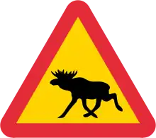
The road signs in Sweden mostly follow the Vienna Convention with a few adaptations, however, allowed within the convention:
- The background of warning signs is yellow
- Warning signs for elk and reindeer
- The background of direction signs is blue with white text
- The background of motorway direction signs is green with white text
- When applicable, the language is Swedish in Sweden.
The signage typeface Tratex is used exclusively in Sweden and is available as freeware.[23]
Switzerland and Liechtenstein
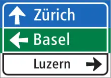
Even though Switzerland is not a member of the EU, the road signs mostly follow the Vienna Convention with a few adaptations and exceptions. Road signs are categorized as follows:
- Warning signs
- Prohibition signs (Regulatory)
- Mandatory instruction signs (Regulatory)
- Priority signs
- Conducting indication signs
- Routing indication signs
- Informational signs
- Complementary panels
- Road markings
- Traffic lights
- Police instructions
Distances and other measurements are displayed in metric units. Starting 2003, ASTRA-Frutiger is the typeface used to replace SNV, which is still used in several European countries.[24]
Major exceptions from the norm are:
- Signs use one of the four national languages corresponding to the location.
- Destinations are spelled according to their local spelling, e.g. Genève for Geneva, also in German or Italian Switzerland.
- Motor-/expressway signs are white text on green background.
- Main road/route signs are white text on blue background.
- Minor road/route signs are black text on white background.
- Detour route signs are black text on orange background.
- Bicycle and mountain bike routes, and routes for vehicle-like transport means are white text on falu red background.
- Commercial direction signs are black text on grey background with a red dot.
- Generally valid speed limit of 50 km/h within densely built-up areas, e.g. within urban settings, villages, or towns (starts with sign no. 2.30.1; ends with sign no. 2.53.1) – sometimes applicable even without producing the corresponding sign (no. 2.30.1) on minor roads after entering a settlement (sign no. 4.27) when densely built-up area begins.
- On mountain roads, priority is given to, firstly, heavy vehicles (lorries and buses), and secondly, upwards-moving vehicles.
- Mountain postal road sign (starts with sign no. 4.05 and ends with 4.06) indicating priority to public transport on (mountain) roads; drivers must follow instructions given by public bus drivers.
- There are more priority signs than usual (often related to the Priority to the right rule).
Ukraine
Road signs in Ukraine broadly conform to European norms, and they are based on the road signage systems used consistently throughout the former USSR.
United Kingdom
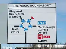
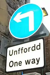
Traffic signing in the UK conforms broadly to European norms, though a number of signs are unique to Britain and direction signs omit European route numbers. The current sign system, introduced on 1 January 1965, was developed in the late 1950s and early 1960s by the Anderson Committee, which established the motorway signing system, and by the Worboys Committee, which reformed signing for existing all-purpose roads. (For illustrations of most British road signs, see 'Know your traffic signs'[25] on the GOV.UK website.)
The UK remains the only Commonwealth country to use non-metric (Imperial) measurements for distance and speed, although "authorised weight" signs have been in metric tonnes since 1981 and there is currently a dual-unit (metric first) option for height and width restriction signage, intended for use on safety grounds. On motorways kilometre signs are visible at intervals of 500 metres (1,600 ft) indicating the distance from the start of the motorway. (See Driver location sign).
Three colour schemes exist for direction signs:
- On motorways they are blue with white lettering
- On primary routes they are green with white lettering and yellow route numbers
- A non-primary route has white signs with black lettering
- A fourth colour scheme, black on yellow, is seen on temporary signs, for example marking a diversionary route avoiding a road closure.
Two typefaces are specified for British road signs. Transport "Medium" or Transport "Heavy" are used for all text on fixed permanent signs and most temporary signage, depending on the colour of the sign and associated text colour; dark text on a white background is normally set in "Heavy" so that it stands out better. However route numbers on motorway signs use a taller limited character set typeface called "Motorway".
Signs are generally bilingual in all parts of Wales (English/Welsh or Welsh/English), and similar signs are beginning to be seen in parts of the Scottish Highlands (English/Scottish Gaelic).
All signs and their associated regulations can be found in the Traffic Signs Regulations and General Directions,[26] as updated by the TSRGD 2008, TSRGD 2011 and TSRGD 2016 and complemented by the various chapters of the "Traffic Signs Manual".
Gaelic-speaking Scotland
Wales
North America and Oceania
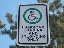
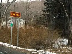
In North America (including Mexico) these colours normally have these meanings. These are standard but exceptions may exist, especially outside the US:
- red with white for stop signs, yield, and forbidden actions (such as No Parking)
- green with white letters for informational signs, such as directions, distances, and places
- brown with white letters for signs to parks, historic sites, ski areas, forests, and campgrounds
- blue with white symbols (or business logos) for rest areas, food, gasoline, hospitals, lodging, and other services
- white with black (or red) letters for regulatory signs, such as speed limits (or parking)
- yellow with black letters and symbols for warning signs, such as curves and school zones
- orange with black letters for temporary traffic control zones and detours associated with road construction[27]
- purple for "lanes restricted to use only by vehicles with registered electronic toll collection (ETC) accounts",[28] such as EZPass.
- black with white letters or arrows for lane use.[29]
The US Manual on Uniform Traffic Control Devices prescribes four other colours: [28]
- fluorescent yellow-green with black symbols for school zone, school bus stop, pedestrian, playground, and bicycle warning signs
- fluorescent pink with black letters and symbols for incident management signs
- coral and light blue, which are unassigned but reserved for potential future use.
Regulatory signs are also sometimes seen with white letters on red or black signs. In Quebec, blue is often used for public services such as rest areas; many black-on-yellow signs are red-on-white instead.
Many US states and Canadian provinces now use fluorescent orange for construction signs.[30]

Highway symbols and markers
Every state in the U.S. and province in Canada has different markers for its own highways, but uses standard ones for all federal highways. Many special highways – such as the Queen Elizabeth Way, Trans-Canada Highway, and various auto trails in the U.S. – have used unique signs. Counties in the US sometimes use a pentagonal blue sign with yellow letters for numbered county roads, though the use is inconsistent even within states.
In Australia, the five states have alphanumeric markers for their own highways, based on the Great Britain road numbering scheme of 1963. Tasmania was the first state to implement this scheme in 1979.[31] "M" roads signified motorways, "A" roads signified primary highways, "B" roads signified less significant roads and "C" roads linked smaller settlements. Western Australia never implemented the alphanumeric scheme, instead retaining the shield system.[32]
Units
Distances in traffic signs generally follow the measurement system in use locally: that is to say, the metric system in all countries of the world except Burma, Liberia, the United Kingdom, and the United States – although in the UK, all distances shown on road signs in TSRGD 2002 by the Department for Transport must be in yards, miles or fractions of a mile but metric units are used on width and height clearances,[33] and in the US, the MUTCD 2000[34] and 2003[35] editions developed by the Federal Highway Administration contain (but rarely used) metric versions of the signs, although some of the metric editions of the signs do get used outside of the US.
Languages
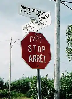
Where signs use a language, the recognized language/s of the area is normally used. Signs in most of the US, Canada, Australia, and New Zealand are in English. Quebec uses French. In contrast, the New Brunswick, Jacques-Cartier, and Champlain bridges, in Montreal (as well as some parts in the West Island), use both English and French, and a number of other provinces and states, such as Ontario, Manitoba, and Vermont use bilingual French–English signs in certain localities. Mexico uses Spanish. Within a few miles of the US–Mexico border, road signs are often in English and Spanish in places like San Diego, Yuma, and El Paso. Indigenous languages, mainly Nahuatl as well as some Mayan languages, have been used as well.
In both Canada and Mexico, pictorial signs are common compared to the US, where many signs are simply written in English.
Typefaces
The typefaces predominantly used on signs in the US and Canada are the FHWA alphabet series (Series B through Series F and Series E Modified). Details of letter shape and spacing for these alphabet series are given in "Standard Alphabets for Traffic Control Devices", first published by the Bureau of Public Roads (BPR) in 1945 and subsequently updated by the Federal Highway Administration (FHWA). It is now part of Standard Highway Signs (SHS), the companion volume to the MUTCD which gives full design details for signfaces.
Initially, all the alphabet series consisted of uppercase letters and digits only, although lowercase extensions were provided for each alphabet series in a 2002 revision of SHS. Series B through Series F evolved from identically named alphabet series which were introduced in 1927.
Straight-stroke letters in the 1927 series were substantially similar to their modern equivalents, but unrounded glyphs were used for letters such as B, C, D, etc., to permit more uniform fabrication of signs by illiterate painters. Various state highway departments and the federal BPR experimented with rounded versions of these letters in the following two decades.
The modern, rounded alphabet series was finally standardized in 1945 after rounded versions of some letters (with widths loosely appropriate for Series C or D) were specified as an option in the 1935 MUTCD and draft versions of the new typefaces had been used in 1942 for guide signs on the newly constructed Pentagon road network.
The mixed-case alphabet now called Series E Modified, which is the standard for destination legend on freeway guide signs, originally existed in two parts: an all-uppercase Series E Modified, which was essentially similar to Series E, except for a larger stroke width, and a lowercase-only alphabet. Both parts were developed by the California Division of Highways (now Caltrans) for use on freeways in 1948–1950.
Initially, the Division used all-uppercase Series E Modified for button-reflectorized letters on ground-mounted signs and mixed-case legend (lowercase letters with Series D capitals) for externally illuminated overhead guide signs. Several Eastern turnpike authorities blended all-uppercase Series E Modified with the lowercase alphabet for destination legends on their guide signs.
Eventually, this combination was accepted for destination legend in the first manual for signing Interstate highways, which was published in 1958 by the American Association of State Highway Officials and adopted as the national standard by the BPR.
Uses of non-FHWA typefaces
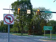
The US National Park Service uses NPS Rawlinson Roadway, a serif typeface, for guide signage; it typically appears on a brown background. Rawlinson has replaced Clarendon as the official NPS typeface, but some states still use Clarendon for recreational signage.
Georgia, in the past, used uppercase Series D with a custom lowercase alphabet on its freeway guide signs; the most distinctive feature of this typeface is the lack of a dot on lowercase i and lowercase j. This was discontinued in 2012.[36] More recent installations appear to include dots.[37]
The Clearview typeface, developed by US researchers to provide improved legibility, is permitted for light legend on dark backgrounds under FHWA interim approval. Clearview has seen widespread use by state departments of transportation in Arkansas, Arizona,[38] Illinois,[39] Kentucky, Maryland, Michigan, Ohio, Pennsylvania, Texas, Vermont, and Virginia. The Kansas Turnpike Authority has also introduced Clearview typeface to some of its newer guide signs along the Kansas Turnpike, but the state of Kansas continues to use the FHWA typefaces for signage on its non-tolled Interstates and freeways.
In Canada, the Ministry of Transportation for the Province of British Columbia specifies Clearview for use on its highway guide signs,[40] and its usage has shown up in Ontario on the Don Valley Parkway and Gardiner Expressway in Toronto and on new 400-series highway installations in Hamilton, Halton and Niagara, as well as street signs in various parts of the province. The font is also being used on newer signs in Alberta, Manitoba, and Quebec.
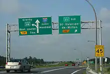
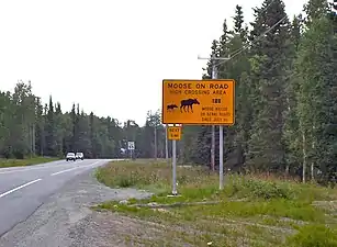
It is common for local governments, airport authorities, and contractors to fabricate traffic signs using typefaces other than the FHWA series; Helvetica, Futura and Arial are common choices.
Australia
For road signs in Australia, this is covered by AS 1742 which is unofficially known as Manual of Uniform Traffic Control Devices for Australia, and it serves as a similar role to the FHWA MUTCD.[41] As a result, road signs in Australia closely follow those used in America, but some sign designs closely follow the ones used in the United Kingdom.
- Australian warning signs have a yellow diamond with a black legend, following America's practice. Australia remains the only country that still has the text-based version of the low-clearance signage. (Most other countries now use vertical arrows in between the clearance height.)
- Australian temporary warning signs are rectangular, following the United Kingdom practice, but they differ from the British temporary warning signs by having a yellow, or an orange background instead.
- Australian regulatory signs are similar to those used in America, except (at least since 1974) the speed limit signs which bear the red circle legend.
The typeface used for Australian road signs is the AS 1744 font which is based on Highway Gothic.
Canada
For road signs in Canada, the Transportation Association of Canada (TAC) publishes its own Manual of Uniform Traffic Control Devices for Canada for use by Canadian jurisdictions.[42] Although it serves a similar role to the FHWA MUTCD, it has been independently developed and has a number of key differences with its US counterpart, most notably the inclusion of bilingual (English/French) signage for jurisdictions such as New Brunswick and Ontario with significant anglophone and francophone population, a heavier reliance on symbols rather than text legends and metric measurements instead of imperial.
The Ministry of Transportation of Ontario (MTO) also has historically used its own MUTCD which bore many similarities to the TAC MUTCDC. However, as of approximately 2000, MTO has been developing the Ontario Traffic Manual (OTM), a series of smaller volumes each covering different aspects of traffic control (e.g., regulatory signs, warning signs, sign design principles, traffic signals, etc.).
Central America
For road signs in Central American countries, the Central American Integration System (SICA) publishes its own Manual Centroamericano de Dispositivos Uniformes para el Control del Transito, a Central American equivalent to the US MUTCD.
Mexico
Road signs in Mexico are influenced by road signs in America, and are published under Manual de Dispositivos para el Control del Tránsito en Calles y Carreteras. It serves as a similar role to the FHWA MUTCD, but is independently developed and has a number of key differences with the US counterpart, and the language used is Mexican Spanish. Like Canada but unlike America, Mexico had a heavier reliance on symbols than text legends, and metric measurements instead of imperial.[43]
New Zealand
New Zealand road signs are generally influenced both by American and European practices.
Warning signs are diamond-shaped with a yellow background for permanent warnings, and an orange background for temporary warnings. They are somewhat more pictorial than their American counterparts. This is also true for Canadian and Mexican signage.
Regulatory signs also follow European practice, with a white circle with a red border indicating prohibitive actions, and a blue circle indicating mandatory actions. White rectangular signs with a red border indicate lane usage directions. Information and direction signs are rectangular, with a green background indicating a state highway, a blue background for all other roads and all services (except in some, where directional signage is white), and a brown background for tourist attractions.
Before 1987, most road signs had black backgrounds – diamonds indicated warnings, and rectangles indicated regulatory actions (with the exception of the Give Way sign (an inverted trapezium), and Stop sign and speed limit signs (which were the same as today)). Information signs were yellow, and direction signage was green on motorways and black everywhere else.
Papua New Guinea
Road signs in Papua New Guinea are standardised and closely follow those used in Australia with certain distinctions. They are written in English.[44]
United States
The Manual on Uniform Traffic Control Devices for Streets and Highways (usually referred to as the Manual on Uniform Traffic Control Devices, abbreviated MUTCD) is a document issued by the Federal Highway Administration (FHWA) of the United States Department of Transportation (USDOT) to specify the standards by which traffic signs, road surface markings, and signals are designed, installed, and used. In the United States, all traffic control devices must legally conform to these standards. The manual is used by state and local agencies as well as private construction firms to ensure that the traffic control devices they use conform to the national standard. While some state agencies have developed their own sets of standards, including their own MUTCDs, these must substantially conform to the federal MUTCD.[45]
The MUTCD defines the content and placement of traffic signs, while design specifications are detailed in a companion volume, Standard Highway Signs. This manual defines the specific dimensions, colors, and fonts of each sign and road marking. The National Committee on Uniform Traffic Control Devices (NCUTCD) advises the FHWA on additions, revisions, and changes to the MUTCD.[45]
The United States is among the countries that have not ratified the Vienna Convention on Road Signs and Signals. The first edition of the MUTCD was published in 1935, 33 years before the Vienna Convention was signed in 1968. The MUTCD differs significantly from the European-influenced Vienna Convention, and an attempt to adopt several of the Vienna Convention's standards during the 1970s led to confusion among many US drivers.[45]
Latin America and the Caribbean
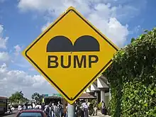
Road signs in Caribbean and Latin America vary from country to country. For the most part, conventions in signage tend to resemble United States signage conventions more so than European and Asian conventions. For example, warning signs are typically diamond-shaped and yellow rather than triangular and white. Some variations include the "Parking" and "No Parking" signs, which contain either a letter E or P, depending on which word is used locally for "Parking" (Spanish estacionamiento or parqueo, Portuguese estacionamento), as well as the Stop sign, which usually reads "Pare" or "Alto". Notable exceptions include speed limit signs, which follow the European conventions, and the "No Entry" sign, often replaced with a crossed upwards arrow.
Argentina
Brazil
Chile
Colombia
Traffic signs in Colombia are classified into three categories:
- Warning signs
- Mandatory signs
- Information signs.[46]
Warning signs are very similar to warning signs in United States. They are yellow diamond-shaped with a black symbol (the yellow colour is changed to an orange colour in areas under construction). In certain cases, the yellow colour is shifted to fluorescent yellow (in the School area sign and Chevron sign).
Mandatory signs are similar to European signs. They are circular with a red border, a white background and a black symbol. Stop sign and Yield sign are as European, except the word "Stop" is changed for "Pare" and the Yield sign has no letters; it is a red triangle with white centre.
Information signs have many shapes and colours. Principally they are blue with white symbols and in many cases these signs have an information letter below the symbol.
Haiti
Road signs in Haiti are standardized road signs closely following those used in France with certain distinctions. They are written in French and Haitian Creole.
Suriname
Road signs in Suriname are particularly modelled on the Dutch road signs since Suriname is a former Dutch colony, although traffic drives on the left.
References
- "Vienna Convention on Road Signs and Signals" (PDF). UNECE. 31 October 2022.
- "Trans-African Highway Network". Google My Maps. Retrieved 5 February 2023.
- Vantharith Oum (31 August 2011). "Road Traffic Signs in Cambodia" (in Khmer).
{{cite journal}}: Cite journal requires|journal=(help) - "旧型道路標識一覧(禁止・指導・規制・警戒標識)". trafficsignal.jp (in Japanese). Retrieved 9 September 2022.
- "Road Traffic in N. Korea". world.kbs.co.kr. Retrieved 20 July 2022.
- "MMDA defends 'pink' as traffic enforcement standard". GMA News Online.
- "Probe looms over MMDA's pink traffic signs". GMA News Online.
- "В помощь: Дорожные знаки Фотографии старого Саратова" (in Russian). Archived from the original on 13 April 2015. Retrieved 9 April 2015.
- Saudi highway signs near Makkah (archived)
- League of nations Traty Series, vol. 150, p. 247
- United Nations Treaty Series vol. 182, p. 228
- United Nations Treaty Series vol. 182, p. 286
- "Norma 8.1-I.C." (PDF). Ministerio de Fomento, Gobierno de España. Archived from the original (PDF) on 9 March 2014.
- "Google Maps". Google Maps. Retrieved 2 January 2023.
- S.I. No. 55/1926: Road Signs and Traffic Signals Regulations, 1926 Archived 26 February 2006 at the Wayback Machine – Irish Statute Book
- S.I. No. 284/1956: Traffic Signs Regulations, 1956 Archived 5 September 2006 at the Wayback Machine – Irish Statute Book
- "NT Cornelia typeface". MyFonts.com. Retrieved 11 March 2021.
- "Rozporządzenie Ministra Infrastruktury z dnia 3 lipca 2003 r. w sprawie szczegółowych warunków technicznych dla znaków i sygnałów drogowych oraz urządzeń bezpieczeństwa ruchu drogowego i warunków ich umieszczania na drogach (Regulations On Traffic Signs And Signals And Traffic Safety Devices And Their Placement On Roads, consolidated as at 12 July 2019)". Dziennik Ustaw (Polish Gazette) (in Polish). Retrieved 25 December 2020.
- Ralf Herrmann (8 July 2008). "Traffic Sign Typefaces: Poland". Retrieved 25 December 2020.
- "Polskie Fonty Online: Tablica Drogowa". Fonty.PL (in Polish). Retrieved 25 December 2020.
- "Drogowskaz Font". FFonts.net. Retrieved 25 December 2020.
- "Дорожные знаки меньшего размера появятся по всей России" (in Russian). www.kommersant.ru. 4 February 2019. Archived from the original on 4 February 2019. Retrieved 4 February 2019.
- Teckensnitt på vägmärken / Vägverket Archived 20 April 2006 at the Wayback Machine
- rel (20 January 2003). ""Frutiger" für die Strasse". NZZ (in German). Zurich, Switzerland. Retrieved 28 June 2017.
- "Know your traffic signs".
- "The Traffic Signs Regulations and General Directions 2002". opsi.gov.uk. Retrieved 30 November 2010.
- "The Evolution of MUTCD". dot.gov.
- Section 1A.12 Color Code, Manual on Uniform Traffic Control Devices
- "Signs, signals and road markings" (PDF). icbc.com. Archived from the original (PDF) on 22 October 2013.
- Section 6F.02 General Characteristics of Signs [Temporary Traffic Control], Manual on Uniform Traffic Control Devices
- Department of Primary Industries, Parks, Water & Environment (January 2014). "Tasmanian Road Route Codes: Route descriptions and focal points" (PDF). Version 2.7. Government of Tasmania. pp. 6, 60–64. Archived from the original (PDF) on 14 July 2014. Retrieved 10 April 2014.
{{cite web}}: CS1 maint: multiple names: authors list (link) - Main Roads Western Australia (21 September 2011). "Route Numbering". Guidelines for Direction Signs in the Perth Metropolitan Area. Government of Western Australia. Archived from the original on 21 October 2013. Retrieved 17 November 2013.
Main Roads has chosen to retain the shield numbering system
- "Where are metric units legal on British roads?". UK Metric Association. 8 October 2020. Retrieved 31 October 2022.
- "Manual of Uniform Traffic Control Devices" (PDF). Federal Highway Administration. 2000. Retrieved 31 October 2022.
- "Manual of Uniform Traffic Control Devices" (PDF). Federal Highway Administration. 2003. Retrieved 31 October 2022.
- "Image". gribblenation.com. Retrieved 30 November 2010.
- "Photo". gribblenation.com. Retrieved 30 November 2010.
- Holstege, Sean (11 September 2013). "Seeing double on I-17? It's a sign of safer times". The Arizona Republic. Phoenix, Arizona, USA. Retrieved 3 December 2014.
- "Illinois Department of Transportation". Archived from the original on 14 May 2011. Retrieved 12 October 2006.
- "2006 Internet Templates". Archived from the original on 1 September 2010. Retrieved 5 May 2006.
- "AS 1742.1:2021 | Standards Australia". store.standards.org.au. Retrieved 28 October 2022.
- "Transportation Association of Canada". Transportation Association of Canada. Retrieved 14 July 2021.
- "Road and Traffic Signs in Mexico – What You Need to Know". www.rhinocarhire.com. Retrieved 28 October 2022.
- "Guide to Driving In Papua New Guinea - Drive Safe in Papua New Guinea - Rhinocarhire.com". www.rhinocarhire.com. Retrieved 28 October 2022.
- "Manual on Uniform Traffic Control Devices (MUTCD) - FHWA". mutcd.fhwa.dot.gov. Retrieved 8 April 2023.
- Colombia traffic signs manual Archived 10 June 2008 at the Wayback Machine

