12-5
Be sure your drawings communicate care and respect
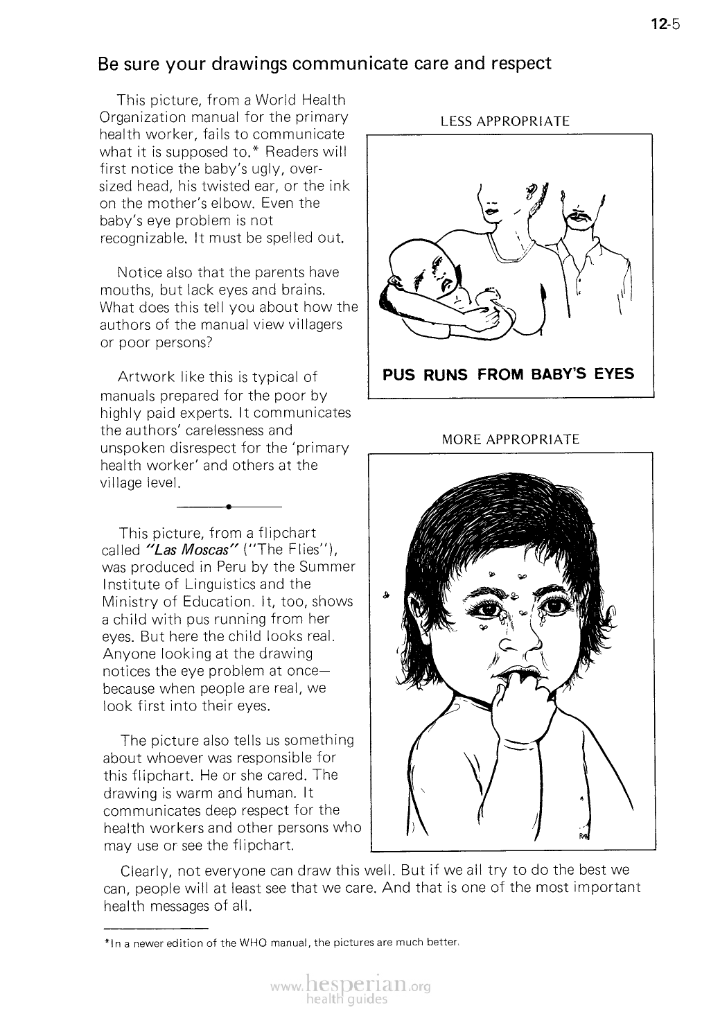
This picture, from a World Health
Organization manual for the primary
health worker, fails to communicate
what it is supposed to.* Readers will
first notice the baby’s ugly, oversized
head, his twisted ear, or the ink on the
mother’s elbow. Even the baby’s eye
problem is not recognizable. It must be
spelled out.
LESS APPROPRIATE
Notice also that the parents have
mouths, but lack eyes and brains.
What does this tell you about how the
authors of the manual view villagers or
poor persons?
Artwork like this is typical of
manuals prepared for the poor by
highly paid experts. It communicates
the authors’ carelessness and
unspoken disrespect for the ‘primary
health worker’ and others at the village
level.
•
This picture, from a flipchart called
“Las Moscas” (“The Flies”), was
produced in Peru by the Summer
Institute of Linguistics and the Ministry
of Education. It, too, shows a child
with pus running from her eyes. But
here the child looks real. Anyone
looking at the drawing notices the eye
problem at once— because when
people are real, we look first into their
eyes.
PUS RUNS FROM BABY’S EYES
MORE APPROPRIATE
The picture also tells us something
about whoever was responsible
for this flipchart. He or she cared.
The drawing is warm and human. It
communicates deep respect for the
health workers and other persons who
may use or see the flipchart.
Clearly, not everyone can draw this well. But if we all try to do the best we can,
people will at least see that we care. And that is one of the most important health
messages of all.
*ln a newer edition of the WHO manual, the pictures are much better.