This article was co-authored by Juli Roland. Juli Roland is a Color Specialist and the Founder of PaintColorHelp.com, one of the first companies in Dallas, Texas metro area that provides in-home color consultations and helps clients create paint color schemes. Juli has over 15 years of commercial and residential color consulting experience, including seven years as a custom-matcher in the paint industry. She earned her certification in color strategy from Camp Chroma and is a member of the Inter-Society Color Council. She has a BA in Advertising from Texas Tech University.
There are 13 references cited in this article, which can be found at the bottom of the page.
This article has been viewed 101,897 times.
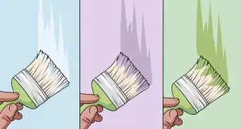
Choosing the right interior paint colors depends on the kind of room you want. Take some time to think about what kind of ambiance you want. Certain colors add weight to the room while others create a lighter tone. You can also mix colors into different shades and tints to help create more visual unity. Plan out your rooms before painting so that you can make your home’s interior pleasant no matter what colors you use.
Steps
Selecting a Color Palette
-
1Paint with warm colors to create comfortable, energizing rooms. Warm colors include red, orange, and yellow. The brightest tints of these colors are bold and vibrant but can be too strong when used often. More muted shades can make a room feel cozier, similar to a summer or autumn day. Warm colors work well in rooms that feature a lot of activity, such as living rooms.[1]
- For example, use a deep shade of red on your walls, then pair it with yellow and orange decorations. Your room will look playful, like a leaf pile in fall.
- Use bright tints of warm colors as an accent. A bright yellow, for instance, can lighten up a room, but using it sparingly prevents it from feeling overwhelming.
- You can also add subtle warmth to a room by painting it in shades of white lightly tinted with warm colors.
-
2Choose cool colors to make a room relaxing. Blue, green, and purple are all cool colors. Cool colors can freshen up a room or help you calm down after a long day. They make for good choices in bedrooms and sitting rooms. Lighter shades can feel more vibrant, while darker shades can feel more soothing.[2]
- For example, a light shade of blue can remind you of the water at the beach. A darker shade would feel much heavier.
- Cool colors can be used in rooms that feature a lot of activity. However, you may want to choose a lighter tint or offset the cool color with a neutral color, such as white.
- Darker cool colors, such as deep green or navy blue, can help you feel grounded in the room and give the space a cozy feeling.
Advertisement -
3Select neutral colors to balance out other colors. At first glance, the various shades of white and gray seem boring. In decorating, they are very useful because they fit well in any color palette. They tone down warm or light colors, but they also lighten cool or dark colors. Black, brown, and light blue are a few alternative colors that can serve as a neutral base.[3]
- The key to using neutrals is to keep them as accents. Painting all of your walls white will look pretty boring until you start decorating.
- Whites and grays come in various tones. Be careful when using darker shades of gray, since they can make your room feel heavier or more drab.
- You can also balance out warm or cool paint colors by using furniture in neutral colors.
-
4Opt for lighter tints in order to open up rooms. Pale yellows, blues, and whites are great choices to lighten up a room. Light colors lack visual weight, which means your eye isn't drawn to them. When you step into the room, your eye may go to a piece of art or another bright feature. Since you aren’t focused on the exterior surfaces, rooms with light colors often feel larger than they are.[4]
- Any color can be made lighter by mixing it with white. If you can’t find the exact color of paint you want, try mixing your own!
- Include the ceiling in your considerations. A light ceiling can create the illusion that a room is taller than it is.
-
5Paint rooms with darker shades to make them more intimate. Darker colors have visual weight. When you walk into a room, your eyes are drawn to them.[5] Painting your walls with darker colors can make your room feel smaller, cozier, and more austere. Similarly, a dark ceiling also makes a room feel smaller.[6]
- Think of a library. If you designed this room in your home, you might use dark colors to create a quiet, intimate atmosphere.
- If you have a long, narrow hallway, paint the far walls a dark color to make the hallway feel shorter.
- Dark colors can also camouflage ducts and other exposed elements, but use them sparingly so they don’t make your room feel too small or restrictive.
- You can also add a metallic glaze over any paint. This gives the paint a metallic finish, which draws attention like regular dark paint does. It can be good on painted architecture.
- Using a dark color on a wall can also create a strong backdrop for a focal point, such as a framed painting on the wall behind your bed or sofa.
-
6Choose a glossy paint sheen to make your paint look shinier. You can check the label on any paint you choose to see how it will affect the finish. Paints with a gloss or semi-gloss finish look a little brighter than normal. For this reason, they are often used in areas such as the kitchen. Glossy paints work best with lighter colors and are easy to renew with a new coat of paint.[7]
- Satin and eggshell finishes are a little less glossy. Satin is durable and used in high-traffic areas such as a family room. Eggshell finishes are a little more delicate and can be used in low-traffic areas like your dining room.
- Flat or matte finishes have no shine at all. This type of paint works well with dark paint, particularly in quiet areas like bedrooms.
-
7Use a paint app to help you choose your color palette. Paint apps in your phone’s app or play store can help you test different colors. A few paint manufacturers and home stores have these apps. Some of these apps allow you to upload a photo to find a matching color, such as if you want to find a matching paint for a surface you have already painted.[8]
- For example, try apps like Color Grab, Project Color, or Pick-a-Paint.


Designing a Single Room
-
1Select 1 predominant color to define your room. The predominant color is your room's main color, so take some time to think about how you want the room to look. This color will likely end up on your walls. You may also want to find furniture and decorations that contain this color in order to emphasize a consistent color theme.[9]
- Since the walls are the biggest color canvas in a room, starting there is easiest but not mandatory. If your predominant color is very bright, for example, you might buy accessories in that color, then paint your walls to complement it.
- Pick out colors that capture your attention. Any item, such as a favorite coffee mug or blanket, can provide you with colors to use.
-
2Choose 2 or 3 accent colors to give your room variety. Find a couple of colors that go well with the predominant color you chose. You can make a cohesive room out of just about any combination of colors, so let your imagination run wild. Complementary colors create harmony, but opposing colors can accentuate your predominant color.[10]
- For example, red and yellow pair well together, but you could paint your walls a light blue color to draw attention to a striking red decoration.
- Try looking up a color wheel to see which colors complement and contrast one another. Paint supply stores will have swatch books you can use for this purpose.
- If your predominant color is bold, then choose muted accent colors to complement it or balance it out. For example, if your main color is a bold pink, your accent colors could be muted orange and white or shades of light grey and white.
-
3Use multiple shades of the same color to add variety to a room. A room that is painted a singular shade of blue looks consistent but boring. To break up the monotony, find ways to incorporate different shades. You could paint the wall 1 shade, then paint the doors another shade, for example.[11]
- If you can’t find a shade you like, remember that you can mix your own paint. Many paint suppliers will do this for you. Add white to a color to lighten it or add gray to a color to darken it.
-
4Paint room architecture a different shade than the rest of the room. When choosing colors, work with the room’s architecture. Items such as doorways, molding, and built-in bookshelves are difficult and costly to remove, but they do draw attention. By painting them slightly lighter or darker than your primary color, you can show off these components without inhibiting the room’s theme.[12]
- For example, if you have gray walls, paint these components white or brown. These colors complement the gray paint without overwhelming it.
- Try painting these fixtures with a metallic glaze in order to slightly alter their coloring.
-
5Match your paint colors to your furniture and decorations. To get a full sense of what you want the finished room to look like, imagine how you will decorate the room. Use the colors in furniture, plants, art, and other components to help settle on paint colors. Blend the colors of your items with the paint you choose to create a consistent room theme.[13]
- For instance, physical items can be a part of the room’s theme. If you have blue and white furniture, for instance, paint your room a matching blue and white.
- Items can also be used as highlights through contrasting colors. If you have a vibrant, red painting, try painting the wall behind it a neutral or pale color. This draws attention to the painting instead of the wall.
- If your furniture and walls are the same color, your room may look dull and lifeless. Make sure to include at least a few decorations in different colors to keep things interesting.
-
6Get paint samples to test directly on the wall. Purchase small samples from a paint supply store. You should test colors for a few days before settling on them. See how the color changes throughout the day, including when you turn on lighting fixtures. This way, you can be sure you love your choices before committing to them.[14]
- If you don’t want to paint the sample on your wall, apply it to a primed piece of drywall. Otherwise, you can bring home paint swatches and try to use them to make a decision.
- Give yourself at least a day to live with your colors. The paint will look a little different from day to night, so see if it consistently appeals to you.
- The type of light in your room affects the paint’s color. Incandescent lighting makes it seem warmer and yellower while fluorescent lighting makes it seem sharper and bluer.[15]


Painting Multiple Rooms
-
1Note which rooms you can see from other rooms. When designing a home’s interior, the goal is to make the rooms feel like they fit together. To do this, the paint colors need to flow together. Walk around your home. Make a floor plan and take notes, remembering that even distant colors affect a room's atmosphere.[16]
- For instance, if you paint your room with deep reds and browns, a bright orange hallway will detract from it. You may want to paint the hallway a pale yellow so it isn’t a distraction.
- A simple way to create flowing paint colors is to settle on a theme color. For example, painting trim, bannisters, and furniture white creates consistency even if you paint adjacent rooms different colors.
- Choose no more than 3-4 colors throughout your house.[17]
-
2Start with the biggest, most central room when painting. This room is often the easiest to plan out. Most likely you already have an idea of how you want to paint the room. Once you settle on a color scheme, you can then begin working on adjoining rooms, coming up with colors that complement it.[18]
- For instance, you might start with the living room. Think about painting it a bright color to make it big and vibrant. Then, paint adjoining rooms with more subdued colors.
- If you know you want to paint a room with bold colors, you can start there even if the room is small. Come up with contrasting colors for nearby rooms.
-
3Alternate soft and bold colors between rooms. There are many ways to plan out an interior, but alternating colors keeps a home interesting. Painting every room the same color feels monotonous. Try to give each room a different amount of visual weight. Mix in some darker colors, then switch back to more vibrant colors to keep your eye engaged.[19]
- For example, paint your living room a vibrant red. Paint the room next to it a light yellow. Add red and brown decorations to complete the effect.
- While you can juxtapose 2 dark colors, such as a dark red and brown, this can make your interior seem a little gloomy and claustrophobic.
-
4Create a consistent interior by mixing in different shade and tints. When you settle on a color for 1 room, choose a color 1 shade lighter or darker. Find a way to incorporate the shade into nearby rooms. This will give your interior some visual consistency while keeping it interesting. You can use this color to choose complementary and accentuating colors that give each room a unique character.[20]
- For example, say you paint your room blue with white trim. Avoid using the same shade of blue in another room. Instead, try painting the walls white and the trim a lighter blue color.
- Shades can help you plan out big rooms with a lot of open space. Select a main color, then find ways to apply darker shades and lighter tints.
- The exception is when your home has a separate upstairs and downstairs. Consider these to be different worlds. You do not need to keep them consistent with each other.
- It is harder to use a variety of colors across different rooms if you have a house with an open plan. If you have closed off rooms, you can use different colors more easily without creating a busy or inharmonious appearance.
-
5Make connecting spaces neutral so they match all rooms. If you have a foyer that leads to your kitchen, living room, and staircase, you have to match it to all of those areas. This quickly gets overwhelming! Instead, try keeping it a simple, neutral white or gray so you can focus on refining the colors in those other rooms.[21]
- The only exception is if the other rooms are all a similar color. If you paint the other rooms neutral colors, the connecting room can be a bolder or richer color.
-
6Paint repeating architecture the same way for consistency. Make use of your home’s architecture to create a theme for your interior. Items like windows, trim, and wainscoting are all opportunities for consistency. You can design the rest of the colors any way you like, but let the architecture serve as a unifying feature.[22]
- For example, imagine brown trim running throughout your home. The color can tie a bright red room to a subdued blue room.
- For instance, paint all your windows, doors, or shelves white. This can make your interior look very planned and consistent.


What Are Some Common Mistakes People Make When They Bring Color Into Their Home?
Expert Q&A
-
QuestionWhat are some great complementary colors that go well with turquoise?
 Juli RolandJuli Roland is a Color Specialist and the Founder of PaintColorHelp.com, one of the first companies in Dallas, Texas metro area that provides in-home color consultations and helps clients create paint color schemes. Juli has over 15 years of commercial and residential color consulting experience, including seven years as a custom-matcher in the paint industry. She earned her certification in color strategy from Camp Chroma and is a member of the Inter-Society Color Council. She has a BA in Advertising from Texas Tech University.
Certified Color SpecialistA classic combination is turquoise with orange or coral. These are called “complementary colors” because they’re opposite each other on the color wheel. This combo tends to have a beachy or retro feel. -
QuestionIf my wall looks dark and dull, how can I brighten it up?Juli RolandJuli Roland is a Color Specialist and the Founder of PaintColorHelp.com, one of the first companies in Dallas, Texas metro area that provides in-home color consultations and helps clients create paint color schemes. Juli has over 15 years of commercial and residential color consulting experience, including seven years as a custom-matcher in the paint industry. She earned her certification in color strategy from Camp Chroma and is a member of the Inter-Society Color Council. She has a BA in Advertising from Texas Tech University.
Certified Color SpecialistYou can brighten spaces from the 90s and early 2000s by using a warmer off white, or a light “greige” wall color, meaning a near-neutral that actually comes from the yellow family. Examples of colors that might fit the warm gray/greige category include PPG 1007-2 Swirling Smoke, Behr N320-1 Campfire Ash, and Benjamin Moore 1549 Balboa Mist. Don't plug in just any gray, though. A silvery or blue-gray will look odd next to the typical materials from those eras, which tended to be from the peachy-yellow family. -
QuestionWhich colour is best for a living room?
 Katherine TlapaKatherine Tlapa is an interior designer, currently working as a Design Specialist for Modsy, a design service based in San Francisco. She also runs her own DIY Home Design blog, My Eclectic Grace. She received her BFA in Interior Architecture from Ohio University in 2016.
Interior DesignerLiving rooms can be any color you like depending on personal style preference. Consider your existing decor to find a color that will complement what's already in the room.
Warnings
- Colors can vary under different lighting, so be sure to test a color thoroughly so you know what you are getting.⧼thumbs_response⧽
- Remember to coat surfaces in primer before painting, or else the original color can bleed through and ruin your paint.⧼thumbs_response⧽


References
- ↑ Juli Roland. Certified Color Specialist. Expert Interview. 27 March 2020.
- ↑ Juli Roland. Certified Color Specialist. Expert Interview. 27 March 2020.
- ↑ https://www.heytherehome.com/8-tips-choosing-right-paint-color/
- ↑ https://www.forbes.com/sites/houzz/2014/01/15/secrets-from-a-color-expert-paint-picking-help/#989d2c8662f8
- ↑ Juli Roland. Certified Color Specialist. Expert Interview. 27 March 2020.
- ↑ https://www.forbes.com/sites/houzz/2014/01/15/secrets-from-a-color-expert-paint-picking-help/#989d2c8662f8
- ↑ https://www.consumerreports.org/interior-paints/pick-the-perfect-paint-sheen-for-every-room/
- ↑ https://www.cnet.com/how-to/how-to-choose-the-right-paint-color-for-your-home/
- ↑ https://www.heytherehome.com/8-tips-choosing-right-paint-color/
- ↑ https://www.apartmenttherapy.com/how-to-choose-the-right-paint-color-for-your-home-183658
- ↑ https://www.bhg.com/decorating/color/basics/how-to-pick-interior-color-schemes/
- ↑ https://www.bhg.com/decorating/color/basics/how-to-pick-interior-color-schemes/
- ↑ https://www.youtube.com/watch?v=6nAUtBdrnk0&feature=youtu.be&t=25
- ↑ https://www.housebeautiful.com/room-decorating/colors/a226/advice-choosing-paint-colors/
- ↑ https://www.youtube.com/watch?v=6nAUtBdrnk0&feature=youtu.be&t=81
- ↑ https://www.forbes.com/sites/houzz/2013/07/29/how-to-pick-a-color-palette-for-your-whole-house/
- ↑ Juli Roland. Certified Color Specialist. Expert Interview. 27 March 2020.
- ↑ https://www.forbes.com/sites/houzz/2013/07/29/how-to-pick-a-color-palette-for-your-whole-house/#659f431d3716
- ↑ https://www.bobvila.com/slideshow/look-11-painted-ceilings-that-wow-47294
- ↑ https://www.bobvila.com/slideshow/look-11-painted-ceilings-that-wow-47294
- ↑ https://www.forbes.com/sites/houzz/2013/07/29/how-to-pick-a-color-palette-for-your-whole-house/#659f431d3716
- ↑ https://www.bhg.com/decorating/color/basics/how-to-pick-interior-color-schemes/
About This Article