This article was co-authored by wikiHow staff writer, Jack Lloyd. Jack Lloyd is a Technology Writer and Editor for wikiHow. He has over two years of experience writing and editing technology-related articles. He is technology enthusiast and an English teacher.
This article has been viewed 68,297 times.
Learn more...
This wikiHow teaches you how to structure your website's home page. The home page—also known as a landing page—is usually the first page people will see when visiting your website, so setting it up for convenience is crucial if you want to encourage people to stay on your website.
Steps
-
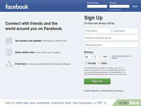
1Review popular landing pages. Before you set out to create your own landing page, take a look at the home pages used for common websites to get an idea of how they present their information to appeal to their target audiences. Good examples of sites with obvious, concise home pages include the following:
- Spotify
- Wikipedia
-
2Establish your landing page's objective. While many landing pages serve to encourage users to sign up for a service or make a purchase (e.g., Spotify), yours may simply exist to direct users to different sections of the site (e.g., Wikipedia). Knowing what the point of the landing page is will help you guide your design choices.Advertisement
-
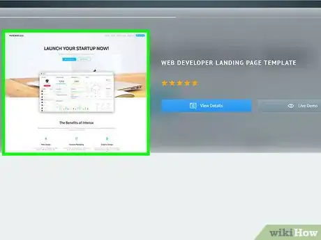
3Consider using a landing page template. While virtually all web-hosting services will allow you to turn a blank page into your home page, most services also include dedicated landing page templates which can be customized for your preferences.
- Since templates are usually tested before becoming available, using a template is a quick way to guarantee that your page will be user-friendly.
-
4Remember to implement common web design. Unique presentation makes for a strong impression in most areas of landing page design, but the overall format of the page isn't one of them. When building your landing page, keep the following conventions in mind:
- Place the search bar (if applicable) in the upper-right side of the page.
- Keep menu items at the top of the page.
- Place your logo or home page link in the upper-left side of the page.
- Place links to important advanced content (e.g., the Contact Us link) at the bottom of the page.
-
5Use images and text to support the objective. Depending on your objective itself, this will vary; for example, if you're trying to encourage a user to sign up for a service, your landing page's text should focus on the service's aspects and benefits, while the images should showcase those perks.[1]
- You can also use this space to place customer testimonials, news about your site, or other user-relevant information.
-
6Answer your audience's questions. Users who end up on your landing page will have questions whether or not they're actively pondering them, and failing to present some form of answer on your landing page will often result in the users leaving. There are four main questions that your landing page should answer with minimal effort:[2]
- What is the purpose of the site? — The site's purpose, product, or service should be clearly shown and explained in as few words as possible at the top of the site.
- How does the purpose apply to the user? — Convincing any user that they need your service or site can be tricky, but explaining the site's relevance through headings with wrap text is a good way to ensure that users have the information necessary to make a decision.
- Why should the user stay on the site? — Showcasing a promotion (e.g., "First month free") or demonstrating your product, service, or site in use is often enough to persuade users who are already considering your offer.
- How can the user act to benefit from the site? — Placing a call to action button (e.g., Sign Up Now!) on your landing page addresses this question.
-
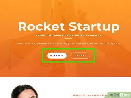
7Add a clear call to action button. If your goal is to get a user to sign up for notifications, for example, your call to action button should say something like "Notify Me" rather than "Submit Email Address".
- Placing a subheading below your call to action (e.g., "Never miss a deal again") can help reinforce the button's message.[3]
-
8Don't overuse text forms. If your website requires users to sign up with an email address or create an account, keep the number of text boxes they have to fill out to a minimum. The more text boxes people have to fill out, the more likely they are to abandon the sign-up process before they finish.[4]
- An email address, a first and last name, and a password should usually be the extent of your requested information.
-
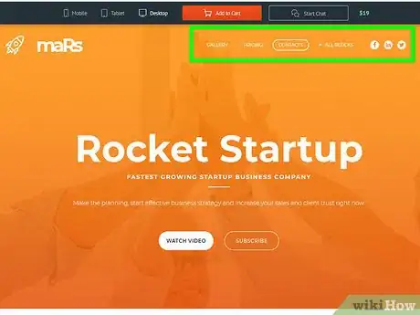
9Provide clear navigation options. Navigation options typically go in the top-right corner of your landing page, and involve links such as Store, About, and so on. Making sure that these options are both visible and accurately titled will provide users with a frustration-free navigation experience.
- You may also want to add a search bar in the upper-right corner if your website has a vast inventory or similarly high-search options.
-
10Minimize the amount of on-screen clutter. Aside from the landing page's bare essentials, you shouldn't pack the screen with floating bars, pop-up windows, or additional menu options unless absolutely necessary for site navigation.
- One option for content-heavy landing pages is to put the non-essential items in a collapsible menu denoted by a menu icon (☰) in the top-left side of the page. The menu can then serve as a table of contents.
-
11Display urgent alerts at the top of the page. If your site is about to undergo maintenance, you're offering a promotional discount, a new product is in stock, or something similarly important for your site's traffic to see is occurring, make sure that you place an eye-grabbing reference to it at the top of your page.
-
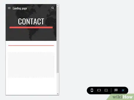
12Keep mobile users in mind. While most mobile browsers can view desktop sites, you'll have a more positive response if you create a separate, mobile-friendly version of your site's landing page.
- The bulk of online traffic comes from mobile users, so consider minimizing your use of flash-based graphics or any kind of auto-playing videos.
- If you're using a hosting service's landing page template, the template probably includes a mobile version which will automatically display when a mobile browser is detected.
-
13Avoid common landing page pitfalls. Anything that might be off-putting or unattractive to your audience should be removed from your landing page before launch. Common examples include the following:
- Pop-ups
- Large ad spaces which prevent users from being able to see the whole page
- Vivid, clashing colors
- Overly dynamic elements (too much movement on a web page can cause some users to experience motion sickness)
- Too many images or videos (this can lead to a slow-loading page)
Warnings
- Users will often click off of your landing page if it takes more than 5 seconds to load.⧼thumbs_response⧽
References
- ↑ https://www.wix.com/blog/2015/11/create-a-powerful-free-landing-page-in-under-an-hour/
- ↑ https://knowledge.hubspot.com/landing-page-user-guide-v2/how-to-create-a-landing-page
- ↑ https://www.weidert.com/whole_brain_marketing_blog/simple-tips-for-optimizing-your-landing-pages
- ↑ https://www.wordstream.com/effective-landing-pages
About This Article
1. Check out other landing pages.
2. Establish your objective.
3. Consider a landing page template.
4. Implement common conventions in web design.
5. Answer your audience's questions.
6. Add a clear Call to Action button.
7. Provide clear navigation options.
8. Keep mobile users in mind.
