This article was co-authored by wikiHow staff writer, Nicole Levine, MFA. Nicole Levine is a Technology Writer and Editor for wikiHow. She has more than 20 years of experience creating technical documentation and leading support teams at major web hosting and software companies. Nicole also holds an MFA in Creative Writing from Portland State University and teaches composition, fiction-writing, and zine-making at various institutions.
This article has been viewed 295,792 times.
Learn more...
Creating a bar chart or graph is a great way to compare data that's separated into categories. Microsoft Word makes it easy to create many types of graphs, including simple but attractive bar charts, using their Chart tool. We'll show you how to insert a Chart into your Microsoft Word document and use it to illustrate your own data.
Steps
-
1Click the Insert tab in Microsoft Word. It's at the top of Word.[1]
-
2Click Chart on the toolbar. It's the vertical bar graph icon in the toolbar at the top of Word. Depending on your version, it may be on a panel called "Illustrations."Advertisement
-
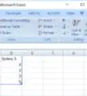
3Select the Bar option. You'll see it in the left panel.
-
4Double-click the bar chart format you want. You can select any of the bar charts in the right panel to choose that type of chart. This places the chart in a spreadsheet window that looks like Excel.
- The Clustered and 3-D Clustered bar charts are helpful for comparing values across categories.[2]
- Stacked bar and 3-D Stacked bar charts are best for showing the relationship of individual items to a whole.
- The 100% Stacked and 3-D 100% Stacked bar charts compare the percentage each value contributes across multiple categories.
-
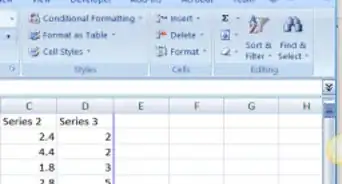
5Replace the sample data with your own data. Now that you have the basic chart format, you can just swap out the example information with your own data to display your chart.
- You can close the spreadsheet window when you're finished. If you need to edit the data again, click the chart to select it, click the Chart Design tab at the top, and then click Edit Data on the toolbar.
-
6Edit your chart details. While the chart is selected, you'll see four icons at its top-right corner. You can use these icons to make your data look exactly as you want.
- Click the first icon, which looks like a curved line over a set of horizontal lines, to display and select from a variety of layout and text-wrapping options.
- Click the + to show or hide chart elements, including axes, category and series names, grid lines, legends, and more.
- Click the paintbrush icon at the top-right corner of the chart to choose a different chart style.[3]
-
7Select different chart elements to view options in the Format panel. As you click different chart elements, such as the bars or gridlines, the Format panel on the right side of Word will change to show you editing options for the selected element.
- For example, if you click text on your chart, you can change the text color and outline in the right panel.
- You can change the colors of the chart by clicking Change Colors on the Chart Design tab.
- For more formatting options, click the Chart Design tab at the top of Word—it's only visible when the chart is selected. This is also where you'll find options for changing the chart type, editing the data, and choosing a different color scheme.


Community Q&A
-
QuestionHow should I name the x- and y-axis on the graph?
 Community AnswerThe x-axis is the horizontal part of the graph and is the independent variable meaning it will not be affected by the other variable, which is on the y-axis. You can name them according to the data that is being represented on your graph.


References
- ↑ https://support.microsoft.com/en-us/office/add-a-chart-to-your-document-in-word-ff48e3eb-5e04-4368-a39e-20df7c798932
- ↑ https://support.microsoft.com/en-us/office/available-chart-types-in-office-a6187218-807e-4103-9e0a-27cdb19afb90#OfficeVersion=macOS
- ↑ https://support.microsoft.com/en-us/office/change-the-color-or-style-of-a-chart-in-office-f4db3f23-f5a1-4b30-abb3-62e8c2c33d9b
About This Article

1. Click Insert.
2. Click Chart.
3. Click Bar.
4. Double-click a bar chart format.
5. Replace the sample data with your own data.