This article was co-authored by wikiHow Staff. Our trained team of editors and researchers validate articles for accuracy and comprehensiveness. wikiHow's Content Management Team carefully monitors the work from our editorial staff to ensure that each article is backed by trusted research and meets our high quality standards.
wikiHow marks an article as reader-approved once it receives enough positive feedback. In this case, 86% of readers who voted found the article helpful, earning it our reader-approved status.
This article has been viewed 190,623 times.
Learn more...
Psychrometric charts are used by engineers and scientists to visualize the relationships of gases and vapors. While the charts may look complex, they’re relatively easy to read when you know what each part of the graph is representing. By identifying the axes and reading the markings on the interior of the chart, you can plot points and draw conclusions from known measurements on the chart.
Steps
Identifying the Axes
-
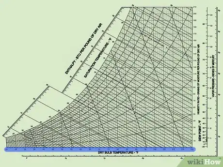
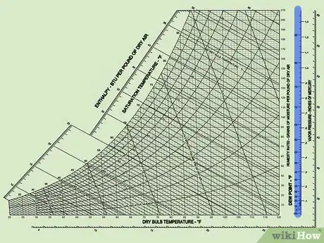
1Look along the bottom of the chart to find the dry bulb temperature. The horizontal, or “X” axis, of the chart denotes the various temperature readings in Fahrenheit or Celsius. Use the vertical lines extending from this axis to trace the measurements throughout the chart.[1]
- Each labeled temperature will have one vertical line extending from the axis. If the measurement that you are looking for is between the labeled temperatures, estimate its location.
-
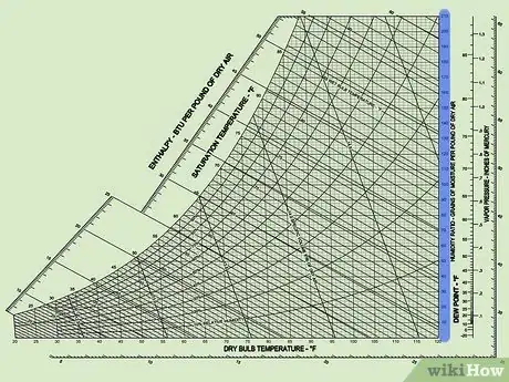
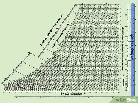
2Find the humidity ratio labeled on the right vertical axis. The vertical, or “Y” axis of the chart marks the amount of moisture per pound or kilogram. Use the horizontal lines extending from this axis to trace the humidity ratio throughout the chart.[2]
- The humidity ratio is sometimes referred to as the “mixing ratio” or “absolute humidity.”
Advertisement -
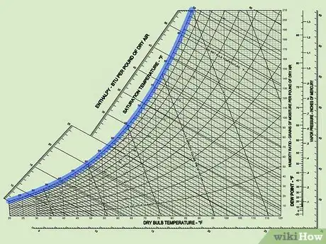
3Locate the uppermost curved line on the chart to find the saturation curve. This curve connects the X and Y axis, and marks the relationship between temperature and absolute humidity when the relative humidity is 100%.[3] Along this line, note that the wet bulb temperature and the dew point are always equal to the dry bulb temperature.
- The curved line gets its shape due to a rise in absolute humidity when the temperature increases.
-
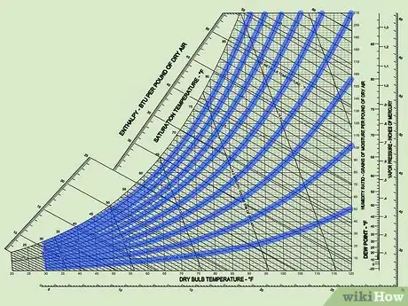
4Follow the interior curved lines to see various levels of relative humidity. On the chart, you will notice various lines that follow the curve of the saturation curve. These mark the relationship between temperature and pressure when the humidity is less than 100%. In most cases, each line away from the saturation curve represents a 10% decrease in saturation.[4]
- Notice that as the temperature decreases, the relative humidity lines become closer together until they are nearly indistinguishable.
Reading Interior Markings
-
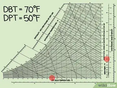
1Look on the right side of the chart to find the vertical dew point line. Just to the right of the Y-axis, find the line with the dew point measurement in degrees Fahrenheit or Celsius. If you’re having trouble seeing the lines on the chart, use a ruler to align the hash marks with the lines on chart.[5]
- Since the lines for dew point remain constant and flat throughout the chart, the dew point does not change according to the dry bulb temperature.
-
2Locate the vapor pressure line to the right of the dew point line. Next to or along the same vertical line as the dew point measurements, there will be markings denoting the various vapor pressures in inches of mercury or millibars. Again, if you’re having trouble following the lines on the chart, use a ruler horizontally to align the hash marks of the vapor pressures with the lines on the chart.[6]
- Like dew point, vapor pressure remains constant even if the dry bulb temperature changes.
-
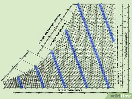
3Identify the diagonal specific volume lines throughout the chart. The specific volume of the air tells you the amount of air that this chart was meant to measure, normally within a range of a 2-3 m3/kg or ft3/lb. As the relative humidity increases at a certain temperature, the specific volume of the air also increases.[7]
- This measurement is helpful when using the chart to calculate the rate of cooling for a fan or coil.
-
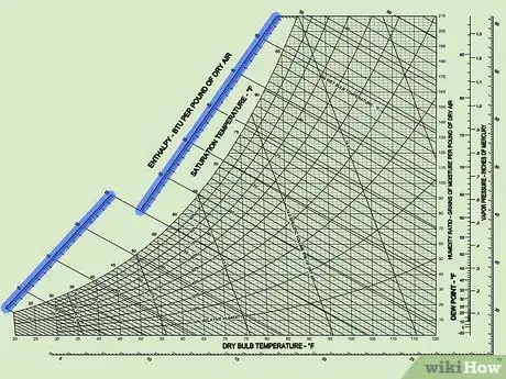
4Find the diagonal enthalpy scales surrounding the chart. Around the extremes of the chart and just outside of the saturation curve, locate the diagonal scales which represent enthalpy in BTU per pound of dry air.[8] Use a ruler to extend these measurements into the chart.
- As temperature and absolute humidity increase, the enthalpy also increases.
Drawing Conclusions from Given Parameters
-
1Identify 2 known measurements that are on the chart. When solving a problem involving a psychrometric chart, you only need 2 measurements to read the chart. Pick any 2 known measurements available and plot them on the chart where the lines intersect.[9]
- Normally, you should give preference to measurements of dry temperature, absolute humidity, dew point, or vapor pressure. However, you can also use relative humidity, enthalpy, and specific volume to make estimated conclusions.
-
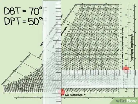
2Use a ruler to locate other measurements at the point of intersection. Once you’ve marked the point where your known measurements intersect, use a ruler to follow the lines extending from the point of intersection to the various scales on the chart. Try to be as exact as possible when using the chart to read other measurements, and mark your answers in the proper units for that measurement.[10]
- For example, if you know the dry temperature and absolute humidity readings, you can use a ruler to gather information about the dew point, relative humidity, specific volume, enthalpy, and vapor pressure.
-
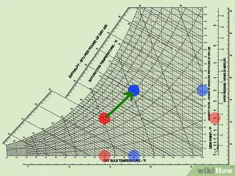
3Visualize 2 measurements by comparing them on the chart. If you’re calculating a change in any of the measurements over time, plot the points on the chart and gather all of the measurements possible for each point from the chart. From there, compare the difference in the measurements and make note of how the change affected the air.[11]
- This is especially useful for visualizing how a change in temperature, absolute humidity, dew point, or vapor pressure affects relative humidity, enthalpy, or specific volume.
References
- ↑ https://extension.psu.edu/psychrometric-chart-use
- ↑ https://extension.psu.edu/psychrometric-chart-use
- ↑ https://extension.psu.edu/psychrometric-chart-use
- ↑ https://www.brighthubengineering.com/hvac/41264-how-to-use-psychrometric-chart/
- ↑ https://www.rotronic.com/media/productattachments/files/h/o/how_to_read_psychchart_f_web.pdf
- ↑ https://www.rotronic.com/media/productattachments/files/h/o/how_to_read_psychchart_f_web.pdf
- ↑ https://www.brighthubengineering.com/hvac/41264-how-to-use-psychrometric-chart/#
- ↑ https://extension.psu.edu/psychrometric-chart-use
- ↑ https://www.rotronic.com/media/productattachments/files/h/o/how_to_read_psychchart_f_web.pdf
About This Article
To read a psychometric chart, find the dry bulb temperature on the horizontal or X axis. Check the vertical or Y axis for the humidity ratio. The uppermost curved line on the chart shows the saturation curve when the relative humidity is 100 percent. The interior curved lines represent various levels of relative humidity. The straight, diagonal lines show specific volume lines. On the right of the chart, you’ll find the dew point line and the vapor pressure line on the right of that. For more tips, including how to draw conclusions from specific parameters on a psychometric chart, read on!
