wikiHow is a “wiki,” similar to Wikipedia, which means that many of our articles are co-written by multiple authors. To create this article, 18 people, some anonymous, worked to edit and improve it over time.
This article has been viewed 578,398 times.
Learn more...
Control charts are an efficient way of analyzing performance data to evaluate how a process changes over time. Control charts are also called statistical process control, or SPC, charts, and they have many uses, like checking machinery or evaluating test scores. It might sound complicated at first, but it's a pretty easy process—especially if you're using software like Excel, Power BI, or Tableau. Our guide will show you how to create a control chart to track your own process data!
Steps
-
1Check to see that your data meets the following criteria:
- Data should usually be normally distributed revolving around a mean (average).
- In the example below, a bottle company fills their bottles to 16 oz. (mean); they are evaluating if their process is “in-control”. The amount in ounces over 16 oz. is normally distributed around the mean.
- Measurements need to be independent of one another.
- In the example, the measurements are in subgroups. The data in the subgroups should be independent of the measurement number; each data point will have a subgroup and a measurement number.
- Data should usually be normally distributed revolving around a mean (average).
-
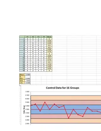
2Find the mean of each subgroup.[1]
- To find the mean, add all measurements in the subgroup and divide by the number of measurements in the subgroup.
- In the example, there are 20 subgroups and in each subgroup there are 4 measurements.
Advertisement - To find the mean, add all measurements in the subgroup and divide by the number of measurements in the subgroup.
-
3Find the mean of all of the means from the previous step (X).[2]
- This will give you the overall mean of all the data points.
- The overall mean will be the centerline in the graph (CL), which is 13.75 for our example.
-
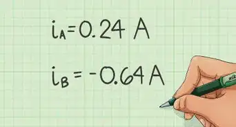
4Calculate the standard deviation (S) of the data points (see tips).[3]
-
5Calculate the upper and lower control limits (UCL, LCL) using the following formula:[4]
- UCL = CL + 3*S
- LCL = CL – 3*S
- The formula represents 3 standard deviations above and 3 standard deviations below the mean respectively.
-
6Refer to the below chart with steps 7 through 10.
-
7Draw a line at each deviation.
- In the above example, there is a line drawn at one, two, and three standard deviations (sigma's) away from the mean.
- Zone C is 1 sigma away from the mean (green).
- Zone B is 2 sigma away from the mean (yellow).
- Zone A is 3 sigma away from the mean (red).
- In the above example, there is a line drawn at one, two, and three standard deviations (sigma's) away from the mean.
-
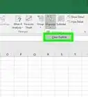
8Graph the X-bar Control Chart, by graphing the subgroup means (x-axis) verses measurements (y-axis).[5] Your graph should look like something like this:
-
9Evaluate the graph to see if the process is out-of-control. The graph is out-of-control if any of the following are true:
- Any point falls beyond the red zone (above or below the 3-sigma line).
- 8 consecutive points fall on one side of the centerline.
- 2 of 3 consecutive points fall within zone A.
- 4 of 5 consecutive points fall within zone A and/or zone B.
- 15 consecutive points are within Zone C.
- 8 consecutive points not in zone C.
-
10State whether the system is in-control or out-of-control.


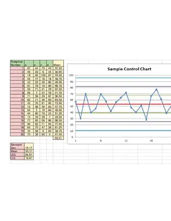
Sample Control Charts

Community Q&A
-
QuestionWhat is the minimum number of samples that I would need to create a valid control chart?
 Community AnswerYou need for there to be a sample size of at least 30 for the distribution to be considered normal.
Warnings
- Control charts are (generally) based on data being normally distributed. In practice, however, they are reasonably robust to non-normal data.⧼thumbs_response⧽
- X-bar charts, such as the one explained above, chart means rather than individual values. As explained by the Central Limit Theorem, Means tend to be normally distributed even if the underlying data are not.⧼thumbs_response⧽
- Moving Range charts (often used with the Individuals Chart (also known as the X or I chart) use different interpretation rules to cater for the very strong non-normality of Moving Range data.⧼thumbs_response⧽
- For some charts, e.g. the c chart, data probably will be non-normally distributed.⧼thumbs_response⧽
Things You'll Need
- Basic understanding of graphical analysis.
- Access to Excel.


References
- ↑ http://www.syque.com/quality_tools/toolbook/Control/do_avg_range_calc.htm
- ↑ http://www.syque.com/quality_tools/toolbook/Control/do_avg_range_calc.htm
- ↑ https://www.stat.auckland.ac.nz/~wild/ChanceEnc/Ch13.pdf
- ↑ https://www.youtube.com/watch?time_continue=222&v=71v1xNX_9qQ
- ↑ https://www.isixsigma.com/tools-templates/control-charts/a-guide-to-control-charts/