X
wikiHow is a “wiki,” similar to Wikipedia, which means that many of our articles are co-written by multiple authors. To create this article, volunteer authors worked to edit and improve it over time.
The wikiHow Tech Team also followed the article's instructions and verified that they work.
This article has been viewed 473,115 times.
Learn more...
Pareto Analysis is a simple technique for prioritizing potential causes by identifying the problems. The article gives instructions on how to create a Pareto chart using MS Excel 2010.
Steps
-
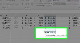
1Identify and List Problems. Make a list of all of the data elements/work items that you need to prioritize using the Pareto principle. This should look something like this.
- If you don't have data to practice, then use the data shown in the image and see if you can make the same Pareto chart, which is shown here.
-
2Arrange different Categories in Descending Order, in our case “Hair Fall Reason” based on “Frequency”.Advertisement
-
3Add a column for Cumulative Frequency. Use formulae similar to what is shown in the figure.
- Now your table should look like this.
-
4Calculate total of numbers shown in Frequency and add a column for Percentage.
- Ensure that the total should be same as the last value in Cumulative Frequency column.
- Now your data table is complete and ready to create the Pareto chart. Your data table should look like this.
-
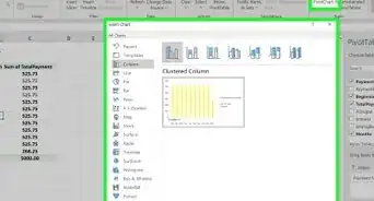
5Go to Insert-->Column and select the 2-D Column chart.
-
6A blank Chart area should now appear on the Excel sheet. Right Click in the Chart area and Select Data.
-
7Select Column B1 to C9. Then put a comma (,) and select column E1 to E9.
- This is one of the important step, extra care need to be taken to ensure correct data range is being selected for the Pareto.
-
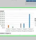
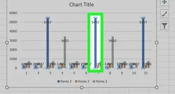
8Now, your Pareto Chart should look like this. Frequency is shown as Blue bars and Percentage is shown as Red bars.
-
9Select one of the Percentage bars and right click. Click on “Change Series Chart Type” to “Line with Markers”.
- Following screen should appear.
-
10Now your chart should look like this.
- Percentage bars are now changed to line-chart.
-
11Select and right click on the Red Line chart for Percentage and Click on Format data series.
- Now, Format Data Series pop-up will open, where you need to select "Secondary Axis".
-
12Secondary "Y" axis will appear.
- The only problem with this Pareto Chart is the fact that the secondary Y-axis is showing 120%. This needs to be corrected. You may or may not face this issue.
-
13Select the Secondary Y-axis. Right click and click on "Format Axis" option shown as you right click.
- Go to Axis Options in the "Format Data Series" dialog box and Change the value for "Maximum" to 1.0.
-
14Your Pareto is complete and should look like this.
- However, you can still go ahead and Add some final touch to your Pareto to make it more appealing.
Go to Chart Tools --> Layout. You can add Chart Title, Axis Title, Legend and Data Tables, if you want.
- However, you can still go ahead and Add some final touch to your Pareto to make it more appealing.


Advertisement
Warnings
- The data displayed in the Pareto Chart is for reference only.⧼thumbs_response⧽
Advertisement


About This Article
Advertisement