This article was co-authored by wikiHow Staff. Our trained team of editors and researchers validate articles for accuracy and comprehensiveness. wikiHow's Content Management Team carefully monitors the work from our editorial staff to ensure that each article is backed by trusted research and meets our high quality standards.
There are 7 references cited in this article, which can be found at the bottom of the page.
This article has been viewed 149,398 times.
Learn more...
Pie charts, also called circle charts, are composed of a circle divided into different wedges or sections. You can draw a pie chart using programs like Adobe Illustrator or Microsoft Excel. However, it is also easy to hand draw a pie chart if you have a compass, protractor, and markers or colored pencils.
Steps
Interpreting Your Data
-
1Gather your data. Pie charts are used to compare the relative size of different data categories.[1] Pie charts are best used with nominal or ordinal data, in which 6 or fewer categories are represented. If you have more than 6 categories, certain sections of a pie chart may be too small to effectively read and interpret.[2]
- Nominal data is data that has no specific order or scale, but is categorized only by a name or category type.[3] Examples of nominal data include favorite dessert or college major.
- Ordinal data is data that is based on position or scale.[4] Examples of ordinal data include level of satisfaction or education level.
-
2Calculate the total value of the data. This is the total number of data points that you have. If you conducted a one-question survey, the total number of data points would be the total number of responses you received.
- For example, if you surveyed 100 American millennials on who their favorite Beatle is, you will have 100 data points.
Advertisement -
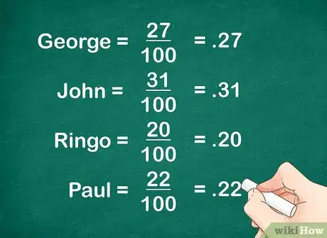
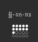
3Calculate the ratio of each category. To find a ratio, place the number of responses a particular category received over the number of data points. Turn this into a percentage by dividing the numerator by the denominator.[5]
- For example, you might have found the following data from your survey:
Who is your favorite Beatle?
- For example, you might have found the following data from your survey:
Drawing the Chart
-
1Use a compass to draw a circle. Attach a sharpened pencil and hold the point firmly while you swing the compass to create a circle. It doesn't matter how large the circle is, but the larger the circle, the easier it will be to create and read your pie chart.
-
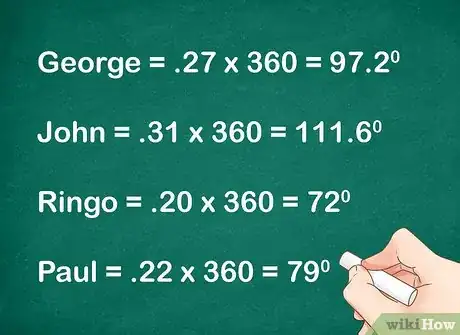
2Multiply each category percentage by 360. Use the decimal form of the percentage in your calculation. This will give you the size of each category's section in degrees. Each section needs to be represented as a proportion of 360, since there are 360 degrees in a circle.[6] You might need to round decimals up or down. Make sure your total number of degrees adds up to 360.
- For example:
- For example:
-
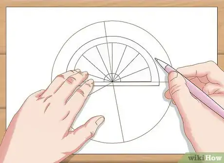
3Draw the first category section. Place the protractor's origin hole in the center of the circle. Create the first angle by drawing two points, one at the 0 degree line, and one at the line showing the number of degrees of your angle. Remove the protractor, and use its straight edge to draw the borders of the section. Each line segment should begin at the circle's center point, end at the edge of the circle, and pass through either point you drew with the protractor.[7]
- For example, the John category should be a section that is 97 degrees. So you would draw a point outside the protractor at the 0 degree line, and another point at the 97 degree line. Then you would finish drawing the section by drawing lines through these points.
- Take care when using a protractor to read it correctly. Most protractors have two sets of numbers. Think about the size of the angle you are making to ensure you are looking at the correct numbers.
-
4Draw the other categories. For each new category, place the protractor's 0 degree line over the edge of the previous section. Draw the sections using their degree measurements, just as you did the first section.[8]
Labeling the Chart
-
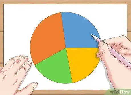
1Color each section. By making each section of the pie chart a different color, it makes it easier for readers to interpret its information. The colors you use don't matter, but if they are too dark or vibrant, reading your chart may be difficult.
-
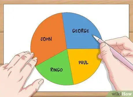
2Label each section category. Your chart should be properly labeled so that anyone looking at it can interpret what its sections mean. Usually the category if each section is written directly on the chart. If a particular section is too small to write clearly inside of it, draw a line connecting the section to an area outside of the chart, and write the category title there.
- Another option is to make a key. Instead of labeling directly on your pie chart, you can make a small box below it, denoting which color indicates which category.
-
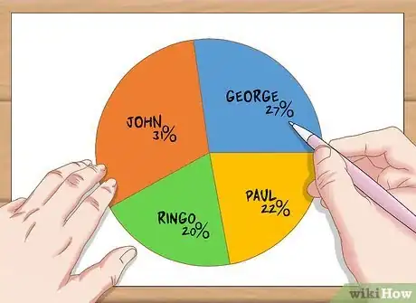
3Denote each section's percentage. Even though the pie chart's section indicate their relative size, it is helpful to give readers the exact size by labeling each category's percentage. Write the percentage above or below the category title so that it is clear which percentage applies to which section of the pie chart.
-
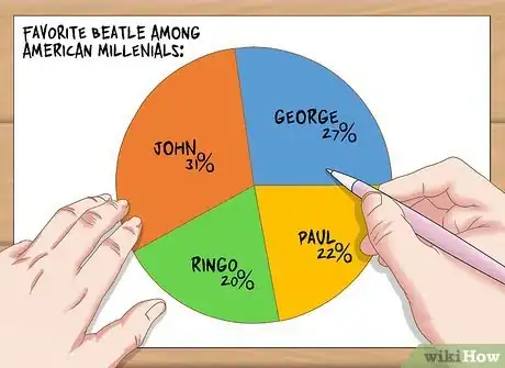
4Title your chart. Every chart should have a title that tells the reader what information it is displaying. Your title should be descriptive, but not too long.
- For example, you might name your chart “Favorite Beatle Among American Millennials.”
Community Q&A
-
QuestionHow do I make a pie chart if the digits are in decimal?
 DonaganTop AnswererTo make a pie chart displaying numbers that are given in decimal form, add all the numbers together, and then divide each individual number by that sum. That will give you more decimal numbers. Multiply each by 100 to arrive at percentages for each number. Multiply each percentage by 360° to get the central angle for each segment of the pie.
 -
QuestionHow do I convert the percentage into a decimal while multiplying?
 Jake VandenbergCommunity AnswerIn order to convert a percentage to a decimal, simply divide the percentage by 100. For example, 25 percent becomes 0.25 after dividing by 100.
 -
QuestionHow do I find the percentages?
 DonaganTop AnswererThe above article assumes you have been given the percentages, rather than having to find them. If instead you have been given the angles at the center of the pie, you can find the percentages involved by dividing each angle by 360° and then multiplying the resulting decimal number by 100 (and tacking on a % sign).
References
- ↑ https://www.mathsisfun.com/data/pie-charts.html
- ↑ https://www.youtube.com/watch?v=1oShnkmA_ww
- ↑ http://changingminds.org/explanations/research/measurement/types_data.htm
- ↑ http://changingminds.org/explanations/research/measurement/types_data.htm
- ↑ http://www.mathplanet.com/education/pre-algebra/introducing-geometry/circle-graphs
- ↑ http://www.bbc.co.uk/schools/gcsebitesize/maths/statistics/representingdata1rev2.shtml
- ↑ https://youtu.be/p_nPxTRuLxo?t=230
- ↑ https://youtu.be/p_nPxTRuLxo?t=280
About This Article
Drawing a pie chart from percentages is fairly simple once you understand how to convert percentages to angles of a circle. The whole pie represents 100 percent, or 360 degrees, which is the angle of a circle. This means that you’ll need to convert each percent into an angle before you can add it to the pie chart. To do this, first, convert each percentage into a decimal by moving the decimal two spots to the right. Then, multiply that number by 360 to get its equivalent angle. For example, if you have a category that’s 20 percent, that would become .20, which multiplied by 360 is 72 degrees. Use a protractor to draw each angle into your pie chart. To learn how to add the finishing touches to your pie chart, read on!


