This article was co-authored by wikiHow Staff. Our trained team of editors and researchers validate articles for accuracy and comprehensiveness. wikiHow's Content Management Team carefully monitors the work from our editorial staff to ensure that each article is backed by trusted research and meets our high quality standards.
This article has been viewed 310,801 times.
Learn more...
Most people are familiar with reading numbers on a number line or reading data from a graph. However, under certain circumstances, a standard scale may not be useful. If the data grows or decreases exponentially, then you will need to use what is called a logarithmic scale. For example, a graph of the number of McDonald’s hamburgers sold over time would start at 1 million in 1955; then 5 million just a year later; then 400 million, 1 billion (in less than 10 years), and up to 80 billion by 1990.[1] This data would be too much for a standard graph, but it is easily displayed on a logarithmic scale. You need to understand that a logarithmic scale has a different system of displaying the numbers, which are not evenly spaced as on a standard scale. By knowing how to read a logarithmic scale you can more effectively read and represent data in graphic form.
Steps
Reading the Axes of the Graph
-
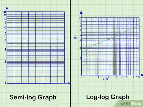
1Determine whether you are reading a semi-log or log-log graph. Graphs that represent rapidly growing data can use one-log scales or two-log scales. The difference is in whether both the x-axis and y-axis use logarithmic scales, or only one.[2] The choice depends on the amount of detail that you wish to display with your graph. If numbers on one axis or the other grow or decrease exponentially, you may wish to use a logarithmic scale for that axis.
- A logarithmic (or just “log”) scale has unevenly spaced grid lines. A standard scale has evenly spaced grid lines. Some data needs to be graphed on standard paper only, some on semi-log graphs, and some on log-log graphs.
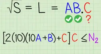
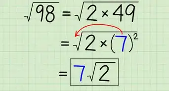
- For example, the graph of (or any similar function with a radical term) can be graphed on a purely standard graph, a semi-log graph, or log-log graph. On a standard graph, the function appears as a sideways parabola, but the detail for very small numbers is difficult to see. On the log-log graph, the same function appears as a straight line, and the values are more spread out for better detail.[3]
- If both variables in a study include great ranges of data, you would probably use a log-log graph. Studies of evolutionary effects, for example, may be measured in thousands or millions of years and might choose a logarithmic scale for the x-axis. Depending on the item being measured, a log-log scale may be necessary.
-
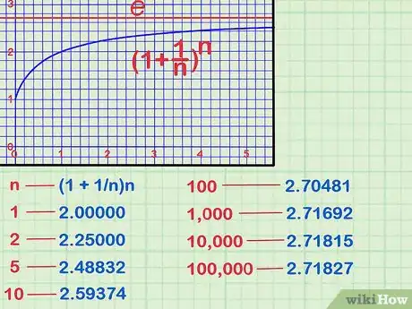
2Read the scale of the main divisions. On a logarithmic scale graph, the evenly spaced marks represent the powers of whatever base you are working with. The standard logarithms use either base 10 or the natural logarithm which uses the base .
- is a mathematical constant that is useful in working with compound interest and other advanced calculations. It is approximately equal to 2.718.[4] This article will focus on the base-10 logarithms, but the reading the natural logarithm scale operates in the same way.
- Standard logarithms use base 10. Instead of counting 1, 2, 3, 4… or 10, 20, 30, 40… or some other evenly spaced scale, a logarithm scale counts by powers of 10. The main axis points are, therefore, and so on.[5]
- Each of the main divisions, usually noted on log paper with a darker line, is called a “cycle.” When specifically using based 10, you can use the term “decade” because it refers to a new power of 10.
Advertisement -
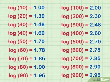
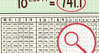
3Notice that the minor intervals are not evenly spaced. If you are using printed logarithmic graph paper, you will notice that the intervals between the main units are not evenly spaced. That is, for example, the mark for 20 would actually be placed about 1/3 of the way between 10 and 100.[6]
- The minor interval marks are based on the logarithm of each number. Therefore, if 10 is represented as the first major mark on the scale, and 100 is the second, the other numbers fall in between as follows:
- At higher powers of 10, the minor intervals are spaced in the same ratios. Thus, the spacing between 10, 20, 30… looks like the spacing between 100, 200, 300… or 1000, 2000, 3000….
- The minor interval marks are based on the logarithm of each number. Therefore, if 10 is represented as the first major mark on the scale, and 100 is the second, the other numbers fall in between as follows:
Plotting Points on a Logarithmic Scale
-
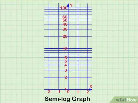
1Determine the type of scale you wish to use. For the explanation given below, the focus will be on a semi-log graph, using a standard scale for the x-axis and a log scale for the y-axis. However, you may wish to reverse these, depending on how you want the data to appear. Reversing the axes has the effect of shifting the graph by ninety degrees and may make the data more easily interpreted in one direction or the other. Additionally, you may wish to use a log scale to spread out certain data values and make their details more visible.[7]
-
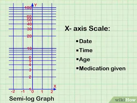
2Mark the x-axis scale. The x-axis is the independent variable. The independent variable is the one that you generally control in a measurement or experiment. The independent variable is not affected by the other variable in the study. Some examples of independent variables may be such things as:[8]
- Date
- Time
- Age
- Medication given
-
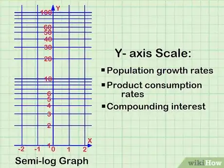
3Determine that you need a logarithmic scale for the y-axis. You will use a logarithmic scale to graph data that changes extremely quickly. A standard graph is useful for data that grows or decreases at a linear rate. A logarithmic graph is for data that changes at an exponential rate. Samples of such data might be:
- Population growth rates
- Product consumption rates
- Compounding interest
-
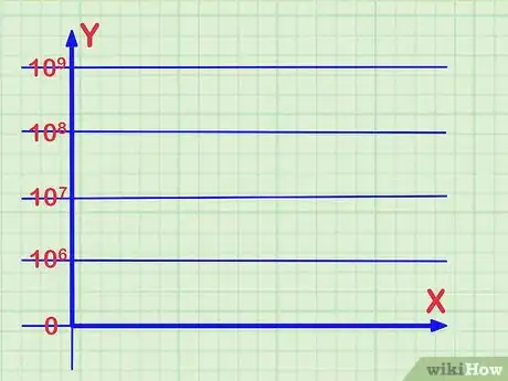
4Label the logarithmic scale. Review your data and decide how to mark the y-axis. If your data measures numbers only within, for example, the millions and billions, you probably do not need to have your graph begin at 0. You could label the lowest cycle on the graph as . Subsequent cycles would be and so on.
-
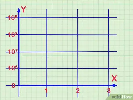
5Find the position on the x-axis for a data point. To graph the first (or any) data point, you begin by finding its position along the x-axis. This may be an incremental scale, such as a regular number line that counts 1, 2, 3, and so on. It may be a scale of labels that you assign, such as dates or months of the year when you take certain measurements.
-
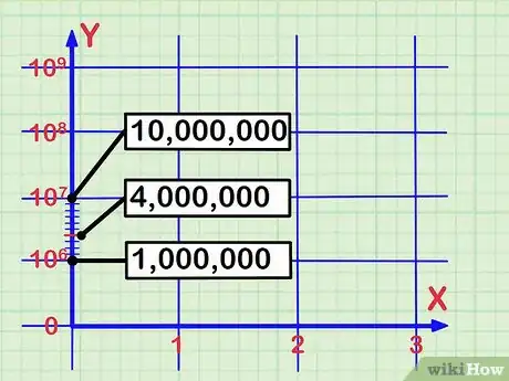
6Locate the position along the logarithmic scale y-axis. You need to find the corresponding position along the y-axis for the data that you wish to plot. Recall that, since you are working with a logarithmic scale, the major markings are powers of 10, and the minor scale markings in between represent the subdivisions. For example, between (one million) and (ten million), the lines represent divisions of 1,000,000’s.[9]
- For example, the number 4,000,000 would be graphed at the fourth minor scale mark above . Even though, on a standard linear scale, 4,000,000 is less than halfway between 1,000,000 and 10,000,000, because of the logarithmic scale, it actually appears slightly more than halfway.
- You should note that the higher intervals, closer to the upper limit, become squeezed together. This is due to the mathematical nature of the logarithmic scale.
-
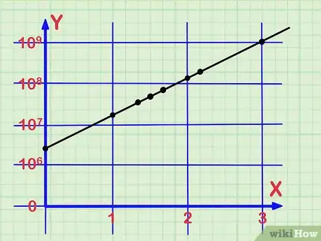
7Continue with all the data. Continue repeating the previous steps for all the data that you need to graph. For each data point, first locate its position along the x-axis, and then find its corresponding location along the logarithmic scale of the y-axis.
Community Q&A
-
QuestionIs log scale also calculus?
 Community AnswerLog scales and similar applications of logarithms are not part of calculus, but are a significant topic in pre-calc. Historically, logarithms came first; Newton had ready access to log scale slide rules when he was inventing calculus. However, the natural logarithm and properties of Euler's constant e are topics for calculus, and don't make a lot of sense without it.
Warnings
- When reading data off a logarithmic scale, be sure you know what base is used for the logarithm. Data measured in base 10 will be very different than data measured on a natural log scale with base e.⧼thumbs_response⧽
References
- ↑ http://www.thedailymeal.com/eat/has-mcdonald-s-really-sold-billions-and-billions-burgers
- ↑ https://www.youtube.com/watch?v=bCmMAfxctdI
- ↑ http://www.intmath.com/exponential-logarithmic-functions/7-graphs-log-semilog.php
- ↑ https://www.mathsisfun.com/numbers/e-eulers-number.html
- ↑ http://www.windows2universe.org/teacher_resources/graphs/worksheet_logarithmic_scale.html
- ↑ http://www.windows2universe.org/teacher_resources/graphs/worksheet_logarithmic_scale.html
- ↑ http://www.intmath.com/exponential-logarithmic-functions/7-graphs-log-semilog.php
- ↑ https://nces.ed.gov/nceskids/help/user_guide/graph/variables.asp
- ↑ http://www.intmath.com/exponential-logarithmic-functions/7-graphs-log-semilog.php
About This Article
When reading a logarithmic scale, the evenly spaced marks represent the powers of whatever base you are working with. Standard logarithms use base 10, so a logarithm scale counts by powers of 10. Each of the main divisions, noted on log paper with a darker line, is called a cycle or decade. The minor intervals are not evenly spaced since their value is based on the logarithm for each number. To learn how to plot points on a logarithmic scale, keep reading!
